A candlestick pattern is a movement in prices shown graphically, on the chart, which consists of
Candlestick charts originated in Japan somewhere around the 1700s, and is still now, one of the most powerful ways of analyzing the markets.
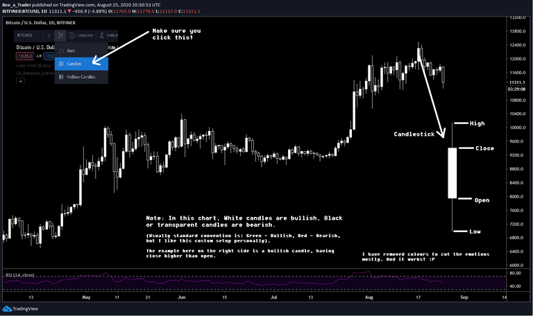
A daily candlestick (I have taken the example of candles in a 1 day timeframe chart) shows the market's open, high, low, and close price for the day, along with a "Body".
(don't worry if you don't understand yet, I'll cover the details soon).
I'll try to cover this guide in the most newbie friendly way as possible, and in case you don't understand something, feel free to let me know in the comments, or on Twitter :)
The content of this article is primarily for educational purpose only.Disclaimer: I'm not a certified financial advisor, and even though I've been trading for quite a few years, I urge people reading this, and my other posts to #DYOR (Do your own research) before taking any financial decisions! There is no guarantee whatsoever that you will become a profitable trader.
Here is the link to the previous series in case you have missed out: [1], [2].
Let's break down the charts.
For reference, I am referring to the Bitcoin daily chart, on Tradingview.
Link: https://www.tradingview.com/symbols/BTCUSD/?exchange=BITFINEX
Steps: go to the above link, or simply search for "BTCUSD" in tradingview, and open one chart from your favorite exchange, and click on the "Full featured Chart"
P.S. Please zoom into the image to check the small notes I added.
By now I hope you have got a fair idea on what a candlestick is, so in this example, considering that it is a daily chart, one candlestick will capture the price movement in a day.
A new candlestick will mean, a new day has started.
Similarly, if you are checking the hourly chart, every candlestick in the chart will capture price movement of one hour timeframe. Same for every timeframe you look at.
Candlestick components:
- Open: This is the price, at the start of the time interval.
- Close: This is the price, at the end of the time interval.
- High: This is the maximum price, the asset has reached, during the time interval.
- Low: This is the minimum price, the asset has reached, during the time interval.
- Wicks/Shadows: The part of the candle not having real body.
Calculation: High-close can be a wick, or open-low can be a wick. (Example shown below)
(In the example, each candle equals 1 day of price movement)
If we take 1 day as time interval, the zero second, or the start of the day will be the open of the candlestick, and the exact end of the day will be the close of the candlestick.
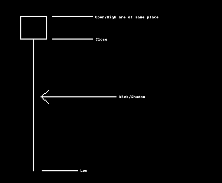
In the above candlestick, note that the Open/High are at the same point, and also note the long wick.
(This is an example of a Hammer candlestick (will cover more details later))
Let's try to understand what are bullish/bearish candles:
- If a candle closes higher than the opening, the candle is bullish. (I have used white in my example)
- If a candle closes lower than the opening, the candle is bearish. (I have used black/transparent in my example).
Note: you can use any combination you want.
Now for an exercise, just open the charts, switch to the 1 minute timeframe and see the candles capturing prices and making new candles every minute! (I won't recommend using 1 minute chart for real trading, because there is too much noise and chaos in low timeframes like these)
Now just open up a chart, and if you are on the correct settings, I mentioned on my previous article, you will see there are two types of candles. One is the black candle, one is the white candle. Black candle means price is going down, white candle means, price is going up.
(Or you can keep default settings, and green candle will be up, red will be down)
Simple.
Why should we use candlestick charts?
Ans: This is because, it captures the entire range of price movements in a time interval, inside a candle, and presents that thing in a very easy to read and digest format.
Following things are must for good analysis:
- If we analyse candlesticks without keeping the bigger picture in mind, this will be entirely useless. We must keep in mind the previous price action, before we can actually trade accurately.
- Cut out the noise, learn how to identify and eliminate the noise from the market. (This includes psychological and emotional impacts, like, asking everyone about price predictions, opening up your search engine to find out about price predictions instead of the actual analysis behind an asset, or even mindlessly asking other people on groups like what should be the price of this asset after sometime, or "Btc fell too much, how much will it fall?"or something like these)
- Try to add in some more data points to improve your quality.
- Keep it simple. (This is by far the most important)
In one of the above points, I can show one example, which you can see for yourself.
If you choose a higher timeframe for analysis (and you need more patience for that obviously), you will see significantly less noise, or rather, a much cleaner data.
For example: You may have a lok at the 4 hour chart, and find that the candlesticks or any chart) makes much more sense, than a 1 minute chart.
Higher timeframes will contain more data, and will be much better than lower timeframes.
Let's understand Supply/Demand
Every candlestick you see on the chart is a result of buys and sells happening, between bulls and bears.
In simple terms, bulls are those people who speculate that the price of an asset will go up.
Similarly, bears are those people who speculate that the price of an asset will go down.
Supply and demand forms a very fundamental concept towards understanding how the candlesticks work, technically.
*In simple terms:
Keeping demand constant
-> If the supply is reduced, the price will go up.
-> If the supply is increased, the price will go down.
Keeping supply constant
-> If the demand increases, the price goes up.
-> If the demand decreases, the price will go down.
Now comes the fun part:
As the tug of war between the bulls and bears take place continuously, there will be two scenarios:
- Price will go up if demand is greater than supply
- Price will go down if supply is greater than demand.
Translate that to a candlestick data:
If the number of bulls exceed number of bears, the price will go up.
If the number of bears exceed number of bulls, the price will go down.
Bulls take the price higher, and Bears take the price lower. That's it!
Now wicks, as I have mentioned earlier, are failed attempts to take the price higher/lower.
Consider the chart as a playground where bulls and bears are playing a tug of war.
If the bulls push price forward, price goes up. LAter on, if the bears step in and move the price lower, the price will go down. Now a candlestick will capture all the data, starting from (Open, High, Low, Close) so we will also see failed attempts to take prices higher and lower, which may be denoted by long wicks.
The example I mentioned, represents a bullish hammer candle, where bears have failed to take price downwards, which means, bulls are successful, and should be successful in pushing prices higher, which, in supply/demand terms, mean that demand exceeds supply.
Now we are going to understand the context of the candles.
Let's say, we suddenly notice a large bearish candle.
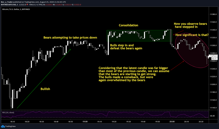
If you look at the notes in the image, it will be self explanatory.
Now we must also see that the bearish candle is still less significant than the bullish movement which happened previously, so the bearish price action would not be justified unless all the bulls are defeated! But at the same time, recent data holds more ground than the previous data.
Now if you like to keep a bullish/bearish bias, on seeing this recent price action, you may switch from being a bull to start having a little neutral bias.
Switching immediately to bear may be more aggressive, and it is better to avoid being that aggressive in the market.
If, you see another big bearish candle, (not yet observed), there will be another confirmation, and you may want to switch to being a bear instead.
But at the most recent candle, we again see that there is a large wick, and price got rejected from the bear territory, so price should be bullish from the next candle onwards!
Let's see what happened after that!
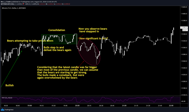
Price was indeed bullish, but the fight between bulls and bears is going on!
There's one thing which we should avoid if we are trading: The outliers, or anomalies.
Let's say we see a huge, out of the context move on one candle. This is something we should avoid trading, as it will likely hamper the decisions. We can look out and start trading again after consolidation, or when markets are mode favorable.
Now go back to the single candle I mentioned at the beginning of the article.
You see that the candle has a large wick downwards. This is a typical textbook style hammer candlestick.
Now we must understand a few more concepts:
- The candlestick alone is bullish in nature.
- We don't know what the previous candle was, so this is an isolated candlestick, and may be meaningless.
- There is no information about the previous trend, or any other thing like volume, or sentiments, therefore no conclusion can actually be drawn just by looking at one candlestick!
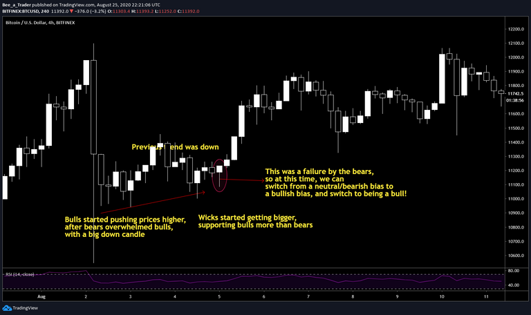
This is an example, in context!
So, simply remembering the candlesticks may or may not help in actual trading, as you have to understand everything from the fundamental laws of supply and demand.
(This is not really difficult, but with little bit of practice, you will be able to master it very easily.)
Especially on a bigger context, a bullish candle may not be that bullish if the previous price was extremely bearish, with a very large bearish candle!
Further Reading:
Investopedia: https://www.investopedia.com/trading/candlestick-charting-what-is-it/
Wikipedia: https://en.wikipedia.org/wiki/Candlestick_pattern
Stay tuned for the upcoming articles on more candlestick patterns, and an introduction to supports and resistances

In case you want to support my work, please consider using the referral links to sign up on any of the exchanges below using my affiliate link: (You will also get benefit and save on fees)
FTX: https://ftx.com/#a=1846613
Binance: https://www.binance.com/en/register?ref=NL4008SG
Okex: https://www.okex.com/join/2172681 (Get $10 for free)
Kucoin: https://www.kucoin.com/ucenter/signup?rcode=E3t8Ao&lang=en_US
Bittrex: https://bittrex.com/Account/Register?referralCode=XWY-LBA-B5F
Pionex: https://www.pionex.com/en-US/sign?r=eOxX26Bq
Poloniex: https://poloniex.com/signup?c=M5NDJH48
Delta Exchange: https://www.delta.exchange/referral?code=CVIVPG
Bitbns: https://ref.bitbns.com/56721 (Get 50 Bns tokens)
Bitpolo: https://www.bitpolo.com/registerUser?ref=RAH25C
These are the exchanges I'm using right now. I'm not directly affiliated with any of the above exchanges.
You can also download one of the best Ad block/privacy Brave browser from here: https://brave.com/bee435

If you liked the article, please this with your friends and circles, and also spare an upvote for me, so that I get motivated to keep sharing market insights and analysis:)
Click this to get onboarded and start earning on Hive :)


gif by @doze
Posted Using LeoFinance
Indeed a very good educational post, well done!
Thanks a lot for your support! :)
Posted Using LeoFinance
Congratulations @beehivetrader! You have completed the following achievement on the Hive blockchain and have been rewarded with new badge(s) :
You can view your badges on your board And compare to others on the Ranking
If you no longer want to receive notifications, reply to this comment with the word
STOPTo support your work, I also upvoted your post!
Do not miss the last post from @hivebuzz:
Love this post, awesome job.
Posted Using LeoFinance
Thanks a lot for appreciating the content! :)
Posted Using LeoFinance