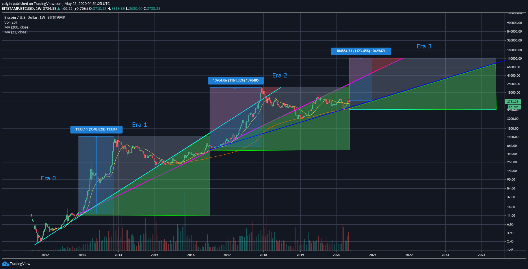
I have some time today and decided to do a longer term price analysis on Bitcoin. The objective here is to identify the best accumulation zones and sell zones from the long-term perspective. My analysis was done on the log chart using the weekly time-frame and this is how it looks like 😅.

Bitcoin is one of those rare commodities that have a defined supply flow which is determined by the Bitcoin block reward halving events. Hence, my analysis divided the log chart into 4 distinct time-frames according to the halving events. I named them Era 0 to Era 3.
My personal preference when analyzing chart is to keep things as simple as possible to identify patterns. If you follow my blog, you will probably realize that I love to use trendlines and moving averages for my analyses.
For this analysis, my usual approach is used. To get to the chart above, I drew a long-term support trendline for each Era and extend each trendline to the subsequent Eras. The first trendline is in cyan, which extends from Era 0 to Era 2. The next line is in magenta, it extends from Era 1 to Era 3. Finally the dark blue trendline extends from Era 2 to Era 3.
Note that the best chart which provided me with the longest price history is the one from Bitstamp. The first trendline in cyan was drawn based on the limited candles I have before the first halving event on 28 November 2012.
The different zones
Green zones - Best time to accumulate Bitcoin in each Era?
When the support trendline in Era 0 is extended to Era 1, it seems to divide the Era into 2 zones. As price fell below the extended trendline, it indicated the best period to accumulate Bitcoin. Similarly, if we extend the support trendline of Era 1 (in magenta) into Era 2, it divides Era 2 into 2 clear zones. Whether the green shaded area in Era 2 proves to be the best accumulation zone will depend on what happen during the current Era.
Red zones - Best time to sell Bitcoin in each Era?
Another interesting observation is the best period to sell. When Era 0's support trendline is extended into Era 2, you can observe that Era 2 peak soon after it crossed the trendline. Hence, I have marked that zone as a proven sell zone. Using the same concept, I extended Era 1's trendline into the current Era. Will this zone prove to be the best time to sell during this Era? I guess only time will tell.
Other interesting observations
Following each halving, the 21 weekly SMA of Bitcoin served as a support until it peaks in that halving cycle. After the peak of each Era, the 200 weekly SMA became the support. This can be seen in both Era 1 & 2.
In addition, after the first halving, the price of Bitcoin boomed 9500% from point of halving to Era 1 peak. After the second halving, the price of Bitcoin ran up 3100% from point of halving to Era 2 peak. Hence, the trend seems to be that there will be a 67% reduction on the percentage price increase of Bitcoin from halving to peak after each Era. If that is the case, a peak of about a $100,000 in Era 3 is possible. This is a very simplistic analysis and I personally do not hold much faith on it. So do take it with a pinch of salt 😅.
Conclusion
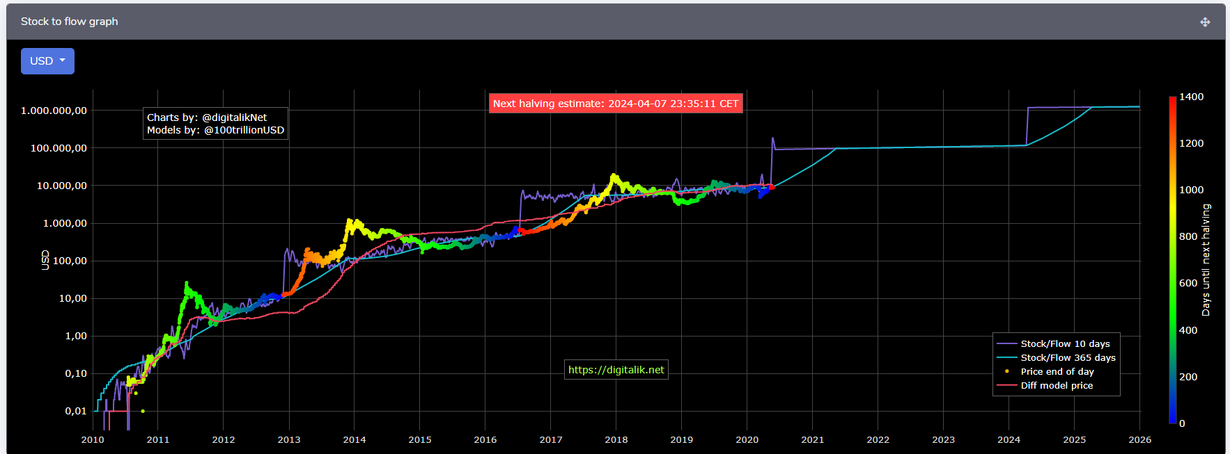
This trendline analysis of the Bitcoin log chart kind of aligns with PlanB's stock to flow model.

Source
While the stock to flow model aims to provide some kind of fair value for Bitcoin, my analysis breaks down each Era into sell and accumulation zones. My idea is to sell chunks of my holdings while the price is in the sell zone and accumulate slowly within the accumulation zones.
Only time will tell if my analysis is accurate. As usual, this is just my thought process and please do not take it as financial advice. Due diligence and research are still required for your own investment. Do you have a long-term outlook for Bitcoin price? Share with me in the comments section.
20% of post rewards goes to @ph-fund and 5% goes to @leo.voter to support these amazing projects.

Posted Using LeoFinance
pretty interesting TA write up!!
Thank you!
Amazing analysis. Just a question, why do you use 21WMA instead of the usual 50WMA?
Thanks! The 21wma and 200wma are just observations I made. I didn't observe any obvious pattern with the 50wma hence I hid it :)
Good observation then
This post was shared on Twitter as part of #posh,