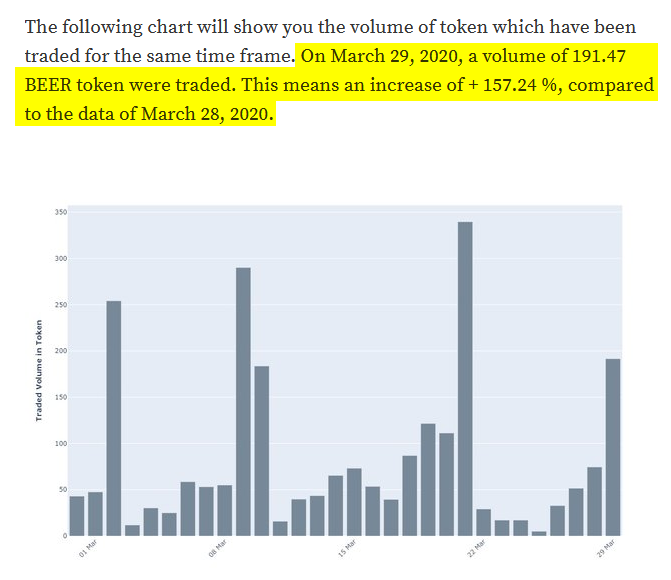
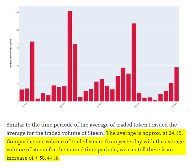
Our beautiful token charts became an update. Whats new?
Since, sometimes it is hard to read the figures of the y-axis, now I do print the amount of traded volume Steem and token in the text above of the respective chart and comparing the volume of yesterday with the volume of the day before yesterday. The deviation of these two days are represented by percentage.
Furthermore to get more information out of these charts. I show the calculated average of the relative traded volume for the issued time period. I think this will give some more content or opportunity to get an idea of this token. You can find the average traded volume below the respective chart.
Finally I compare the traded volume of yesterday to the average of this given time period. The deviation is noted as percentage between those two values.
The update launched with those posts below:
#13 | Beautiful LEO charts
#12 | Beautiful BEER charts
Want to see any specific data of your favorite token? Or you would rather love to see another token represented in such a chart? Leave me a comment. :D


Some coin and token suggestions:
Plankton (PLKN), QuratorToken (Q), PALcoin (PAL), Dark Energy Crystals (DEC), Good Game Token (GG), Coffeea Friendship Token (COFFEEA), DerangedCoin (DERANGED).
Thanks for your token suggestions. Is there any certain reason why those tokens would be great to show? :DHi @xplosive.