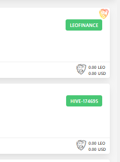
Yep. Sorry. That was a poor description. I think it's probably the first tag rather than tribe?
As far as I remember it was on the left side before so I didn't have to look for it.

Posted Using LeoFinance Beta
Yep. Sorry. That was a poor description. I think it's probably the first tag rather than tribe?
As far as I remember it was on the left side before so I didn't have to look for it.

Posted Using LeoFinance Beta
Ok, I understand now. No, you're right about calling it a tribe :) Yeah, it was sometimes on the left and sometimes on the right before, I believe. It varied based on which screen you were in. But it often didn't fit very well.
I'm curious what you mean by "didn't have to look for it". Is there something which you do which is now more difficult because it is on the right side?
Posted Using LeoFinance Beta
I like to see which front end people posted from and upvote from that one, depending which one it is. When it's on the same side as the upvote button I don't have to look over to the right and can upvote more quickly if I'm going to vote on LEO which is most often the case.
I suppose it's only a split second difference but it's surprising what a difference it makes to ease of use not having to look over to the right right.
Posted Using LeoFinance Beta