This is not my first post doing little project based off online ideas, in fact it is my second, and I plan at some point joining all these ideas and do a website of my own where I'll showcase all that I've learned in a sort of interactive website as a CV, instead of the Finance way of just shoving a piece of paper up the ass of the potential employer.
I know, how cool of me to think like this, it's not like this idea is 20 years old and I'm late to the party. Well, I'm late to the developer party by like 25 years, but you gotta start somewhere, this is my somewhere.
In the meantime, I will leave you with two project Ideas based off on Brad Traversy's paid course on Udemy. Credit at the bottom and links btw.
Note: The code is based off someone else's ideas, all the comments and doc are mine as this is supposed to be a teaching kind of post, and even though the main concept is not mine, all the code has been tweaked and modified to align with my own ideas.
Rotating navigation
<title>Rotating Navigation</title>
</head>
<body>
<div class="container">
<div class="circle-container">
<div class="circle">
<button id="close">
<i class="fas fa-times"></i>
</button>
<button id="open">
<i class="fas fa-bars"></i>
</button>
</div>
</div>
<div class="content">
<h1>A Dog Park Sunday</h1>
<small>@anomadsoul</small>
<p>
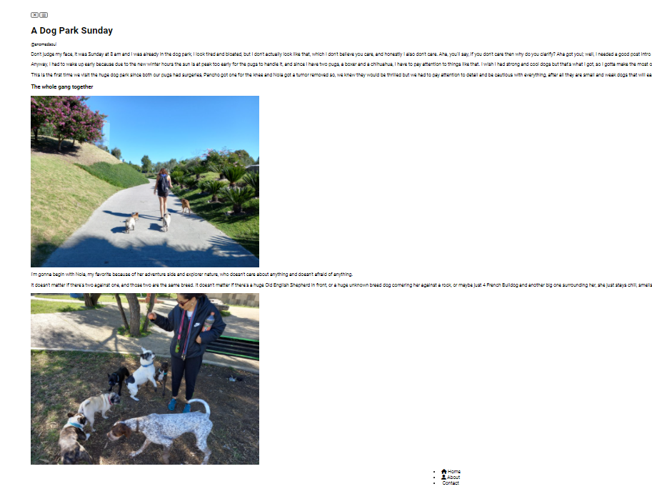
Don't judge my face, it was Sunday at 8 am and I was already in the dog park, I look tired and bloated, but I don't actually look like
that, which I don't believe you care, and honestly I also don't care.
Aha, you'll say, if you don't care then why do you clarify? Aha got
you!; well, I needed a good post intro and it seemed a good one,
that's why I clarify.
Anyway, I had to wake up early because due to the new winter hours the
sun is at peak too early for the pugs to handle it, and since I have
two pugs, a boxer and a chihuahua, I have to pay attention to things
like that. I wish I had strong and cool dogs but that's what I got, so
I gotta make the most out of these weak, beautiful small dogs.
</p>
<p>
This is the first time we visit the huge dog park since both our pugs
had surgeries, Pancho got one for the knee and Noia got a tumor
removed so, we knew they would be thrilled but we had to pay attention
to detail and be cautious with everything, after all they are small
and weak dogs that will easily suffer against big strong dogs that may
go crazy, which is something that can happen anytime.
</p>
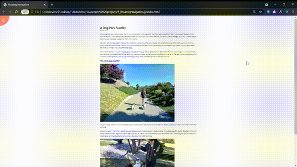
<h3>The whole gang together</h3>
<img src="https://images.hive.blog/768x0/https://images.ecency.com/DQmT5M5s8SSsk3ApoXHQVWGbCfG6iSL9JBd6hRUyspu7V3U/20211107_093350.jpg"
alt="Pic of the whole gang"
/>
<p>
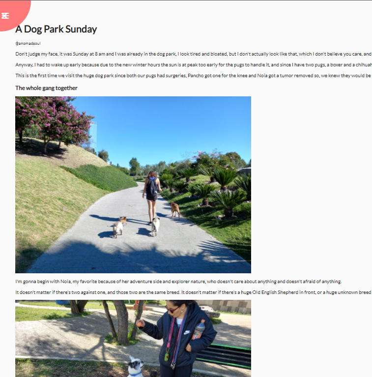
I'm gonna begin with Noia, my favorite because of her adventure side
and explorer nature, who doesn't care about anything and doesn't
afraid of anything.
It doesn't matter if there's two against one, and those two are the
same breed. It doesn't matter if there's a huge Old English Shepherd
in front, or a huge unknown breed dog cornering her against a rock, or
maybe just 4 French Bulldog and another big one surrounding her, she
just stays chill, smells asses, let's hers be smelled, and as I said,
she doesn't afraid of anything.
</p>
<img src="https://images.hive.blog/768x0/https://images.ecency.com/DQmatYGTVU5K6ysH7a3KVjLQhs6KZwbREnzCNbr5jnwGcir/20211107_094114.jpg"
alt="Pic of Noia being a Badass"
/>
</div>
</div>
<nav>
<ul>
<li><i class="fas fa-home"></i> Home < /a></li>
<li><i class="fas fa-user-alt"></i> About< /a></li>
<li><i class="fas fa-envelope"></i> Contact< /a></li>
</ul>
</nav>
<script src="script.js"></script>
</body>
</html>
* {
  box-sizing: border-box; // 1
}
1. If we add any padding or border into an element it doesn't affect the width of it.
*Means we are applying it to everything on the file
body {
  font-family: "Lato", sans-serif;
  background-color: #333;
  color: #222;
  overflow-x: hidden; /* We want to get rid of the scroll bar in the X axis.*/
  margin: 0;
}

.container {
  background-color: #fafafa;
  transform-origin: top left; /* We want to change the transform origin, because we want it to rotate from the top left. This makes the origin of the tilt to be the top left.*/
  transition: transform 0.5s linear; /* We want it to have a transition for visual reasons*/
  width: 100vw; /*So it takes up all the page*/
  min-height: 100vh; /*We take the whole viewport*/
  padding: 50px;
}
We want the container to rotate over to the right when it has a specific class of "show nav".
.container.show-nav {
  transform: rotate(-10deg);
}

Then we head over the HTML file to manually modify the container class name.

.circle-container {
  position: fixed;
  top: -100px; // We want it to be a half circle on the top left
  left: -100px;
}

.circle {
  background-color: #ff7979;
  height: 200px;
  width: 200px; //Since we made the circle's size 200 px, now it makes sense that we hid 100px in the circle-container
  border-radius: 50%; //This makes it a circle
  position: relative; // So we can position the buttons inside as absolute
  transition: transform 0.5s linear;
}

.container.show-nav .circle {
  /*When the container has the .show-nav applied to it, we want to appply this*/
  transform: rotate(-70deg);
}

.circle button {
  cursor: pointer;
  position: absolute;
  top: 50%;
  left: 50%;
  height: 100px;
  background: transparent;
  border: 0;
  font-size: 26px;
  color: #fff;
}
.circle button:focus {
  // We want to get rid of the border of the button once it is on focus state
  outline: none;
}

.circle button#open {
  left: 60%;
}

.circle button#close {
  top: 60%;
  transform: rotate(90deg);
  transform-origin: top left;
}

.container.show-nav + nav li {
  /*When the container has the property "show-nav" then we want to take the direct navigation li after that*/
  transform: translateX(0); /*Its original place*/
  transition-delay: 0.3s; /* So it comes a little bit after the rotation*/
}

nav {
  position: fixed;
  bottom: 40px;
  left: 0;
  z-index: 100; /*So it shows on top of the animated transition*/
}

nav ul {
  list-style-type: none; /*So no bullet points*/
  padding-left: 30px;
}

nav ul li {
  text-transform: uppercase;
  color: #fff;
  margin: 40px 0; /* To separate them from each other*/
  transform: translateX(
    -100%
  ); /*We need to put them on the left so they come out when the page rotates*/
  transition: transform 0.4s ease-in;
}

nav ul li i {
  /*We want more space between the icons and the text*/
  font-size: 20px;
  margin-right: 10px;
}

nav ul li + li {
  /*We want the elements right after the first element of the list to stick to the right 15 pixels, so they go in mood with the rotated body*/
  margin-left: 15px;
  transform: translateX(-150%);
}

nav ul li + li + li {
  /*Same concept as above*/
  margin-left: 30px;
  transform: translateX(-200%);
}

nav a {
  color: #fafafa;
  text-decoration: none;
  transition: all 0.5s;
}

nav a:hover {
  color: #ff7979;
  font-weight: bold;
}

.content img {
  max-width: 100%; /* The max size of the image is at 100% of the container, so it is not thaaat big*/
}

.content {
  /* For the content itself*/
  max-width: 1000px;
  margin: 50px auto; /* This will keep it in the middle even if we stretch it out it will have the 1000px as max*/
}

.content h1 {
  margin: 0;
}

.content small {
  color: #555;
  font-style: italic;
}
.content p {
  color: #333;
  line-height: 1.5;
}
We are only going to see the Nav bar at the bottom when the container is rotated
const open = document.getElementById("open");
const close = document.getElementById("close");
const container = document.querySelector(".container"); // We use QuerySelector because it is a class.

open.addEventListener("click", () => container.classList.add("show-nav"));

close.addEventListener("click", () => container.classList.remove("show-nav"));
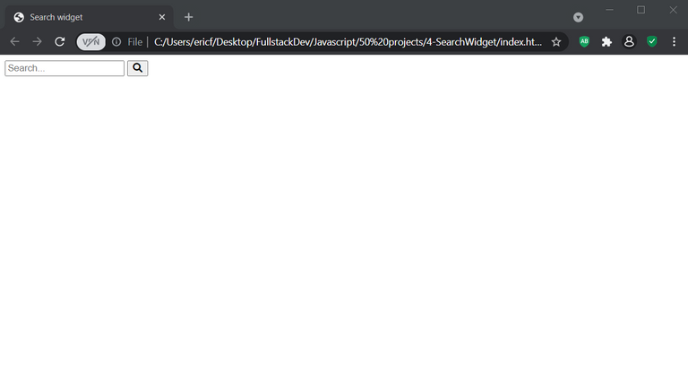
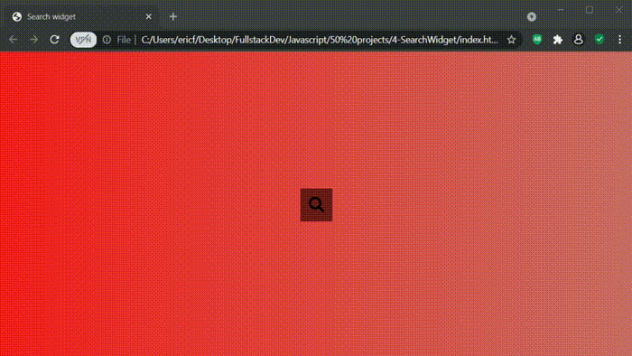
Creating a Hidden Widget
HTML CODE
   <title>Search widget</title>
  </head>
  <body>
    <div class="search">
      <input type="text" class="input" placeholder="Search..." />
      <button class="btn">
        <i class="fas fa-search"></i>
        (html comment removed: We are specifying that we want the Font Awesome Icon)
      </button>
    </div>
    <script src="script.js"></script>
  </body>
</html>
###
* {
  box-sizing: border-box; /* If we add any padding or border into an element it doesn't affect the width of it.*/
}
*Means we are applying it to everything on the file
Main focus: We want to have a class of active that when it is active, the input search bar will expand and the cursos will change.
body {
background-image: linear-gradient(
90deg,
#f51c1c,
#ca6c65
); /* The first color is the one we will begin with (on the right side), and the second the one we'll finish with (on the left). This if from left to right, that's why we add the 90 degress).*/
font-family: "Roboto", sans-serif;
display: flex; /* This centers everything on the project. Everything we write will be displayed horizontal with no "enter" between them unless we specify it.*/
align-items: center; /* If your flex box is horizontal, it will align them to the center of the row. If its a row, it will align them to the center of the column.*/
justify-content: center;
height: 100vh; /* viewport height: Take the entire height of the browser.*/
overflow: hidden; /* Hidden because we don't want scrollbars to be shown by default.*/
margin: 0;
}
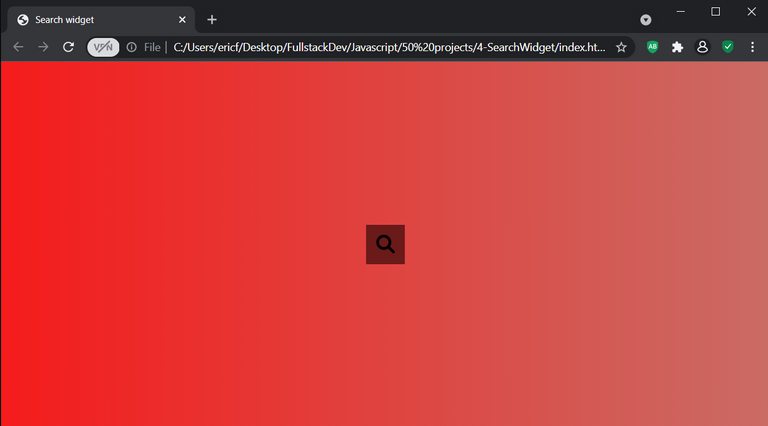
.search {
position: relative; /*So we can position things inside of it in absolute position.*/
height: 50px;
}
.search .input {
background-color: rgb(121, 52, 52);
border: 0;
font-size: 18px;
padding: 15px;
height: 50px; /* It will start short, as a small cube*/
width: 50px;
transition: width 0.3s ease; /*We want the width to have a transition that we will specify below*/
}
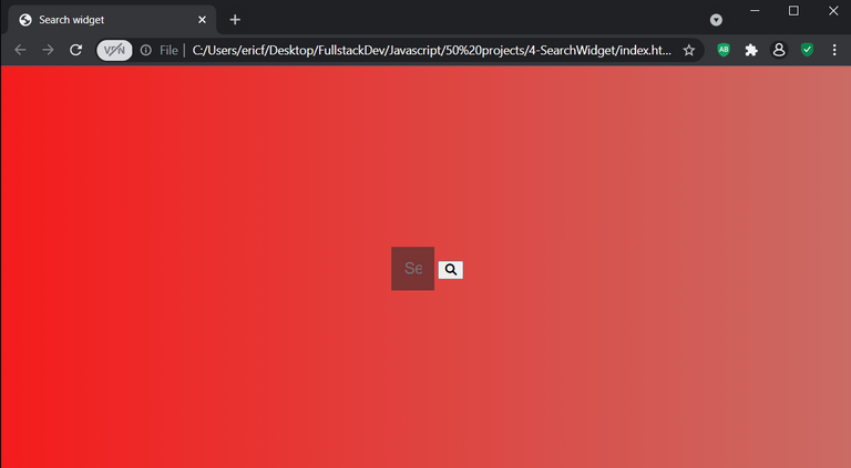
.btn {
  background-color: rgb(107, 26, 26);
  border: 0;
  cursor: pointer; /*When we hover over we want a pointer cursor*/
  font-size: 24px;
  position: absolute;
  top: 0;
  left: 0;
  height: 50px;
  width: 50px;
  transition: transform 0.3 ease; /*We want a transition because we want the input to expand the width. The input gets wider and the button gets pushed over.*/
}
Getting rid of any outline
.btn:focus,
.input:focus {
  /*When the button and the input are in focus state*/
  outline: none;
}

.search.active .input {
  /*If the search has an active class, we want the input to do the following:*/
  width: 200px; /* When the search element has an active class, the width of the input will go from 50 px specified above, to 200px*/
}

.search.active .btn {
  transform: translateX(
    198px
  ); /* When the search class is active, we want the button to move to the righh which is why we use the X axis*/
}
JS CODE
We just need to grab the three classes that we want to play with
const search = document.querySelector(".search");
const btn = document.querySelector(".btn");
const input = document.querySelector(".input");
We add a simple event listener that changes the status of the search class into active
btn.addEventListener("click", () => {
  search.classList.toggle("active");
  input.focus();
});
These projects are based on a CSS, HTML and JS paid course I got on Udemy by Brad Traversy. I made my own changes and tweaks but the template so to speak, is his idea and I do not claim them to be my own.
Hey you!!! I think it's pretty cool because aside from a little bit of HTML, it's really all Chinese to me. I always had a little bit of regret not learning it when everyone was saying people should get into IT. I guess being a rebel in those cases is just dumb haha.
How are you? Next week we're going to be on the plane to Mexico :) Finally. I did it.
Yay! 🤗
Your content has been boosted with Ecency Points
Use Ecency daily to boost your growth on platform!
Support Ecency
Vote for Proposal
Delegate HP and earn more, by @anomadsoul.