Almost 8,000 words, this has to be my record by far but hey, I spent 18 hours learning this and 3 more writing this post, so I am quite proud of my final outcome, even if it is just useful for three people - I wonder if it is Hive's overall post length record?.
Well, hopefully when I upload it to my yet-to-be-created website, more and more people find it useful and since it will include a link to this post, maybe even increase Hive's presence on the interwebz.
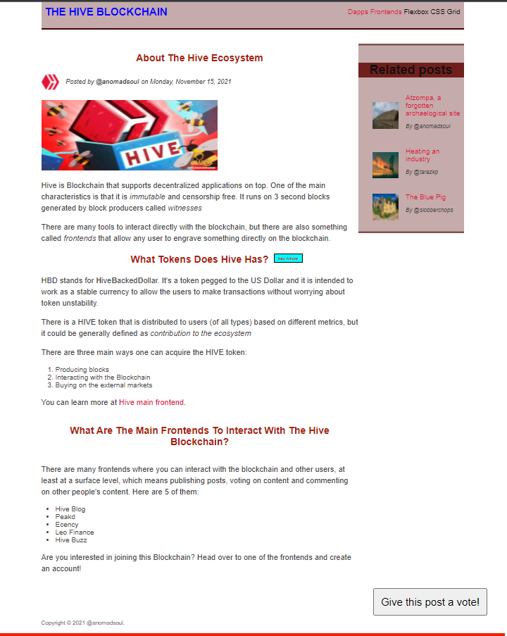
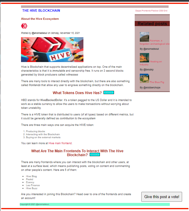
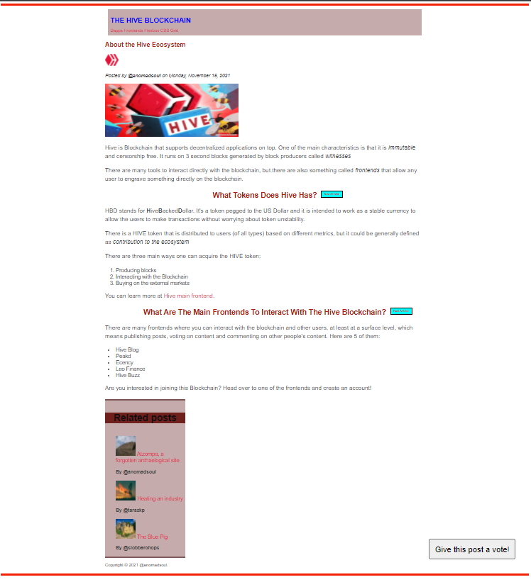
Before we get into the good stuff, let me show you how the Final outcome after you get through with this post looks:
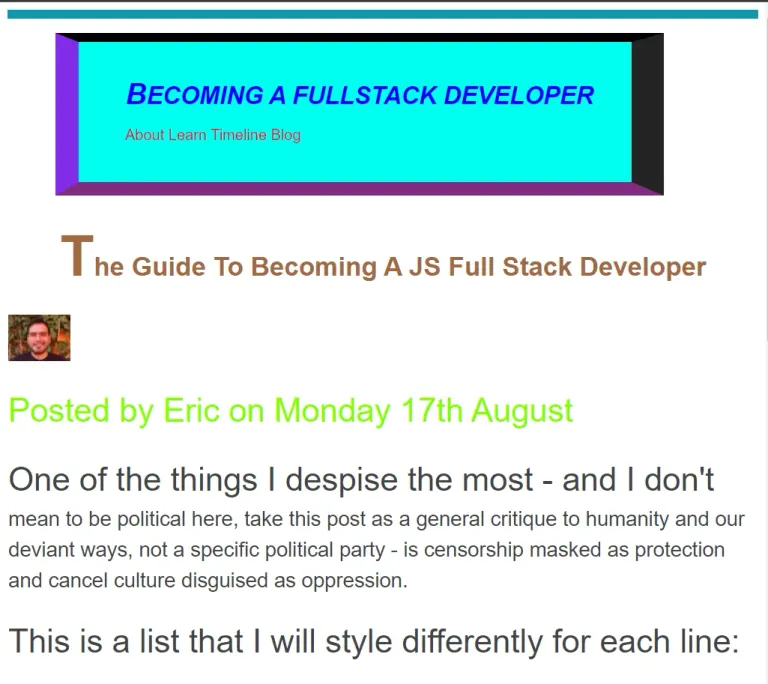
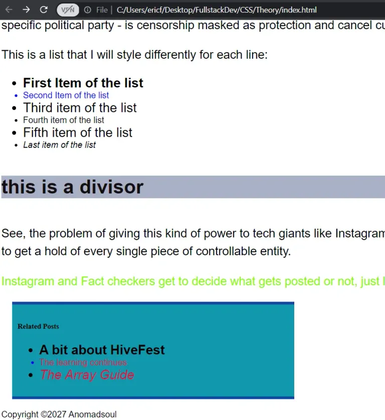
For reference, this is how my "Home" style webpage draft looked before all the tweaks of this post:
 |  |
|---|
CSS Layouts: Float, Flexbox and CSS Grid
When we say layout, we mean the way that text, images and content in general, is placed and arranged.
The layout gives a visual structure in which we can place the content. Being a Front End developer, knowing your way around layouts is a must.
Layouts exist to make website easier to understand and make them visually more attractive.
There are two types of layout: Page layout (the general layout) and Component layout (those that go inside specific parts on the website).
There are three ways of building layouts with CSS: Float, Flexbox and CSS Grids.
- Float Layouts are the old way of building layouts of all sizes suing the float CSS property. They are still used but they are outdated and deprecated. I will still talk about them for the sake of completion but if you won't even bother writing about them (although they could be considered important by some people).
- Flexbos is the modern way of laying out elements in a one dimensional row without using floats. It is perfect for component layouts.
- CSS Grid is used for laying out elements in a fully fledged two dimensional grid. It is perfect for page layouts and complex components.
Flexbox and CSS Grid are the way to go. These two revolutionized the way developers write CSS layouts.
Float
Whenever you see a website you might be thinking "these two elements would look better side by side" or something like that. I mean I don't think anybody actually thinks that but I have to invent a situation where floats are useful.
So, what should we do to actually manipulate elements of a website in order to set them wherever we want in a webpage? That's right, Floats.
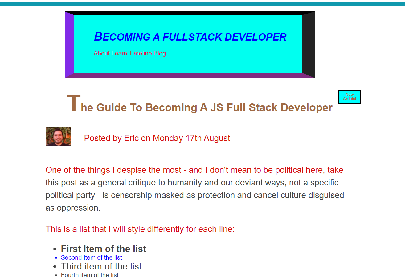
First, what we have to do to actually be able to manipulate something, is to give them a class on the HTML file so that we can target them with our code on CSS. Take the blog post from my previous CSS article:
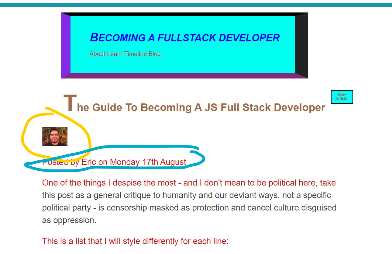
Let's say we want to make those two elements inside the perfectly drawn circles, but we don't know how. Well, we are here to learn exactly that:
<header>
    <h3>The Guide to becoming a JS full stack developer</h3>

    <img src="Eric.jpg"
      alt="Image of the Author, Eric"
      height="50" class="author-img"/>

    <p id="related-author" class="author">
      Posted by Eric on Monday 17th August</p>
</header>
Now that the we have a class for both elements in the HTML file we can move on to the CSS file:
This image is going to be taken out of the documents flow just like an absolutely positioned element. But with Floats you don't need a relative element, you are actually making all the other elements to float around it.
.author-img {
  float: left;
  margin-bottom: 30px;
}
We can use Float: left, right or none, and this will play a big part on how we layout the elements.
Now all we need to do is to set some properties to the text to make it float in a more nice way on the right side of the image.
.author {
 margin-left: 100px;
 margin-top: 40px;
 margin-bottom: 50px;
}
If you look closely, it is as if the image was no longer part of flow and nothing else affects it other than itself. That's floating.
This works nicely but there are better ways of doing this with flexbox and grid, but it is positive to learn float before learning the other two.
To create space between both the image and the author text, we can just add margins around them.
If we want to keep styling using float, we can actually float the menu on the navigation bar and make them a little bit more stylish.
For the HTML code we have:
<h1 style="color: blue">Becoming a Fullstack Developer</h1>

<nav>
<a href="About.html">About </a>
<a href="Learn.html">Learn </a>
<a href="Timeline.html">Timeline </a>
<a href="blog.html">Blog </a>
</nav>
Now, with CSS we can give them a little bit of attitude:
h1 {
  float: left;
}
As a kind of brief, let's talk about normal flow vs absolute positioning vs floats.
- Normal flow uses default positioning, the elements are in flow, and are laid out according to their order in the HTML code.
- Absolute positioning removes the element from the normal flow into an out of flow positioning, it makes the elements have no impact on their surroundings, and we must use always the top, right, bottom and left to offset the element from its relatively positioned container.
- In Floats the element is removed from the normal flow into an out of flow position, but the text and inline elements will wrap around the floated element. The container in which the floated element is set, will not adjust its height to the element.
Note to self: If all the child elements of an element are floating, the parent element stops having content and it will behave weirdly, avoid that. The parent element is called a collapsed element. To fix that there's an easy trick.
Clearing Floats
The easiest way to avoid issues like the one stated above where the container collapsed, is to add the clear property into another class right below the elements we want to affect. First we have to create that class on the HTML file.
<header class="main-header">
  <h1 style="color: blue">Becoming a Fullstack Developer</h1>

  <nav>
    <a href="About.html">About </a>
    <a href="Learn.html">Learn </a>
    <a href="Timeline.html">Timeline </a>
    <a href="blog.html">Blog </a>
  </nav>

  <div class="anyName"></div>
</header>
And then on the CSS file we target the class anyName and we give it the property of clear.
.anyName {
  clear: both;
}
We have victory:
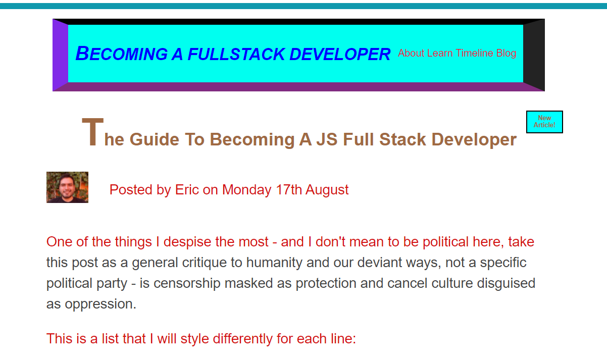
But actually, this practice is very outdated and obscure, there's an easier way to do it:
(Actually floats in general are outdated, do not worry if you don't get everything about Floats, as long as you get the logic).
To avoid using the clear property, we can on add a clearfix class on the element that has the collapsed height on the HTML file.
<header class="main-header clearfix">
And then simply adding a pseudo element of after to that clearfix class.
Remember this only shows up if we define something for the content property
.clearfix::after {
    clear: both;
    content: '';
    display: block;
}
This trick only works with block elements, that's why we changed the display to block.
Floats in practice
We just know the very basics of Floats but this is enough to try and build a nice layout for the horrible website I've been showing as an example for the past 3 CSS posts.
We have the header in aqua, the article in brown, the aside and footer in yellow, and our little button in blue.
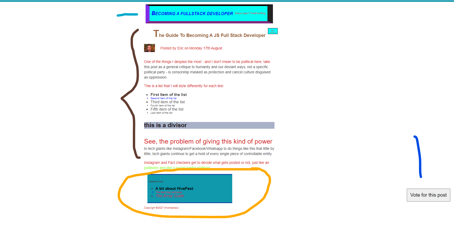
So, let's get dirty.
.container {
  width: 1200px;
}
Right now both the article and the aside use up all the width of the page, so we want to modify that in both
article {
  background-color: red;
  width: 900px;
  float: left;
  padding-left: 10px;
}

aside {
  background-color: blue;
  width: 280px;
  float: right;
}
If we make the article and the aside float, then the footer will also come around with the aside because remember that floating an element makes the elements adjacent to hover around the floated element. We don't want this so:
footer {
 background-color: aquamarine;
 clear: both;
}
As you can see floats are not convenient, which is why we are lucky that flexbox and grid exist.
Flexbox
Flexbox is a set of related CSS properties for building one dimensional layouts. The main idea back when Flexbox was created, was to allow the browsers to automatically divide empty space inside some container elements by it child elements, making the browser do a lot of work that the devs had to do manually (For example, with Floats).
It makes it pretty easy to automatically align items to one another inside a parent container, both horizontally and vertically, it also solves vertical centering and creating equal-height columns (which was a pain in the ass back when flexbox wasn't around). On every website I have visited, they say I am lucky to jump into CSS now that Flexbox is around, and I blindly believe them.
Terminology for Flexbox
- Flex container: It is the element on which we want to set the flexbox. All we need to do is to set the display property to flex.
- Flex items: They are all the direct children of the flex container.
- Main axis: It is the direction in which these flex items are laid out.
- Cross axis: The perpendicular axis related to the main axis. (We can play around with axis as well, that's why it is important to know their names)
Now for the actual code, first of all, let's go back to having the horrible layout we had before we did any Float magic.
I created two HTML files, one for the Flexbox example and the other for the GRID example.
Here's the starting code, I will just modify it as I go:
Flexbox HTML
    <title>Flexbox</title>
    <style>
      .el--1 {
        background-color: rgb(233, 210, 210);
      }
      .el--2 {
        background-color: rgb(233, 180, 180);
      }
      .el--3 {
        background-color: rgb(233, 150, 150);
        height: 150px;
      }
      .el--4 {
        background-color: rgb(233, 120, 120);
      }
      .el--5 {
        background-color: rgb(233, 90, 90);
      }
      .el--6 {
        background-color: rgb(233, 60, 60);
      }
      .el--7 {
        background-color: rgb(233, 30, 30);
      }
      .el--8 {
        background-color: rgb(233, 0, 0);
      }

      .container {
        font-family: sans-serif;
        background-color: #ddd;
        font-size: 40px;
        margin: 40px;

      }
    </style>
  </head>
  <body>
    <div class="container">
      <div class="el el--1">(1) HIVE</div>
      <div class="el el--2">(2) the</div>
      <div class="el el--3">(3) Blockchain</div>
      <div class="el el--4">(4) that</div>
      <div class="el el--5">(5) will</div>
      <div class="el el--6">(6) revolutionize</div>
      <div class="el el--7">(7) the</div>
      <div class="el el--8">(8) Cryptoverse</div>
    </div>
  </body>
And to give you a hint of how this code shows on a website right now:
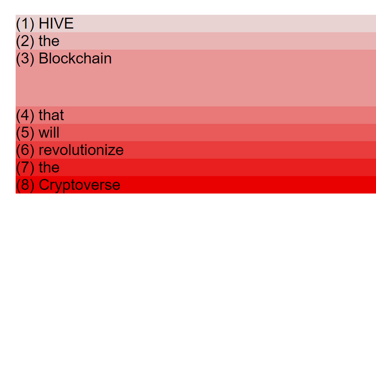 |
|So that's what I got to work with, doesn't look like much does it?
Well, first things first. We have to use the display element property and set it to flex in some container element (any element with at least two child elements).
.container {
   font-family: sans-serif;
   background-color: #ddd;
   font-size: 40px;
   margin: 40px;

   display: flex;
}
After adding the display we get:

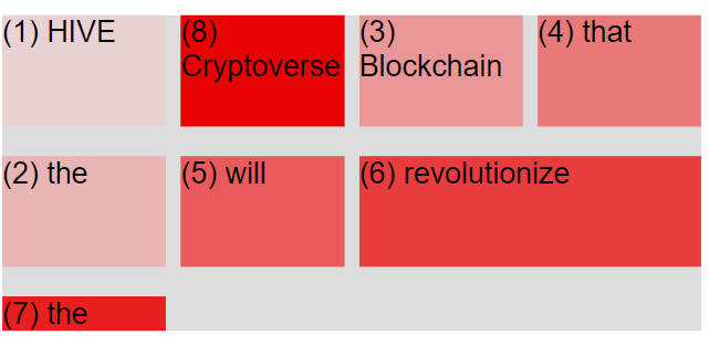
The .container is the parent element and the 8 elements below are the children. As you can see, each of those elements occupy the horizontal space it needs, nothing more and nothing else. Vertically, by default, all the flex items are as tall as the tallest element (which is 150px which we set in the third element of the flexbox code file), but if I was to delete that part of the file it would look like this:

So let's do a few experiments to see how powerful is the Flexbox.
Let's center all the elements vertically. For that, right below where we included the display property we add:
align-items: center;
And we get:

By the way, that gray area behind is just the background color which we can actually manipulate as well.
Notice how the other elements do not occupy as much space as the third element, because their height is not set to the same pixels, but they are still aligned as if they were 150 pixels tall. But what if we wanted them to do actually that? Well, we just need to add below the display property the stretch value for the alignment:
align-items: stretch;
And it will look like this:

Nobody on Hive like to justify their content, but just so you know, flexbox allows you to do that with another property that we still write inside the container element:
justify-items: center;

Notice how the content has the same background space in both sides.
Imagine how hard it would be to do this without Flexbox and just with floats? Calculating all the margins manually, some paddings, classes everywhere and whatnot.
There are many properties that are part of the Flexbox specification, both for the flex container and the flex items, the most used ones are:
For the Flex container (the first one is the default value):
- gap: value (any numerical value). It is the space between the items without margin
- justify-content: flex-start | flex-end | center | space-between | space-around | space-evenly. This is used to align the items using the main axis.
- align-items: stretch | flex-start | flex-end | center | baseline. They are used to align items using the cross axis.
- flex-direction: row | row-reverse | column | colummn-reverse. They define which one is the main axis in case we want to change it.
- flex-wrap: nowrap | wrap | wrap-reverse. They allow the items to wrap into a new line if they are too large.
- align-content: stretch | flex-start | flex-end | center | space-between | space-around. This only applies when there are multiple lines
For the flex items (the first one is the default value):
- align-self: auto | stretch | flex-start | flex-end | center | baseline. They overwrite the align-items property from the flex container for individual flex items.
- flex-grow: integer. This allows an element to grow (0 means no, 1 or more means yes)
- flex-shrink: integer. Same as above, just reversed.
- flex-basis: auto. This defines an item's width without having to use the width property.
- flex: 0 1 auto (Uses an integer, integer, length). This is the reccommended shorthand for flex-grow, flex shrink, and flex-basis. This is used to set the three above at the same time.
- order: value (any number). It controls the order of the items without having to change them in the source code, only visually. -1 makes item first, 1 makes it last.
What did you say? Do you want to go down the rabbit hole of Flexbox properties? Your wish is my command.
Aligning flex items and creating spaces between them
Using align-items will make it so all the flex items have the same alignment, but some times we want to overwrite that for one element. For that we type outside of the container class:
.el--1
  align-self: flex-start;
}

.el--6
  align-self: stretch;
}
As you can see in the image, it is a simple spell but quite effective.

If we want to change the order of the items can be useful when we want to change the layout depending on the device the user is using to browse our website, we can manage that pretty easily:
To note, by default, all the elements are in the place number zero, so we can play around without changing the order of all the other elements.
.el--7 {
  order: -1;
}

.el--2 {
  order: 1;
}
We can set the order however we want, we just need to use integers higher or lower than the first or last that we already set, just like as follows:
.el--3 {
  order: 2;
}

But wait, what about adding space you ask? I know, I know, I said I would tackle alignment and spacing, let's get to it:
To manually define space between elements we can just add margins to the flex items:
.el {
  margin-right: 30px;
}
But doing it that way is not as flashy and efficient as the following line of code inside the flex container:
gap: 30px;
And voila, we have a result, and it is an efficient one:

Now that you are a little bit more familiarized with Flexbox, let's dive into the flex property.
The Flex property
It is the property we use to size flex items. We should not confuse it with the flex value that we set to the display property in order to start styling our flexbox.
display: flex; =/= flex-grow: 1
The default values for the flex items properties are:
flex-grow: 0; // It **doesn't** allow the item to grow.
flex-shrink: 1; // It **does** allow the item to shrink.
flex-basis: auto; // The item's width will be automatically defined.
Whenever we want to size flex items with a certain width, we don't use the width property and we use flex-basis, this piece of code goes inside the element (.el) class. If the content is larger than what we define in pixels, then the content will be as wide as it needs to, but if the content is thinner, the space will be as wide as we define it:
.el {
  flex-basis: 100px;
}

As you can see in the image, the short words do have more width than what the word needs, but the long words use up as much space as they need.
If we set a width that is longer than the container (the container is 1000 pixels wide and we define five elements with a 250 pixels width), then the browser will automatically make them as wide as they can be without trespassing the container's width, but this only happens when we allow the items to shrink, which is the default value (flex-shrink: 1;).
The opposite will happen if we don't have enough width between all the items to fit the whole container, if we set the flex-grow property to one (1), it will make the items use as much space as it is needed to evenly fit the whole container.
We can set the flex-shrink and flex-grow properties to only one item, allowing that item to grow or shrink depending on the remaining space of the container. This can be useful when we want to highlight one of the elements.
.el--5 {
  flex-grow: 1;
}
And the website will look like this, with the fifth element highlighted or occupying more space:

We can actually set grow priorities by using higher values for the flex-grow property:
.el--5 {
  flex-grow: 1;
}

.el--6 {
  flex-grow: 2;
}

Notice how both items grew when the container allowed them to, but the sixth one grew more than the fifth one.
The number 2 and 1 for the flex-grow property doesn't mean they will grow to twice or thrice the width of the other items, it means that they will get double or triple or quadruple of the available space compared to the other items that are not allowed to grow.
Now, to wrap flex up, let's dive into the flex shorthand property, you know, the one that allows us to use flex-grow, flex-shrink, and flex-basis at the same time.
First of all, if we are going to use the flex property, we should avoid using any of the other three individually.
The first value is for grow then for shrink and lastly for basis.
This code:
.el--1 {
flex-grow: 0;
flex-shrink: 1;
flex: basis: 100px;
}
Is the same as writing this code:
.el--1 {
  flex: 0, 1, 100px;
}
Is that clear? Is it? I hope it is, because now that we know about this property, we can actually style the website I've been slowly creating above on this post, only that this time we won't use the Float property, we will use Flexbox.
Flexbox in practice
We want to do the same that we did with the Float layout technique, but using Flexbox.
First we want to style the h1 and the nav bar to put them side by side, so we have to set to the flex the display property of the parent container, which is the main-header.
.main-header {
  display: flex;
  align-items: center;
}
When we align the items, it aligns them vertically by default unless we say otherwise.
We also want to push the navigation bar to the right. Whenever we have only two flex items and we want to push each of them to one side, then we can use the justify-content property, because that way we can play with the remaining space of the container.
justify-content: space-between;

As you can see, it works perfectly, but now I noticed one more thing I want to do. See the Hive logo and the author text? I want them side by side as well.
So, we set the display of the parent of both elements to flex so we can play with them.
<header class="post-header">
  <h2>About the Hive Ecosystem</h2>

  <img src="hivelogo.png"
    alt="Hive Logo"
    height="50"
    width="50" />

  <p id="author">
    Posted by <strong>@anomadsoul</strong> on Monday, November 15, 2021
  </p>

  <img
    src="hiveimage.jpg"
    alt="HTML code on a screen"
    width="500"
    height="200"
    class="post-img"
  />
  <button>Give this post a vote!</button>
</header>
But wait, there are more elements inside the header container, and we don't actually want to include all of them in the flexbox, so we can just create another class inside the header class so we can manipulate only those two.
<div class="logo-and-author">
  <img src="hivelogo.png" alt="Hive Logo" height="50" width="50" />

  <p id="author">
    Posted by <strong>@anomadsoul</strong> on Monday, November 15, 2021
  </p>
</div>
And now we can style that *logo-and-author" class in the CSS file.
.logo-and-author {
  display: flex;
  align-items: center;
  justify-content: left;
  margin-bottom: 20px;
  gap: 20px
}
We add some margins so there's some space between the logo and the image below.
The gap is so that both items have some space in between.
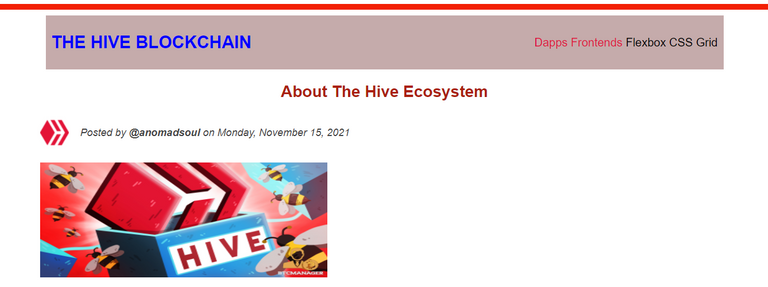
That looks so much better, doesn't it?
Now, we have an aside element that has a list of articles, and if you check out how the website is laid out, they actually look like crap, we should style them a little bit.
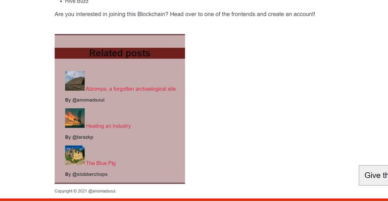
We want to display both the name of the article and the author, side by side with the image, and we want the article title and the author to be one below the other. Let's Flexbox the crap out of them.
We need to add a class that includes the post image, the post name and the *author, and then another class that includes only the post name and author so that we can flexbox them, we will do that directly on the list element.
<aside>
  <h4>Related posts</h4>
  <ul class="related">
    <li class="image-post-author">
      <img src="atzompa.jpg" alt="Atzompa ruins" width="75" height="75" />
    <div class="post-author">
      <a href="https://hive.blog/hive-163772/@anomadsoul/atzompa-a-forgotten-archaeological-site"
      class="related-link">Atzompa, a forgotten archaeological site</a>
      <p class="related-author">By @anomadsoul</p>
    </div>
    </li>
    <li class="image-post-author">
      <img src="heating.jpg" alt="Sunrise" width="75" height="75" />
    <div class="post-author">
      <a href="https://hive.blog/hive-167922/@tarazkp/heating-an-industry"
      class="related-link">Heating an industry</a>
      <p class="related-author">By @tarazkp</p>
    </div>
    </li>
    <li class="image-post-author">
      <img src="urban.jpg" alt="JavaScript code on a screen" width="75" height="75"/>
    <div class="post-author">
      <a href="https://hive.blog/hive-104387/@slobberchops/tales-of-the-urban-explorer-the-blue-pig"
      class="related-link">The Blue Pig</a>
      <p class="related-author">By @slobberchops</p>
    </div>
    </li>
  </ul>
</aside>
Now we can manipulate those classes.
.image-post-author {
  display: flex;
  align-items: center;
  gap: 20px;
  margin-bottom: 30px;
}

.related-link:link {
  font-size: 18px;
  font-weight: bold;
  font-style: normal;
  display: block;
}
And now, it's starting to look pretty awesome, right?
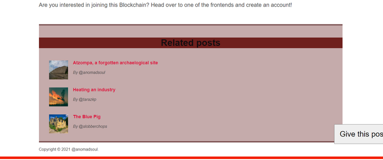
There we go, we are almost there, we have created the Flexboxes for all the elements, but we also want to display the aside element right next to the article in the same way that we did with the Float property, remember?
I mean, I know it's been a long post and all, that's why I'm asking, not because I think you're not paying attention, in case there is someone reading this, which I highly doubt because it is too much of a monster post.
All we need to do is use the overall layout and the outer classes to do so. We have to create a new class that includes the article and the aside elements, which are the two containers that we want to put inside the Flexbox.
<div class="article-aside">
     'Here goes the code for both the article
      and the aside containers'
</div>
And then, we have to style that class on the CSS file.
.article-aside {
  display: flex;
  align-items: flex-start;
  gap: 50px;
}

article {
  flex: 1;
}
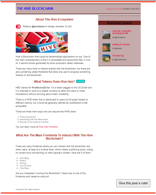
You are now a Flexbox Wizard apprentice, aren't you produ of yourself? Now we are both ready to tackle the last topic of this post: Grid Layouts
Setting Layouts using GRID
CSS Grid is the most modern and complete set of properties to build two dimensional layouts, and it is considered by some as the easiest form to use.
Grid allows us to write fewer nested HTML and it also makes the code easier to read.
Grid is not meant to replace Flexbox, they are meant to work together and you just need to know how to identify when to use which: When you need a one dimension layout use Flexbox; when you need a two dimension layout, use Grid.
Terminology for CSS Grid
- Grid container - It is where everything included on the Grid will be placed. We set it with the property display: grid.
- Grid items - All the child elements that are in the container.
- Column axis and Row axis - The Column and row axis can't be changed like in Flexbox.
- Grid lines - They are the lines that divide the grid and separate the columns and rows. They are numbered beginning from the left and the top (for two columns we would have three column grid lines, get it?). We can use these grid line numbers to place a grid item exactly where we want it to be.
- Grid cells - They are the intersections of the Grid lines. They may or may not be filled and it doesn't affect our Grid but the number of Grid cells doesn't change no matter if they are filled or not.
- Gutters/gaps - This is the space between the Grid items. (gap property).
- Grid Track - It can be a column or a row and it is basically the number of columns and rows we have on the grid: A Grid with four columns and two rows, has two grid row tracks and four column tracks. We can use this to manipulate the space that a specific row or column uses.
There are many properties that are part of the CSS Grid specification, both for the Grid container and the grid items, the most used ones are:
Grid container (The first value is the default one):
- grid-template-rows: ; - These two establish the grid row track. One length unit for each track. We can use any unit we want.
- grid-template-columns: ;
- row-gap: ; - These create space between the tracks.
- column-gap: ; - They can be coded as gap: 0; and we can use any number we want.
- justify-items: stretch | start | center | end; - We use this to align items horizontally inside the Grid cell.
- align-items: stretch | start | center | end; - We use this to align items vertically inside the Grid cell.
- justify-content: start | center | end; - The last two only apply if the container is larger than the grid.
- align-content: start | center | end; - This allows us to align the entire grid in relation of the container itself.
Grid Items: (The first value is the default one):
We use these two to place a grid item into a specific cell, based on line numbers. The span keyword can be used to span an item across more cells.- grid-column: / | span - We can use any number as long as it is equal or under the number of columns.
- grid-row: / | span - We can use any number as long as it is equal or under the number of rows.
- justify-self: stretch | start | center | end; - We use this to overwrite the Grid container property of justify-items for a specific item.
- align-self: stretch | start | center | end; - We use this to overwrite the Grid container property of align-items for a specific item.
Setting up a CSS Grid is pretty simple, but first, I'll include my HTML code because I'm going to base off this code to start building my grid.
Grid HTML file
    <title>CSS Grid</title>
  <style>
    .el--1 {
      background-color: rgb(233, 210, 210);
    }
    .el--2 {
      background-color: rgb(233, 180, 180);
    }
    .el--3 {
      background-color: rgb(233, 150, 150);
      height: 150px;
    }
    .el--4 {
      background-color: rgb(233, 120, 120);
    }
    .el--5 {
      background-color: rgb(233, 90, 90);
    }
    .el--6 {
      background-color: rgb(233, 60, 60);
    }
    .el--7 {
      background-color: rgb(233, 30, 30);
    }
    .el--8 {
      background-color: rgb(233, 0, 0);
    }

    .container--1 {
      font-family: sans-serif;
      background-color: #ddd;
      font-size: 40px;
      margin: 40px;

    }

    .container--2 {
      font-family: sans-serif;
      background-color: black;
      font-size: 40px;
      margin: 100px;

      width: 1000px;
      height: 600px;

    }
  </style>
</head>
<body>
  <div class="container--1">
    <div class="el el--1">(1) HIVE</div>
    <div class="el el--2">(2) the</div>
    <div class="el el--3">(3) Blockchain</div>
    <div class="el el--4">(4) that</div>
    <div class="el el--5">(5) will</div>
    <div class="el el--6">(6) revolutionize</div>
    <div class="el el--7">(7) the</div>
    <div class="el el--8">(8) Cryptoverse</div>
  </div>

  <div class="container--2">
    <div class="el el--1">(1)</div>
    <div class="el el--3">(3)</div>
    <div class="el el--4">(4)</div>
    <div class="el el--5">(5)</div>
    <div class="el el--6">(6)</div>
    <div class="el el--7">(7)</div>
  </div>
</body>
This HTML file looks like this, pretty much like the starter file I used for the Flexbox but with another set of elements below:
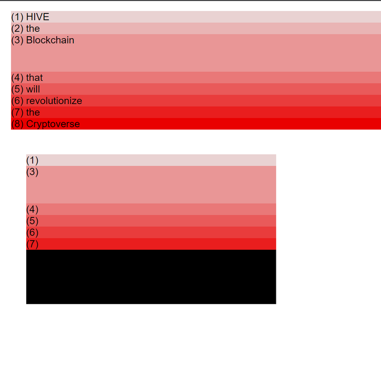
In CSS Grid we have Grid containers and Grid items and we can manipulate them as we wish.
First, we define the display property as grid inside the container that we want to build the Grid.
display: grid;
Then we need to define our two dimensional layout (columns and rows)
grid-template-columns: 250px 250px 100px 150px;
We can define as many width values, and for each value defined, a column will be created.
As soon as we start creating columns, the content will begin to be modified and the content will be distributed following a default CSS standard.
Just like in flexbox, the elements stretch across the defined width and height we specified, no matter how much space they actually need. Also, the height of all the elements that have no height defined, will accommodate to the height of the highest element in that we defined a height.
So far, these two lines of code have already modified the webpage with noticeable changes. As you can see, the top row is higher than the bottom one, also those elements that we set smaller than what the content actually needs, are overlaid and the content gets out of the space defined.

Now we need to set the height of the rows.
grid-template-rows: 300px 200px;
Since we already defined the height of the third element to 150px, but we set the height of the first grid row to 300px, that element will only occupy the space it needs (and was set to), leaving the remaining space of the grid empty.
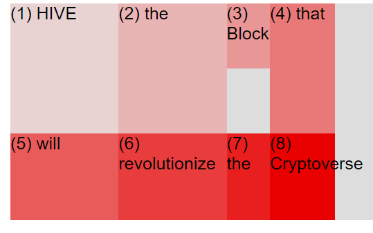
Just like in Flexbox, we can define space between the grid items using the gap property - and actually we should avoid using margins, they just won't work.
gap: 30px;
We can actually define separate gap values for the columns and for the rows, which is something we can't do using Flexbox.
column-gap: 50px;
row-gap: 20px;
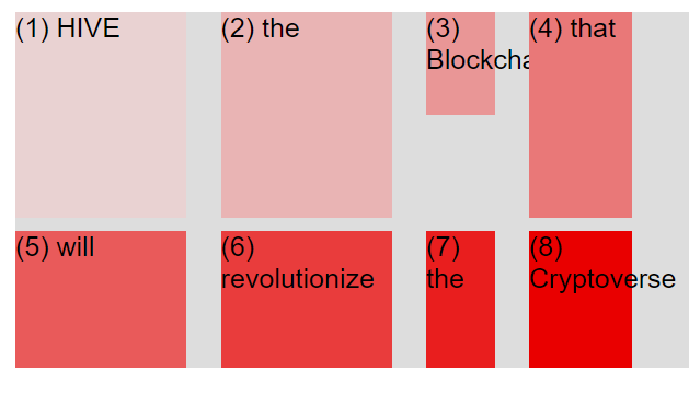
And as you can see, the space between the columns is way wider than the space between the rows.
With just five lines of code we created a simple but great layout. Imagine doing this with Floats... yeah, nightmare.
The Fractional unit AKA fr
This is a new unit we can use on CSS Grids that we can use instead of pixels, which give rigid dimensions, whereas the fr unit makes the grid item's size more flexible and achieve, for example, that a single column fills up any remaining space on the grid. Check out how beautifully it works in practice:
| Using pixels (px) | Using fraction (fr) |
|---|---|
| grid-template-columns: 250px 250px; | grid-template-columns: 250px 1fr; |
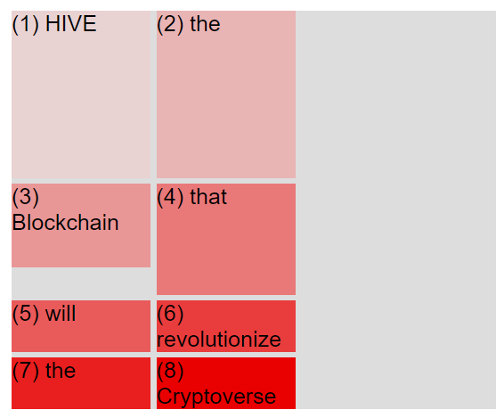 | 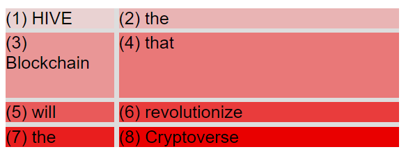 |
This is pretty similar to setting the flex property to one (1) in a Flexbox.
The best practice to make a responsive website is to set all the width of the columns and row to be fractional, but we can do whatever the hell we want, this is just a suggestion.
grid-template-columns: 3fr 2fr 1fr 1fr;
So, the above code will divide the whole container into 7 fractions, which means that the available space when we manipulate the size of the window will de divided as:
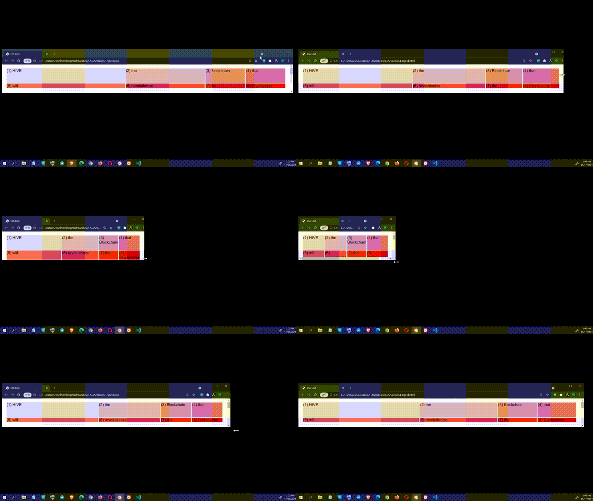
This allows us to not having to specify widths manually when we want out website to be responsive.
When we set this property to auto, the item will only fill as much space as it needs to.
There is a very useful tool to specify how we want to style the columns or rows (or anything actually) in CSS, the repeat function.
We set the function, and for arguments we first set the times que want to repeat the value, and then we set the value we want to be repeated:
grid-template-columns: repeat (4, 1fr);
Which gives us:
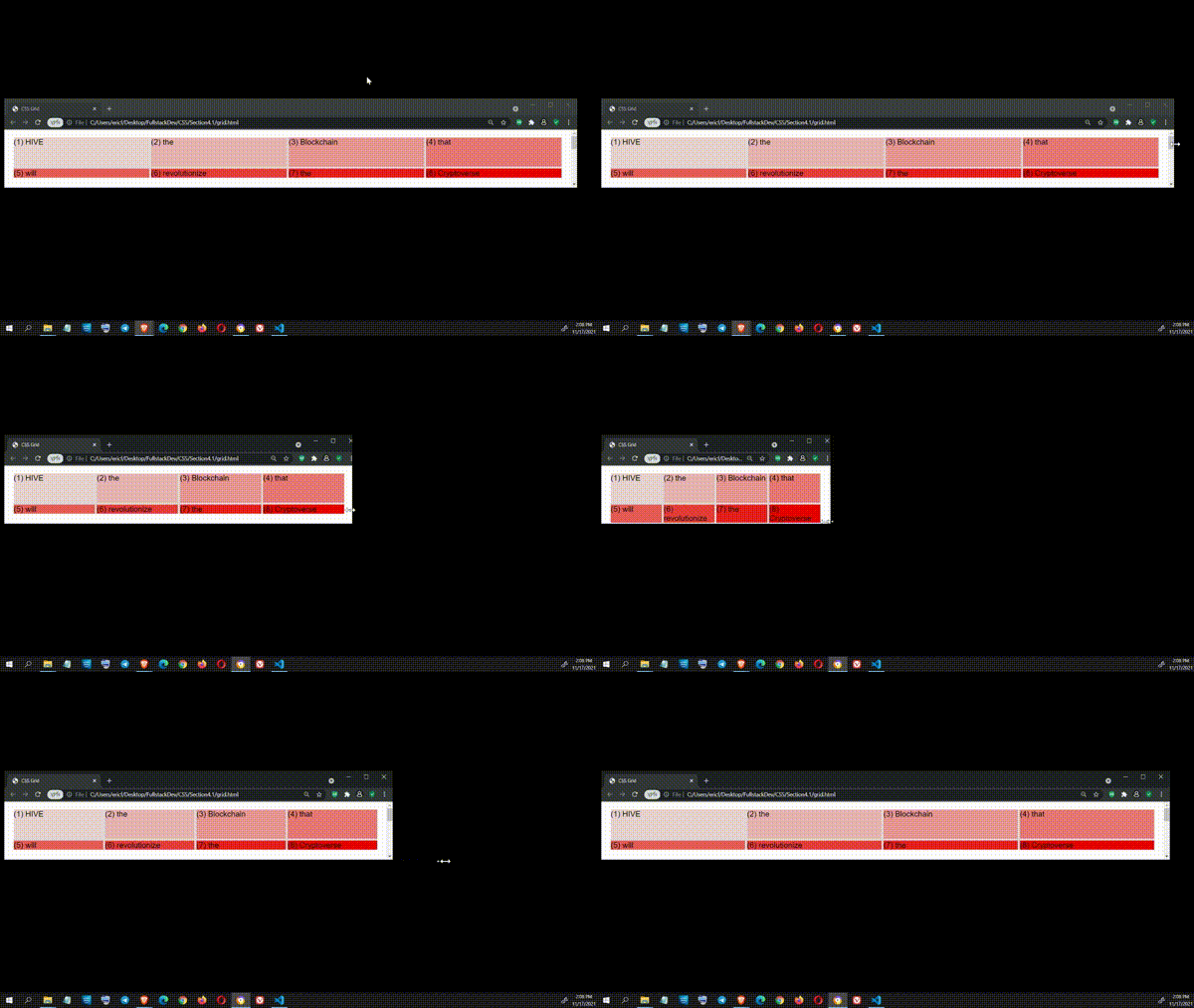
As you've seen, up until this point I've been doing all the styling directly in the source HTML file using CSS, but the best practice is to do this directly in the CSS file, as you can imagine, but we'll deal with that later (on this post), in the meantime...
Placing and Spanning Grid items
There are DevTools available for out disposition in the browser, all we need is to learn how to read them and how to work with them,
We can see the grid, the items, the grid lines and much more. And we can check the measures and much more:
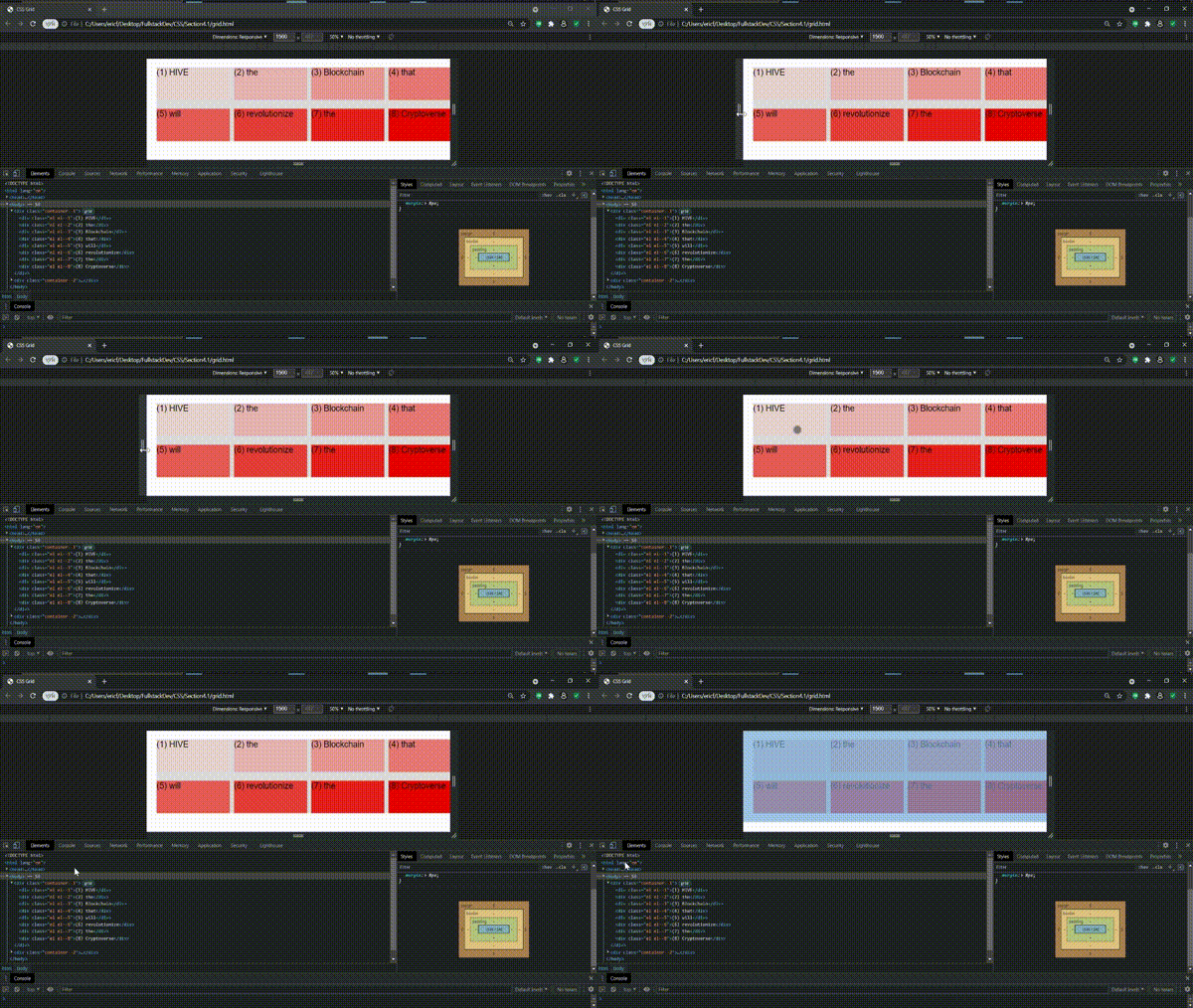
Using the tools of the browser actually helps us get a hold visually of where is everything and manipulate the items. In the image below we can visualize the grid line of the columns and the rows, they are all numbered, these columns and rows surround the Grids, and those numbers are exactly what we'll use to set a specific item in the grid between them.
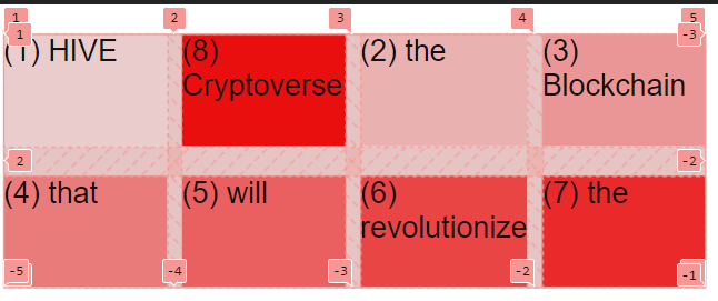
Let's learn how can we change the Grid of an item in the code:
Note: The grid-column/row property should only be used with independent items.
.el--8 {
  grid-column: 2/3;
  grid-row: 1/2;
}
The first value is the grid-line on the left of where our item should be, and the second value is the column on the right of the grid of where our item should be. The same happens with the rows.
As the code says, we want the item number 8 to be placed between the second and the third column, and between the first and the second rows.
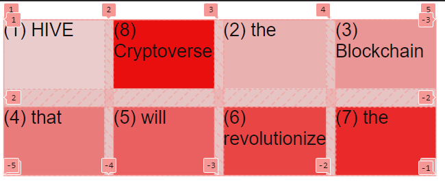
As you can see in the image, we 8th element was moved into the second top grid from left to right, and all the other elements after that one, were displaced one grid to the right.
We can continue moving around the elements with the same type of code:
.el--2 {
  grid-column: 1/2;
  grid-row: 2/3;
}
And we can actually make an item or element use more than one grid cell, all we need to do is set the second grid line to be different than the right next to the starter grid line:
.el--6 {
  grid-column: 3/5;
  grid-row: 2/3;
}
If the number of elements or items surpasses the number of Grid cells, CSS will automatically create a third row to include all the remaining elements.
And just like that we can style even more our grid.
There even another way of specifying how many grid cells we want an element to occupy:
.el--7 {
  grid-column: 1 / span 4;
  grid row: 3;
}
We don't need to count how many grid cells are between one column and the other, we can just tell CSS that we want that element to span over 4 grid cells. If we don't specify the second value or argument for the grid-column/row, it will automatically be set to one.
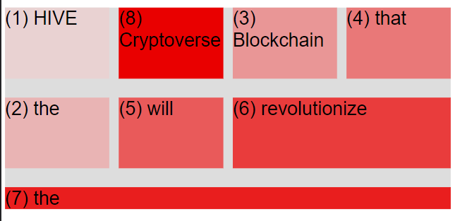
See? Pretty simple once you get the logic of how grids work.
There will be many situations where we don't know how many columns, rows, or grid lines exist in a Grid, or we don't simply want to deal with that. There's a trick for that.
If you look closer to the DevTools image where the number of grid lines is showed, you will notice that each grid line has a positive value and a negative value, this means we can play around with grid lines to make an element span across the whole grid, no matter if we want it to span horizontally or vertically.
.el--7 {
  grid-column: 1 / -1;
  grid row: 3;
}
As you can imagine, these tricks work for both columns and rows.
Aligning and justifying grid items
Did you notice that my first code about Grids included a second container? Well, that one is to play around with aligning and justifying.
.container--2 {
  font-family: sans-serif;
  background-color: black;
  font-size: 40px;
  margin: 40px;
  width: 700px;
  height: 600px;
  // We will define our Grid here
}
And this is how this code looks on a web browser right now. Notice the black space below, which is the size of the Grid, but right now no element is set to occupy as much space as it can, so that is just blank (or black?) space.
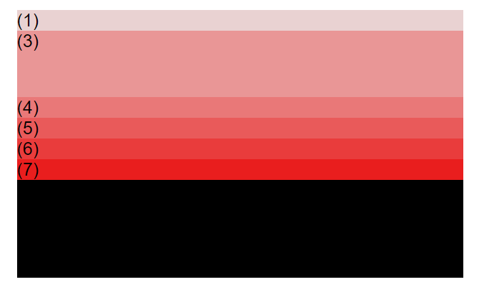
So, we will start by writing our style code lines inside the container--2, right below the line that specifies it.
display: grid;
grid-template-columns: 125px 200px 125px;
grid-template-rows: 250px 100px;
I am not using fraction units because this is just to show you something.
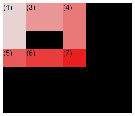
Do you see how the Grid is behaving?
Aligning grid items is different than aligning flexbox items, because with grids we can actually align both the tracks inside the container, and we can align the grid items inside of the tracks.
We will begin with aligning the grid tracks inside the grid container (the rows and columns). This can only be done when the grid itself is smaller than the grid container. This is all about distributing the empty space of the container among the grid cells.
justify-content: center;
align-content: center;
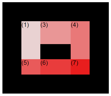
As you can see, this code aligns both tracks to the center of the grid container, but we are also left with a not so nicely looking Grid, we gotta do better.
| end | space between |
|---|---|
| justify-content: end; | justify-content: space-between; |
| align-content: end; | align-content: space-between; |
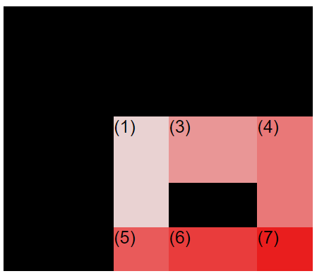 | 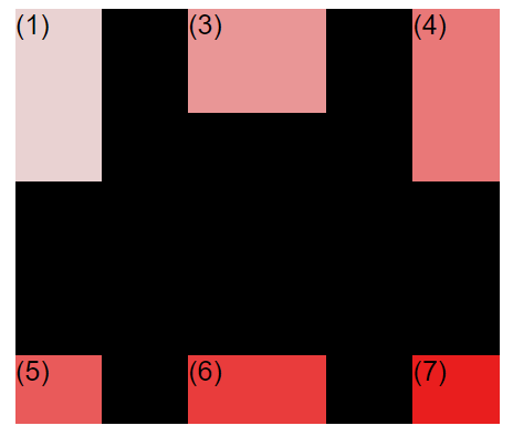 |
But this doesn't work, I mean we can see how the code changes the spacing, but meh, it's just not enough, we want to use up all the space inside the grid with some actual visual pleasure.
We could add some gaps and margins and that kind of tweaks.
| Experiment 1 | Experiment 2 |
|---|---|
| justify-content: center; | justify-content: center; |
| align-content: center; | align-content: space-between; |
| gap: 50px; | gap: 75px; |
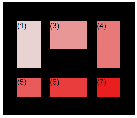 | 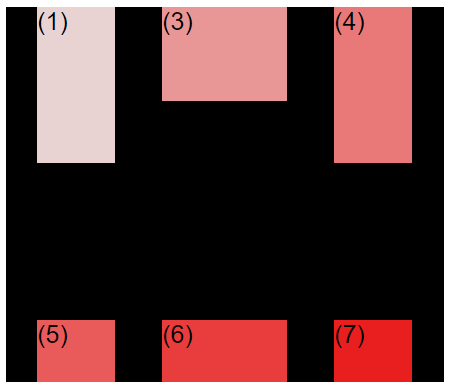 |
| Experiment 3 | Experiment 4 |
|---|---|
| justify-content: center; | justify-content: center; |
| align-content: start; | align-content: end; |
| gap: 50px; | gap: 50px; |
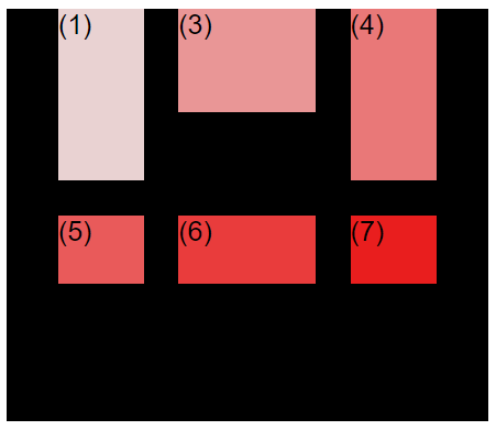 | 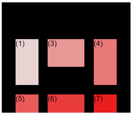 |
And I could continue showing you examples, there are tons of combinations and you can only achieve what you want by exploring all the different property values there are. You don't need to know them all by heart, you can always check online or on your cheasheet.
We can also align the items inside the grid cells (what we did above was track alignment inside the whole container).
| Experiment 5 | Experiment 6 |
|---|---|
| align-items: center; | align-items: center; |
| - | justify-items: center; |
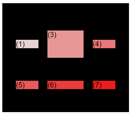 | 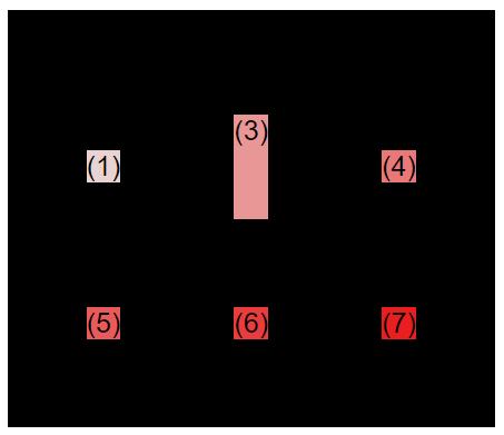 |
In experiment 6, the elements only use up as much space inside the grid cell, and it leaves the unused grid cell empty.
Using the DevTools from the browser, we can see the grid lines in purple with a 50 pixel gap, the grid cells in between, and the space the elements are actually occupying. Notice how the third element has a predefined height, to it will use it all up.
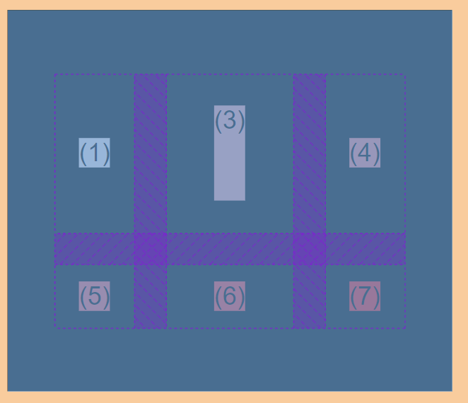
Remember that the default value for both align-items and justify-items is stretch, which means that if we don't set a value manually, the grid cell will be fully occupied by the element.
Now, for the last topic of this terrificous, giganticous, monstrous and all the ous left to invent, post, we'll modify the webpage I styled with Floats and Flexbox, but this time we will use Grid.
Ready? Ready.
As you can remember, the website I styled was a very simple one, it was a one dimensional layout, and we cant to use flexbox for those and only use Grid (or mix both) when we have more complex layouts.
Putting the CSS Grid Layout in practice
If we look and the whole website and not just the body that includes article and the aside, and we include the header, the navigation bar, the body and the footer, then we can actually use grid because that is a two dimension layout. So let's get to it, in case you don't want to check my previous post with the HTML code, here it goes, this is the one we will modify:
<body>
<div class="container">
<header class="main-header">
<h1>The Hive Blockchain</h1>
<nav>
<a href="blog.html">Dapps</a>
<a href="#">Frontends</a>
<a href="flexbox.html">Flexbox</a>
<a href="grid.html">CSS Grid</a>
</nav>
</header>
<article>
<header class="post-header">
<h2>About the Hive Ecosystem</h2>
<div class="logo-and-author">
<img src="hivelogo.png" alt="Hive Logo" height="50" width="50" />
<p id="author">
Posted by <strong>@anomadsoul</strong> on Monday, November 15,
2021
</p>
</div>
<img
src="hiveimage.jpg"
alt="HTML code on a screen"
width="500"
height="200"
class="post-img"
/>
<button>Give this post a vote!</button>
</header>
<p>
Hive is Blockchain that supports decentralized applications on top.
One of the main characteristics is that it is immutable and censorship free. It runs on 3 second blocks generated by block producers called witnesses.
</p>
<p>
There are many tools to interact directly with the blockchain, but
there are also something called frontends that allow any
user to engrave something directly on the blockchain.
</p>
<h3>What tokens does Hive has?</h3>
<p>
HBD stands for Hive Backed Dollar.
Its a token pegged to the US Dollar and it is intended to work as a
stable currency to allow the users to make transactions without
worrying about token instability.
</p>
<p>
There is a HIVE token that is distributed to users (of all types)
based on different metrics, but it could be generally defined as
contribution to the ecosystem.
</p>
<p>There are three main ways one can acquire the HIVE token:</p>
<ol>
<li class="first-li">Producing blocks</li>
<li>Interacting with the Blockchain</li>
<li>Buying on the external markets</li>
</ol>
<p>
You can learn more at
<a href="https://hive.blog" target="_blank">Hive main frontend</a>.
</p>
<h5>
What are the main frontends to interact with the Hive Blockchain?
</h5>
<p>
There are many frontends where you can interact with the blockchain
and other users, at least at a surface level, which means publishing
posts, voting on content and commenting on other people's content.
Here are 5 of them:
</p>
<ul>
<li class="first-li">Hive Blog</li>
<li>Peakd</li>
<li>Ecency</li>
<li>Leo Finance</li>
<li>Hive Buzz</li>
</ul>
<p>
Are you interested in joining this Blockchain? Head over to one of
the frontends and create an account!
</p>
</article>
<aside>
<h4>Related posts</h4>
<ul class="related">
<li class="image-post-author">
<img
src="atzompa.jpg"
alt="Atzompa ruins"
width="75"
height="75"
/>
<div class="post-author">
<a
href="https://hive.blog/hive-163772/@anomadsoul/atzompa-a-forgotten-archaeological-site"
class="related-link"
>Atzompa, a forgotten archaelogical site</a
>
<p class="related-author">By @anomadsoul</p>
</div>
</li>
<li class="image-post-author">
<img src="heating.jpg" alt="Sunrise" width="75" height="75" />
<div class="post-author">
<a
href="https://hive.blog/hive-167922/@tarazkp/heating-an-industry"
class="related-link"
>Heating an industry</a
>
<p class="related-author">By @tarazkp</p>
</div>
</li>
<li class="image-post-author">
<img
src="urban.jpg"
alt="JavaScript code on a screen"
width="75"
height="75"
/>
<div class="post-author">
<a
href="https://hive.blog/hive-104387/@slobberchops/tales-of-the-urban-explorer-the-blue-pig"
class="related-link"
>The Blue Pig</a
>
<p class="related-author">By @slobberchops</p>
</div>
</li>
</ul>
</aside>
<footer>
<p id="copyright" class="copyright text">
Copyright © 2021 @anomadsoul.
</p>
</footer>
</div>
</body>
For the CSS Code, here's what I will work with:
h1,
h2,
h3,
h4,
h5 {
  font-family: sans-serif;
  color: rgb(170, 32, 13);
}

article {
  margin-bottom: 60px;
}

nav {
  font-size: 20px;
}

button {
  font-size: 30px;
  padding: 20px;
  cursor: pointer;
  position: absolute;
  bottom: 50px;
  right: 50px;
}

body {
  color: #444;
  font-family: sans-serif;
  border-top: 10px solid #f32004;
  border-bottom: 10px solid #f32004;
  position: relative;
}

.container {
  width: 1200px;
  margin-left: auto;
  margin-right: auto;
}

h1 {
  color: blue;
  font-size: 30px;
  font-family: sans-serif;
  text-transform: Uppercase;
  font-weight: bold;
}

h2 {
  font-size: 28px;
  font-family: sans-serif;
  text-transform: capitalize;
  text-align: center;
  position: relative;
}

h3 {
  font-size: 28px;
  font-family: sans-serif;
  text-transform: capitalize;
  text-align: center;
  position: relative;
}

h4 {
  font-size: 36px;
  font-family: sans-serif;
  text-align: center;
  color: rgb(22, 14, 16);
  background-color: #6f201d;
}

h5 {
  font-size: 28px;
  font-family: sans-serif;
  text-transform: capitalize;
  text-align: center;
  position: relative;
}

p {
  font-size: 22px;
  font-family: sans-serif;
  line-height: 1.5;
}

li {
  font-size: 20px;
  font-family: sans-serif;
}

footer p {
  font-size: 16px;
}

#author {
  font-style: italic;
  font-size: 18px;
}

.related-author {
  font-size: 16px;
  font-style: italic;
}

.related {
  list-style: none;
}

.main-header {
  background-color: #c5abab;
  padding: 10px 10px 10px 10px;
  border-top: 5px solid rgb(65, 2, 2);
  border-bottom: 5px solid rgb(65, 2, 2);
  margin: 10px 0px;
  display: flex;
  align-items: center;
  justify-content: space-between;
}

aside {
  background-color: #c5abab;
  border-top: 5px solid rgba(60, 3, 3, 0.533);
  border-bottom: 5px solid rgba(60, 3, 3, 0.533);
  border: 10px 10px;
  margin: 10px 10px;
  width: 1200px;
  margin: 0;
}

a:link {
  color: crimson;
  text-decoration: none;
}

a:visited {
  color: black;
}

a:hover {
  color: rgb(21, 6, 1);
  font-weight: bold;
  text-decoration: underline dotted #090505;
}

h3::after {
  display: inline-block;
  content: "New article!";
  font-size: 10px;
  font-weight: bold;
  margin-left: 15px;
  background-color: aqua;
  border-style: solid;
  border-width: 2px;
  border-color: black;
  padding: 5px 10px;
  position: absolute;
  top: 25;
  right: 25;
}

.author-img {
  float: left;
  margin-bottom: 30px;
}

.author {
  margin-left: 100px;
  margin-top: 40px;
  margin-bottom: 50px;
}

nav a:link {
  display: inline-block;
}
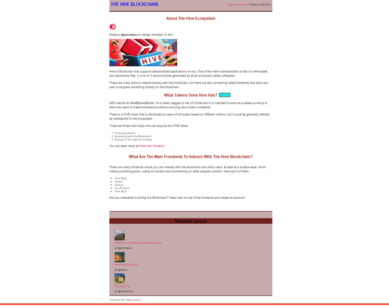
And this is how both HTML and CSS codes look right now:
Now that you have all the tools (feel free to copy it on your code editor programm and use it as you please), let's begin.
Everything in the body is a child of the container, so we will use it as the Grid container.
Notice the first two pieces of code are Flexbox styled, that is because we styled them inside their own container previously.
.logo-and-author {
  display: flex;
  align-items: center;
  margin-bottom: 20px;
  gap: 20px;
}

.image-post-author {
  display: flex;
  align-items: center;
  gap: 20px;
  margin-bottom: 30px;
}


.container {
  display: grid;
  grid-template-columns: 1fr 300px;
  // grid-template-rows: 1fr 1fr;
  column-gap: 50 px;
  row-gap: 30px;
  align-items: start;
}

.main-header {
  grid-column: 1/3;
  // grid-column: 1 -1; // Another waf of doing it
  // grid-column: 1 / span 2; // Yet another way
}

.article {
margin: 0;
}


.footer {
  grid-column: 1/3;
}
And this is our final website layout, freaking finally:

I am not explaining anything because we already know what I did - based on the theory deep dived right before this code - and also because writing this post has been quite the challenge. I spent 18 hours learning all of this, and another 3 hours just writing this freaking post.
I really, really hope you liked it, and I hope that at least a couple of people read it through and it was actually useful for your CSS learning experience.
Big shout-out to Jonas Schmedtmann and his CSS course on Udemy. If you are learning CSS this is the course you have to buy. I am using several sources to learn CSS but this one is definitely the one that has helped me the most.
Definitely did not take me that long to read, though I skimmed pretty quick as I know most of this stuff already (unlike the js stuff you were posting about before). Float still gets my hackles up, I have had so many problems with it I basically avoid it like the plague now XD
Love flexbox though, one of your best friends for responsive layouts :D
I feel the same way, once I was learning about Float I was like "damn, this is too complicated for a freaking layout, no wonder why people stick to wordpress" but then during Flexbox I was like "Ok, looking better, this is intuitive and simple once you get the logic", and then with Grid I was like "I could do this half drunk, I love it" hahaha.
Wordpress themes use all this nonsense too XD
Yeah but in a kind of easier way doesn't it? Kind of clicks and sets, not code and sadness :P
I guess? Admittedly the only time I've ever looked at Wordpress was from a coding point of view (was thinking of doing themes for it) and at the time (a very long time ago now) it was pretty nightmare x_x
INTERCOMMUNITY - HIVE - AFFILIATE team.
Thanks! I appreciate the support.
Your content has been voted as a part of Encouragement program. Keep up the good work!
Use Ecency daily to boost your growth on platform!
Support Ecency
Vote for Proposal
Delegate HP and earn more
I have reblogged this. I am learning about coding little by little. So I love this kind of detailed post. You sure put alot of time and effort into creating it.