Hi there. In this programming post I showcase R programming for analyzing a dataset on the number of schools in the province of Ontario in Canada. The number of schools is categorized by school boards (2021-2022).
The data is publicly available in .txt format or as an Excel file in English or French. Link

Loading The File
Load up the tidyverse package as well as the openxlsx package. I am using the excel file to load in the data into RStudio.
# Load tidyverse package & openxlsx
library(tidyverse)
library(openxlsx)

# Load excel spreadsheet from website

file_path <- paste("https://data.ontario.ca/dataset/81c48bca-938c-413c-8c35-a33f96ed8660/",
             "resource/220a6820-0084-46ee-9747-f295f58301f2/download/schools_by_board_2021-2022_en.xlsx",
             sep= "")

# Using openxlsx package command
ont_school_boards <- read.xlsx(file_path, sheet = 1)
The head() function can be used to preview a sample of the dataframe.
Using str() allows for viewing the dimensions of the dataframe. It also allows you to see the column names and the data types for the values in each column.

Convert Into Numeric Columns
The Elementary.Schools column and the Secondary.Schools columns contain characters with its numbers. I convert these two columns into numeric columns. I plan to sort the data by the number of schools later. You cannot sort numbers when the values are strings/characters.
#### Dataframe Formatting

df <- ont_school_boards

# Change Elementary.Schools & Secondary.Schools values into numeric.

df$Elementary.Schools <- as.numeric(df$Elementary.Schools)
df$Secondary.Schools <- as.numeric(df$Secondary.Schools)
Dealing With Missing Values
I do check if the dataset contains any missing values or NA values.
> ## Dealing with missing values:
>
> # Number of NA values
> sum(is.na(df))
[1] 6
There are six missing values in this dataset. I locate the rows with NA values with the use of filter() from the tidyverse package. (Technically filter() is from dplyr).
These NA values are in the Elementary Schools and Secondary schools columns. For this case it is safe for the NA values to be replaced by zero.
There is a replace_na() function that allows for replacing NAs to a value of the user's choice. Use list(), specify the columns and the values for replacing NAs.

Using Filter To Obtain School Counts
The filter() function is a very useful function to obtain parts of a dataset that meets a certain condition.
French Schools In Ontario
Ontario Catholic Schools
In the province of Ontario we have public schools, private schools (not featured here) and public Catholic schools.
With this one my condition is where the Board Type is the Catholic District School board. I have %>% head(15) for displaying the top 15 Catholic schools from the original dataset order.
French Catholic Schools In Ontario
There can be more than one condition when it comes to using filter(). I filter by Language being French and the Board Type.
Toronto Schools
Toronto is the capital of the province of Ontario. Here are the Toronto school boards.

Sorting Data By School Board Counts
The arrange() function allows for sorting given a column to sort by. I sort by Total.Schools in descending order.
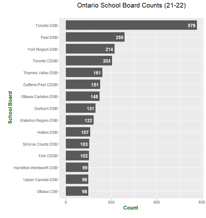
The Toronto District School Board (Toronto DSB) has the largest number of schools out of the school boards in Ontario.
In second it is the Peel DSB with 259 schools. The Peel district school board is west of Toronto with Mississauga as one of the big cities there near the Toronto Pearson Airport.
This following code chunk is for making sure that the horizontal bar graphs are in order from the highest counts to the lowest counts.
# Sort by counts
total_counts$Board.Name <- factor(total_counts$Board.Name,
                          levels = total_counts$Board.Name[order(total_counts$Total.Schools)])
The ggplot2 package that is inside the tidyverse package allows for the creation of bar graphs, line graphs, histograms and other data visualizations.
I don't really want get into too much details with the plotting code below. The main part is ggplot(head(total_counts, 15), aes(x = Board.Name, y = Total.Schools) for specifying the dataset input, the x variable and the y variable.
Stating geom_bar(stat = "identity", width = 0.8) gives a bar graph with the bars of width 0.8.
Having coord_flip() converts the default vertical bar graph into a horizontal bar graph.
The other items such as geom_text(), labs() and theme() is for centering the titles, adding labels, font size and label colours.
# ggplot - Show Top 15 Counts for Ontario School Board

ggplot(head(total_counts, 15), aes(x = Board.Name, y = Total.Schools)) +
  geom_bar(stat = "identity", width = 0.8) +
  coord_flip() +
  geom_text(aes(label = Total.Schools), hjust = 1.2, colour = "white", fontface = "bold") +
  labs(x = "\n School Board", y = "Count \n", title = "Ontario School Board Counts (21-22)\n") +
  theme(plot.title = element_text(hjust = 0.5, size = 16),
  axis.title.x = element_text(face="bold", colour="darkgreen", size = 12),
  axis.title.y = element_text(face="bold", colour="darkgreen", size = 12))

York Region District School Board is in third place. This region is just north of Toronto. Many of the schools in Ontario are in the Toronto and surrounding area.
Sort Counts By Number Of Ontario Elementary Schools
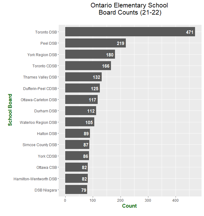
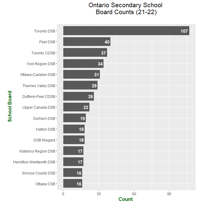
The code for elementary schools and secondary schools (high schools) are more or less the same as the previous section. Here it is.
### Sort Counts by Elementary Schools

elem_counts <- df %>% arrange(desc(Elementary.Schools))
head(elem_counts, 10)

# Sort by Elem school counts
elem_counts$Board.Name <- factor(elem_counts$Board.Name,
                                 levels = elem_counts$Board.Name[order(elem_counts$Elementary.Schools)])

# ggplot - Show Top 15 Counts for Elem Schools Ontario

ggplot(head(elem_counts, 15), aes(x = Board.Name, y = Elementary.Schools)) +
  geom_bar(stat = "identity", width = 0.8) +
  coord_flip() +
  geom_text(aes(label = Elementary.Schools), hjust = 1.2, colour = "white", fontface = "bold") +
  labs(x = "\n School Board", y = "Count \n", title = "Ontario Elementary School \nBoard Counts (21-22)\n") +
  theme(plot.title = element_text(hjust = 0.5, size = 16),
        axis.title.x = element_text(face="bold", colour="darkgreen", size = 12),
        axis.title.y = element_text(face="bold", colour="darkgreen", size = 12))

Sort Counts By Number Of Ontario Secondary Schools
### Sort Counts By Secondary Schools (High School)

hs_counts <- df %>% arrange(desc(Secondary.Schools))
head(hs_counts, 10)

# Sort by High school counts
hs_counts$Board.Name <- factor(hs_counts$Board.Name,
                              levels = hs_counts$Board.Name[order(hs_counts$Secondary.Schools)])

# ggplot - Show Top 15 Counts for Elem Schools Ontario

ggplot(head(hs_counts, 15), aes(x = Board.Name, y = Secondary.Schools)) +
  geom_bar(stat = "identity", width = 0.8) +
  coord_flip() +
  geom_text(aes(label = Secondary.Schools), hjust = 1.2, colour = "white", fontface = "bold") +
  labs(x = "\n School Board", y = "Count \n", title = "Ontario Secondary School \nBoard Counts (21-22)\n") +
  theme(plot.title = element_text(hjust = 0.5, size = 16),
        axis.title.x = element_text(face="bold", colour="darkgreen", size = 12),
        axis.title.y = element_text(face="bold", colour="darkgreen", size = 12))

The numbers for secondary school is much lower compared to the elementary schools. I do wonder what the school sizes are like and what the class sizes are like. That is something to investigate beyond this data.


