This week I put some thought into making the site a bit more mobile friendly. While I succeeded in most things, my goal to make the navbar responsive failed... And instead of pushing myself to get over this one thing for the whole week (like I did with the Google Map), I decided to put the navbar aside for a while and work on other things I could add to the site instead.
This way I would at least make some progress.

Changes to the starting screen
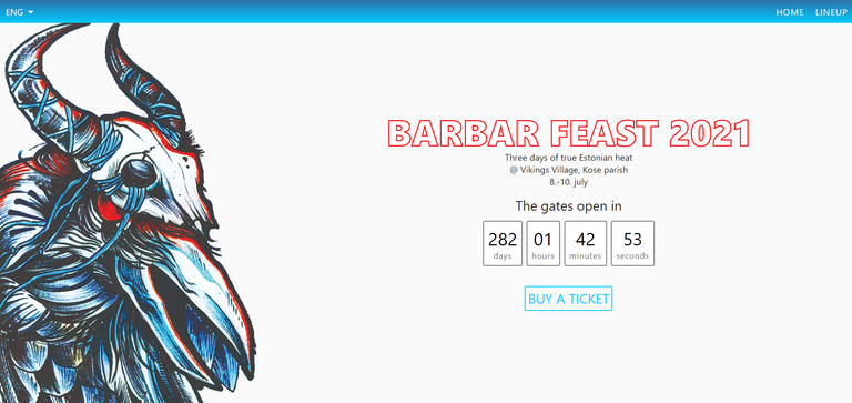
So the first thing you probably noticed was how the starting screen looks all different. I took the freedom of cutting the crow out of the festival's original artwork and use it where I thought it'd look effective. The cut lines don't look too good right now but I'll leave them as they are for now.
I decided I'd have a big header stating the festival's name on the right, followed by information about when and where it takes place and a live countdown counter which is timed to when the festivals gates open.
The last thing I added to the starting screen is a button that leads visitors to buy tickets / festival passes, etc. The button itself doesn't do anything right now, but as the host of the festival starts selling tickets online, I'll either make the whole buying process embed on the site or redirect the customers to the ticket seller's website.
The lineup section
As you scroll down you end up on the festivals lineup section. You might remember I had the bands displayed as a bunch of card components with a photo of the band and their music genre in addition to the band's name. Well, I didn't remove all that, I just moved it onto another router page.

I figured it'd be annoying to scroll down all the bands on the main page of the website on mobile since the cards would wrap into one long column. So instead I decided to make it look a bit like what lineup lists look like on some music festivals posters.
It's actually a simple unordered list with list-style: none on the list itself and a content: "★" on the list items ::before selector to create the star shaped icons inbetween bands names. (I also made the stars be rotated 180deg and the first list item's icon be hidden).
Many metal festival websites like Brutal Assault's and Wacken's have an info page for every artist. The page usually consists of the band's name, a photo, a short description of the band (including a list of band members), some links to their own website / social media, and examples of their music (either as videos or spotify playlists).
I thought of implementing the same system on my site but I haven't yet thought of the best way of doing so with Vue. Can I just make a template page and have it loop through the band objects to display the information of the band that was clicked on?... or should I just have the info pop up as modals? Which one would be less messy and what would actually work?
The FAQ section

Now this is a new addition to the site.
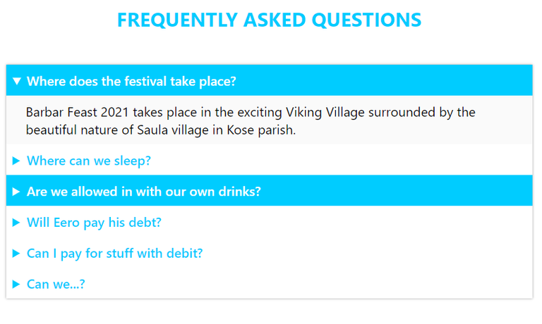
I figured not everyone who'd visit the site would be so keen on reading longer texts about the whos, whats and wheres, so I decided to add a Frequently Asked Questions section to it.
At first I overthought it. My idea was to create a bunch of somethings that'd need writing some JavaScript to display the answers. Luckilly I found a way easier and better way soon enough and quite randomly! I was scrolling Instagram's Explore feed and there was a post about HTML tags that aren't used too often, and there it was - the details element.
<template>
    <div class="FAQ">
        <details class="FAQ__content">
            <summary class="FAQ__content__question">{{ $t("faq.q1") }}</summary>
            <p class="FAQ__content__answer">{{ $t("faq.a1") }}</p>
        </details>
        // ...
    </div>
</template>
There's probably a better way of creating the FAQ by once again looping through the questions and answers and creating a summary element inside of a details element for each but I decided to leave it hardcoded the way it is.
What next?
I've got a lot more to do and not much time to work on it now but I'm still looking to finish this project by or for Christmas. Why not much time? After a looong year of unemployment I finally landed a job and am starting on my first position in the IT-field next Monday!
So, what needs to be done to count this project finished?
First of all, I definitely need to go over the design - the colors... especially the background colors and all of the empty space on the starting screen. I probably should have some way of displaying extra information about the bands that come up on stage.
I should also change and add some questions in the FAQ for information people are quite likely to want to know when they visit a festivals website.
I will probably add a section for information about the venue and about the closest sights to see.
... and I definitely need to get that navbar responsive.
If you've got any ideas of what else to add or what to change, feel free to share them with me!
Looks really nice! I hear you about struggling with something for awhile and then finally having to just set it aside. Clearing your mind is always a good thing!
Thanks! If I would've kept pushing on trying to get the one thing working, I probably wouldn't get a lot of other things done. :D
I still hope to get it done at some point though!
I think I've used that trick once before.
I hope they treat you nice. You seem like you really know what you're doing so I'm sure you'll rock @ the job.
As always, thanks for posting in the programming community.
Music Festival Website.@xves, First of all good wishes from my side towards this
Yes, sometimes we tend to focus towards only one thing and after sometime we feel that we haven't done anything Productive.
After going through from this blog it sounds like many Bands are lined up for this Festival.
Congratulations regarding your Job and have a blessed journey ahead.
Have a joyful time ahead and stay blessed always.
Thank you for these kind words, chireerocks. I hope all the best to you too!
Welcome and thank you so much.