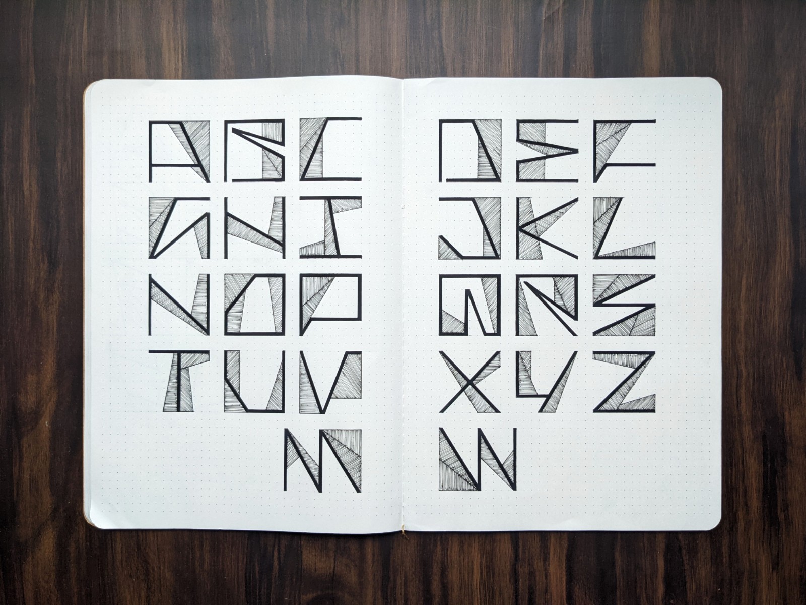
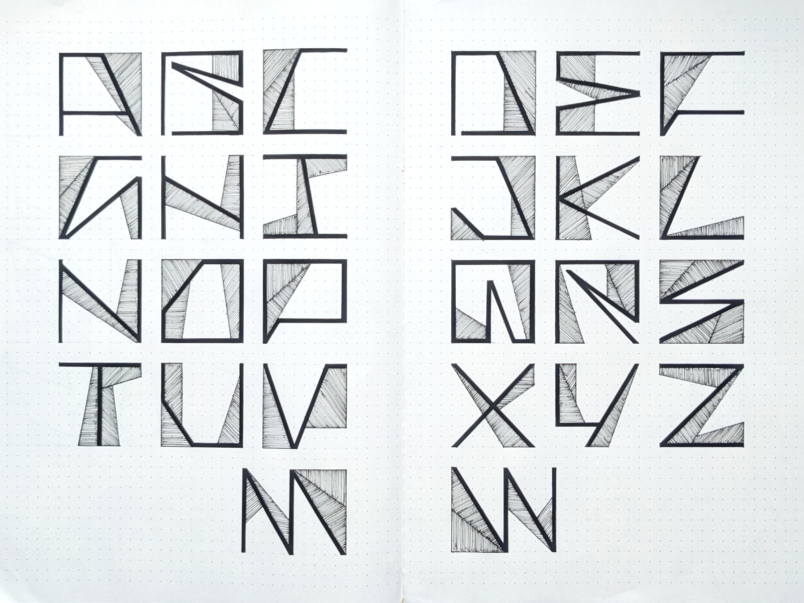
Yesterday, I spent time refining this typography set.
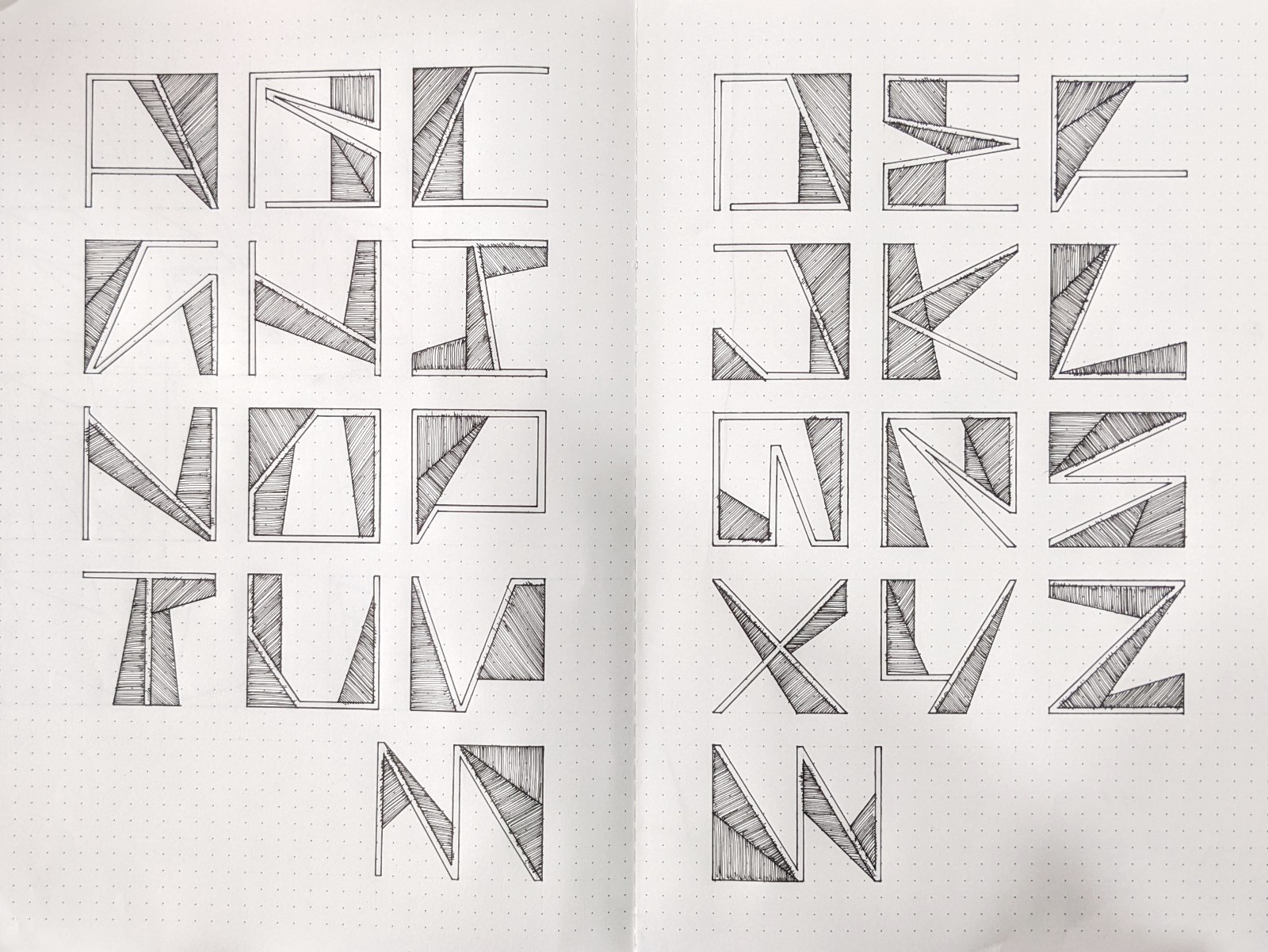
The design became edgier and the contrast between thick lines making the alphabet, and its thinner counterpart is increased. The design of some alphabets changed accordingly.
I really love how this turned out 😄
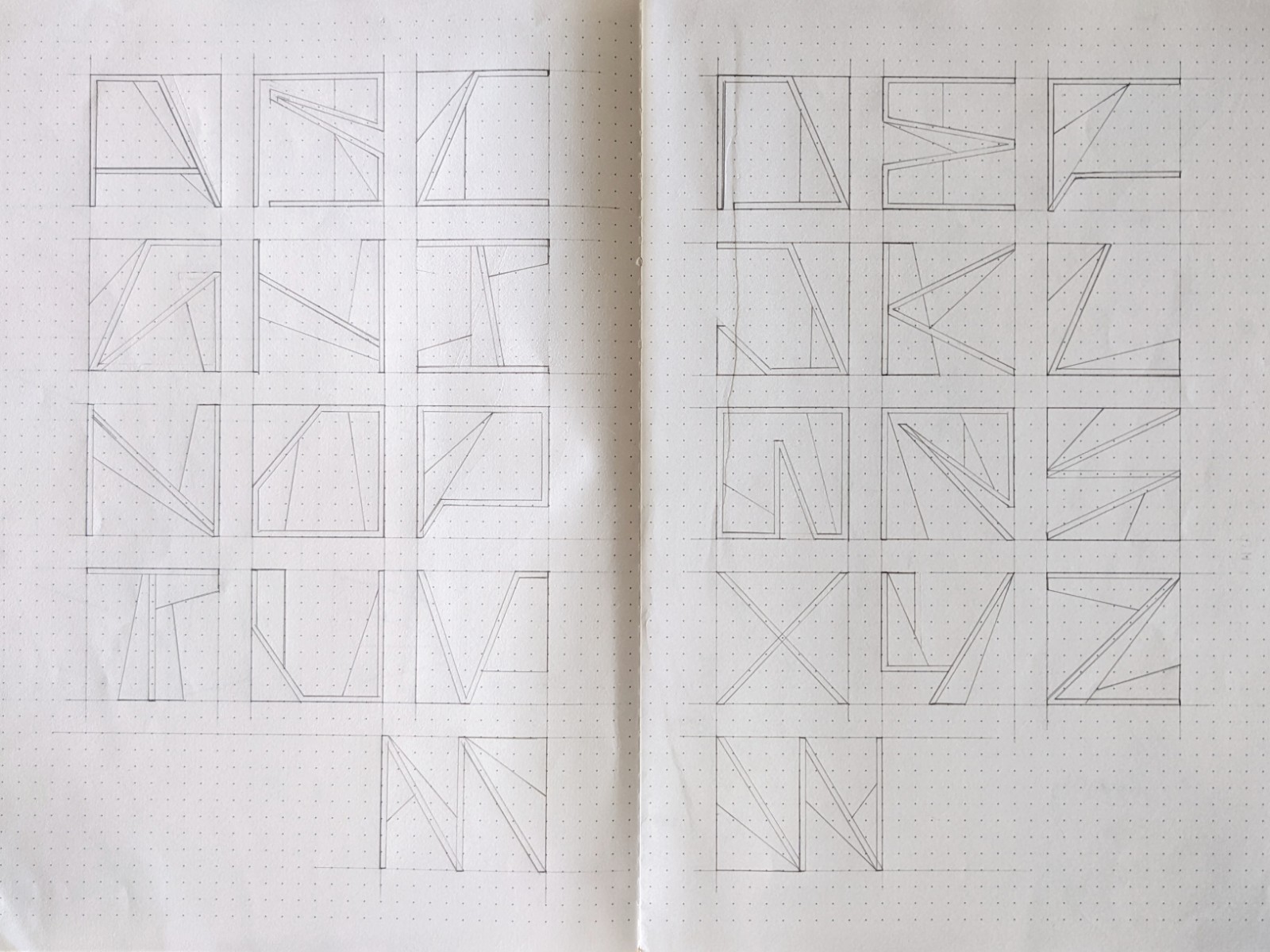
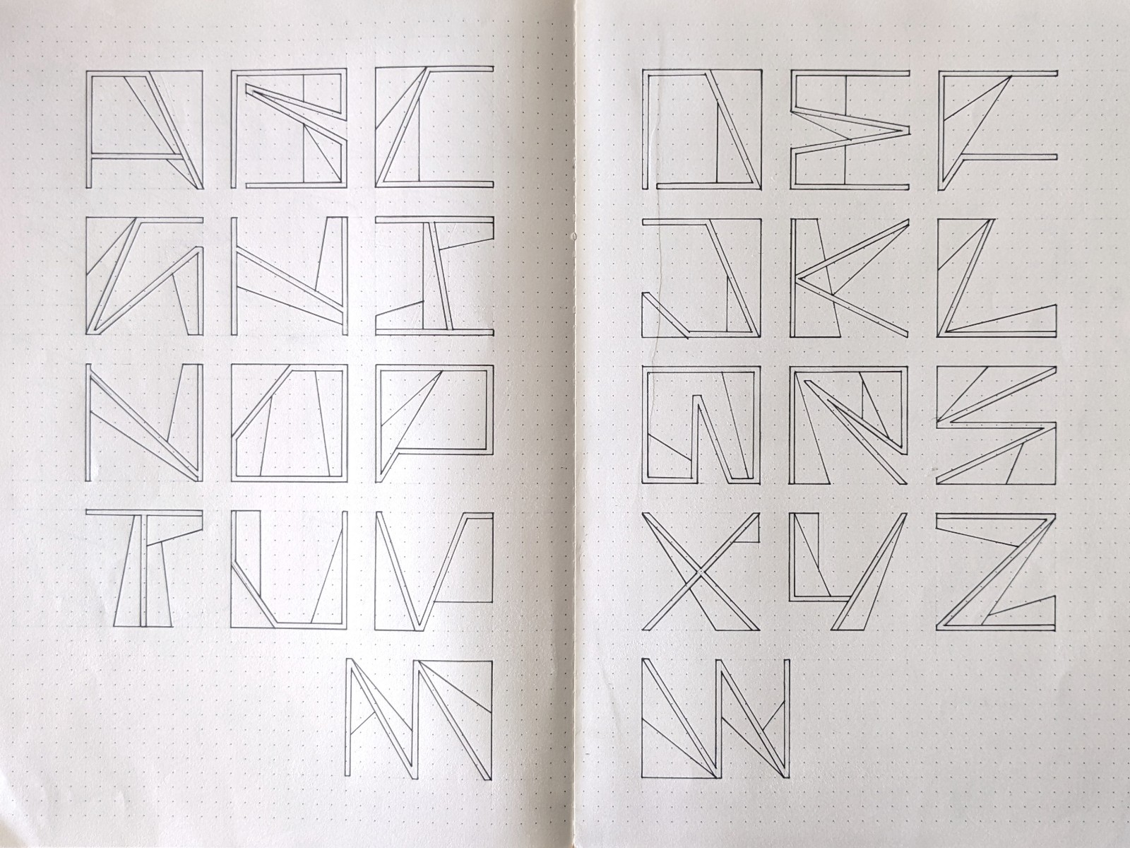
The Process
Nice work 😁
Thanks 🙂
You welcome 😁