Hi Artists and Designers, welcome to another post where I walk you through my creative process in graphic design projects.
Today, I decided to take up and showcase my Logo Work from around March this year. This Logo was for a Web3 Infrastructure Brand called Keychain(not related to Keychain for Hive), I think on the Solana Blockchain.
The goal was for me to Create a Logo that Impresses the founder and in a Style fitting of their brand. Naturally, I prefer creating vibrant, colorful and witty Logos (Like the one from my Startup, PortalsX), so this was a big challenge for me.
Previously, I create most Logos in either Figma, Inkscape and I think I've on a few occasions done Logo Designing in Adobe Illustrator, but I was by no means an expert to understand the various effects and tools.
For this Logo, I Created 3 Perfect Looking Variants.
Working in Illustrator was so fun, that I got the grasp of the tool and using my Creative Skills, simple applied a Similar effect (Metallic look) to two other Logos Designs.
Today, I'll be showing you Guys just ONE of those Logos 😅, and will reveal the others later!
Check the Result of my First Keychain Logo,
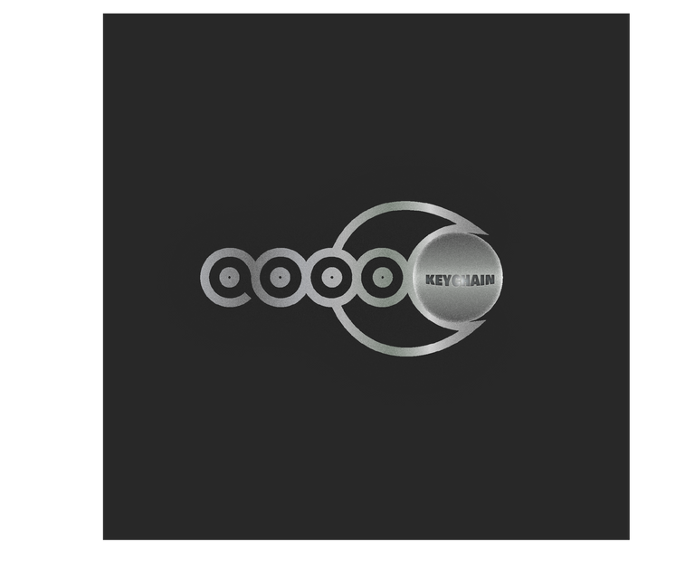
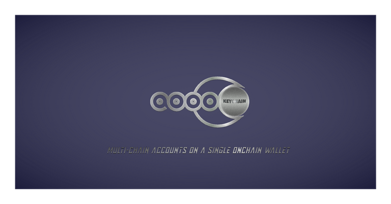
As you can see - The logo inspires the feeling of Sublime, Security, Simplicity and Mature, complete opposite to my colorful creative style 😇.
Let's get on the creative process Bus
I created this work complete in about 5 days (3 Variants), and out of that five days - I spent 2 and Half days thinking and designing the concept of the logo. I had a few styling pointers to work with that aligns with the customer of the brand, so I built my designs around that.
I Started working in Figma, to easily draw the design of the Logo and the Inside Ball
I Transferred this to Adobe Illustrator and Retraced the Twisting Loops with more precise strokes Using the Pen Tool.
The Inner structures were simple Filled Circles with an Inner Cut-out.
The ball is also a Flat Circle that has the realistic look of a Round Shape because of
Gradients. In this case, a Rounded Gradient is Used.
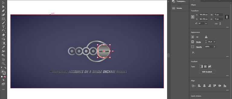
from the image above, you can see the appearance and gradients of the ball
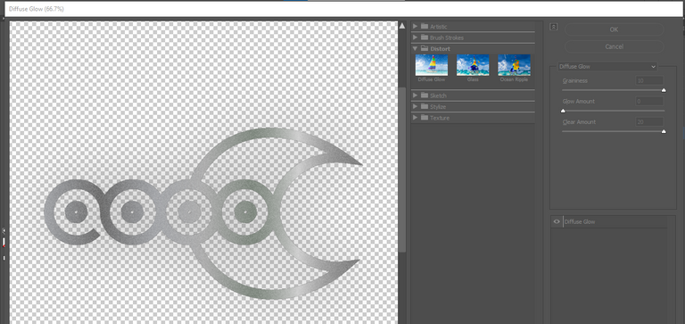
- Next, after the Shape and Look of the Logo is Complete, the effects brings the final Transformation into Metallic. For this process, I used a
Diffuse Glow
Before understanding how I could supply this Metallic glow, I searched online for some answers and by following examples, I was able to tweak it to fit my usecase.
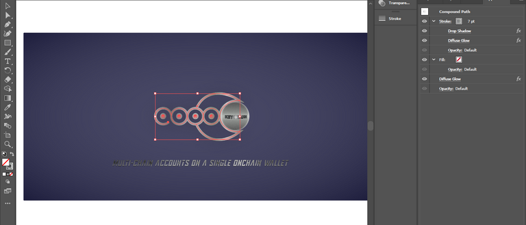
By adding whatever effect you choose to add (in this case, Diffuse Glow),
you have to decided on what layers you want to add it. from the image above, I'm adding the Diffuse Glow effects in multiples on both the Fill and Stroke Layers. Doing differently, will produce a variety of results.Finally, tweak the Diffuse Glow Property, until u get what u like!
AND, That's it
If you are new to Adobe Illustrator, there will be no shortcuts, Once you can understand what each tool(that u will use) and effects does, it would be a breeze because you will spend majority of your time Tweaking and Perfecting your drawn designs
I really enjoyed creating this Logo, although the process was stressful since I had limited time. I'm happy that it deepened my Photoshop Knowledge and now, I feel more at ease with the tool LOL!
At the end of the day, we all learn by doing!
Thanks for reading my Blog today,
I hope you had fun and learned something knew. Feel free to drop your questions because I've shortened the details involved, in order to make this post easily digestible.
Until next time, where I showcase the other Two Variants of the Keychain Brand Logo (completely unrelated to Keychain for Hive) xD!
Congratulations @chel-koby! You have completed the following achievement on the Hive blockchain And have been rewarded with New badge(s)
Your next target is to reach 8000 upvotes.
You can view your badges on your board and compare yourself to others in the Ranking
If you no longer want to receive notifications, reply to this comment with the word
STOP