Recientemente he estado viendo mucho el arte de Mashashi Kishimoto, el creador del manga de Naruto, y he amado con todo mi corazón la manera en la que él ilustra las heridas y golpes en batalla.
Desde siempre he sido fan de la manera de ilustrar del maestro Kishimoto, y cada cierto tiempo reviso su trabajo, pero esta semana me di a la tarea de realizar una ilustración que intentara estudiar un poco su manera de presentar las heridas y golpes, por lo que emocionado quiero presentarles el resultado.
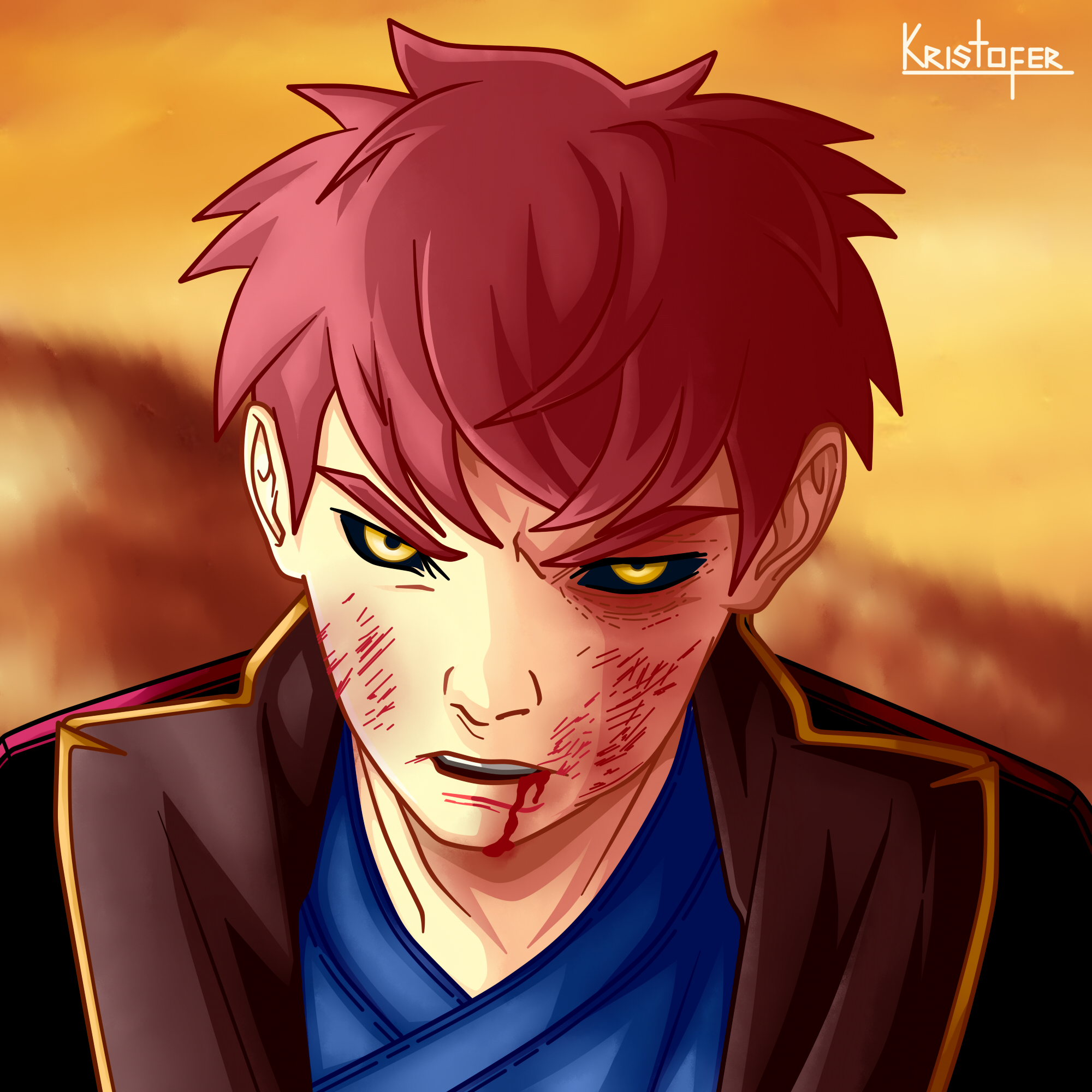
Decidí nombrar a este experimento: "El Guerrero Pintado de Sangre", y quise dibujar a un guerrero o samurai, en plena batalla rodeado por el resplandor del atardecer.
Recently I've been looking a lot at the art of Mashashi Kishimoto, the creator of the Naruto manga, and have loved with all my heart the way he illustrates wounds and blows in battle.
I've always been a fan of Kishimoto's way of illustrating, and every now and then I review his work, but this week I took on the task of making an illustration that tried to study a little bit his way of presenting wounds and blows, so I'm excited to present you the result.
I decided to name this experiment: "The Blood Painted Warrior", and I wanted to draw a warrior or samurai, in full battle surrounded by the glow of the sunset.
Step by Step:
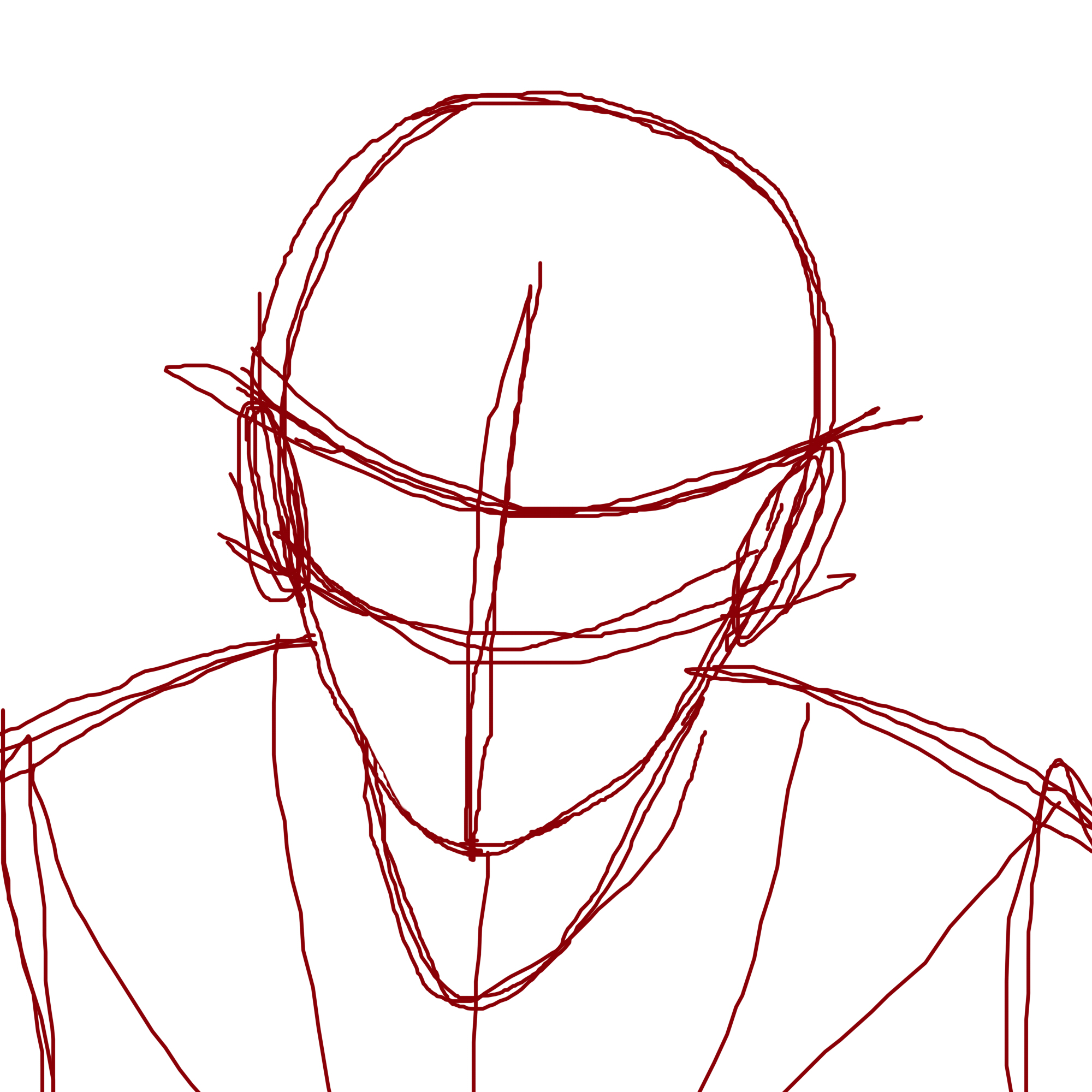
First I made a quick doodle of our protagonist, and then I polished his design and pose a bit. I marked details, defining his wounds and expression.
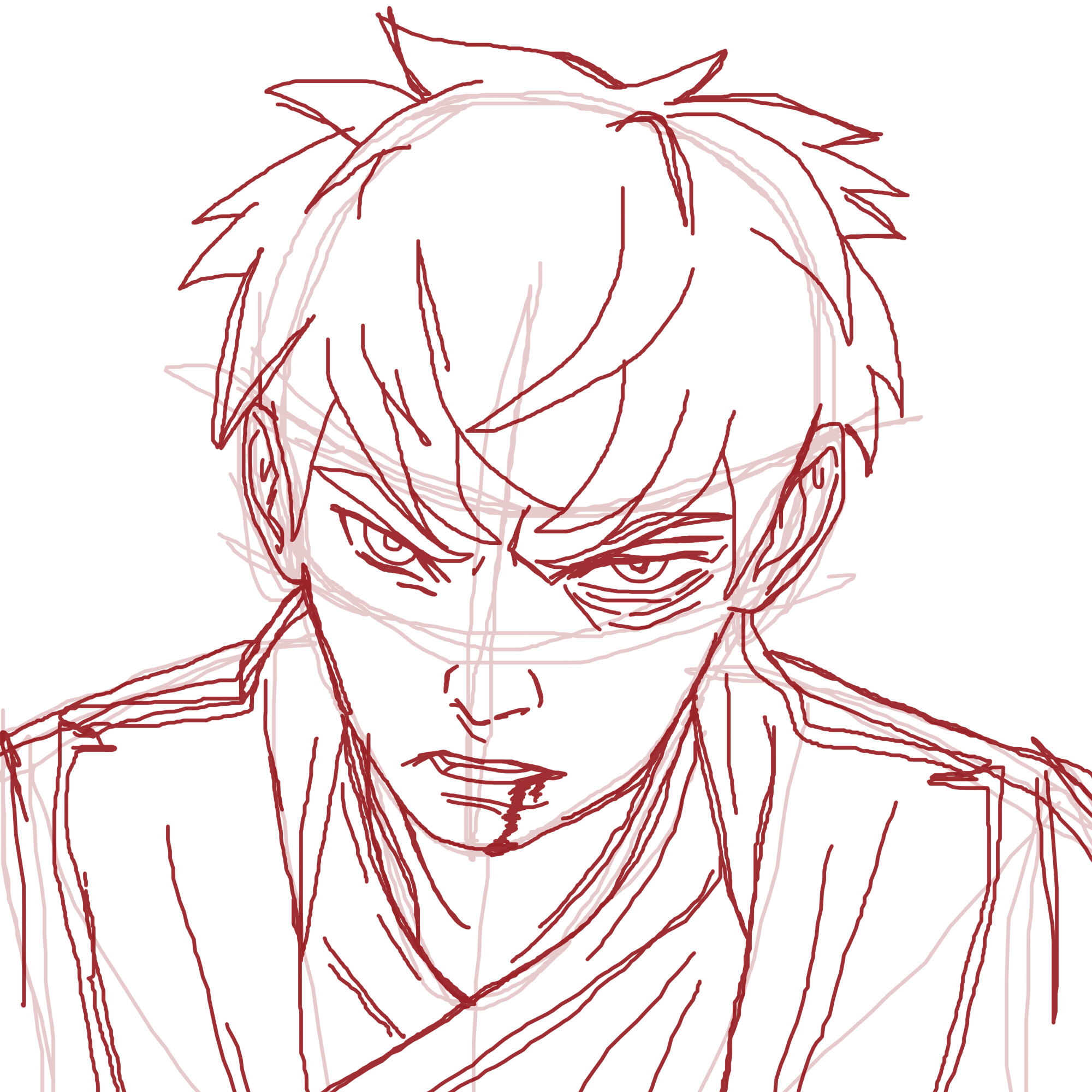
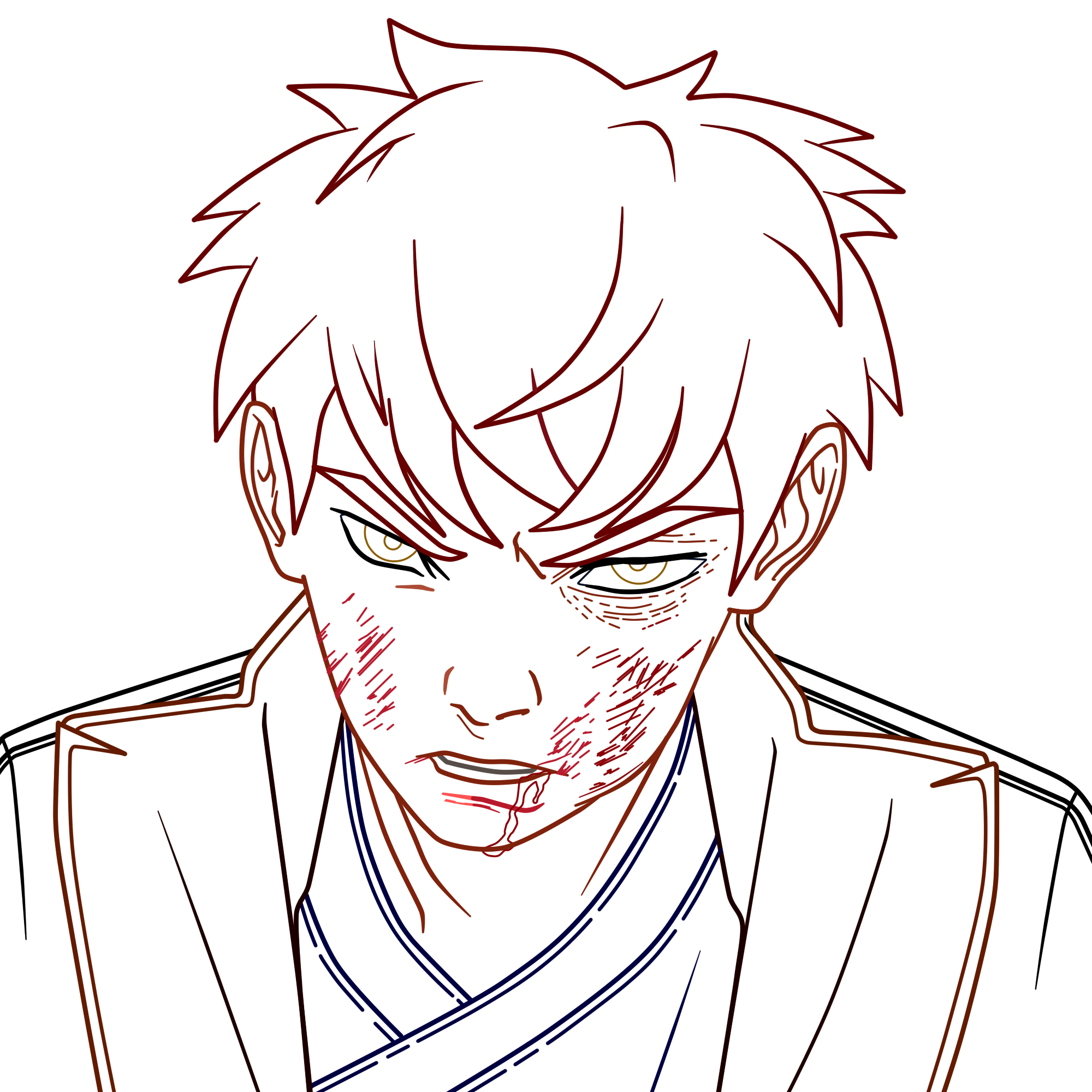
Having finished with the rustic sketch, I focused on making the line art. I was very clear about how I wanted to use color and shadows, so I focused on illustrating with colored lines from the beginning, leaving everything ready for coloring. I wanted the key point of light to be from the left side of the drawing, allowing the right side to be a little darker.
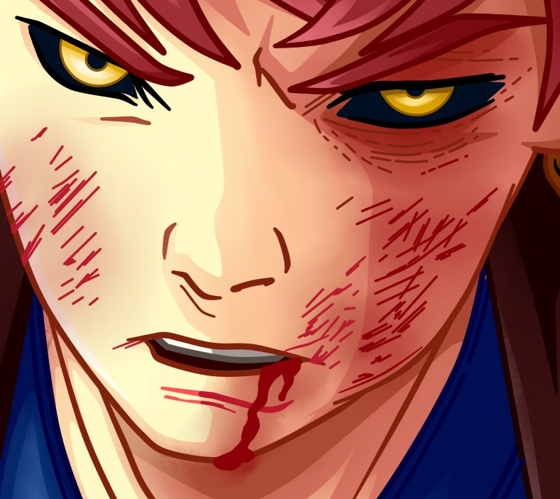
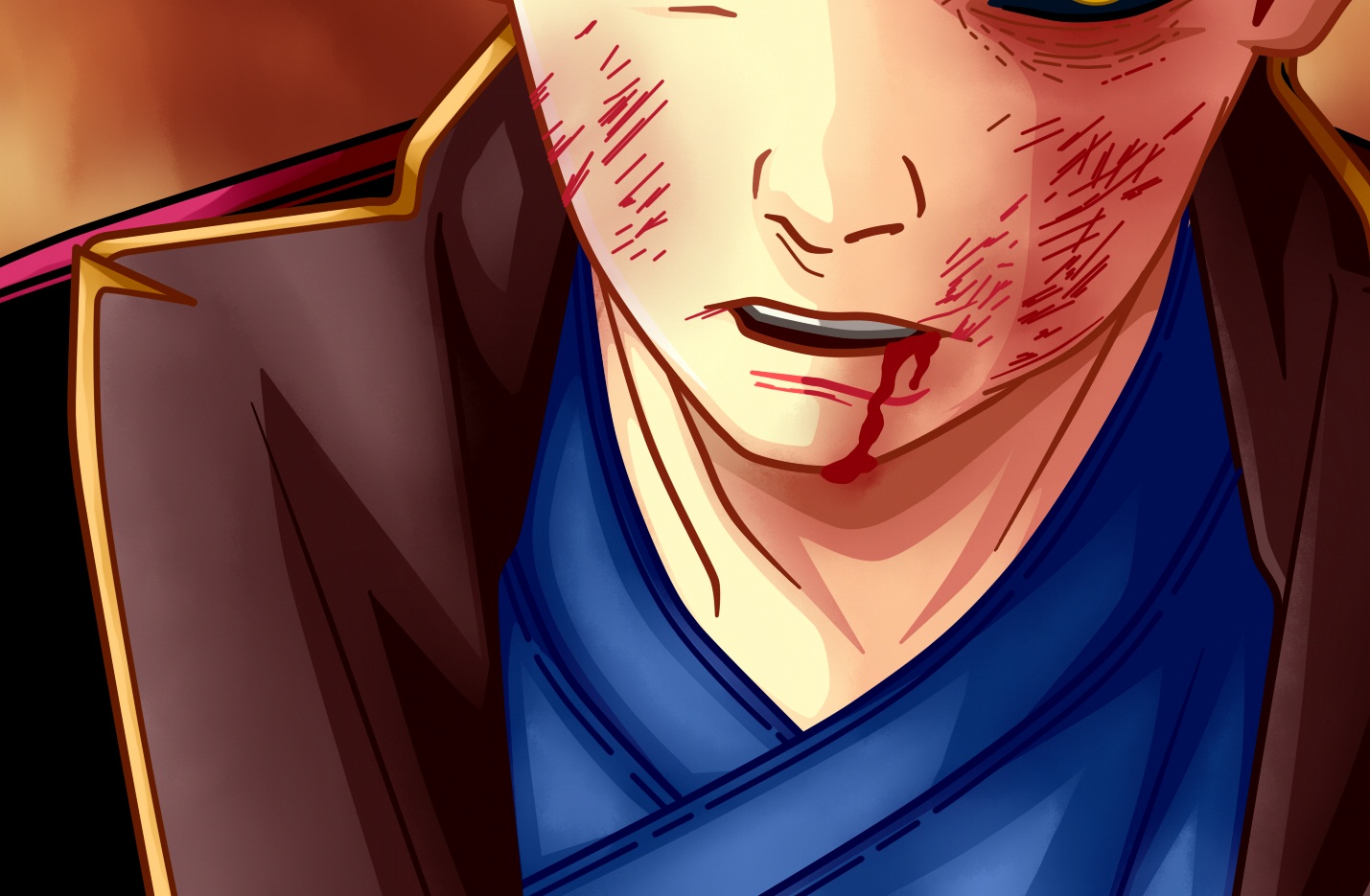
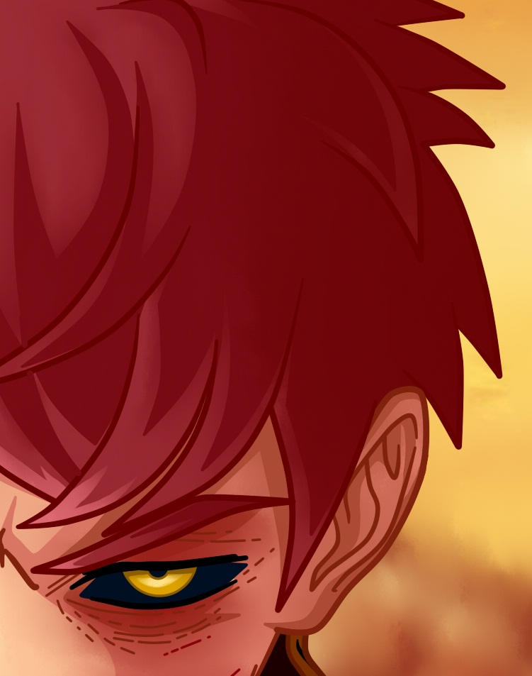
Also, I added many more bumps and scrapes on his face to emphasize the brutality of the beating and fight.

I wanted her to have a distinctive and unique detail as well, so I decided to play a lot with her eye color. I decided to use yellow and black, to achieve a striking look.
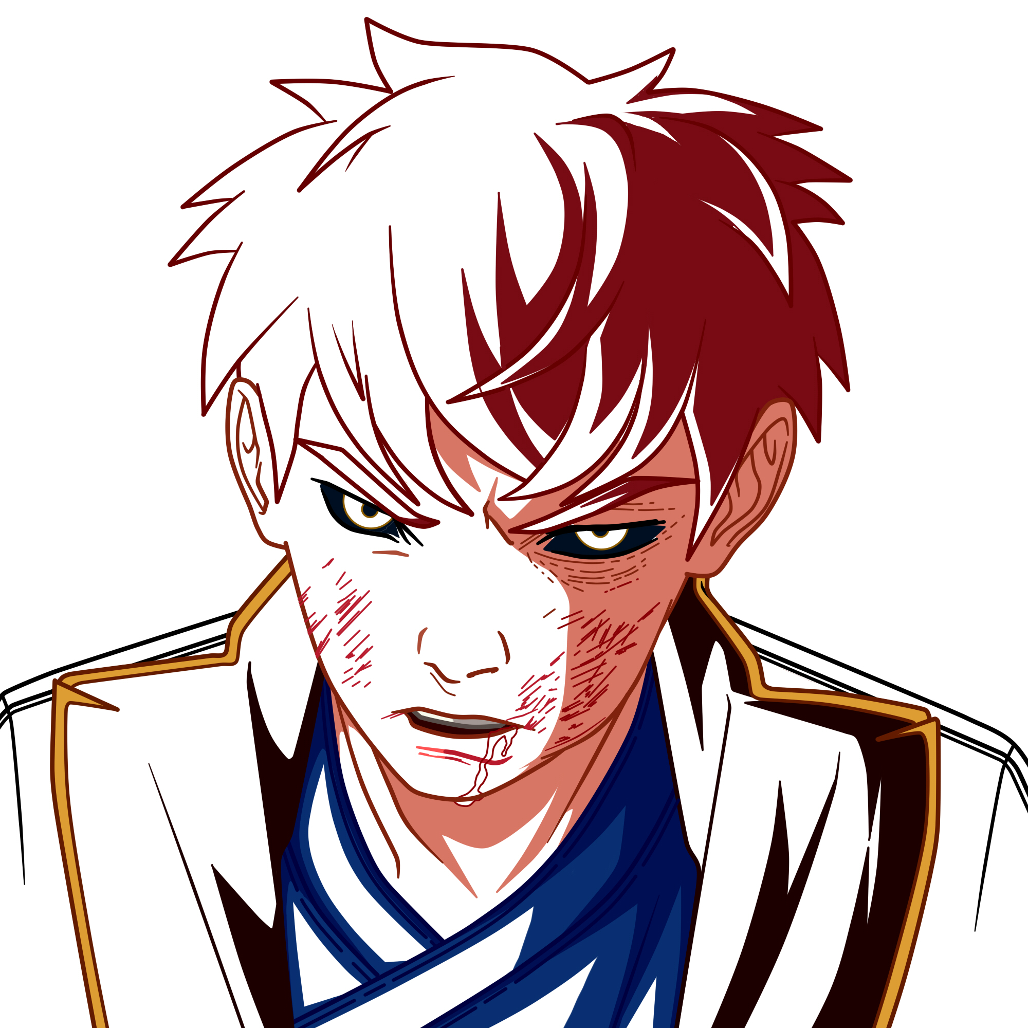
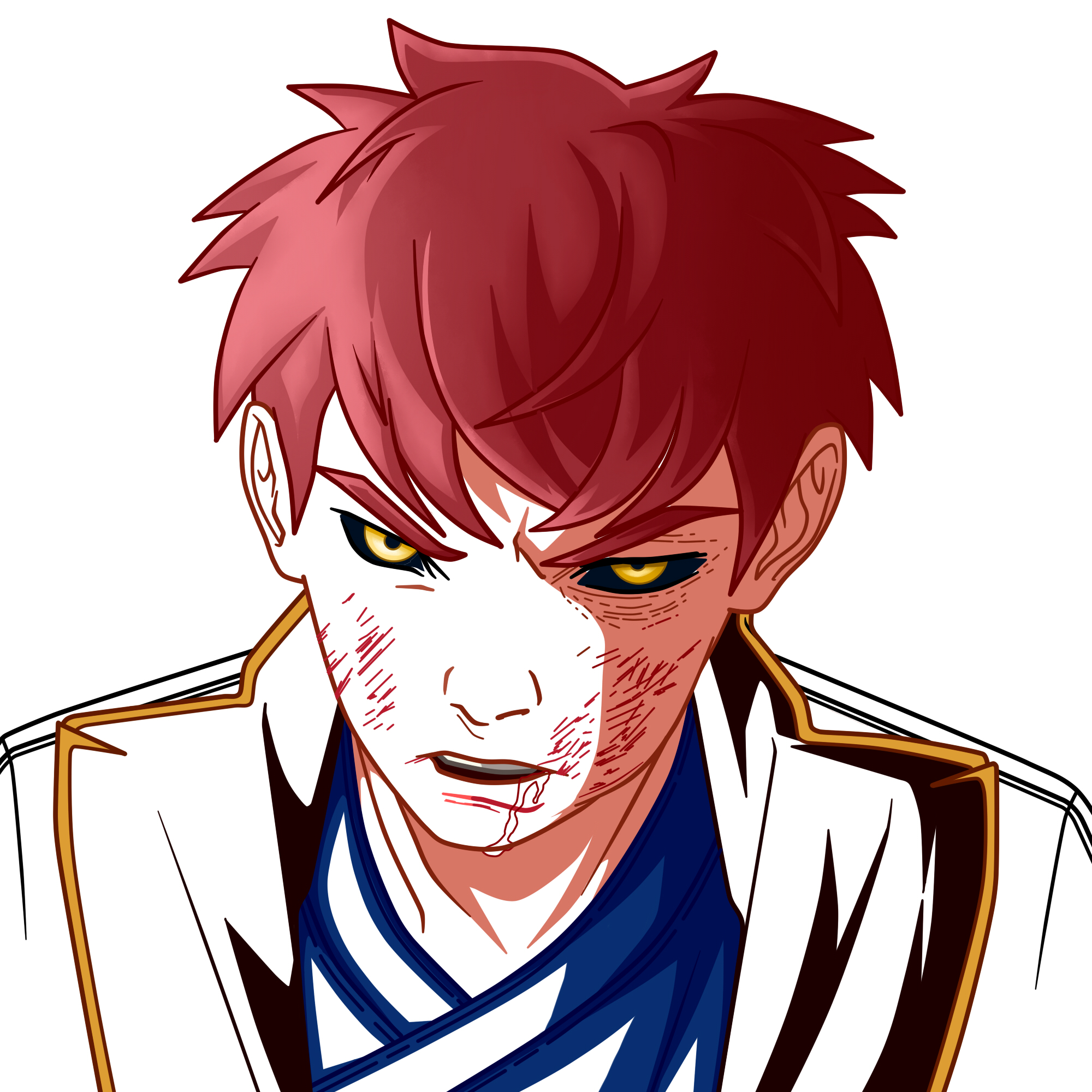
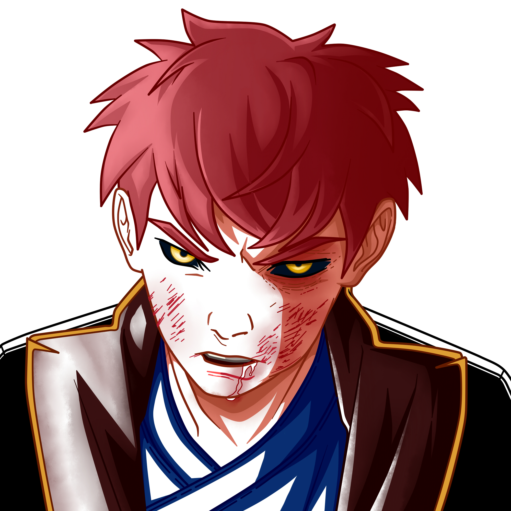
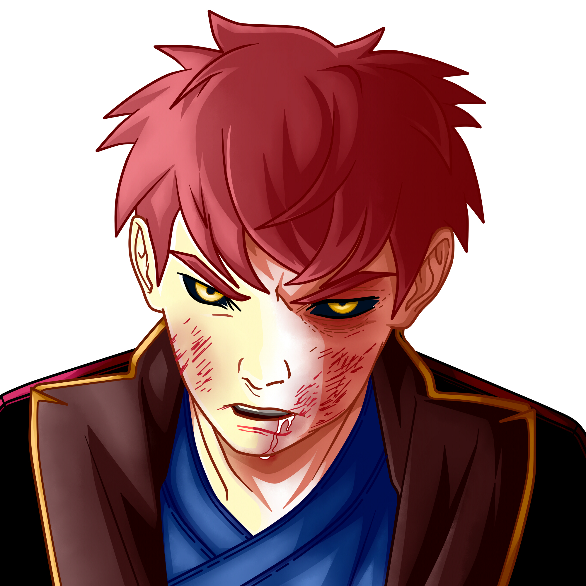
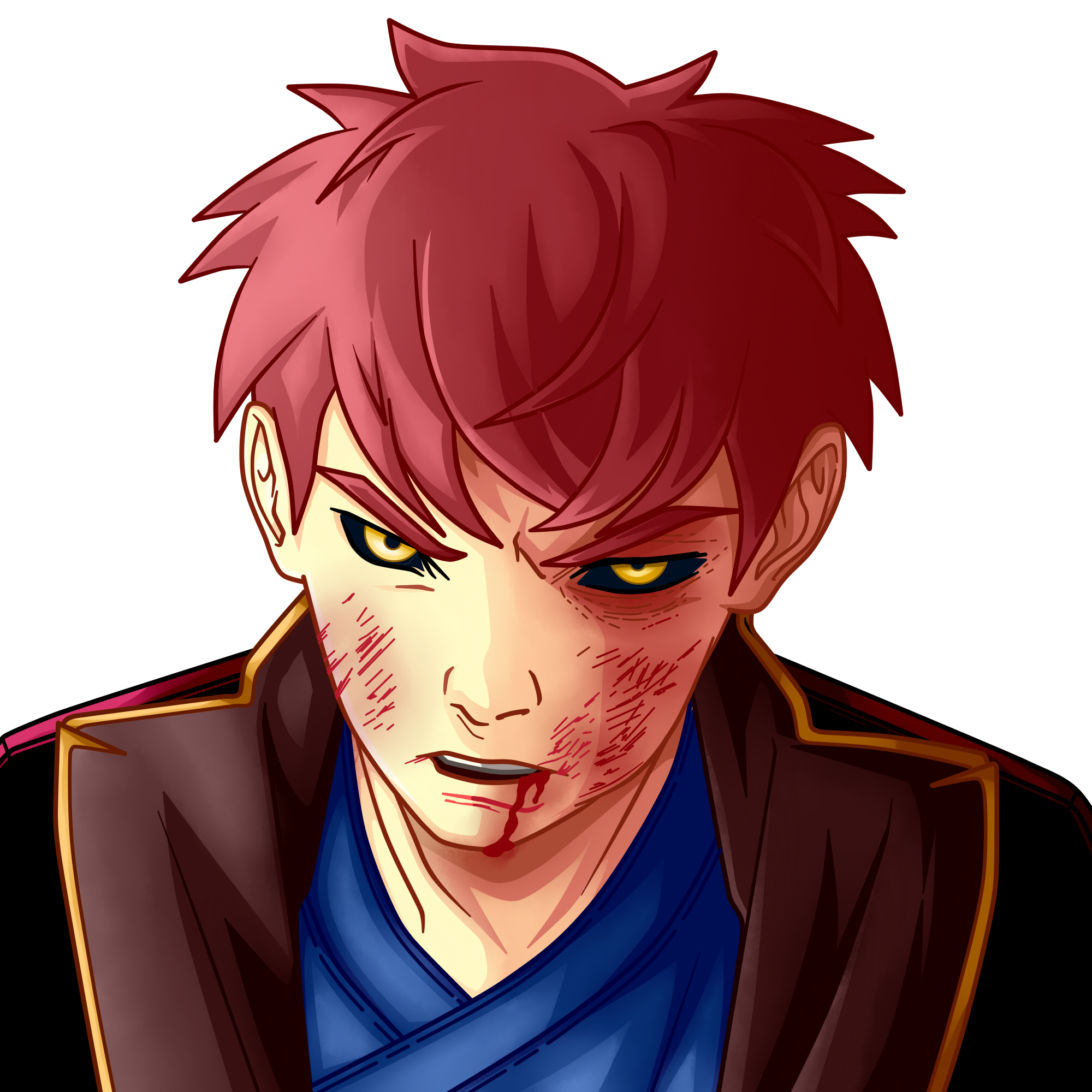
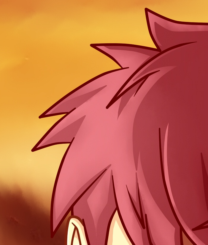
At this point, I decided to add as a background bathed by the sunset and the color red, out of focus. I also added my signature in the upper right part of the canvas, officially ending the illustration.

And so, this is the end of today's publication. It was a very fun experience, I had an incredible time doing this curious project since I don't usually study the art style of other artists, being a little closed in that aspect, but I consider it is important to do this kind of practices and essays for personal and artistic growth.
I loved the final result and I sincerely hope you did too. I can't wait to hear from you in the comments, remember to stay healthy and drink lots of water!
Detalles de la Ilustración
Ilustration Details
Hope you're planning to animate this? Cause i really want the know the story behind those wounds
Thank you very much mate, you have no idea what this kind of comments mean to me. I had not planned to do it, but I will gladly try it now. Best regards