Hola, muy buenas, comunidad de Sketchbook!
Me presento: Soy Veronese, un ilustrador digital. Les presento mi dibujo mas reciente, y su proceso de creacion. Y uno que otro error que paso a convertirse en un error feliz.
En primer lugar, esta es la imagen de referencia:
Introducing myself: I am Veronese, a digital illustrator. I present to you my latest drawing, and its creation process. And one or two mistakes that turned into happy accidents.

First of all, this is the reference image:
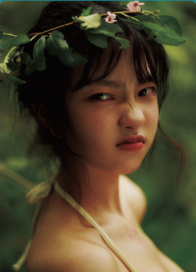
La saque de Pinterest, y el que tenga una luz desde un angulo tan complicado y que tenga una expresion a la que no estoy acostumbrado, se me dificultaria mas adelante, como veran abajo.
I took it from Pinterest, and the fact that it has a light from such a complicated angle and that it has an expression that I am not used to, would make it more difficult for me later, as you will see below.
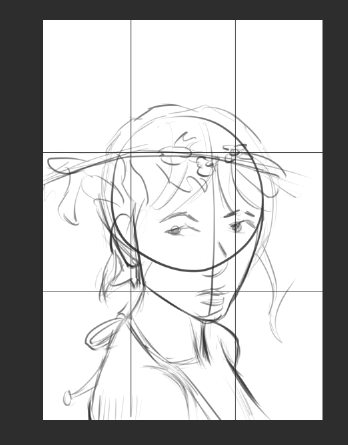
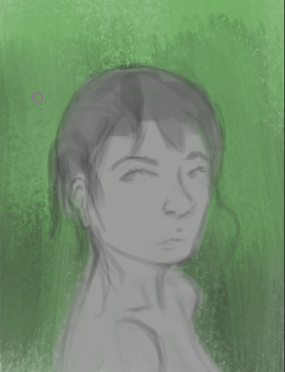
Primero, pongo una regla de composición de cuartos, que es la mas básica y que es un principio artístico al cual no estoy muy acostumbrado (Es mas, y si me equivoco les pido que me corrijan) Y hago un boceto algo rápido de como es que quiero que se vea la pintura al final.
First, I use a rule of thirds composition, which is the most basic one and it is an artistic principle to which I am not very accustomed (In fact, if I am wrong, I ask you to correct me) And I make a quick sketch of how I want the painting to look in the end.
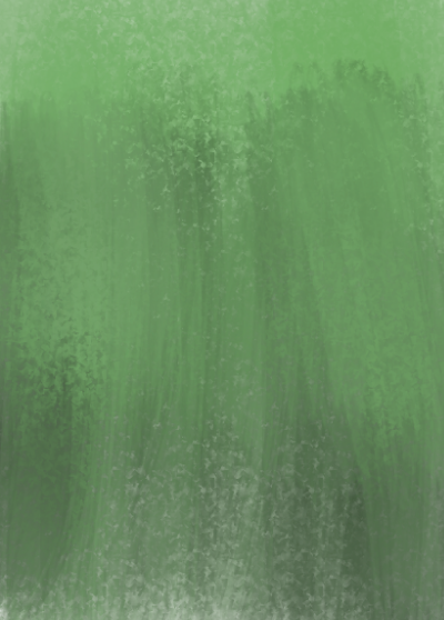
Después, dejo un "relleno" del fondo, que al final no se conservaría el color, pero de todas formas, será de utilidad mas adelante.
Then, I leave a "fill" for the background, which in the end would not be preserved in color, but anyway, it will be useful later.
Después tenemos la base de la pintura. Y se que se preguntaran: "¿Porque esta en blanco y negro?" Y bueno, es una pregunta muy complicada. Aquí pasare a explanarme a mayor detalle.
En los softwares de edición digital, esta algo llamado "mapa de gradientes", lo cual a forma resumida lo que hace es aplicar una tonalidad de color según al valor que detecte la capa. Sera algo que podrán ver mas abajo. Para poder utilizar un mapa de gradientes de forma mas eficiente, se suele trabajar meramente con blanco y negro, ya que es mas fácil reconocer las sombras, luces y volúmenes de un sujeto cuando solo se utilizan estas. Simplemente es mas comodo trabajar asi.
También añado que decidí hacer esto, ya que la primera ves si intente pintarlo con colores de forma normal, pero el resultado no me gusto, así que quise aprovechar y ponerme "experimental"
After that, we have the base of the painting. And I know you're wondering: "Why is it in black and white?" Well, that's a very complicated question. I'll explain it in more detail here.

In digital editing software, there is something called a "gradient map," which, in a nutshell, applies a color tint according to the value detected by the layer. You'll see more of this below. To use a gradient map more efficiently, it is often advisable to work in black and white only, as it is easier to recognize the shadows, highlights, and volumes of a subject when only these are used. It's simply more convenient to work this way.

I also add that I decided to do this because the first time I tried to paint it in normal colors, I didn't like the result, so I wanted to take advantage of the situation and get "experimental."
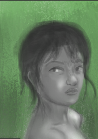
Aqui termino de añadir los volumenes, luces y sombras de la chica. Se ven mucho mejor que en la original.
Aqui termino de añadir los volumenes, luces y sombras de la chica. Se ven mucho mejor que en la original.
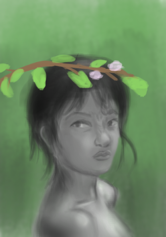
Aqui añado la ramita, la cual no me moleste en hacerla en escala de grises porque no era necesario
Here I add the twig, which I didn't bother making in grayscale because it wasn't necessary.
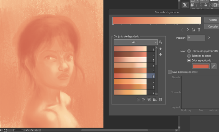
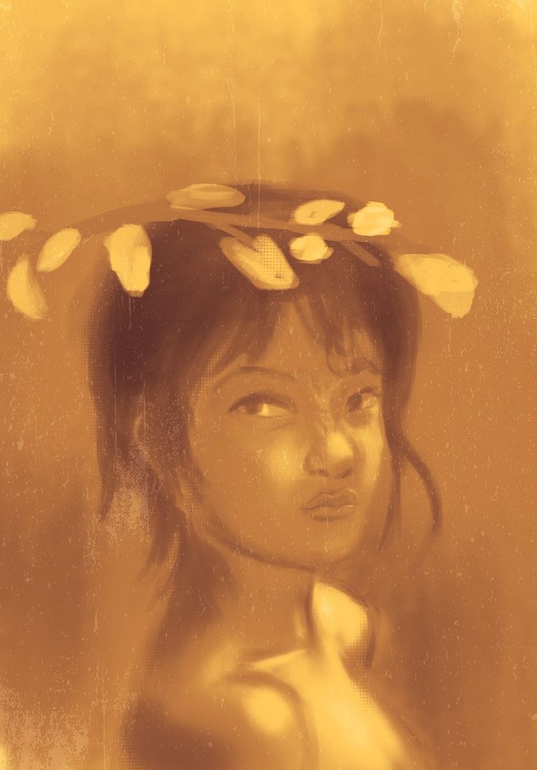
Es aqui cuando empiezo a jugar con los mapas de gradientes y con sus tonalidades. Unas me gustan y otras no tanto, la cuestion es que al final me decidi por la final. Tambien quiero decir que en un principio queria pintar con mapa de gradiente todo exactamente como esta en la referencia (pero parte por parte con distintos gradientes), pero al final me decante en hacer un trabajo mas experimental, imitando un estilo "Y2K", aunque tambien es simiplar a una foto antigua.
This is where I start playing with gradient maps and their tones. I like some of them, and I don't like others so much. The thing is, in the end I chose the final one. I also want to say that at first I wanted to paint everything with a gradient map exactly as it is in the reference (but part by part with different gradients), but in the end I decided to do a more experimental work, imitating a "Y2K" style, although it is also similar to an old photo.
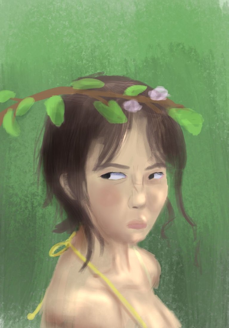
Y despues tenemos al que es el resultado final, que de paso, añado el filtro que mencione arriba (que en realidad es exactamente el de una foto antigua)Y unas pinceladas en partes con bordes suaves sobre puntos, para hacer que la ilustración se vea mas vistosa.
And then we have the final result, which by the way, I add the filter I mentioned above (which is actually exactly like an old photo) And some brushstrokes in parts with soft edges over points, to make the illustration look more eye-catching.
Y por ultimo, añado la ilustración original, la cual quedo inconclusa y de todas formas no me gustaba en absoluto como estaba quedando.
Y bueno, eso es todo. A partir de ahora me comprometo a hacer una publicación en esta pagina web por día. Muchas gracias por leer si es que haz llegado hasta aquí.
And finally, I add the original illustration, which was left unfinished and I didn't like it at all.

And that's all. From now on, I'm committed to making one post per day on this website. Thank you for reading if you've made it this far.