
Hello friends, today I bring you a new post to show you how I designed the banner for my hive profile.
to this one I wanted to put several drawings plus the name that represents me which is plazp plus a purple background as I had before I added the colors that I like the most.

Next I will show you the process of how the design was made.
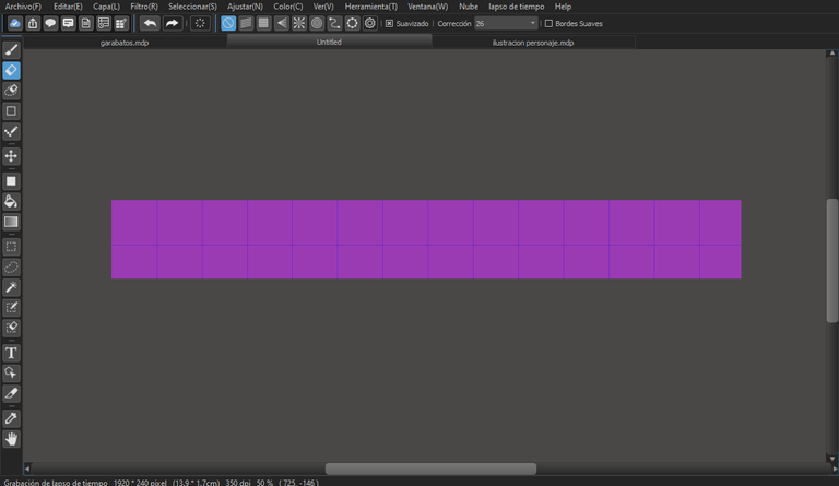
In this part I was thinking about how the design was going to be, the only thing I had clear was that I wanted to use the purple background as I had it before.
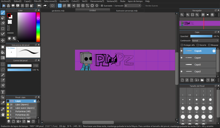
Then I got down to work and introduced a character that I had already designed previously and later I started to doodle my user name and then I would clean it up.
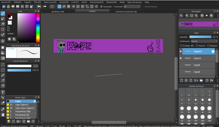
After that I wanted to make a drawing of a very well known game called Among US which I had been playing and I thought it was great to put it in the design to later put the name of HIVE next to it.
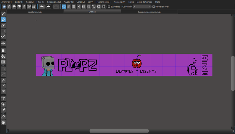
Next I wanted to put the two things that were most characterized within the platform, which is sports and designs, where on top I put an apple that I had designed in advance
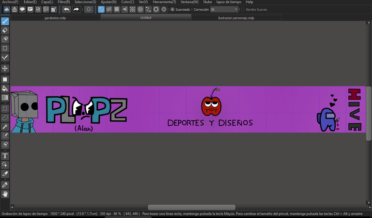
In the end I didn't want to saturate a lot of drawings and all I did was clean up the design a bit and put my name below (the real one) and then go to color and stay like the one we saw earlier at the beginning of the post
I want to tell you an anectote about this design which I wanted to do for a few weeks but I hadn't had the time and I wanted to think a little about how I was going to do it before starting as such, so I started to doodle and some cool designs came out like the characters and the apple which I really wanted to place in this design and in the end I ended up placing it, I also began to practice various types of letters for the design but when it came to doing it, the references that I had in my memory were not I remembered them very well and in the end I ended up making a simple letter design because everyone I tried made it a bit difficult for me to make the letter (z), that's all for today's post I hope you like it and leave me your recommendations to improve. Greetings