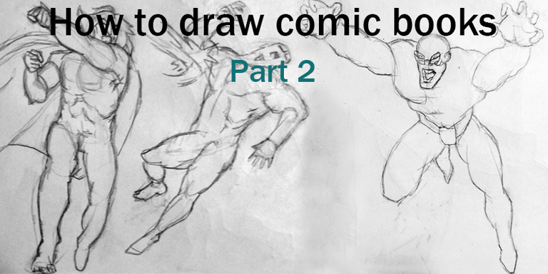
When I started working on the second part of this series I watched the Kill Bill movies, I think that helped me a lot to get in the mood for action scenes, which happens to be the main subject of this series.
For this part, we'll work with the book by Christopher Hart called "How to draw comic book - Heroes and Villains - Part 2". We made a transition from the comic book style of a more comedic purpose to the standard of comic book superheroes that was stated in the '80s.
Let's start...
Comic book fans are interested in a really good big final confrontation, that will make them go through any kind of story. The key on drawing a great fight is understanding how the human body adapts to motion and momentum.
Devastating Punches
A devastating punch is important in any character's repertoire. Consists of two elements:
The windup
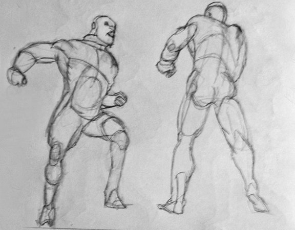
We need to imagine the fist of the character as it would weight 50 pounds so we can visualize how the body is thrown after the fist starts the windup.
Follow-through
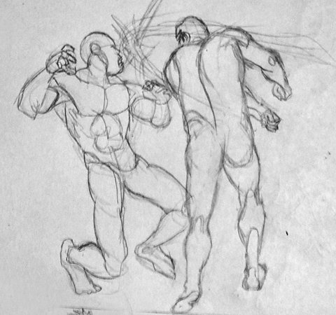
The follow-through is indicated when the arm is already fully extended with the accompanying speed lines. One key factor is that the punch is always shown after the impact. That's the most important detail for a great punch.
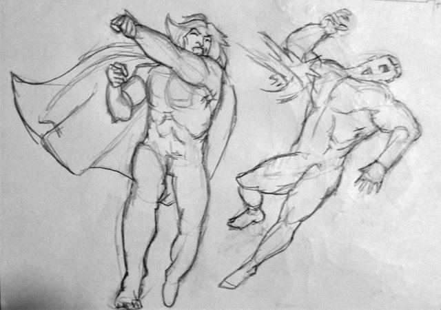
The contact point is only indicated by an outburst. The reader never sees the actual punch. As described by the comic book artist Frank Springer "The punch should look like it hurts". Notice how the one getting punched is thrown back by the force, his knees bend, and his head tilts back.
Clean Punches
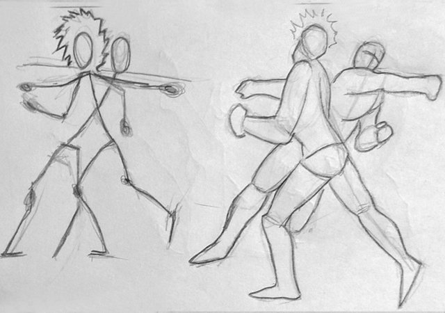
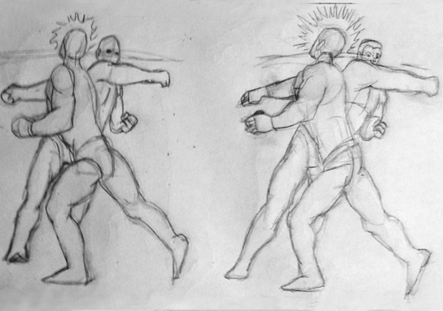
There's no such thing as a small punch in a comic book fight. Each punch is destructive. Considering most fights display overlapping bodies (like the ones we're seeing here) it's important to make sure that the figures get enough space allowing the reader to easily see the full punch at full extension. Short uppercuts and hooks aren't dramatic.
Lunge Attack
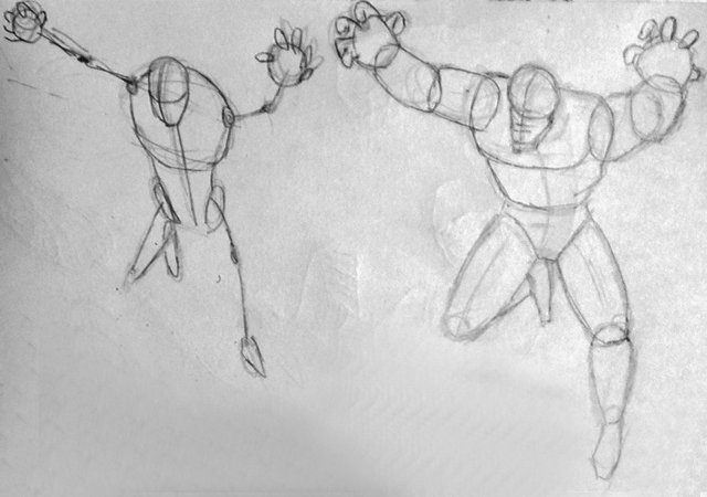
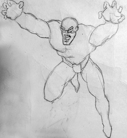
We are all good, but sometimes we want that our characters go for the kill. A lunge or attack movement needs to be swift, sudden, and state clearly the forward motion.
The full body isn't attacking at the same time. His hands are forward, followed by the shoulders then the torso, and finally, the foot that launches. This creates a feeling of movement, like a pouncing lion. It's visually powerful. You can use this technique for a character unarmed or with weapons.
Leaning for the punch or kick
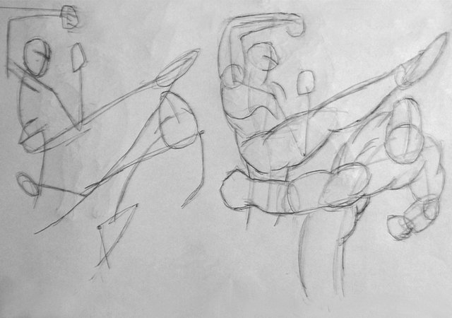
It may seem natural to lean back for a kick. But it means that you're throwing your energy away from your opponent. Your character should lean towards the kick or punch, pushing all his weight forward. The attacker has both of his fists tight while his victim releases all tension, a sign of weakness.
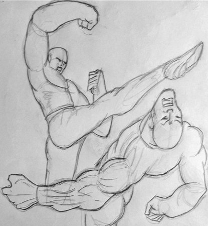
You can show how the blow affected the opponent clearly by drawing his chin up in the air like he was nailed there. That's a clear sign that the hit was effective.
The Judo shoulder throw
At youtube, you will find many videos about martial arts (here's the shoulder throw), it's important for comic book artists to know the basics about some martial arts techniques considering the popular belief that someone schooled in martial arts can defeat a group of punks at the same time.
The shoulder throw is a fascinating way of ending a combat literally throwing the enemy in the air and over his back.
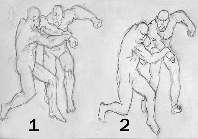
(1 The one defending gives a step towards the side of the attacker while simultaneously grabbing the enemy's arm.
(2 The one defending starts to turn forward and as he does it, he pulls his enemy, making him lose his balance.
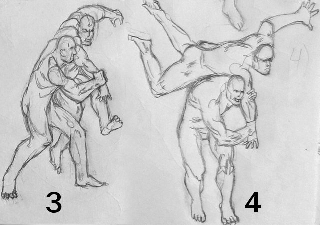
(3 The defender dips his shoulder, preparing to place it under his attacker's arm.
(4 When the defender shoves his shoulder under the attacker's arm, he's done already.
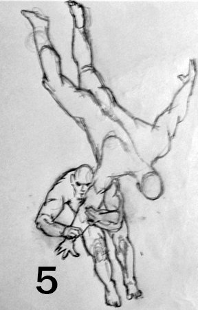
(5 The defender pitches forward and the attacker flies overhead.
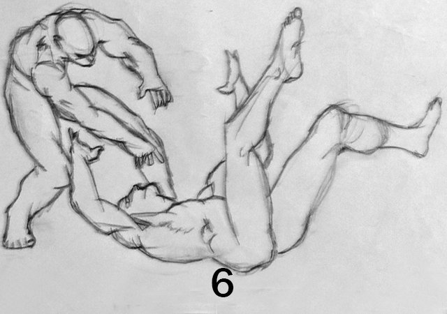
(6 And just when the attacker is going to touch the ground, the defender lets go, causing the attacker to hit the ground harder.
David Vs. Goliath
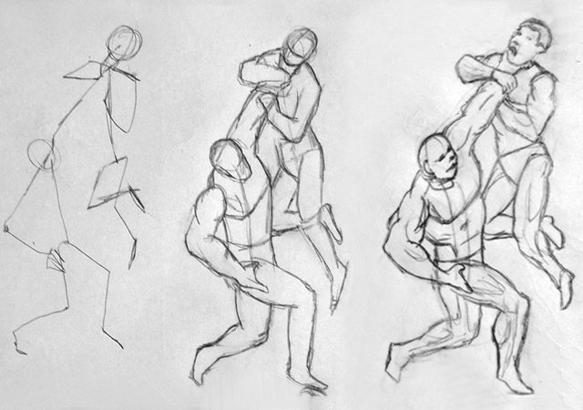
An unfair fight is a very dramatic tool that has been used for eons. Making the hero the underdog, who must win against all odds, makes us want to root for him, and if he starts the fight looking like he'll definitely lose, only to come off with a sheer heart win, it turns the battle extremely exciting.
We have to make sure his nemesis is giant and uses his physical advantages in the fighting scene.
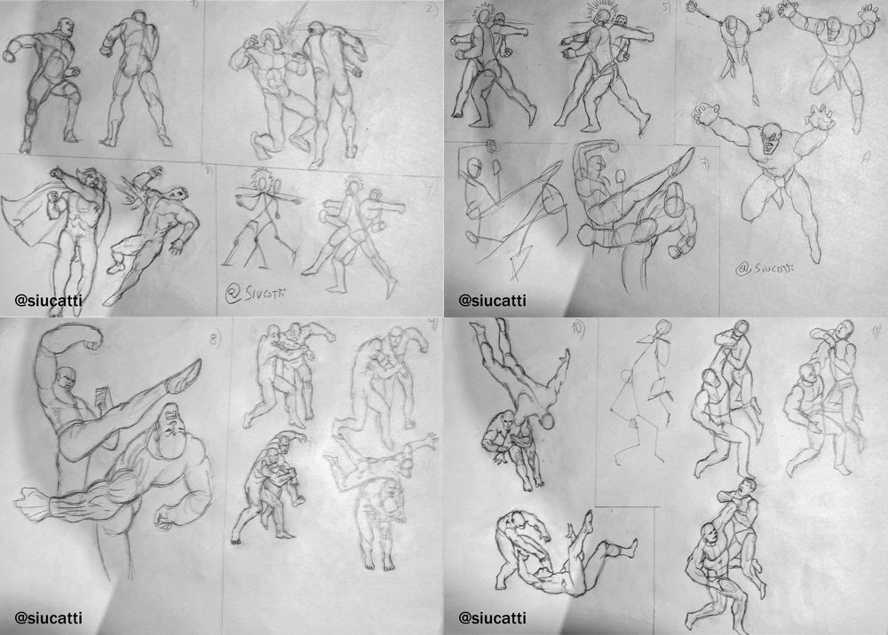
I hope you liked this mini-series of tutorials about motion and fights in comic books. You can check out the first part here.
very informative how to ! a newbie comic artist should read this one :)
Thank you, yes, I try to make my tutorials as comprehensive as possible so everyone can find something useful.
It's really an interesting "how to", well done! I have to improve my skills to draw action and I think this content is very useful. 😊
Thank you, Silvia! I try to be thorough with the tutorials so everyone can find something useful for their style.
I think that drawing movement is one of the most hard things to accomplish. Thanks for sharing.
Thanks, Alejandra. I agree, it's a challenge to add motion to illustrations. I'm glad you liked it!
Shared on Twitter
Congratulations @siucatti! You have completed the following achievement on the Hive blockchain and have been rewarded with new badge(s) :
You can view your badges on your board And compare to others on the Ranking
If you no longer want to receive notifications, reply to this comment with the word
STOPSupport the HiveBuzz project. Vote for our proposal!
Wow, great
Hi! I'm glad you liked it!
Uwc sir..