Design Hint.
What's the main focus? Is it for a book, an album, a mobile app, or a product? Consider important landing page elements (call-to-actions, clarity, etc.)
A landing page is mostly built to be a lone wolf, and it's set up on the knocker for the ballyhoo campaign. It's like your sitting room. It's where a person visiting the page for the first time “lands” after they click on a link from an email, Facebook, YouTube, Instagram, probable ads from Google, Twitter, or analogous places on the web.
Contrary to websites, by and large, which have many end lines and encourage quests. Landing pages are on the docket with a unique purpose, refer to as a call to action (or CTA, for short).
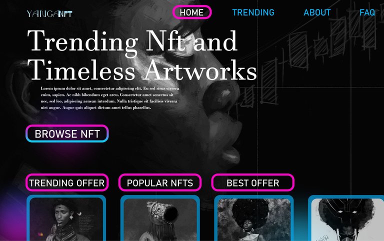
With this in mind, my goal was to design a landing page for an NFT Marketplace with the idea of increasing conversion rates and making sure that the number of clicks equals sales.

TOOLS USED:
Figma
FONT: Javanese Text, Bahnschrift
https://linktr.ee/YangaArts
https://nftshowroom.com/yanga/gallery
https://app.rarible.com/yanga
https://opensea.io/YangaArts