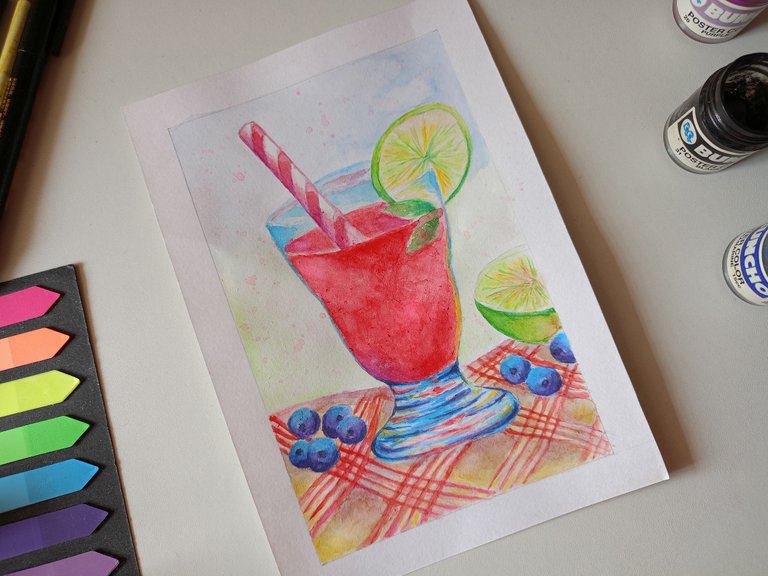
Hi everyone! I painted a red cocktail some time ago and I gave up on posting it due to some issues on the website with uploading the pictures but I'm trying again today via mobile. I gave it many tries back then only for the uploading to fail. Keeping my fingers crossed so it's a different outcome since I'm using a mobile this time.
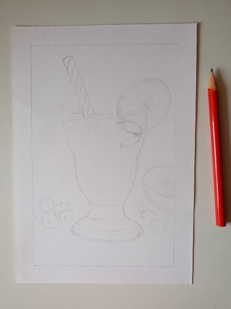
This is my drawing that I made with a pencil. After many eraser shavings, I somehow ended up with a decent drawing.
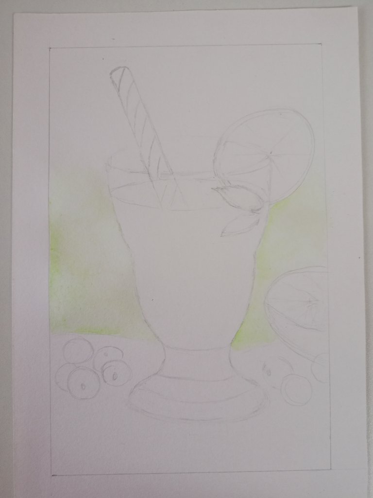
I started the painting with a light background shade which is green. It was very watery and diluted. I wanted it that way so I can layer it on as I keep going.
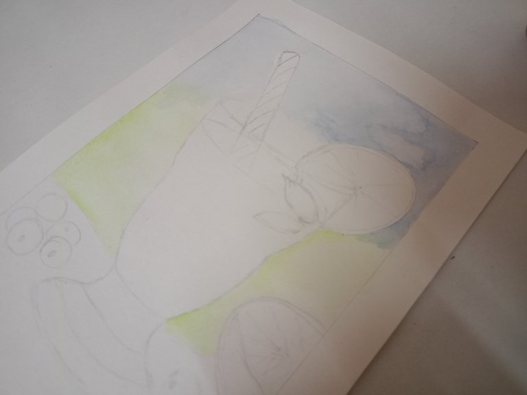
Then I added the next colour which is blue. I wanted to mix both the blue and green to create a gradient effect in the background and contrast with the main subject colour which is red.
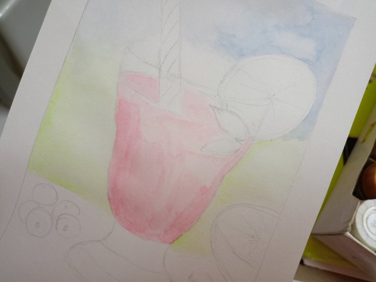
Here comes the main theme of the entire artwork which is red. I wanted to make it striking to further emphasize on the subject which is the cocktail.
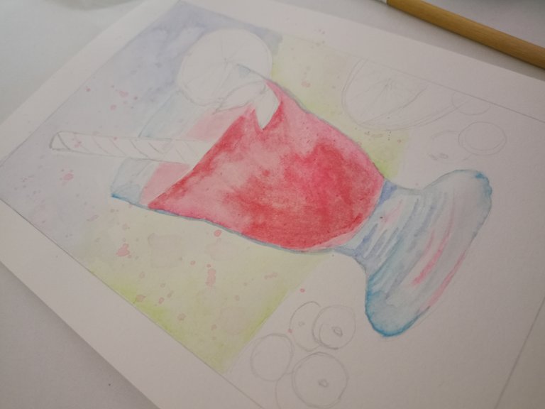
Then, I painted the glass with more blue and added a little paint splatter. I just picked up some diluted red with my brush and splattered it all over the top half of the painting.
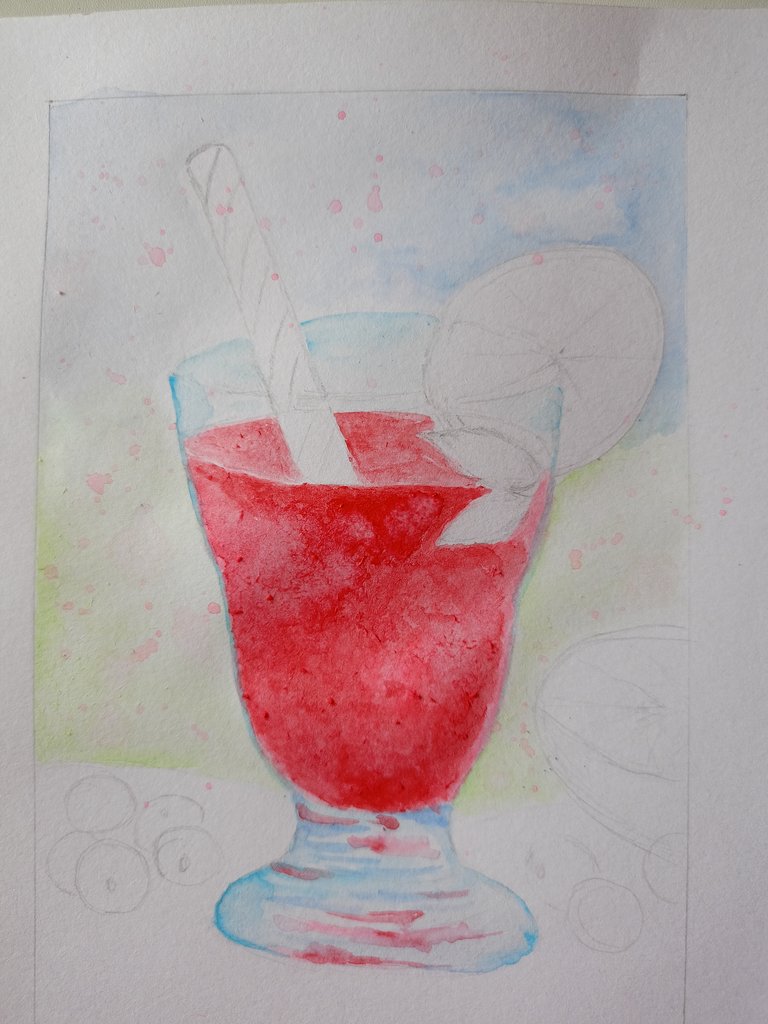
I painting a little more red and started getting the cauliflower effect due to using more water. So that was my cue to stop painting and take a break while the artwork got some time to dry.
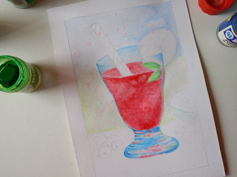
This is after adding a few more layers of paint later on. I managed to build the colour up to make it look more vibrant. I am just using student grade paint so I needed some time to do that. Had I used artist grade paint, I wouldn't need to do that much. It would have probably just taken two layers or so to achieve the the same colour payout.
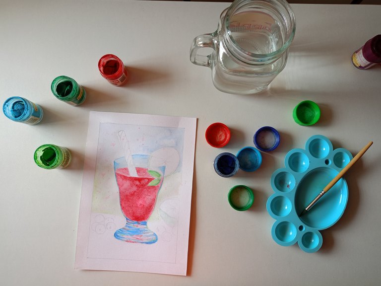
This is my little workspace. It is more of a funspace though ☺️
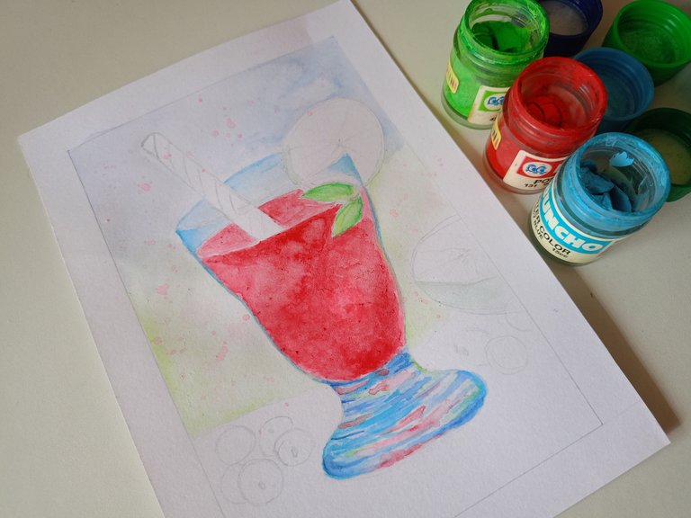
Just an aesthetic looking picture with the paint containers.
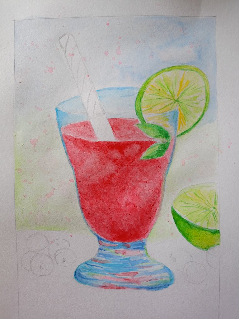
Here I have painted the limes which are the garnish of the cocktail.
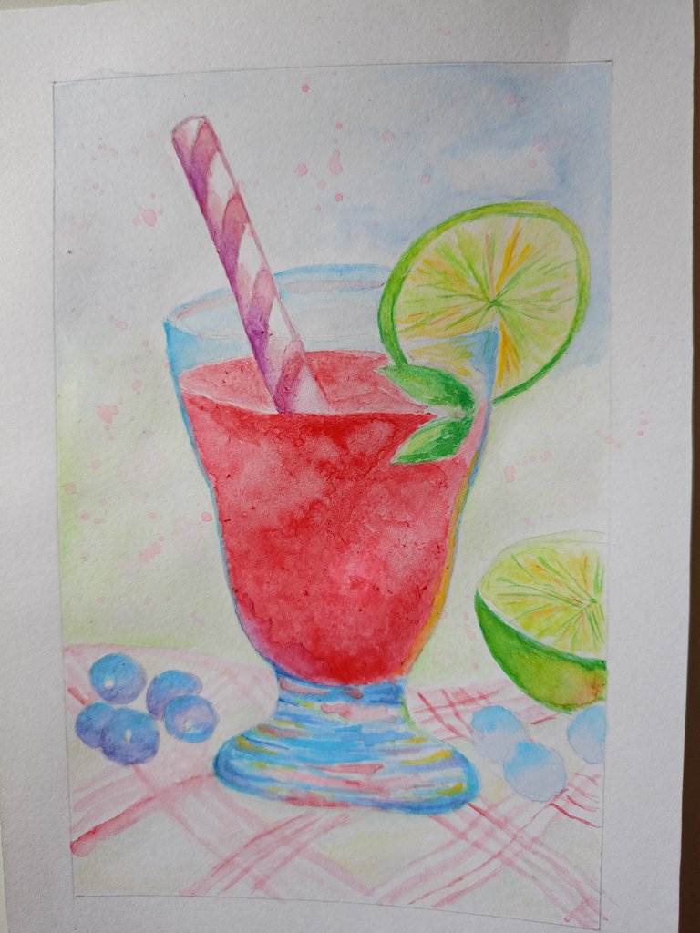
I forgot all about the straw so I painted it here in dual colours for some shading. Then I moved on to the blueberries at the bottom. I added other colours such as yellow, orange and purple to the glass and limes. Then I also painted the placemat in classic plaids.
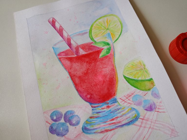
It seemed blurry on the fruits previously so I added darkee shades here which means more purple.
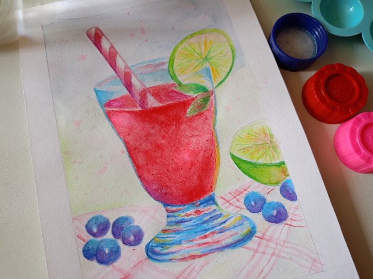
Even more darker shades and contrast for better appearance of everything.

I painted the placemat with more colours because it looked so dull earlier. I also added more paint almost everywhere to make everything more prominent.
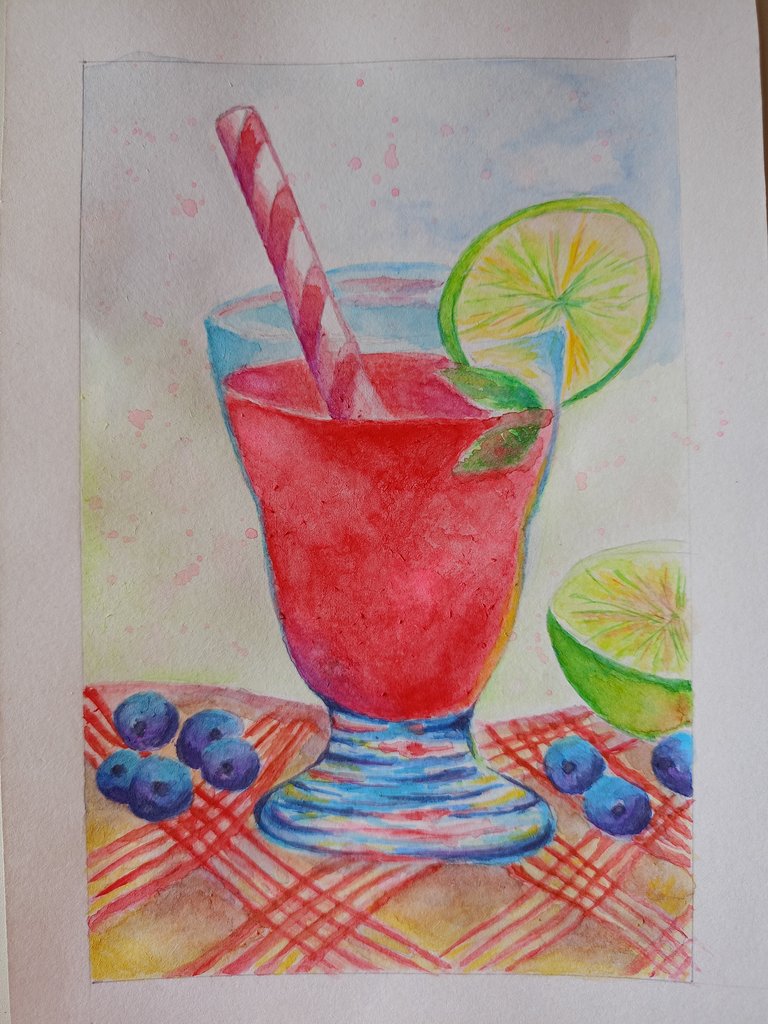
This is the final outcome. I had fun painting this but did not have fun trying to post this some time ago due to some glitches. I'm glad writing this today via mobile went smooth.
Thank you for dropping by and I hope you have a great day!
wow, that's great
Thank you 🙂