
A little while ago I made a piece of art where I experimented with starting in greyscale and transitioning to colour.
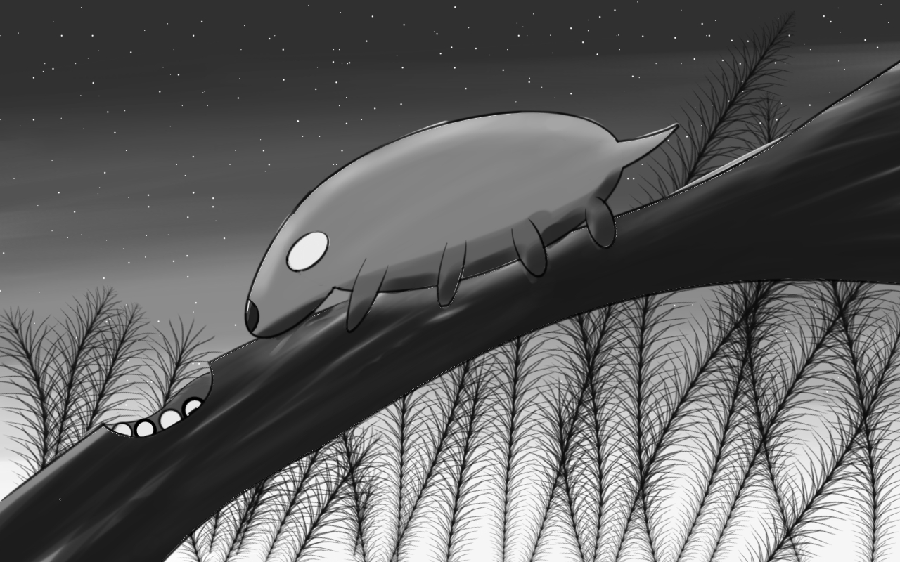
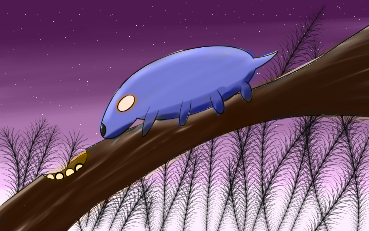
I found the process a bit tedious but I gave it another shot. I gave the colour treatment to another piece of mine where I experimented with a greyscale/colour mix.

The biggest problems with working with grey for me is inaccurate colours. When working with colour whatever I pick on the colour wheel is applied to the piece.
With greyscale on the other hand, the colour varies with the value applied. There are times when I have a colour in mind but can't achieve it. It's a bit frustrating when you want to apply red but what you get instead is pink.
- Autodesk Sketchbook
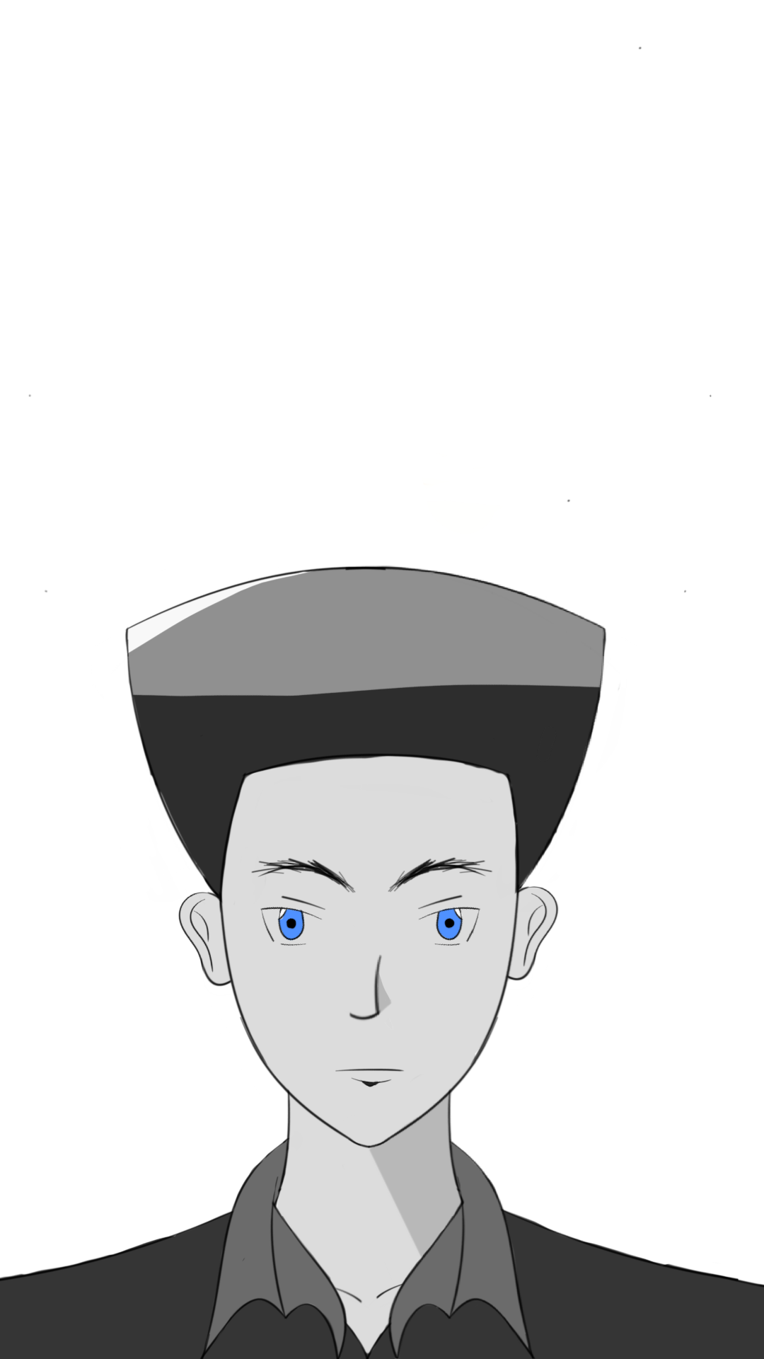
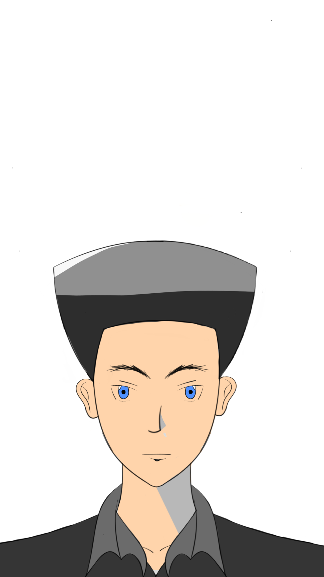
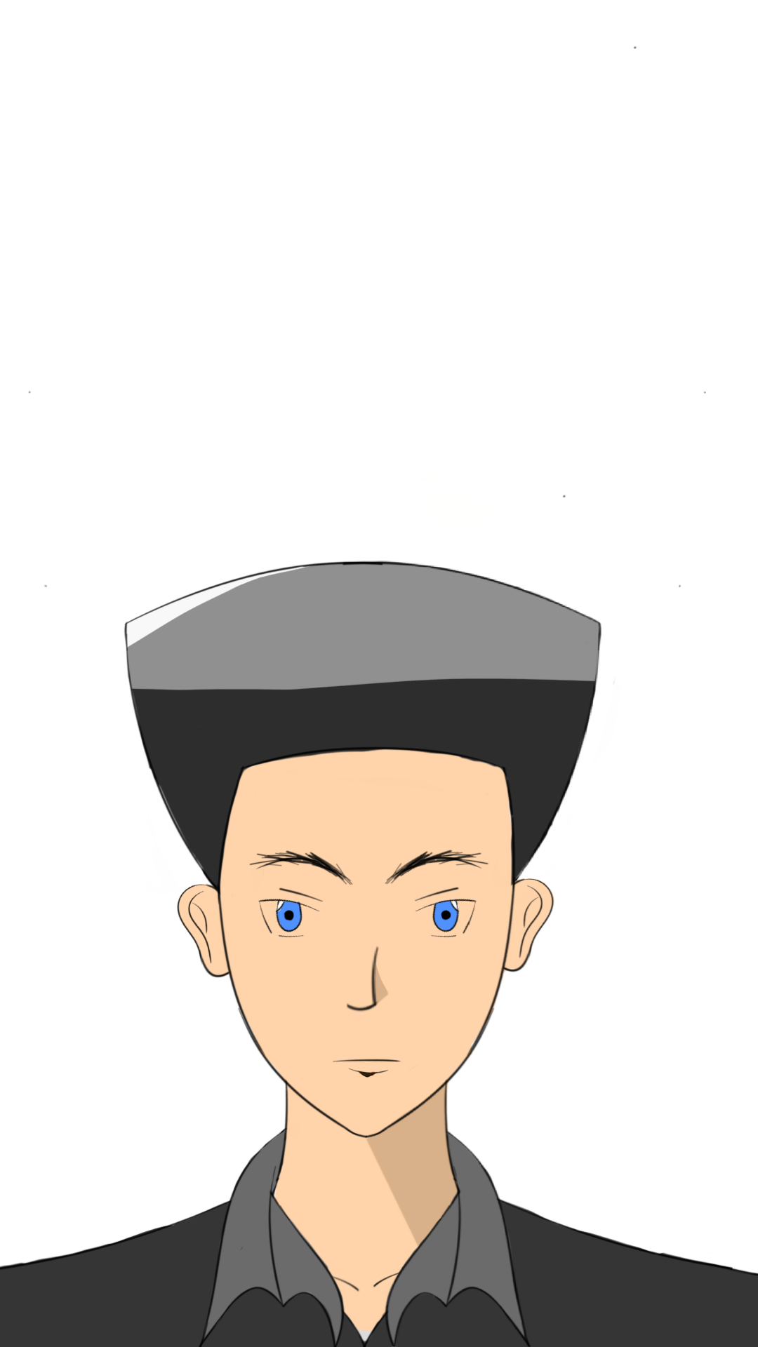
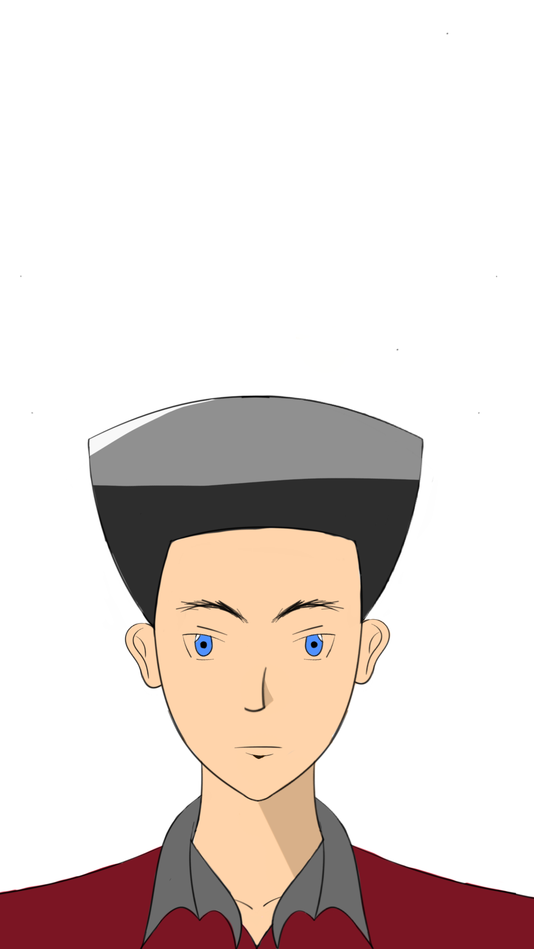

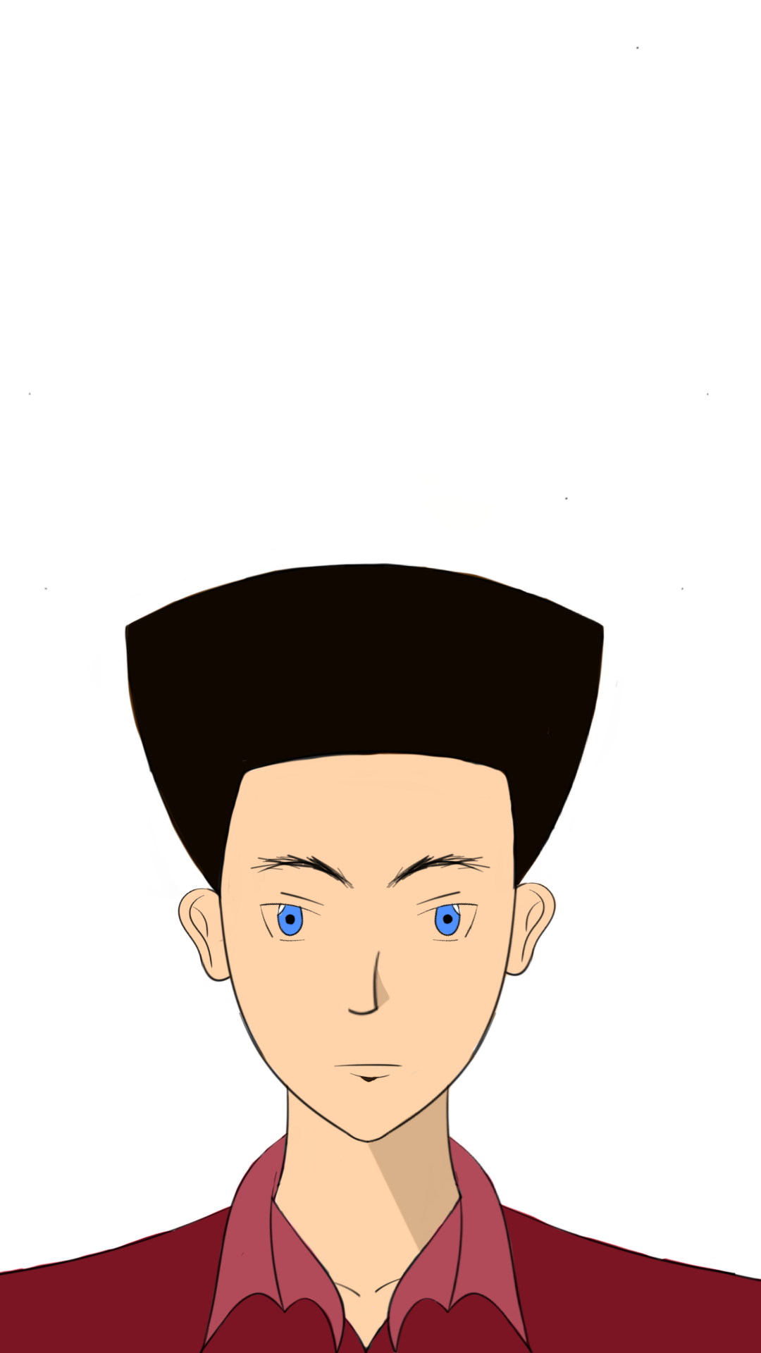

Image credits @jacksondavies

Congratulations @jacksondavies! You have completed the following achievement on the Hive blockchain and have been rewarded with new badge(s) :
You can view your badges on your board And compare to others on the Ranking
If you no longer want to receive notifications, reply to this comment with the word
STOPDo not miss the last post from @hivebuzz:
Support the HiveBuzz project. Vote for our proposal!