How are my dear friends?
This time I want to bring you a topic that I have considered interesting and it is how to get the best out of colors so that our publications are more attractive and showy, thus managing to capture the reader not just with our content.

In advertising there is a subject called color psychology where they explain deeply and clearly the use and management of colors to be able to sell a product, well, taking these aspects into account I have managed to put together a post where I bring some tips that could serve when making a publication.
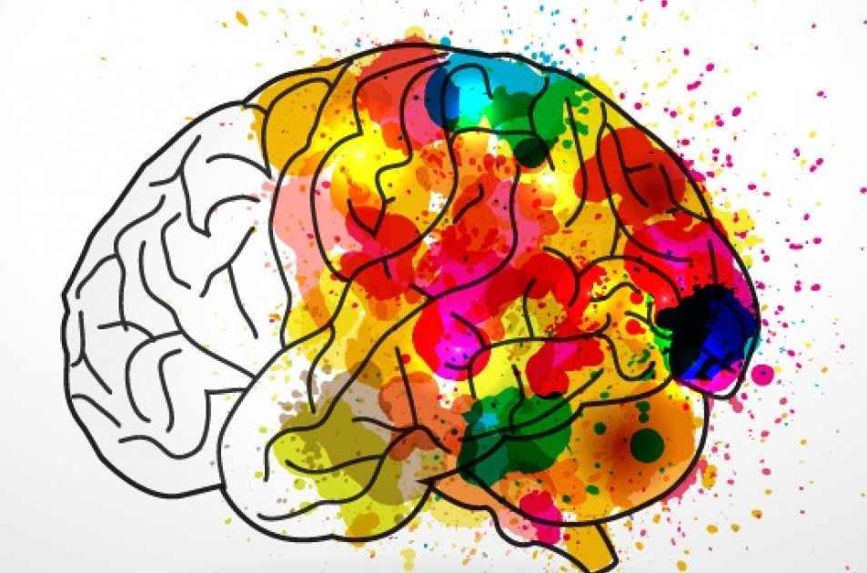
Let's start by going into content about the meaning of the psychology of color, this is a field that studies and analyzes mainly how we perceive and respond to visual stimuli, more specifically Color; Since these are processed in our brain, they have an impact on our emotions.
It should be noted that some elements are subjective since the perception of color can vary between countries, cultures and / or people since the interpretation or meaning is a process that occurs in our brain and is activated according to a previous record or memory.
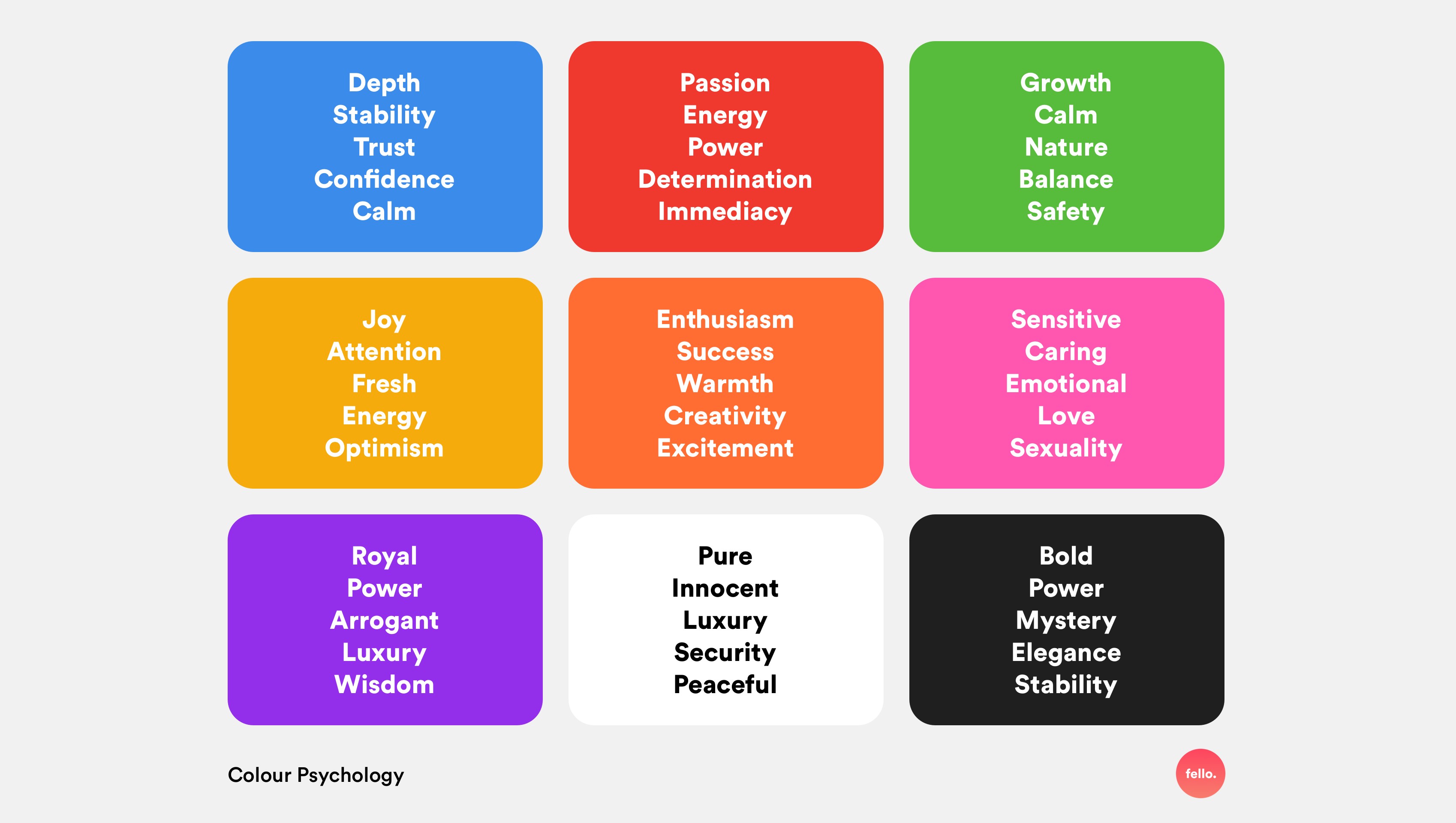
Well, then I show you a summary that I manage to extract based on the meaning of the main colors to use
COLOR MEANING
WHITE
In western cultures, white represents innocence and purity. Also cleanliness, peace and virtue. On the other hand, in some oriental and African cultures the color white represents the color of death.

YELLOW
The yellow color represents gold and sunlight. Like the color red, it can evoke aggressiveness. According to the psychology of color, yellow also symbolizes is synonymous with energy, joy, happiness, wealth, power, abundance, strength and action. Yellow is also one of the most ambiguous colors because it can also represent envy, anger or betrayal. The excessive presence of yellow can irritate our mood, because our eye is used to seeing it in small quantities.

RED
The red hue can be associated with passion, stimulation, strength, virility, and even danger. It is an aggressive color that captures a lot of attention. It is believed that being the color of blood, we therefore associate it with the feeling of vitality, energy and aggressiveness. Wearing the color red could lead us to behave in a somewhat more extroverted way than we are used to.

ORANGE
Orange tones are energetic, bold and warm colors, especially those with the most intense tones. They convey vitality, enthusiasm, action and youth. It can also be associated with sensuality, the divine, and lust. It is a color that is also often linked to optimism.

BLUE
Blue tones are often associated with seriousness and cleanliness. Blue tones convey confidence, which is why they are commonly used by banks, insurance companies and technology companies such as Facebook or Twitter. Being the color of the sky and water, it also represents tranquility, freshness and purity.

GREEN
Green tones evoke nature, freshness, health, ecology, etc. The darker greens convey calm while the more vivid ones are more related to vitality. Green also represents youth and hope.

PINK
Soft pink or pale pink tones evoke childhood, sweetness and innocence. Hot pinks, like fuchsia pink, are associated more with love, passion, and romance.

PURPLE
Purple hues are associated with imagination, nostalgia, and spirituality. It also relates to royalty and evokes high quality. It can represent sophistication and elegance.

BROWN
The brown color is suitable if we want to convey elegance, neutrality, sobriety and simplicity. Being a color linked to the earth, it can also evoke nature, tradition and origin.

BLACK
The black color evokes elegance, luxury, sobriety, authority. In ancient Egypt, black represented fertility and growth. It is a color that has a lot of strength and attention grabber. For this reason, together with the color red, it is usually used in buttons and CTAs (call to action). The color black also has some negative connotations, as it is associated with death, evil and destruction. Due to its close relationship with darkness, I was also able to symbolize the mystery and the unknown.
Why is the management and use of color important in the publication of a post?
Many times we upload images and / or designs made by the author himself to a post where we can subtract or add interest to the content because of how the message we are trying to convey can be displayed.
Saturating a publication with excess colors can result in the reader not being able to concentrate on the message we are trying to give.
The same happens if we make a neutral publication or with a lack of color, it can become a bit boring and uninteresting.
Advice:
- Choose from the color palette those colors that help you convey the message in your post in a more harmonious way.
- Do not saturate a publication with bright colors and / or strong colors in order to keep the reader in the reading.
- If your images are colorful and compelling in their design, avoid dwelling on words and let these images help you convey the message.
- Do not always repeat the same formula because it has worked for you once, you can vary and alternate the use of colors, so you will create a somewhat more interesting profile not only with the topics you can address.
- These are simple tips but don't forget that the most important thing is how you feel and what you want to convey.

I hope this information is useful to you, do not forget to comment, I am interested in knowing your opinion in order to improve and grow in teams
Greetings.-
LINKS USED
https://www.canva.com/es_mx/aprende/psicologia-del-color/
https://psicologiaymente.com/miscelanea/psicologia-color-significado
https://imborrable.com/blog/psicologia-del-color/
https://chet.com.ar/blog/psicologia-del-color-marketing/
https://uxplanet.org/ux-design-colour-psychology-theory-accessibility-40c095cc1077?gi=e5a6ba7b292e
.png)
Nice, how did add the colors?
Place lines saved as JPG, these are anchored as images
Cheers!!
Thanks for this, really educating