Hello A+D members and hive friends!
How was today? It's still early, so I hope we'll all have a nice Wednesday. I've been a little busy lately and a little tired, but I have to keep my spirits up. I hope everyone keeps their spirits up and stays healthy. Anyway, today I would like to share my opinion and photos of the toilet design at my workplace. As I mentioned before that I work in a mall called Gandaria City. So, what I will discuss is the interior design of one of the toilets in the mall where I work. Recently one of the toilets in our mall, precisely on the upper ground floor of zone D was temporarily closed for renovation. Although I work in the same building, I rarely go to that restroom. Hence, I didn't know that the restroom had been renovated. When I found out that the restroom had been renovated, I immediately rushed to visit it because I was very curious about the new design.
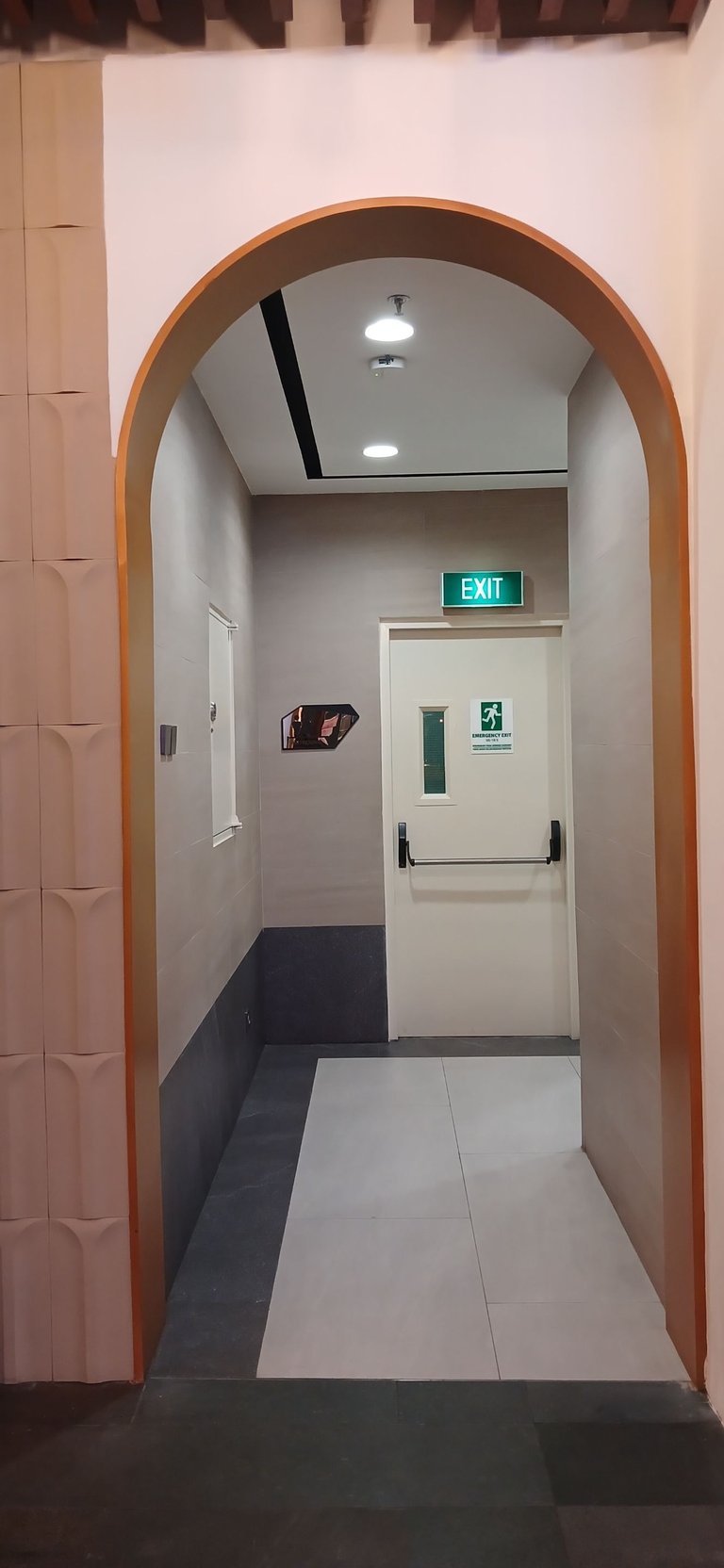
The photo above is the view of the toilet aisle from the mall corridor. The hallway is not too long and then turn to the right slightly to find the entrance to the restroom. The two photos below show how the front of the restroom hallway looks like. The instructions for the men's and women's toilets are bigger and green in color. They used a green plant theme. I think this design is quite interesting. Then the wall on the left side of the hallway is like a light tosca green tile and there was a large mirror next to it. This is also quite interesting.
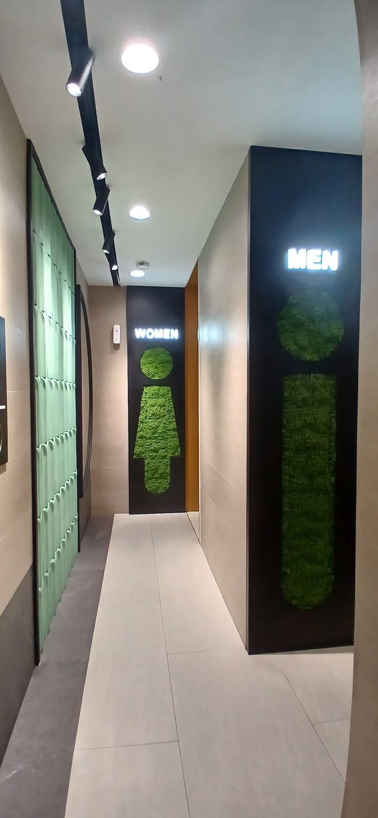
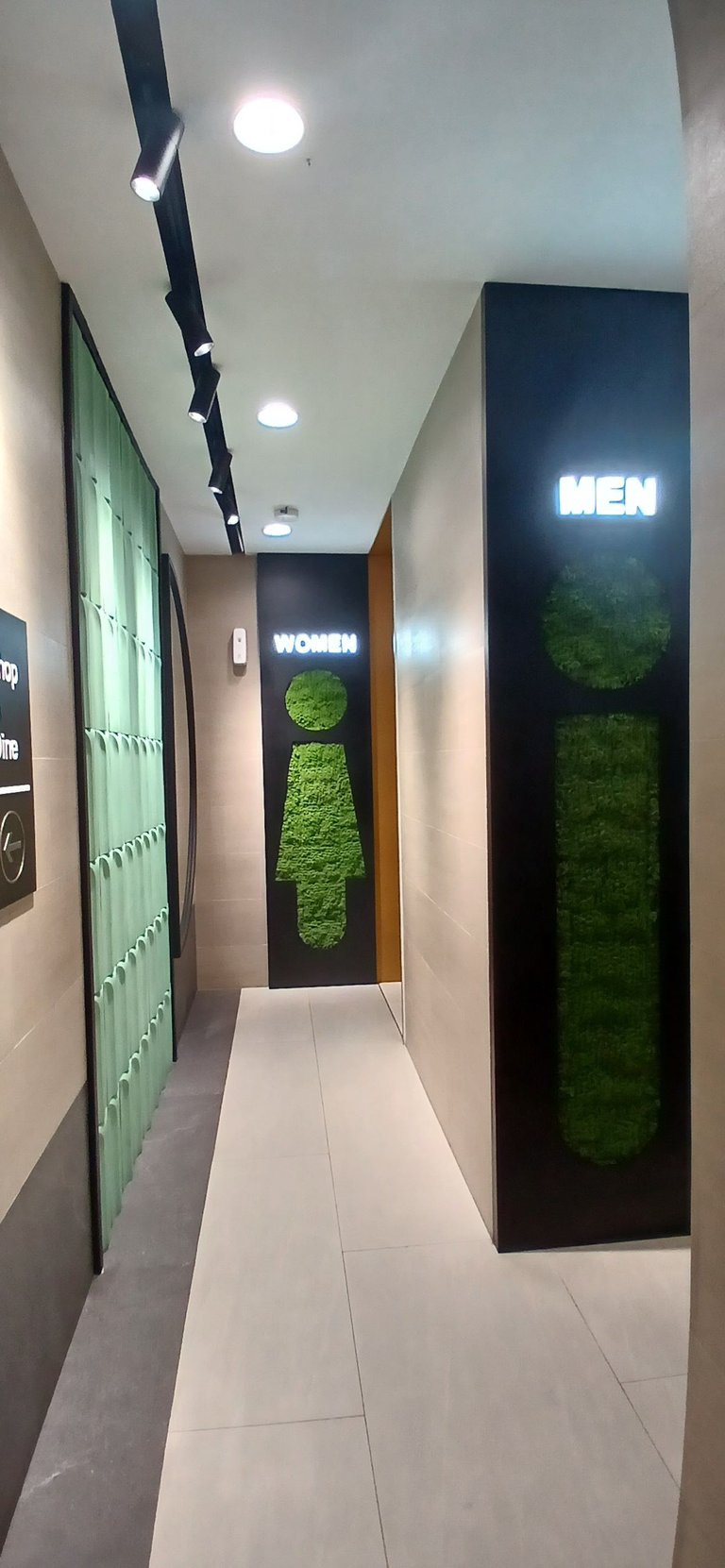
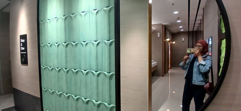
And well when I entered the inner area of the toilet, I spontaneously said "WOW". This toilet is completely transformed. The new design is much better than the previous one. Of course, this restroom has never been renovated since the mall first opened in two thousand ten. This toilet looks brighter than before. The floor was also changed to white color, which was previously dark color. The cubical door is also replaced using wood material and the color is bright. Then in front of the cubical there is a large mirror. I think this part is really beautiful.
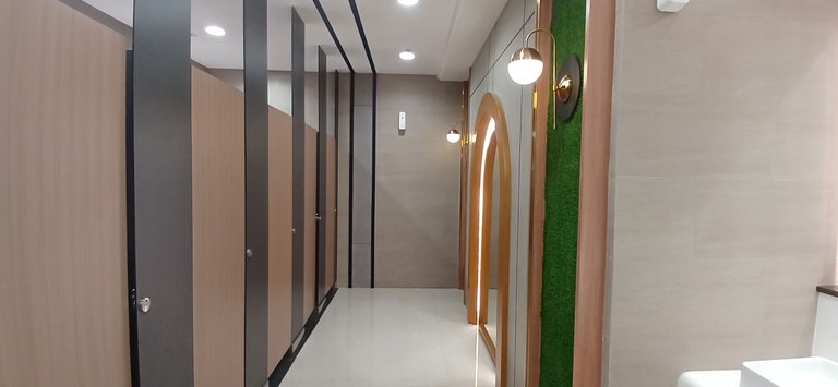
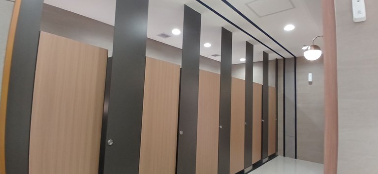
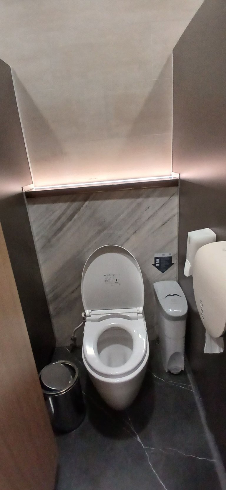
Then, for the area inside the cubical, it looks like the photo below. The floor inside the cube is made different from the outside area. The inner area of the cube uses dark colors. But even so it is still bright because it is given a lamp in the area behind the toilet.
The next thing I want to talk about is the sink area. This area is also very pretty. This area is dominated by white. Starting from the floor, the sink table, the sink to the hand dryer are all white. Only the tissue box is black. On the sink table is a flower pot which I think adds beauty to this toilet. And there was one more thing that caught my eye, the trash can on the sink counter. This trash can doesn't look like a trash can at first glance because it's just a round object between the sink and the countertop. I think it's unique and makes it easier for us to dispose of tissues after washing our hands.
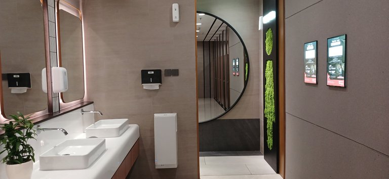
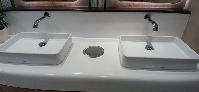
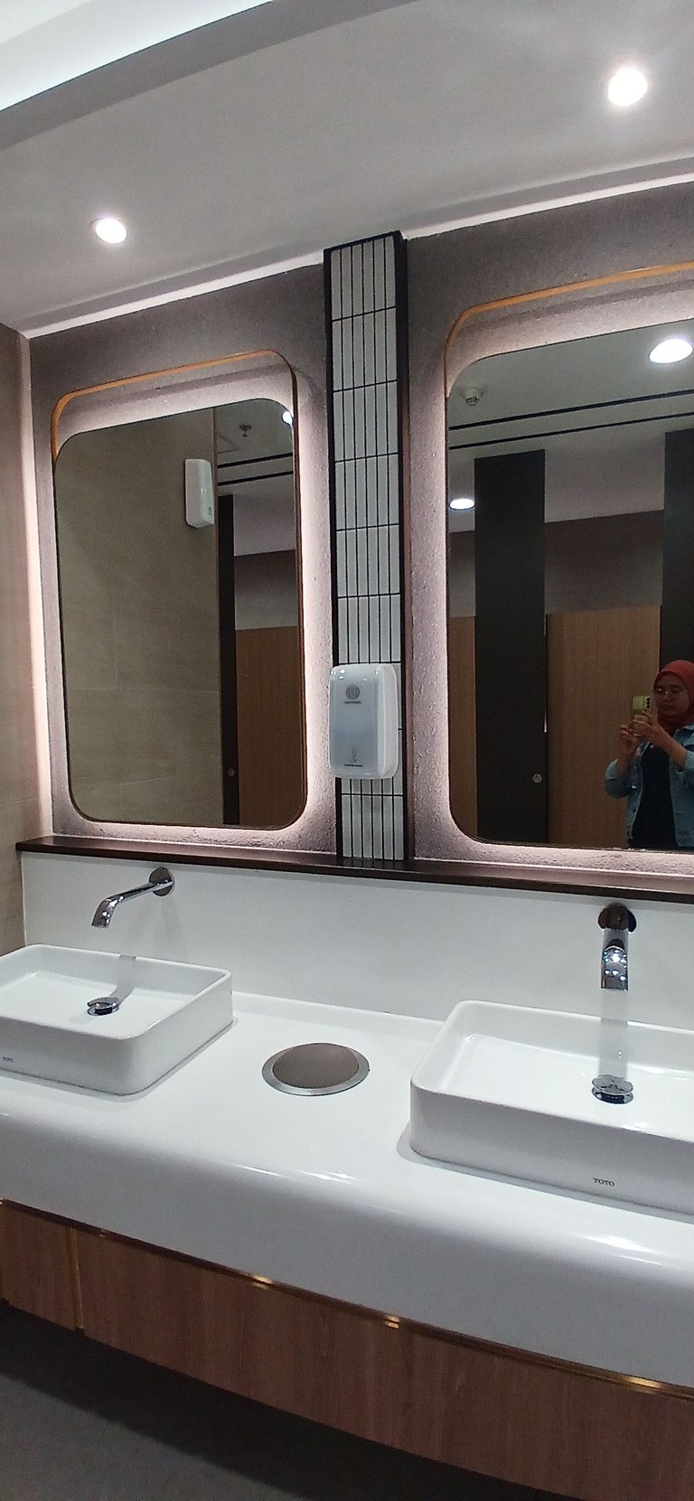
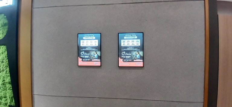
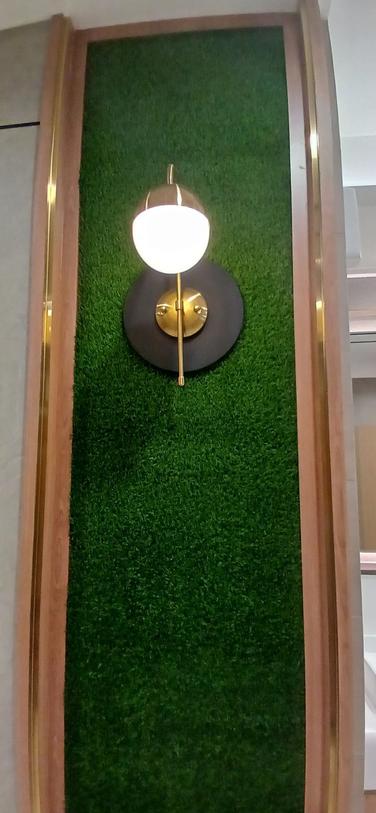
I think the new design looks luxurious. They also added other luxurious touches such as a screen for promotions. There is also a lamp which I think is pretty fancy to put in a restroom. Overall, I really like the new design of this restroom. The design is a bit similar to the new design of my office because the interior designer is the same.
What do you think of the design above? Do you like the design? Thank you for reading this post that I shared and I hope you like it!
All pictures were taken using Samsung A24 by me

Devy Swan
Devy Swan is a girl with a lot of dreams and imagination.She likes cooking, singing and traveling. Recently, in the last two years to be exact, she started learning to write. Although her writing is still not very good, but she has a hope that one day she will have her own book.
Hi @devyswan1, I can say that the renovation of the toilet in Velada complex is commendable because of the brightness inside. It is important to make such changes in the sanitary toilets, which must always be in a clean condition. The green symbols at the entry points for women and men stand out.
Thank you @madushanka ! Always good to read your comments!
Very clean toilet, I'm sure that it is a toilet that smells better than mine!
Because it's still new and someone cleans it all the time, hahaha
Wow, looks very neat and beautiful. I haven't seen it yet. It turns out I haven't visited Gandaria City for a long time
It's cool! Come and see this beautiful restroom!
It's cozy place.. I think Gandaria City has clearest washroom
I think so
Curated Content Catalog and was awarded RUNNER UP in Architecture Anthology™ 64. More power!Congratulations dear @devyswan1! We are delighted to inform you that your outstanding publication was specially selected as an exclusive feature for our
Thank you for subscribing to Architecture+Design, an OCD incubated community on the Hive Blockchain.
Whoaaa! Thank you so much!
You are most welcome dear @devyswan1. Have fun! 😀
What a beautiful design.
The bathroom is a dream, the green areas transmit tranquillity, which is needed on those occasions when we are indisposed.
Thank you for sharing.
My pleasure! Thank you for stopping by!