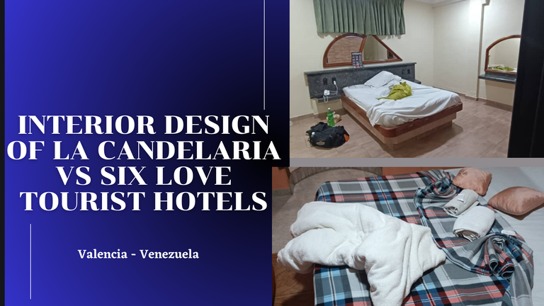
Hello everyone! After a well-deserved break due to my academic activities, I am excited to be back and share this post with you in the architecture + design community. On this occasion, I would like to introduce you to two impressive tourist accommodation hotels located in the state of Carabobo in Venezuela, specifically in the charming city of Valencia. My father had the opportunity to stay at both hotels recently for work, and I want to share with you my impressions and analysis of the interior design of both places. Let's get started!
OUTSIDE
 |  |
|---|
 |  |  |
|---|
 |  |
|---|
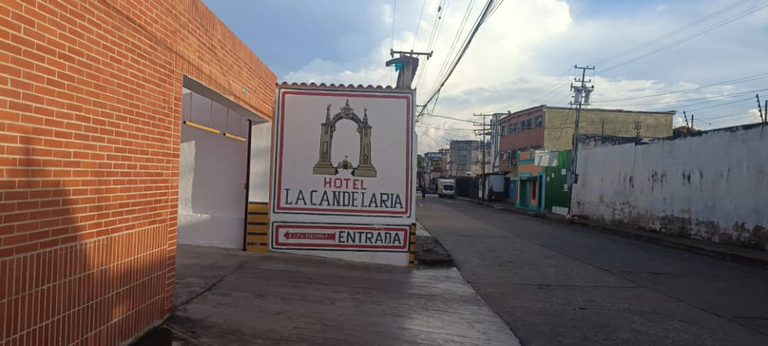
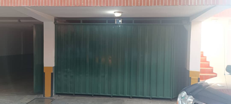
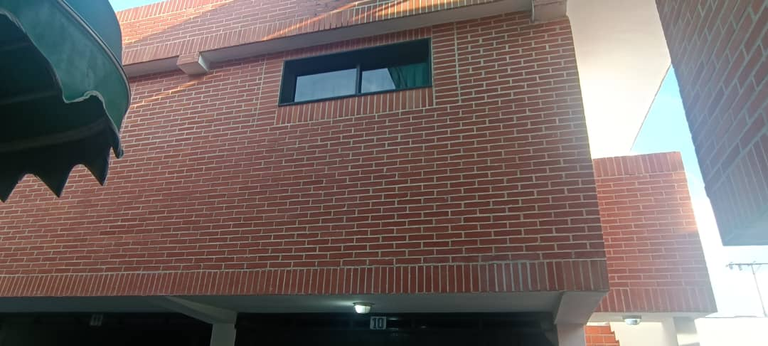
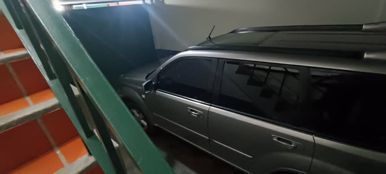
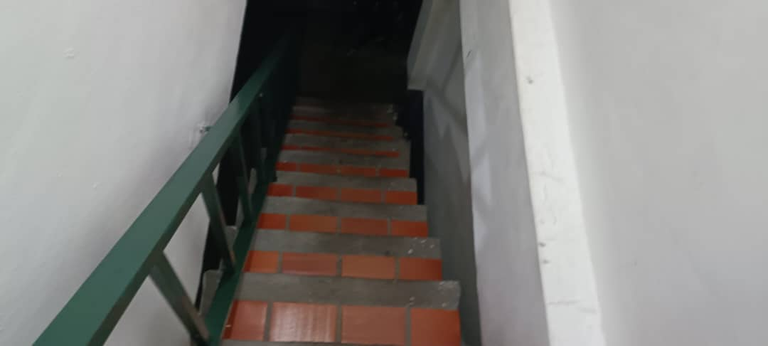
On the first day of his trip, my father was looking for a good hotel to stay in the Valencia area. After asking the locals, he discovered that there were only a few hotels operating in that area, and that one of the best in terms of security and privacy was Hotel La Candelaria. Arriving at the hotel, my father was pleasantly surprised. Despite being in an unknown place, the first impression he had was that the hotel was ideal both for family accommodation during future vacations and for a solo traveler like him.
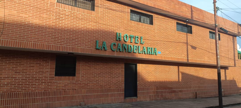
According to my father, one of the things he liked most about La Candelaria was its simplistic façade, decorated mainly with bricks. This material not only gave it visual appeal, but also demonstrated the durability and resistance of the hotel structure against the common challenges of the tropical zone in which it is located.
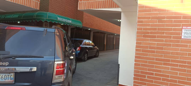
Another aspect that my father highlighted in a positive way was the security of the hotel since, being designed as a low-rise building, the parking lots are located on the ground floor, offering a private and secure space for visitors' vehicles. In addition, the stairs that lead to the rooms are located within the private parking lots, which prevents the arrival of unwanted or drunk people at the doors of the rooms of each guest, therefore it should be noted that the rooms as well as the The parking lot is protected by an internal manual security system that is difficult to violate, which is why each of these details is what gave my father a great sense of security and tranquility during his stay, which consisted of a 12-hour stay. for a cost of $15.
INTERIOR DESIGN
 |  |
|---|
 |  |  |
|---|
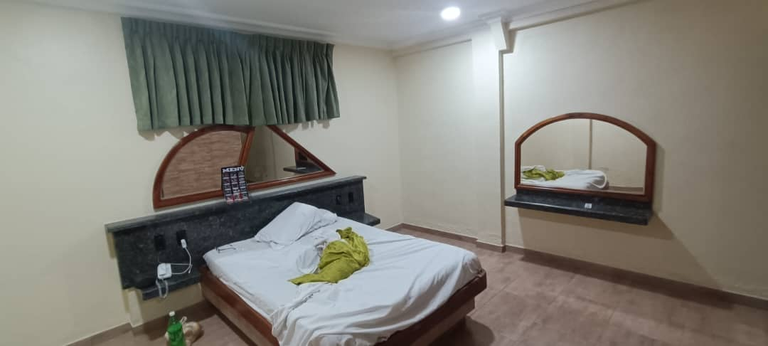
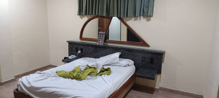
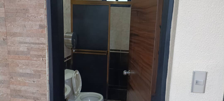
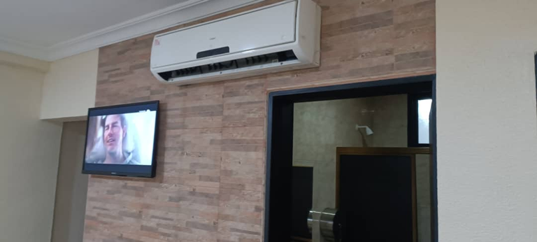
For my father, the most important thing in a room was the presence of efficient air conditioning plus the location of the bathroom and the quality of the mattress as important factors for his stay, since in this way he could sleep in peace and tranquility.
Therefore, finding that all these requirements were fulfilled within the room of the Hotel La Candelaria, he went to sleep without paying much attention to the internal design of the room.
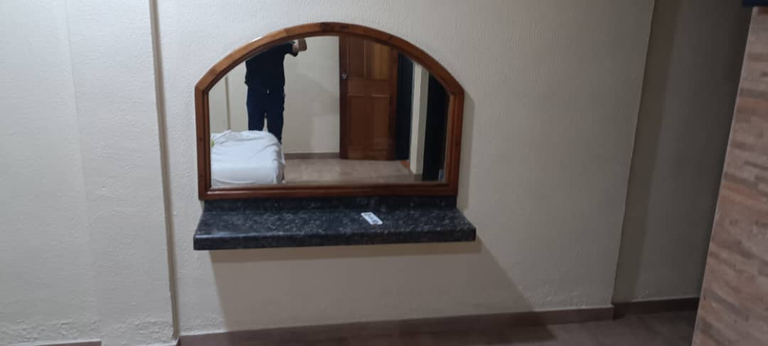
On the other hand, my mother and I, as women, were able to appreciate to a great extent through these photographs the design of the room, especially the presence of a mirror since from our point of view a mirror is the main tool to know how to We are dressed. We also agree with my father's opinion on the importance of air conditioning and good lighting, as well as the quality of the sheets and bedding provided by the hotel.
However, we noticed a mistake in the location of the only window in the room 'because it was in a very high area and behind the head of the bed, which prevented my father from enjoying the view from the room; although after many hypotheses and exchange of ideas together we came to the conclusion that the reason behind this location, which was to preserve the air conditioning of the equipment before sight, since its exhaust can generate humidity inside the rooms that later can proliferate in fungi unsuitable for hosts.
Therefore, in summary, although my father focused on the more practical needs of the room, my mother and I valued its design and aesthetics because, despite being somewhat minimalist and simplistic, it is suitable for all kinds of people. As of situations and despite the failure in the location of the window, we understood the importance of maintaining the air conditioning and cleaning the room as part of a measure to keep the structure itself in good condition.
SIX LOVE HOTEL FACADE
 |  |  |
|---|
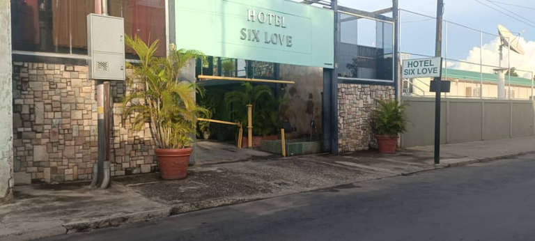
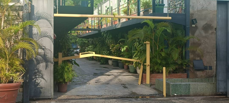
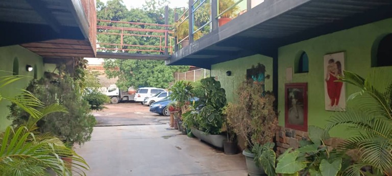
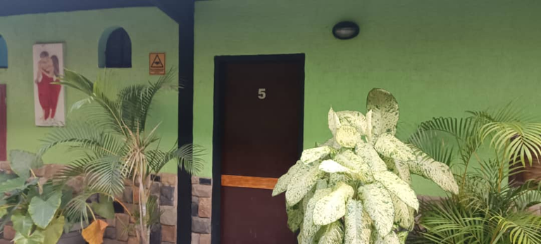
Unlike the previous hotel, this hotel has a more open feel and less fencing, which can make it a bit less safe for guests and their vehicles. However, my father decided to stay there mainly because of the rate, as the price was similar to the previous hotel, with a rate of $15 for 12 hours, increasing to $20 on weekends.
As for the hotel's façade, the choice of the name "Love" might have been disturbing to some guests, as the word is commonly associated with love relationships; however, the atmosphere that the hotel conveyed was quite the opposite, with an exterior design that highlighted the natural environment of the place thanks to the placement of multiple real plants and the use of apple green on the walls, in contrast to the mosaic of earth tones, gray and black that covered half of them.
INTERIOR DESIGN
 |  |
|---|
 |  |
|---|
 |  |  | 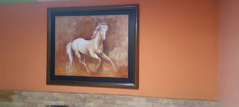 |
|---|
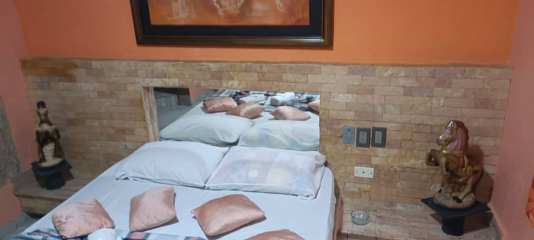
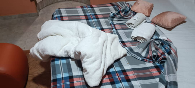
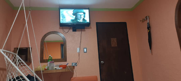
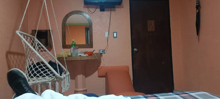
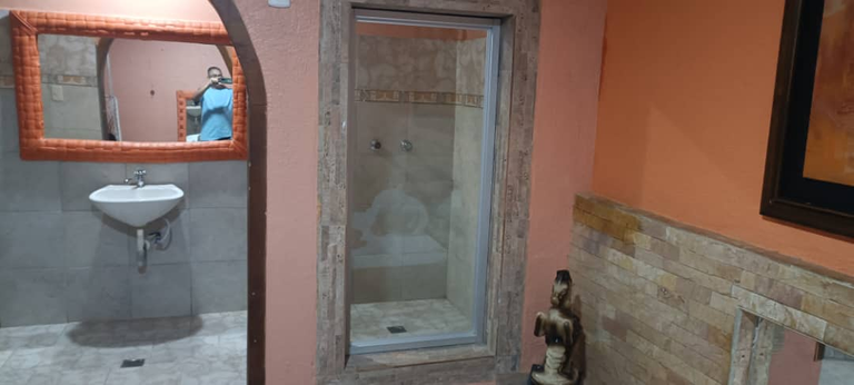
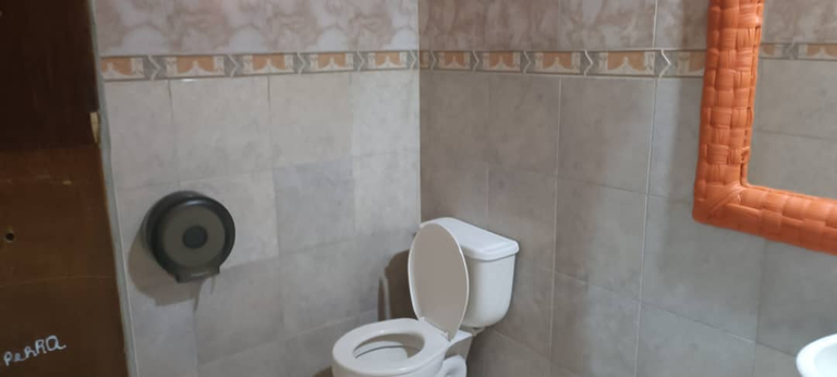
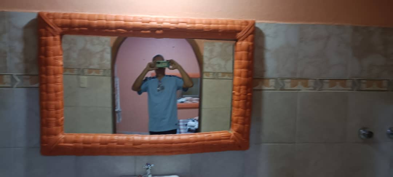
As in the first hotel, my father focused on the practical aspects of the room, such as the position of the bed, the air conditioning and the bathroom. In this hotel, these requirements were satisfactorily fulfilled and, in addition, my father was pleasantly surprised by the additional details that the hotel offered, such as the extra blanket for all rooms and the suspended chair in the air. This last element had a design according to the natural environment of the place and contributed to my father having a more pleasant experience than in the first hotel.
On the other hand, both my mother and I were impressed by the appearance of the hotel, as the pictures showed a really nice atmosphere. The colors used both outside and inside the room encouraged joy and were unusual in other hotels. Also, the color palette was suitable for any guest, which we consider to be a plus for the hotel.
We agreed with my father that the suspended chair was a unique and different detail that is not usually seen in other hotels; however, we also noticed a negative detail in the bathroom as the shower had a large opening that was only covered by a glass door, which may not be suitable for underage children as their privacy may be compromised unless that they are accompanied by a responsible adult who ensures their safety; therefore I thought it important to highlight this detail so that guests are aware of it and can take precautions if necessary.
LOBBY
 |  |
|---|
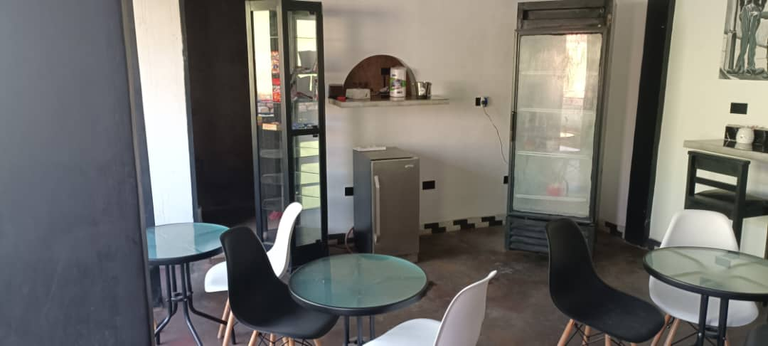
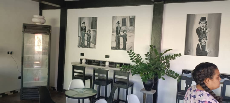
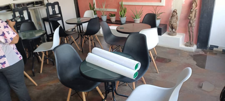
A lovely and very beneficial aspect of the Six Love Hotel was that it had a lobby for guests. This space was ideal for those who wanted to take a breather after a tiring day and relax in a different environment from their room. In addition, in the lobby there was a refrigerator with drinks for sale and multiple chairs and tables that allowed guests to carry out different activities.
CONCLUSION
From my father's point of view, both hotels deserve a perfect 10/10 rating. The first hotel offered a closed and minimalist structure that gave the guest great benefits in terms of security and privacy, while the second hotel had a larger bathroom, a suspended chair and more sets of sheets, such as the spaciousness of the lobby space that They made up for the lack of fencing and protection for guest vehicles.
As a daughter and a writer myself, I find that both hotels feature unique exterior and interior designs that clearly set them apart. This is a point in favor, since each guest can have a unique experience and tell their friends and family about it. So, like my father, I would give both hotels a perfect 10/10 for meeting all the needs they were built for and offering a unique experience to their guests.
Note: All the content is original and was authorized by my father who is named Guillermo López to publish how to use the images for said publication and advertising.
Narrative and writing are carried out by me in an original and personal way according to our personal impressions as a family experience.
Application used to make the cover: Canva.
Translator used: Link