Architecture and dynamism are related to each other. Architecture is changing from time to time, if we see the history of architecture, we easily can understand the growth of architecture so far. I personally feel dynamism is a thought or a movement that varies from person to person's perception. To remove the boredom of a building, sometimes an architect change forms or formulate a new element according to the design considering the climate. It's not necessary that all elements need to be functional. Sometimes it doesn't meet the need of human criteria therefore dynamism is all about introducing new techniques and new methodologies and implement them in a form or in a design.
Architect Zaha Hadid was always my inspiration, she was like a queen of futuristic elements. Now many architects work on futuristic designs and elements but she was the one who thought about futuristic forms, techniques, and designs. Her concept of thinking design always inspired me to work on dynamic forms. When I was a student, I always gave priority to building forms using new techniques instead of focusing on functions. There is always a debate among architects, some say forms should follow functions where others say functions should follow forms. I was the one who always focused on innovations, I wanted to design something unique and that's why I often ended up with a lot of difficulties as well.
I never kept myself rigid or in a confined position when it comes it exploring architecture. I liked to work with diagonal lines, curves, and free-flowing forms. Honestly, I miss those moments, it was another world where I used to give my imagination in a form. A few days ago someone asked me about my educational background, when I said about architecture without any further thoughts he said, oh architectural engineer. I was silent because there was no point to argue because the person doesn't know what is architecture. I have never seen architecture in a regular rigid way, I always felt that architecture is a vast and diversified subject than others.
Regional Service Center
A few days ago I went to the regional service center that was located at Traktorobudivnykiv Ave. Normally I go to the regional center that is located at Shevchensky District within Kharkiv Oblast. But to fix some of my documents, I had to go there. I have never been there before so I had no idea what was waiting for me.
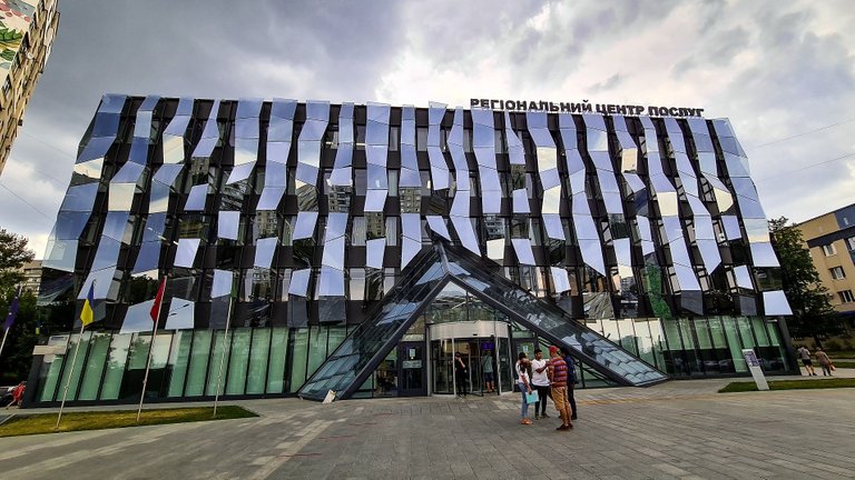
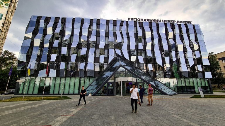
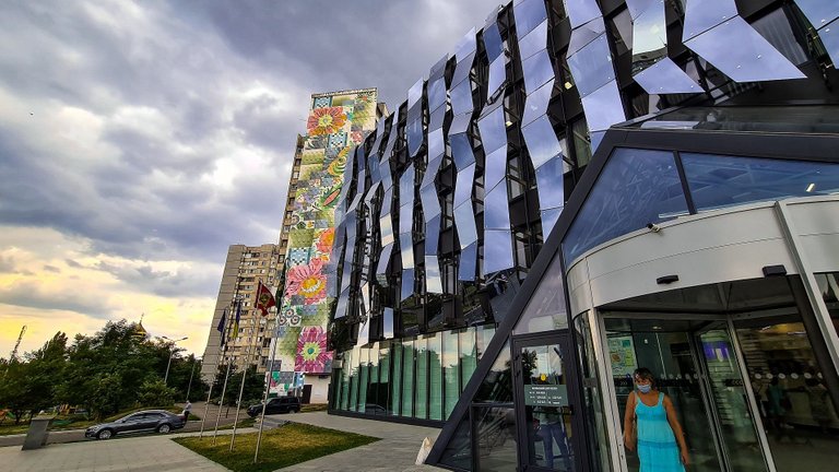
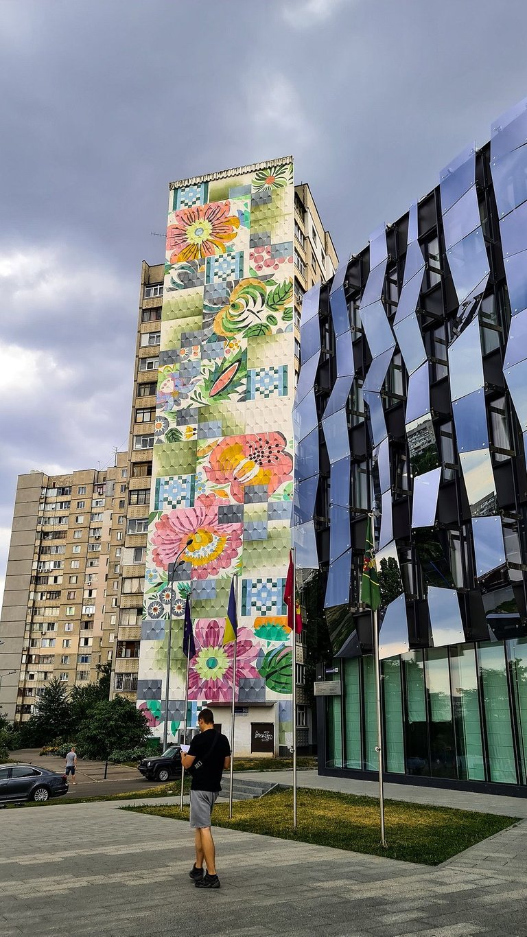
When I reached there the first thing that caught my eyes was this pure rectangular-shaped form with unique elevation. I have mentioned before that in Kharkiv anybody expects aged old society building when it comes to deal with government papers. Most of the government offices and administrative buildings are from the Soviet period so it was kind of shocking for me to see such a building in such a location.
Surrounding context:
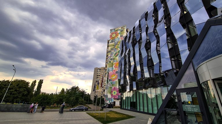
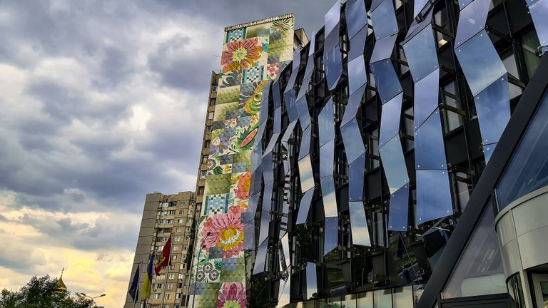
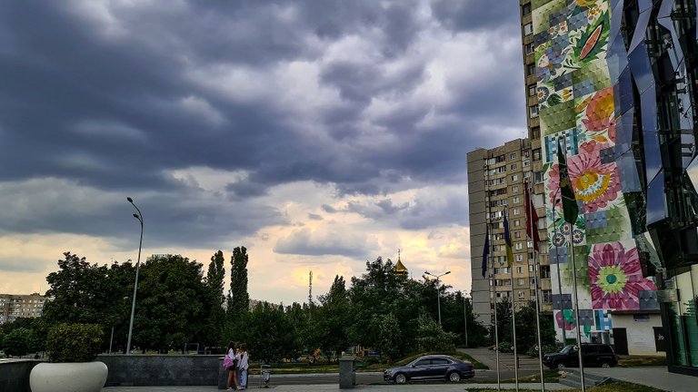
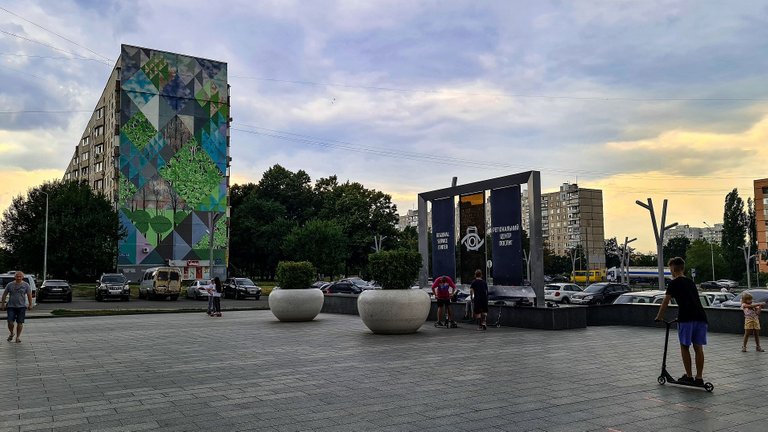
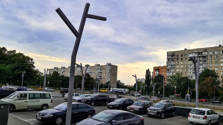
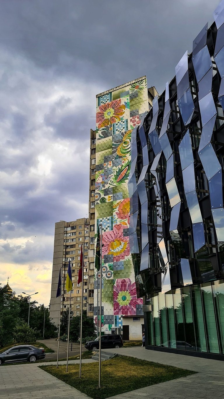
Before entering the building I decided to observe the surrounding context, it was a residential area. Traktorobudivnykiv Ave is actually known for residential buildings so office buildings in such areas express contrast vibes. All residential apartment buildings are from the soviet period, a church is located nearby. I would say the area is excellent and constructing such office buildings in such areas can be challenging as well. I guess without any second thought, architects had chosen modern design instead of following soviet architecture. Probably, they wanted to make this building unique, ironic so that anyone can easily find the office.
The building itself is one individual rectangular form. 5 storied office building, Very simple form but the elevational treatment made the entire form unique. From far away, this form looks really beautiful.
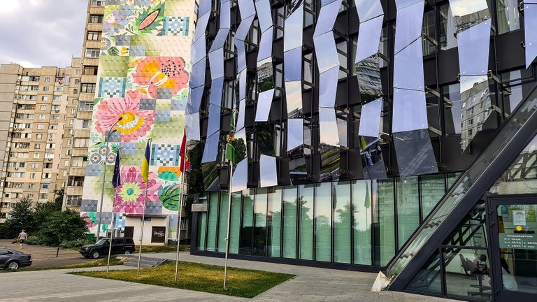
Infront of the building, there is a beautiful plaza and open space. Parking space is also organized and detached from the main entrace. I mean if you want to enter the building, you have to walk on the beautiful concrete plaza.
Entrance:
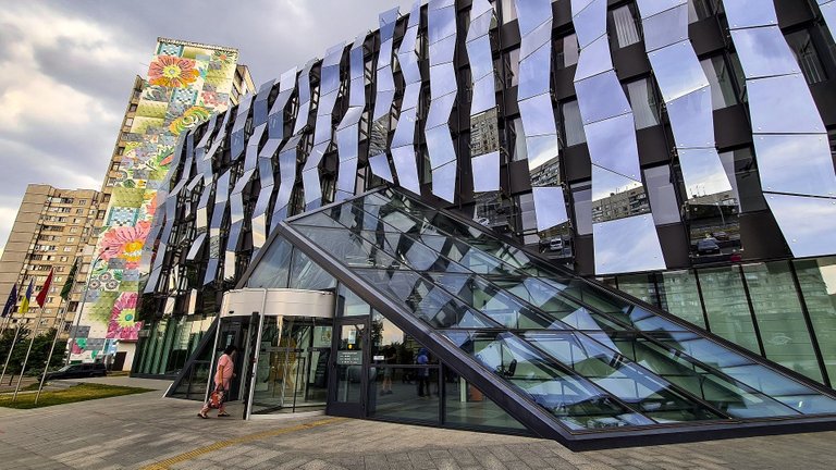
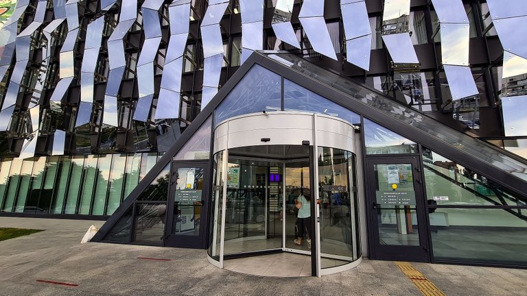
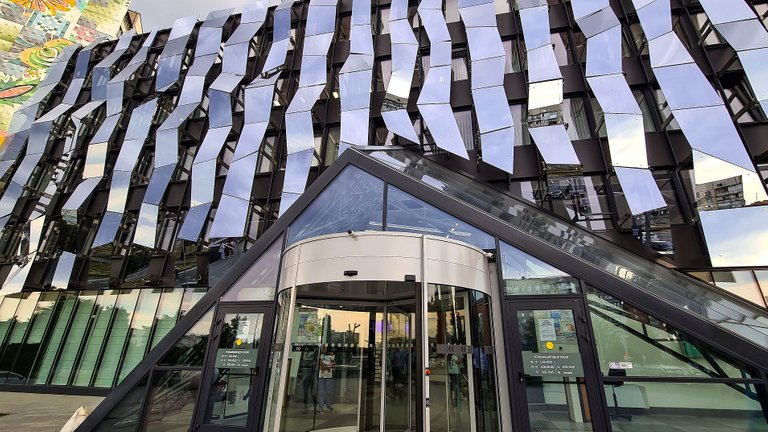
The entrance of the building is different, from far away you won't understand the entrace. I think the architect didn't want to highlight the entrance and his focus was to grab the whole attention of the building. The entrance is a small triangular form that is interlocked with the mother rectangular form. The form is made of glass and steel and completely blended with the mother form.
The entrance itself creates a dynamic form and also created some negative spaces within the form but it doesn't matter I guess...
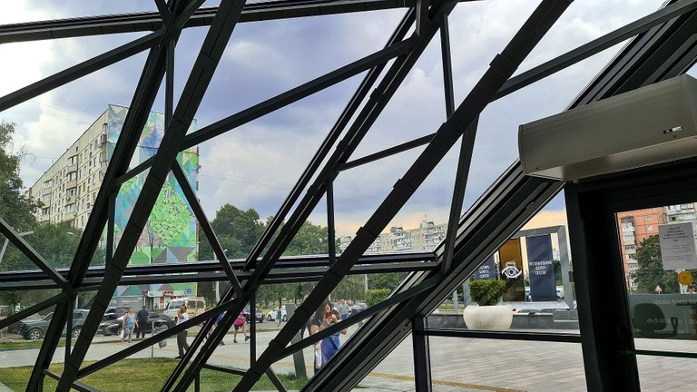
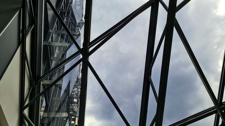
Here are some pictures from the inside of the triangular entrance. Complete truss structure and glass material.
Exterior facade:
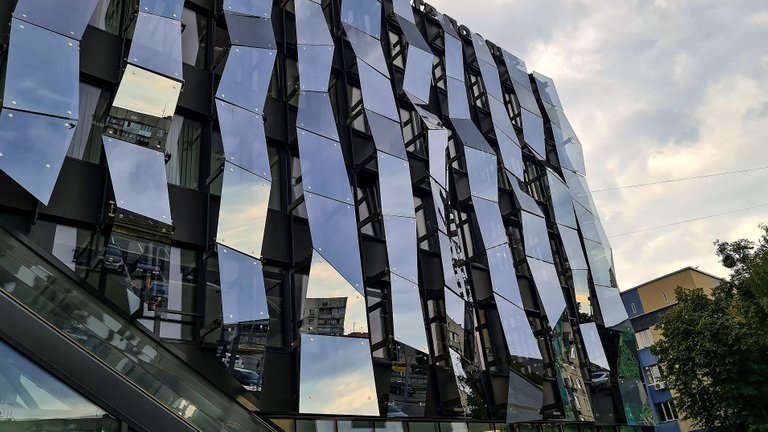
That's the beauty of the entire building. Different shapes of glasses panels were placed in such an inclined way and connected with one another that created a strip-long pattern. Glasses are tinted and glossy so, during daylight, it reflects. The interior of the building is away from direct sunlight and these glasses are working as a shading device. During snowfall, also the front elevation of the building stays protected and due to inclined glasses, snow doesn't stick at all. There are also climatic considerations as well which I actually don't know. Haven't done any further research...
Interior:
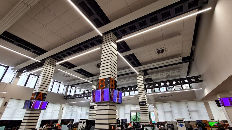
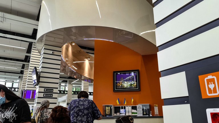
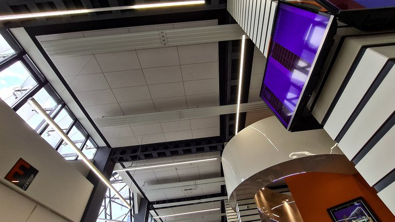
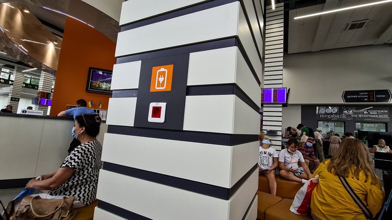
The interior environment is completely different, the world of groove lines. The only reception area is different and the round elliptical-shaped false ceiling made it different from the office zone. One can easily understand and identify the reception area. Also, the color of the area is different as well. The floor height is around 15 feet height, a big vast floor with a large office area. The groove lines of the columns and ceiling design made the interior different...
I don't have much to say about the service and other things, they are official and regular like before. But the environment they are providing to everyone is truly recommendable. I mean Kharkiv people are habituated with the Soviet culture so this kind of modern design is new to them. But honestly, I love the system and building structure as well.
My final thought is it's good to see something interesting especially different and modern architecture in Kharkiv. I have mentioned before that the city is developing and this is the beginning. Probably will see more different forms and architecture here in near future...
That's all for today, folks...
Until next time... Have a nice day everyone...
Thanks for reading my blog...
Love
Priyan

Explore Life with Priyan...

"I am @priyanarc... An architect, a dreamer, and a passionate writer who loves to write about life. I try to present my own perspective and experiences. Please leave your feedback and criticism because it's the only way I can know and reach your mind and thought easily..."

Find me on youtube...
Don't forget to subscribe to my channel...
You can find me on Twitter...
Original post written by @priyanarc...
All the pictures used are captured by the author...


If you want this kind of GIF for yourself, Let me know...

@tipu curate
Wow, that looks quite crazy! Thanks for all the terrific shots and article, too! 😎
Thanks a lot man :D
Hello Friend
I like that building, it seems that it moves and that is very interesting.
You know that I have no studies in architecture, but if I have an active mind and I agree with what you say, I like the new and give it different, more airy and informal forms, I suppose that will be more difficult to put into practice, but you have to modernize.
The building is beautiful outside and inside
Happy day
Completely agree with you, research and creativity always help to come up with something different. We always appreciate free-flowing forms though it's hard to handle. But now the world is modern so anything is possible...
Thanks a lot for reading my post, appreciate it...
Sin duda es la mejor de las simbiosis
Thank you...
wow apu this design is totally bomb 💥 I don't know if it will ever be possible to see these in reality. However, looking at your posts, I am very interested in Ukraine.
Welcome, I try to show different structures and locations of Ukraine, especially in Kharkiv...
It is an awesome looking building that for sure and I like it!
Architecture Brew #37. Congratulations!Well done @priyanarc! We're happy to inform you that this publication was specially curated and awarded RUNNER-UP in
Subscribe to Architecture+Design, an OCD incubated community on the Hive blockchain.