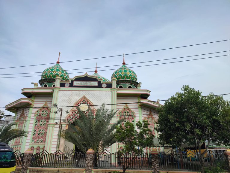
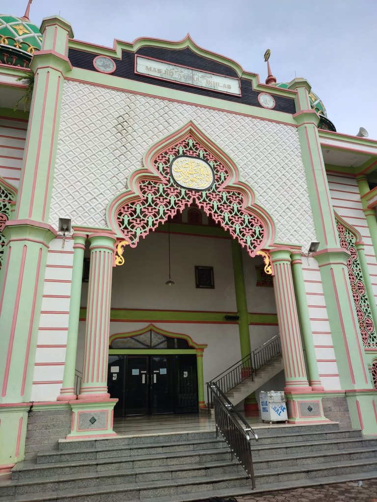
Hello HIVE friends in this community. I never get bored showing the many architectural buildings in my province and tonight I will share the beauty of the architecture in a small town called Tanjung Pura City. There are many beautiful buildings in this city, but tonight I will highlight the beauty of the small mosque that I accidentally stopped at because I wanted to get a free drink and rest here before I continued my journey to Aceh City. The name of this mosque is the Nurul Ikhlas Mosque, from the building I can see that this mosque is quite old but has started to be polished a lot so that it stays put and looks fresher.
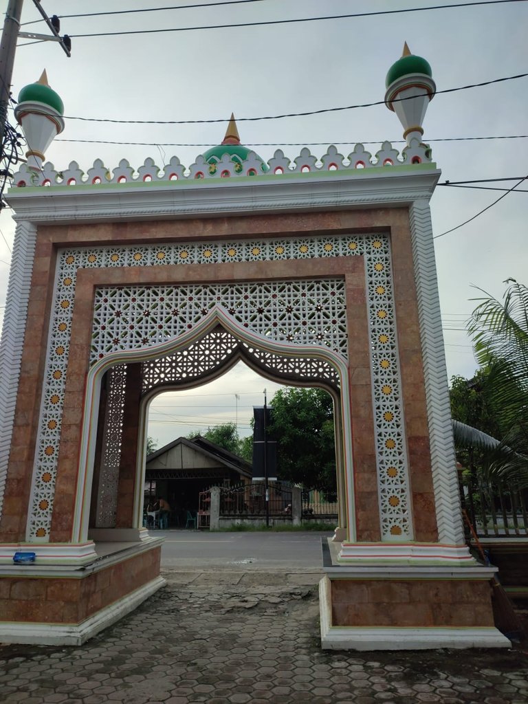
First, I will show you the entrance gate to this mosque. The mosque has a very beautiful gate. The color is not too flashy but has its own style in design which highlights the use of wall panels, natural stone and the use of relief art, the work of which must be done carefully and carefully to have a smooth and perfect design. We can find this relief style on the right and left side which resembles fish scales, then after that there is natural stone which is added with brown paint, then the natural stone flanks the wall panel which has been shaped with a factory design and just needs to be colored. then at the top there is a dome symbol to indicate that the building is a mosque. And this gate was built very sturdy with a diameter of more than 1 meter wide so that visitors can also sit there.
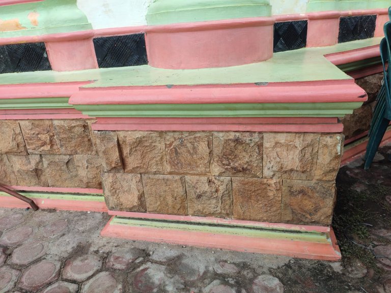
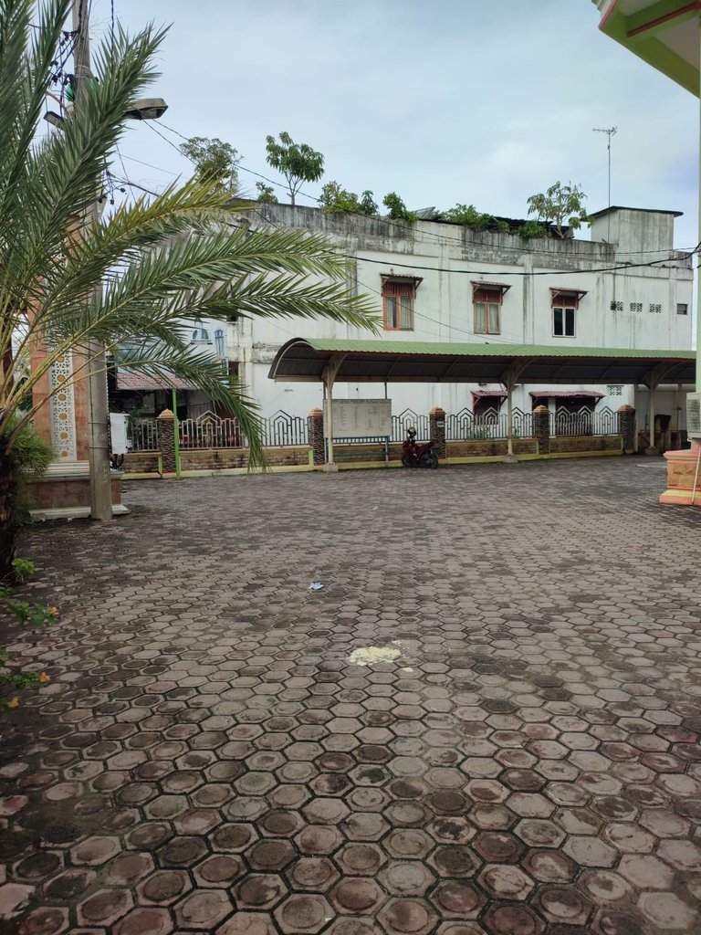
With a large yard and date palm trees on several sides of the mosque. I found an acceptable fact here that the basic concept of using building materials in this mosque is the same, namely the strength of the relief sculptures, the use of wall panels to decorate and the allure of the design itself which is then strengthened by the use of natural stone as a symbol of luxury in our city. Because natural stone is a little expensive compared to other materials, even though the price is far below marble, and you can see for yourself. The use of paint that is not too prominent with a simple concept makes the use of this wall panel much more prominent and makes it a mainstay design in the mosque.
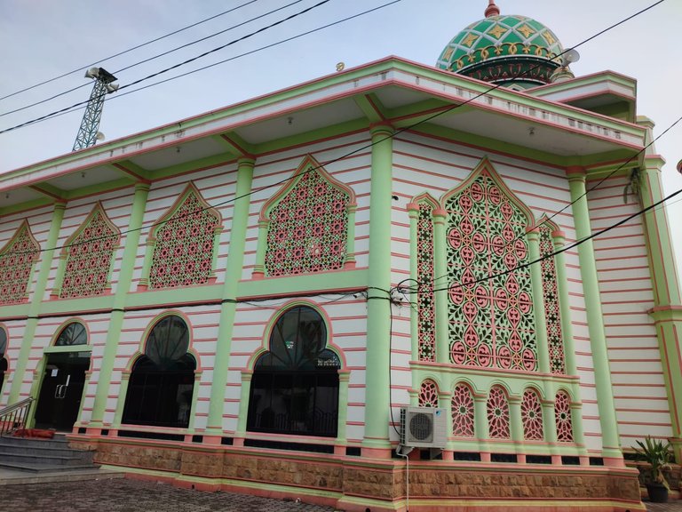
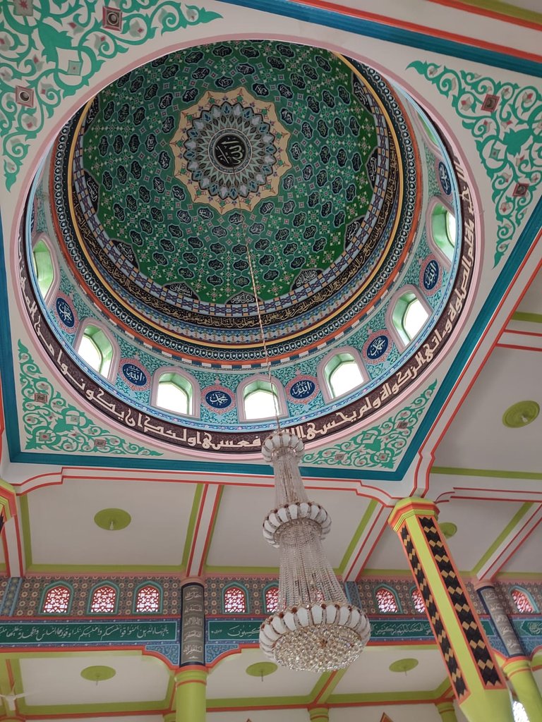
This mosque consists of two floors and when I was about to enter the mosque next to the second floor stairs I could see again the same concept that was used with the addition of a frame of typical curves in a mosque building, so that when we were about to enter the main building of the mosque we did not immediately entered the mosque but was faced with the gate that I indicated. And after entering the mosque, several of the supporting pillars are green and the ceiling is made of cast cement with a square pattern with different color gradients on each side, making this mosque look fresher.
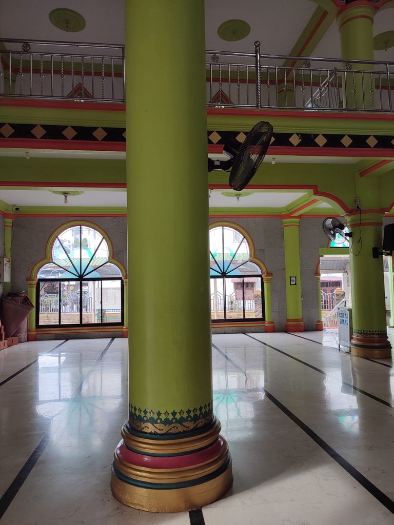
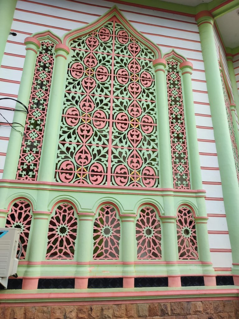
The use of hanging lights on the inner dome which are not too big is a little unbalanced with the design of the inner dome which looks very majestic but I don't think it's too disturbing. It's just that in my opinion, if the decorative lights used were much larger, the conclusion would be that the inside of this mosque looks much more luxurious and shows its own class. However, this does not reduce the overall design level of this mosque.
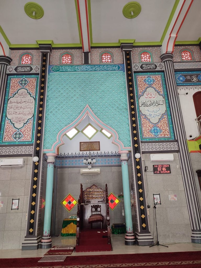
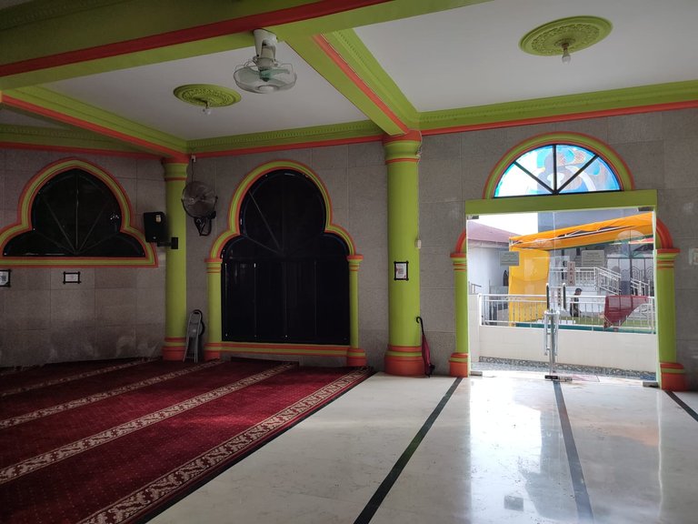
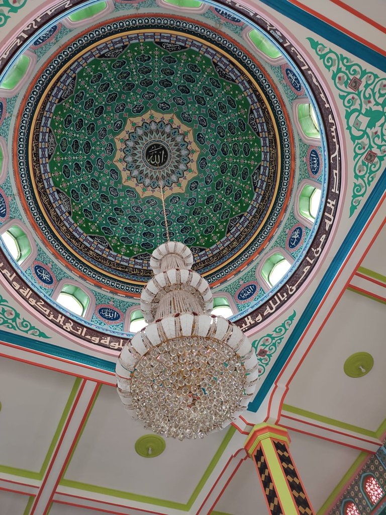
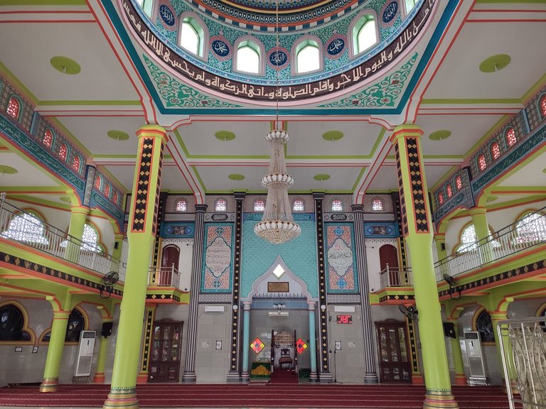
And the conclusion about this mosque is that simplicity, harmony and color combination are the important keys to making this mosque pleasing to the eye. That's all from me regarding the depiction of the architectural design of the Nurul Ikhlas mosque in Tanjung Pura. Greetings from me Tomidiwirja, Indonesia
The design of the mosque is indeed pleasing like a tapestry. It's elegant and you are right, it looks classy inside! I know it's more than beautiful when seen in person.
It is such a beautiful design. I love the domes, the details and colors.