OKAY so I’m a BIG SUCKER for Books. It may not look like it yet, since you don’t know me here but that’s because I just discovered your community hehe
When I was a child, I loved my Mother’s Library. She had all sorts of Books, and no matter how often we moved houses, the Books where always all there.
She had from children’s books to novels, philosophy, history, science, and spirituality.
I never imagined the collecting of books to such an extent would have been passed on to me. Books are definitely a religion 😆

Well with that being said, here is my humble participation to the HIVE BOOK CLUB Design Contest.
I really loved the initiative, loving to experiment with Branding and graphic style, I had real fun creating this! Hopefully you'll like it!

MY PROCESS:
STEP 1: COLORS
I sampled the colors of the Pantone Palette that you indicated, and found that actually many would fit really well together, and I certainly don't mind colorfulness, especially when it comes to the rich and inspiring world of Books, colors are a great illustration of the vastness of literature!
So these were the colors I kept:
- Cinnamon (obviously)
- Chive
- Flame Scarlet
- Saffron
- Biscay green (that color was my 'coup de coeur' I just love how unexpected it is and really gives an edgy touch to the whole!)
- Orange Peel
- Faded Denim
- Sunlight
- Coral Pink

STEP 2: FONT
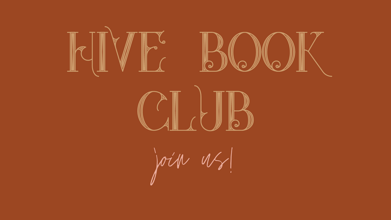
Okay, so I think that font speaks for itself.
It's called Star Full Inline and it's a free font from the internet.
There is not much to say, this font just caught my eye and I just stopped looking for anything else. It just brought together that mystery and elegance I wanted to portray. It's an Art Nouveau style and I found it well accompanied by a handwriting font called 'Jonathan' in Canva, that gives more of a dynamic vibe, like a personal affirmation or like here an invitation with 'join us!' Also of course the handwriting as an honoring for all the handwriting many authors have devoted themselves to leaving their wise words as our inheritance.

STEP 3: LOGO
With those two elements set, I could start the logo.
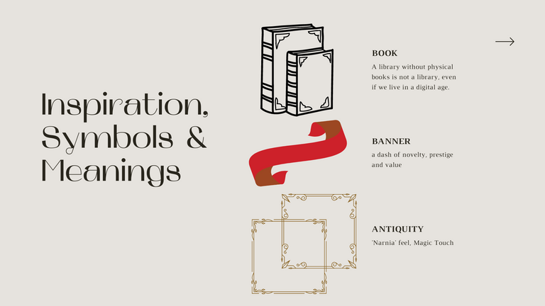
Books transport us, they invite us to travel in dreamlike stories. Since I can remember, books have the power to take us out of the ordinary so it’s a bit of a 'Narnia' feel that I was going for; symbolize the logo as an old mysterious book that begs to be opened and take you on a faraway journey.
Magic touch, well because Magic.
Like you can see here, the additional features I added were banners, which remind of gifts, something precious that is wrapped in ribbon, and they were really helpful to incorporate the entire text 'Hive Book Club'.
To complete the touch of romantism, I played around with 'antique' frames to give the Book some substance and history.
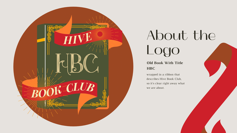
The first color I used for the Book was Chive, however I quickly realized there were many fun combinations possible.
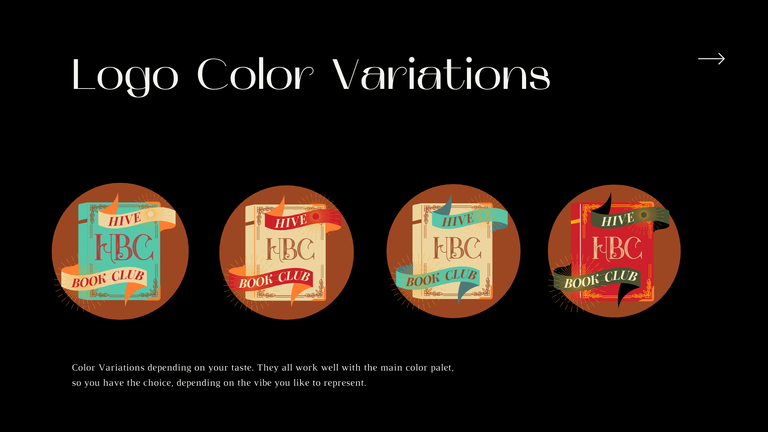

My personal Favorite is this Logo:
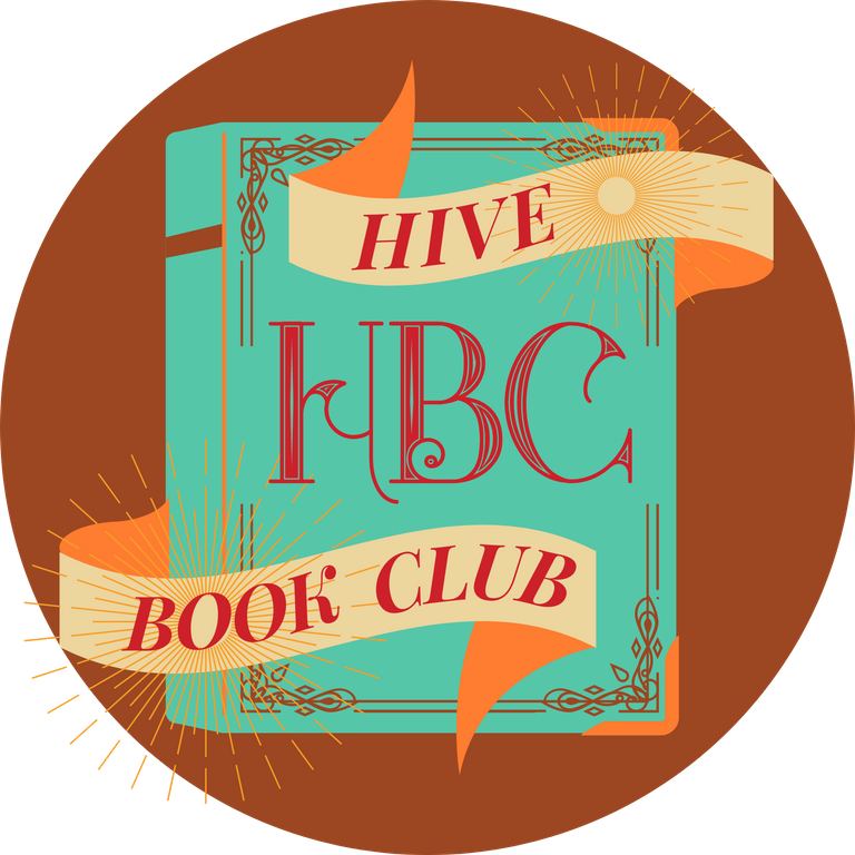
Obviously the sunrays outside the circle will be cut when you use it as a profile picture. I worked with Canva, so to be honest, there was no real feature to crop with the circle. However if you'd need it that way I can work it over with another program :)

STEP 4: BANNER
For the Banner, I really enjoyed creating a sort of 'artsy' fresco. Also I noticed that your posts often open with a Banner saying 'This Week in HBC', so I created one like that too, in case you need that one!
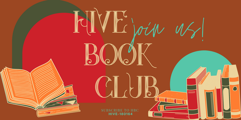
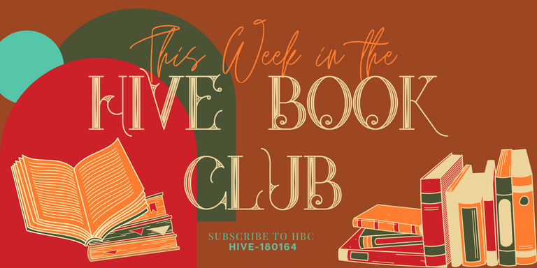

I also saw that you had a banner for your main page that is slightly thinner than the resolution mentioned, so I added this one too for your header image on your community profile :)


STEP 4: DIVIDER
I must admit the divider was a little tricky, as I had the idea to use a gif of a book that is opening and closing, but I couldn't manage to download it with a transparent background, so I settled with this 'static' one.
Books pass on knowledge, they are very precious and plant ideas in our minds, they are the beautiful trees that are left from the authors from another time.
To minimalize that idea into a sleek divider, I have used a leafy wine that flows out of the book; illustrating the personal growth that can take place in reading a book.
I believe the main color is a good fit for both dark and white theme here on Hive!

Voilà, I hope you liked my creation, I did everything on Canva like I said!
Have a lovely Sunday!!!!
Hello ! where can I contact you so we can discuss about this logo further?
Hi! I tried to message you on here but I guess I need a personal account name..
Otherwise I am also @kaliphae on Telegram?
Looks very sleek! Great job on the gfx design!
Oh heeeey thanks so much! :D
Wow these are totally kickass!!! I love them A LOT!!! The dividers are great, the logo is great, the banner is great! Fabulouso, big cheers, high fives and accolades!
Ohhh thank you so much, glad you like it! 😍
Hey, your design looks so lit 🔥🔥. I like it a lot :) and your presentation about the inspiration for the logo is very amazing (I mean, the image presentation looks cool too). Very good work, mate
Heeeey thanks! I like your minimalism too 🌼 well done
Congratulations @kaliphae! You have completed the following achievement on the Hive blockchain and have been rewarded with new badge(s) :
Your next target is to reach 30 posts.
Your next target is to reach 300 upvotes.
You can view your badges on your board and compare yourself to others in the Ranking
If you no longer want to receive notifications, reply to this comment with the word
STOP