ACKEE MONEY???

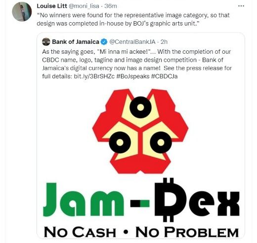
So this little logo hit the internet the other day as Jamaica's highly anticipated digital currency made by the central bank (Bank Of Jamaica) officially launched their logo. It came out of a design competition and this is what was chosen. A blocky representation of the island's national fruit along with some rounded text.
Well Twitter and Instagram have had at it, and they absolutely hate it. It looks more like a trendy 8 bit NFT than a trademark that should be taken seriously as the currency of choice for the crypto-currency nerds among us.
Why do Jamaican's hate it so much though? Well...
- It's the national fruit of Jamaica called the Ackee. A buttery textured and tasting fruit that looks like scrambled eggs when cooked and is often paired with something salty like Salt Fish (Cod Fish), Corned Pork or Bacon. Most people don't know what the national dish has to do with currency.
- It's not an indigenous plant to Jamaica, so it doesn't truly represent Jamaica in some people's eyes, even though Ackee has a significant cultural history in Jamaica.
- The colors are a bit jolting, They match the Ackee perfectly but it's a bit gawdy to look at as a logo or symbol. The shape is blocky and just in the middle of no where.
- The text is not appealing to many, especially with the blatant use of Jamaican flag colors.
- It looks like it was designed in MS Paint for those of you who remember that software.
- Feels like it lacks creativity.
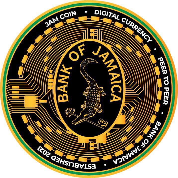
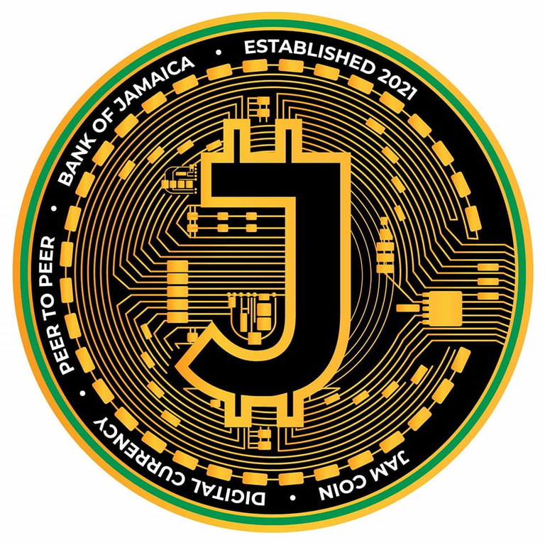
The venomous disdain expressed for this logo had me wondering what the other entries looking like. I could only find one other mark which actually has me wondering, what was the design criteria, because the design that lost to this actually looks good. Here let me show you. Look down there.
Front

Back

Aside from the words running along the perimeter, this looks pretty good to me. I don't see why it needs a back and front but it's a solid and sexy design. Feels modern and feels like digital money.
Some designers decided to modify the Ackee money and give it a better feel. I must admit, while the Ackee does still bother me, the redesign by an independent artist was more acceptable for me.

On the other hand, when things are this controversial, it might be a good thing. The symbol is getting noticed. Maybe for the wrong reason, but this "bad" news is traveling faster and further than had they done a better design right off the bat. Truth is, while we new this currency was coming and we were anticipating it in Jamaica, we weren't anticipating it that much to want to talk about it on social media for any lengthy period of time.
Now that we have this "ugly" logo, people are talking, the word is spreading. Did it do it's job? Are people from all over the world going to be craning their necks to look at the "Ackee Money"? We shall see.
That logo is so f-ing elementary.
Is this some tragic comedy? People cannot be so incompetent. Oh, boy.
If it came to be through a contest by the central bank that means the government was involved. That means it could be a possibility that they didn't even let the best design win, but rather a design made by a "government friend".
The unofficial redesign looks a bit better indeed.
~~~ embed:1494664461801730050?s=20&t=rFp6cs0HQR71ZOnGcztTjA twitter metadata:TWlzdGVyQ2hlZXp8fGh0dHBzOi8vdHdpdHRlci5jb20vTWlzdGVyQ2hlZXovc3RhdHVzLzE0OTQ2NjQ0NjE4MDE3MzAwNTB8 ~~~
#posh #jahm #crypto #digitalcurrency
The rewards earned on this comment will go directly to the person sharing the post on Twitter as long as they are registered with @poshtoken. Sign up at https://hiveposh.com.
PS: that other logo you found , it looks too bitcoiny so I think the BOJ don’t want to have that image.
That is a good point! It did better marketing than a good logo would have done. This news will spread far and wide and have many contemplating how to use it.
I've heard the phrase "any publicity, is good publicity" and seen it way too much and still have my reservations and question if it's true.