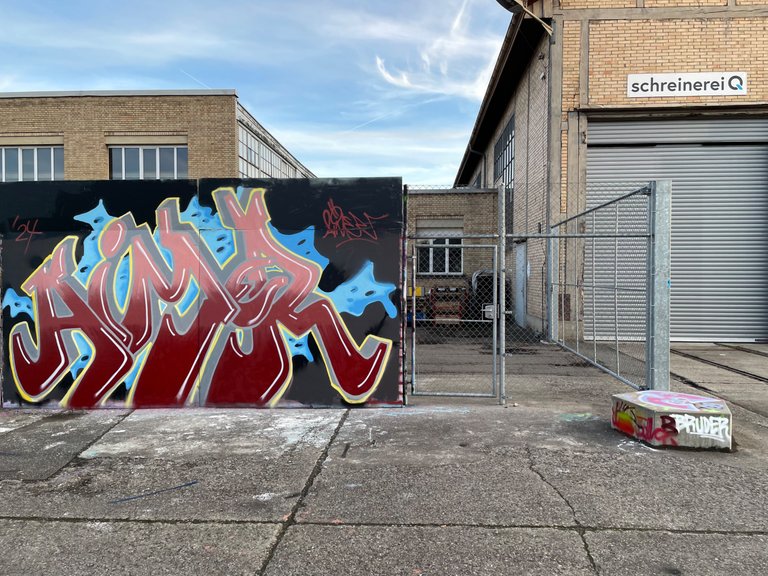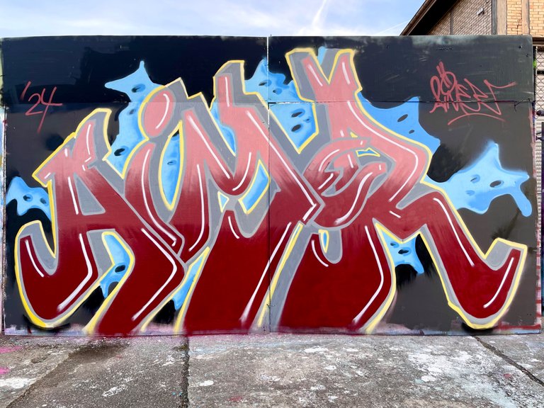
Before I ventured into new experiments, I painted another picture with simple letters. The outlines are a little too light and therefore the contrast is a little lacking. One trick I learned here was that I could have painted the seconds offset, which would have created a contrast.

Simple letters started to bore me and I knew I had to sketch differently at home. I felt the urge to move forward with my style. I am happy to show you the small but nice progress in the next pictures

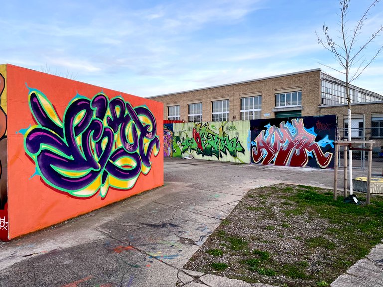
On the left a picture of my homie Viert'. He consistently follows his own style and his development is also nice to see.
This colours are alive! Nice one
thank you 😊
Great job on this job. Simple but neat letters. Thanks for sharing your work on The StreetArt Community.
Have a great Sunday
!PIZZA
$PIZZA slices delivered:
(1/5) @heroldius tipped @syma
Congratulations @syma! You have completed the following achievement on the Hive blockchain And have been rewarded with New badge(s)
Your next target is to reach 200 replies.
You can view your badges on your board and compare yourself to others in the Ranking
If you no longer want to receive notifications, reply to this comment with the word
STOP