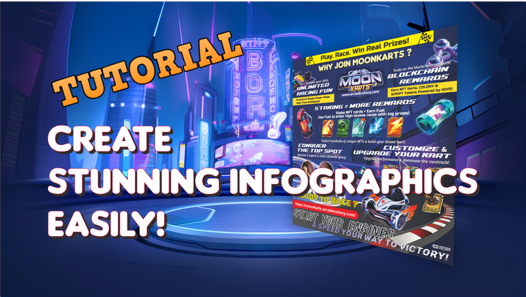
Hello, everyone! This time, I want to share my experience in creating an infographic for the Moonkarts Infographic Contest. If you haven’t heard about this contest yet, let me explain. It’s organized by Moonkarts, and you can check out the details here: contest link. The rewards are quite attractive, so I hope you’ll consider joining too!
For those interested, I’ve summarized everything you need for this contest so you can create an infographic in your own style. But before that, it’s a good idea to get familiar with Moonkarts. You can read more about it here or check out the submitted entries here for inspiration on what elements to include in your infographic.
Once you’ve done some research, let’s start creating the infographic! I personally use CorelDRAW, but feel free to use Canva, Photoshop, Paint, Adobe, or any software you’re comfortable with.
1. Designing the Initial Concept
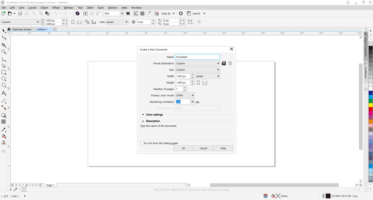
The first step is to determine the concept and design. Infographics can be portrait (vertical) or landscape (horizontal). I chose landscape because I think it fits the racing theme of Moonkarts better. I also set the size to Full HD to ensure sharp and detailed visuals.
At this stage, I sketched a rough layout, deciding on key elements to include. I wanted a winding racetrack, the Moonkarts logo, and some futuristic elements to match the game’s theme.
2. Gathering Design Materials
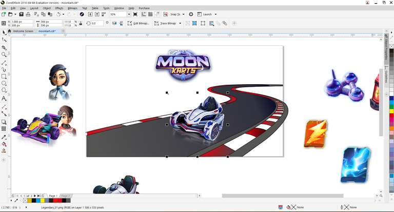
Once I had a concept, the next step was to collect all the necessary visual elements. Fortunately, Moonkarts provides assets like characters, logos, and wallpapers, which you can download here.
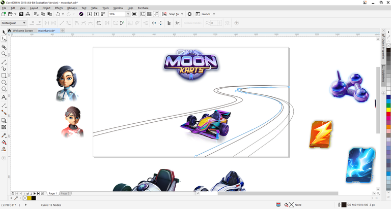
I downloaded these assets and selected the ones I wanted to use. This step is important to keep the design clean and readable. After sorting the images, I imported them into CorelDRAW.
3. Creating the Base Design
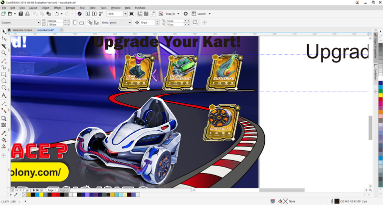
With all the images on the canvas, I started structuring the design. The first thing I created was the racing track. I drew curving lines in the bottom right corner to give the impression of a car making a sharp turn.
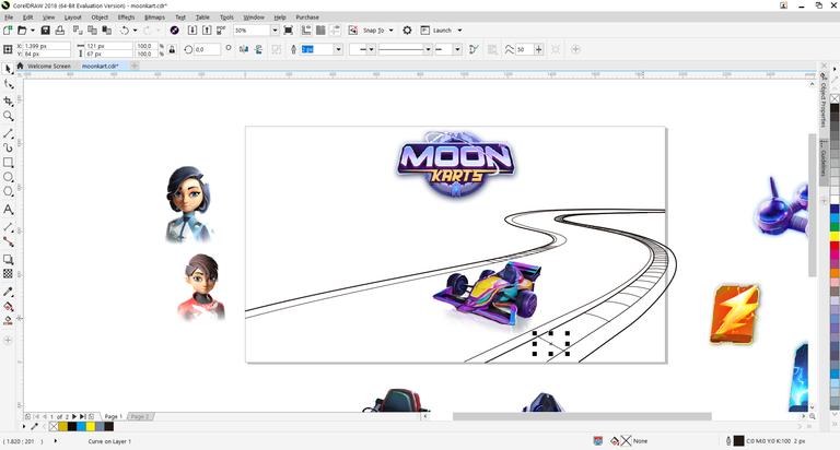
I added shadows and highlights to make the track look more dynamic. At this stage, I kept the design rough since adjustments would be made later.
4. Dividing the Design into Three Sections
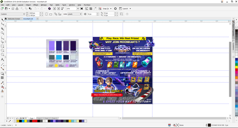
To make the layout neat, I divided the design into three main sections: top, middle, and bottom.
- Top section – Features the title and Moonkarts logo to grab attention.
- Middle section – Contains key information about the game and contest.
- Bottom section – The most important part, where I add a Call to Action to encourage participation.
I focused on the bottom section first since it needed to be engaging and persuasive.
5. Refining the Track Design
Once the bottom section was shaping up, I continued refining the track design, which is a crucial visual element in the infographic.
Initially, I used standard car designs, but they didn’t feel exciting enough. So, I switched to futuristic race cars that better fit the Moonkarts theme. I also added speed effects to create a sense of motion.
6. Adding Text and Key Information
With the base design done, it was time to insert text and key points. I included details about Moonkarts, its main features, and why people should join the infographic contest.
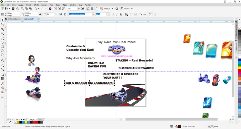
At this stage, I kept the text in a rough format. After ensuring all information was complete, I adjusted its positioning and style for better readability.
7. Choosing Colors According to the Contest Guide
To align with the theme, I referred to the color guidelines provided by the contest organizers. I created a color palette that matched the futuristic concept.
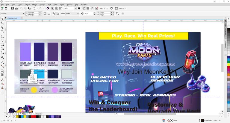
I also used a Moonkarts game background to make the design feel more authentic. Then, I structured the top section to serve as an eye-catching opener.
8. Adjusting Layout and Editing Images
Once all elements were in place, I fine-tuned the layout. I ensured the logo was centered, key points were evenly distributed, and added graphic elements like icons and separators to enhance readability.
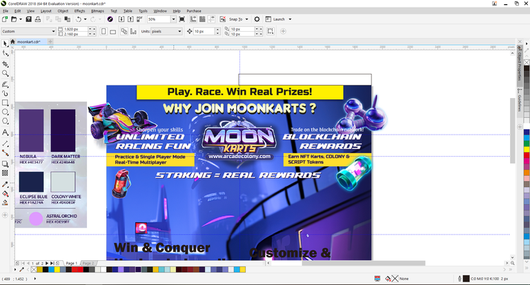
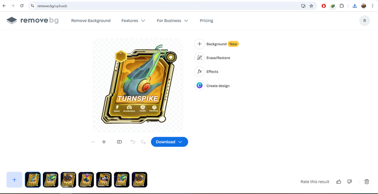
Some images needed editing before use, such as the golden game card from Moonkarts. I used a background remover to get a cleaner cut. If you need a similar tool, check out remove.bg.
9. Final Touches and Detailing
With the main elements ready, I moved on to final touches, including text alignment, refining graphics, and adding extra effects to enhance the infographic’s overall look.
I double-checked all the information to ensure clarity and accuracy. After several revisions, I was finally satisfied with the result!
10. Uploading the Infographic to the Contest
My final design, after several adjustments, is now in two Full HD landscape sizes and almost turned into a portrait format. But this is the final result.
Now that the infographic was ready, it was time to submit it to the contest!
To see the final infographic I created, you can check out the link to my post, which I have submitted as my entry for this contest.
Make sure to post it in the Alien Art Hive Community (@hive-158694) and reblog the contest post.
📌 Deadline: All entries must be submitted before March 4! Don’t forget to use the #MoonkartsInfographic tag and mention @coldbeetrootsoup so your entry is counted.
The final step is to share the infographic on social media like Twitter (X), Instagram, or Facebook, and leave your social media post link in the contest comments.
That’s my experience creating an infographic for the Moonkarts contest. I hope this guide helps you create your own infographic, whether for this competition or others. Don’t miss out—join the contest!
Thank you for reading this far into my article. Hopefully, there is something you can get from what I have shared.
Very good work in digital, you put everything together in a very harmonious way, you achieved a very good infographic. Success in the contest
Thank you so much for your kind words! I'm truly grateful for your appreciation. Your support means a lot and motivates me to keep improving. Wishing you success as well in all your endeavors! 😊