My first ever Official Poster Recreation. It's little bit different from the other photo manipulations I've done - because in this case, the design and idea is already made. It's up to me what techniques & photos will I use and the workflow I'm going to use for getting as precise ending results as possible.

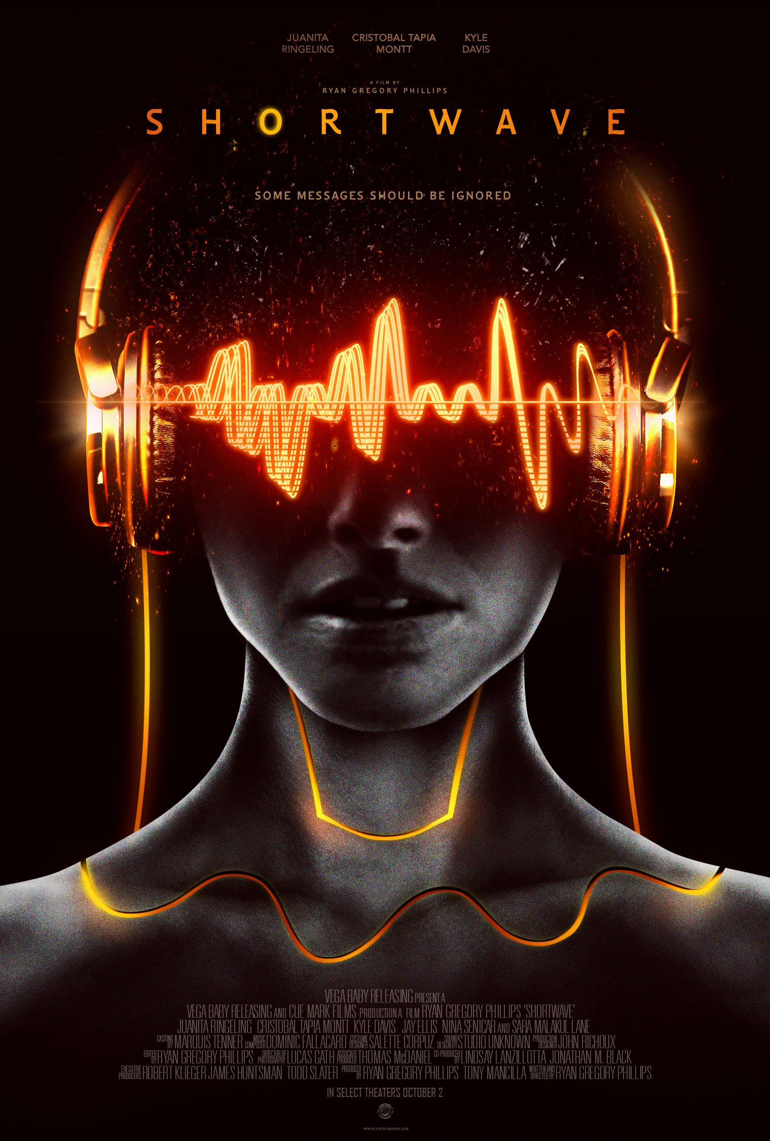
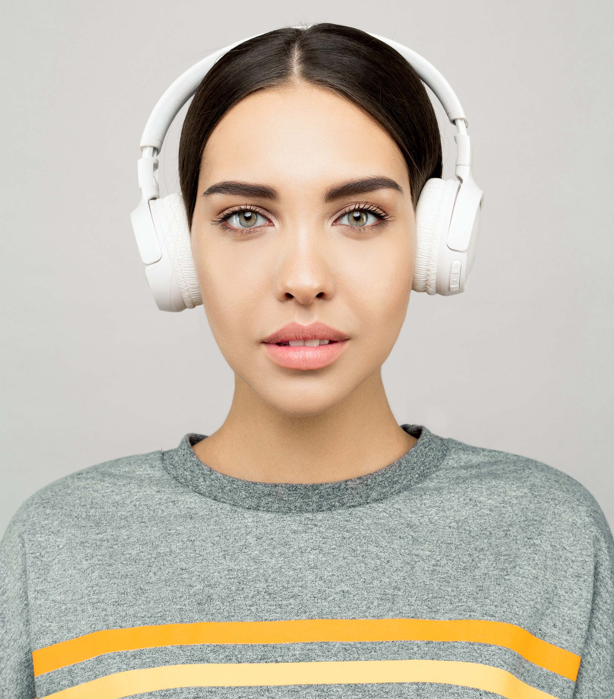
Original Poster Design - Shortwave Movie
- I do not have any rights on the photo - it's used for teaching purposes!
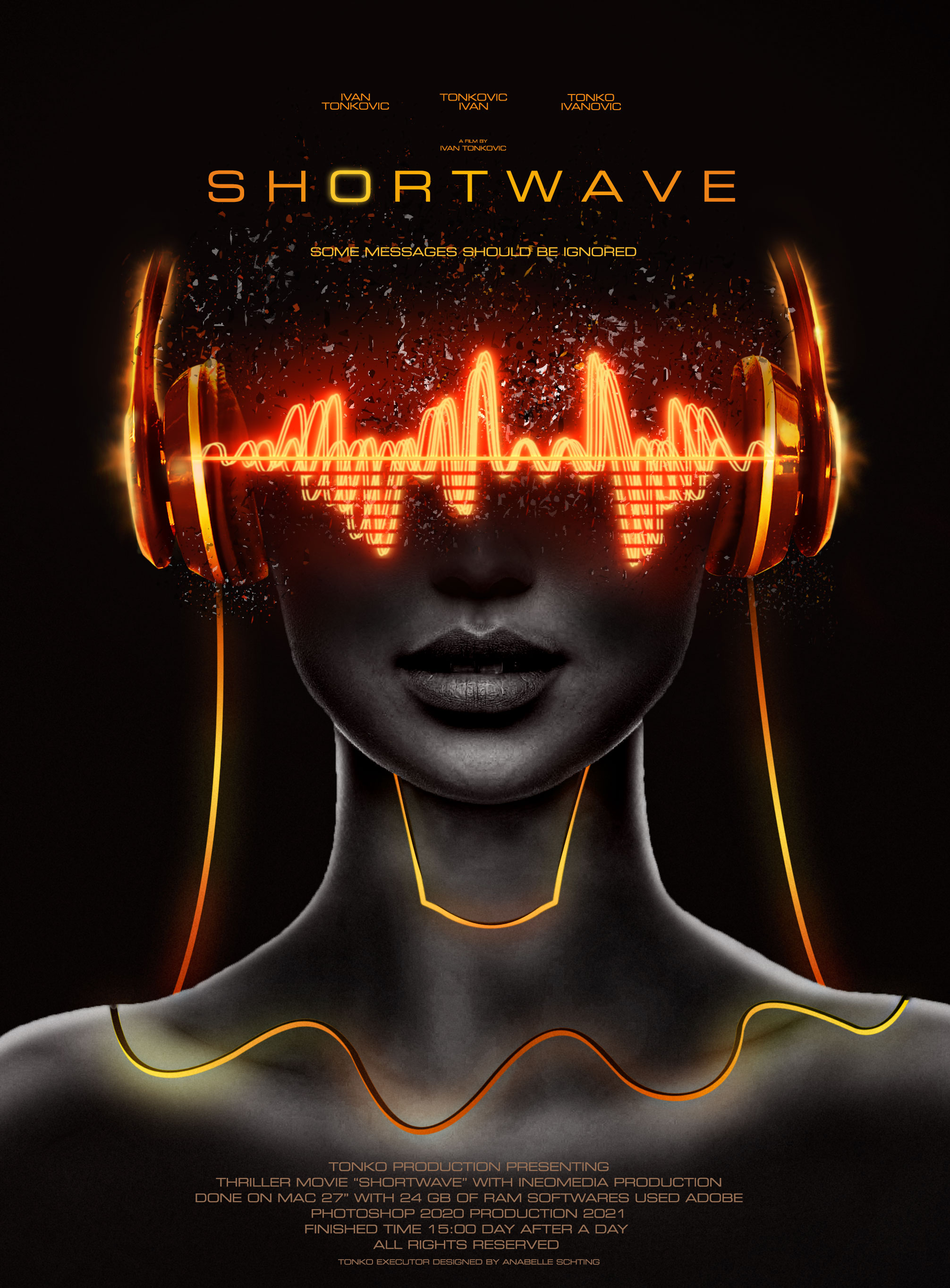
My Finalized Version
Process of Making | Design Workflow
[1] Collecting Materials (Photos) + Explanation
- Link for Project files
- The ORIGINAL Poster Tutorial was made by great person Nemanja Sekulić - graphic designer - Nemanja Youtube
Watching and observing the original poster and its details can be very helpful in further planning. Also, it can extremely speed up the work and spare some time, which is maybe the most useful thing in designing.
Watching the original one, we can see it consists few crucial elements - Model (Some sci-fi women), Headphones and bunch of VFX (Visual Effects)
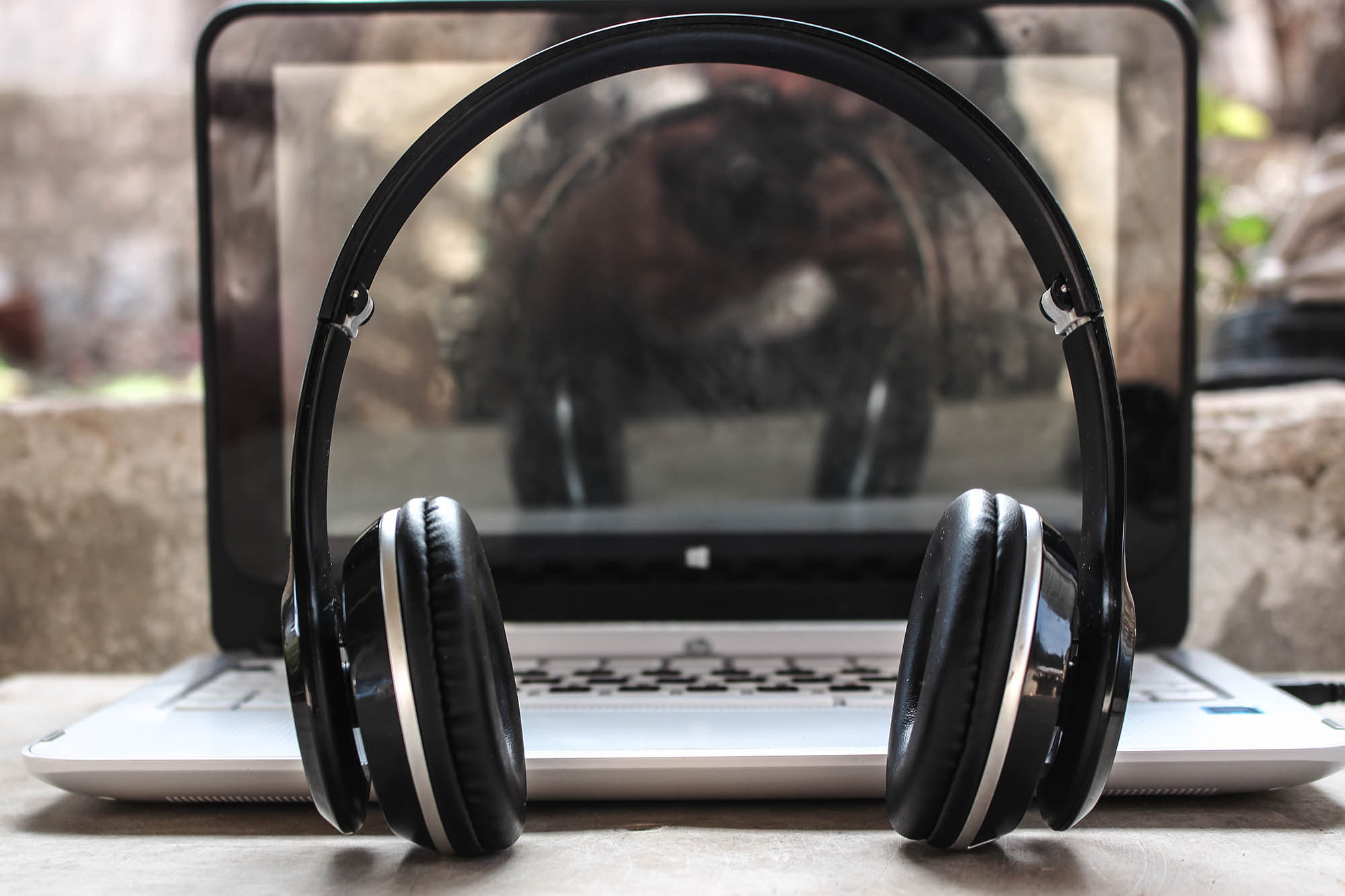
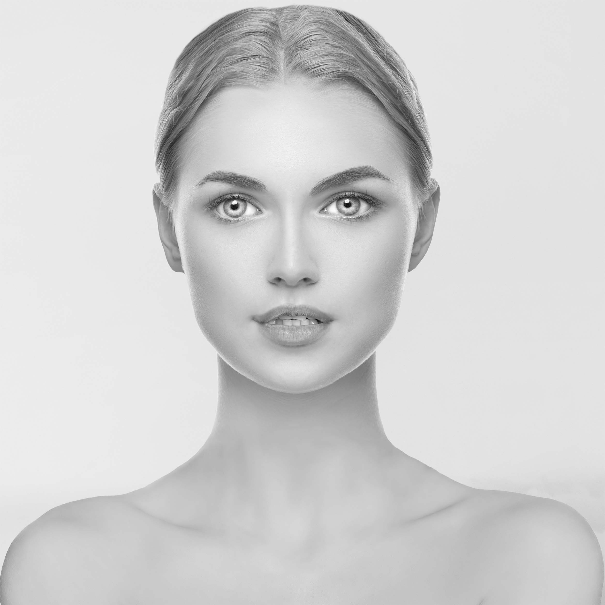
It's about finding the right elements which won't make some problems in future work and process.First 2 photos will be used as main elements - HEADPHONES which I will mask out and use as separated element, and the second one - MAIN MODEL that will represent the character.
The third photo will not be used as a model or for headphones. It will be used for a little trick that will make a detail worth of mentioning. I'll reveal the reason little bit later when the time comes for it.
[2] Setting the Main Elements
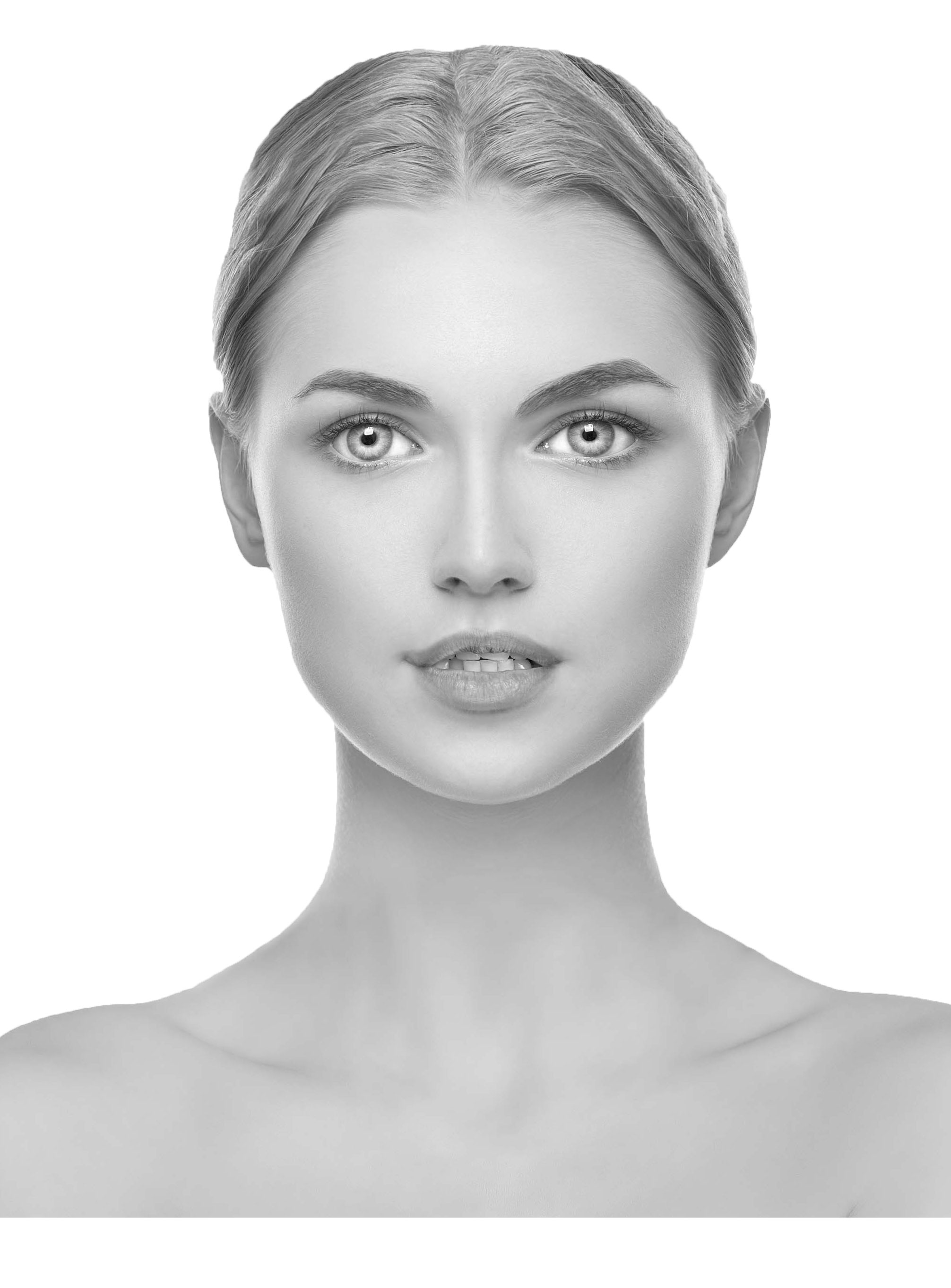
- This 3D model is almost perfect for the scene - symmetrical and without distraction. Perfect for photo manipulation, further designing and color correction.
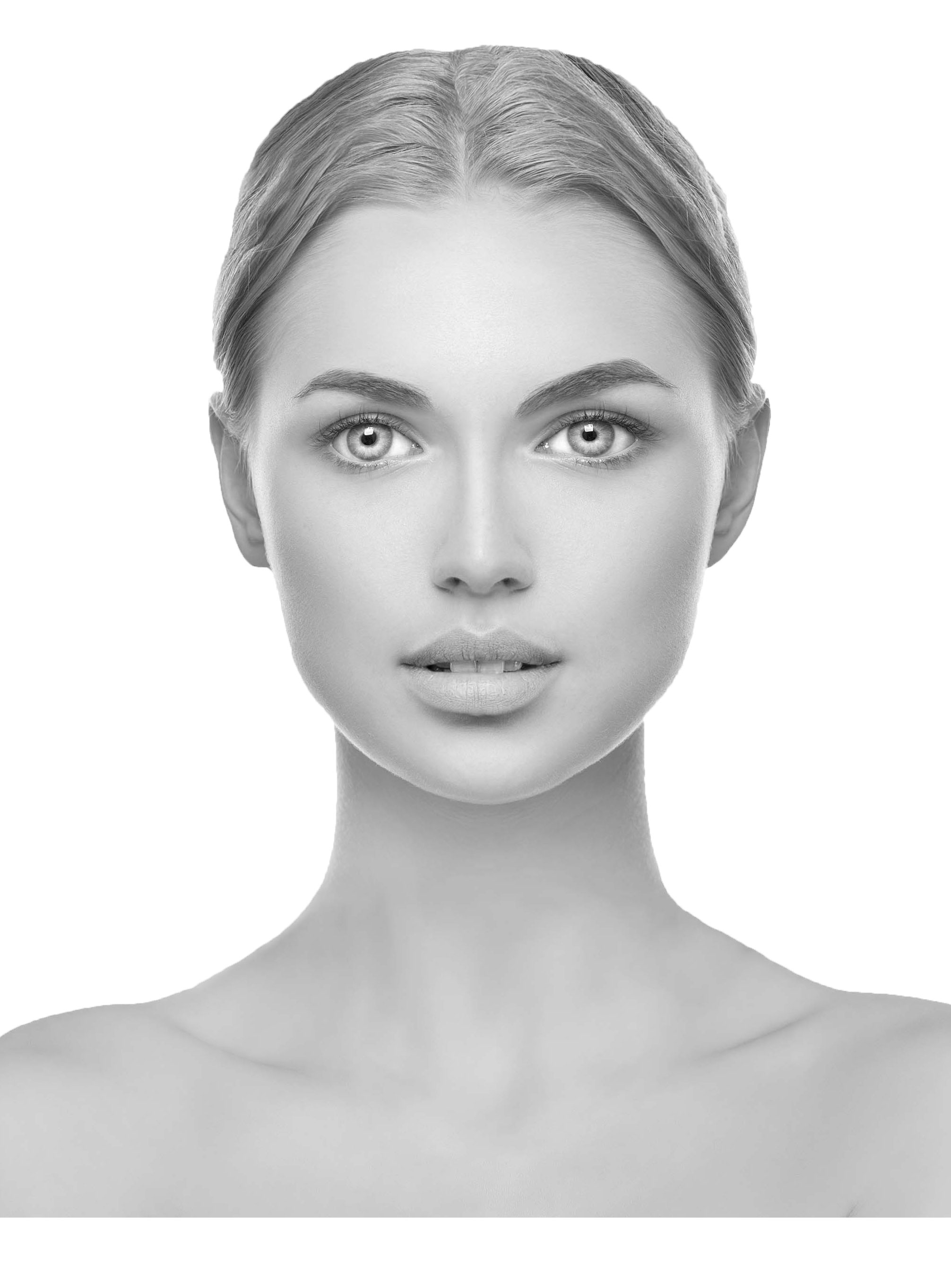
- Now comes the time to explain 3rd photo. Can you see the difference between this one and the one above? Yes, as I said on the beginning - it's about the details. The role of the third photo is just for the purposes of photo manipulating the mouth. I personally liked her lips more and I find it more attractive.
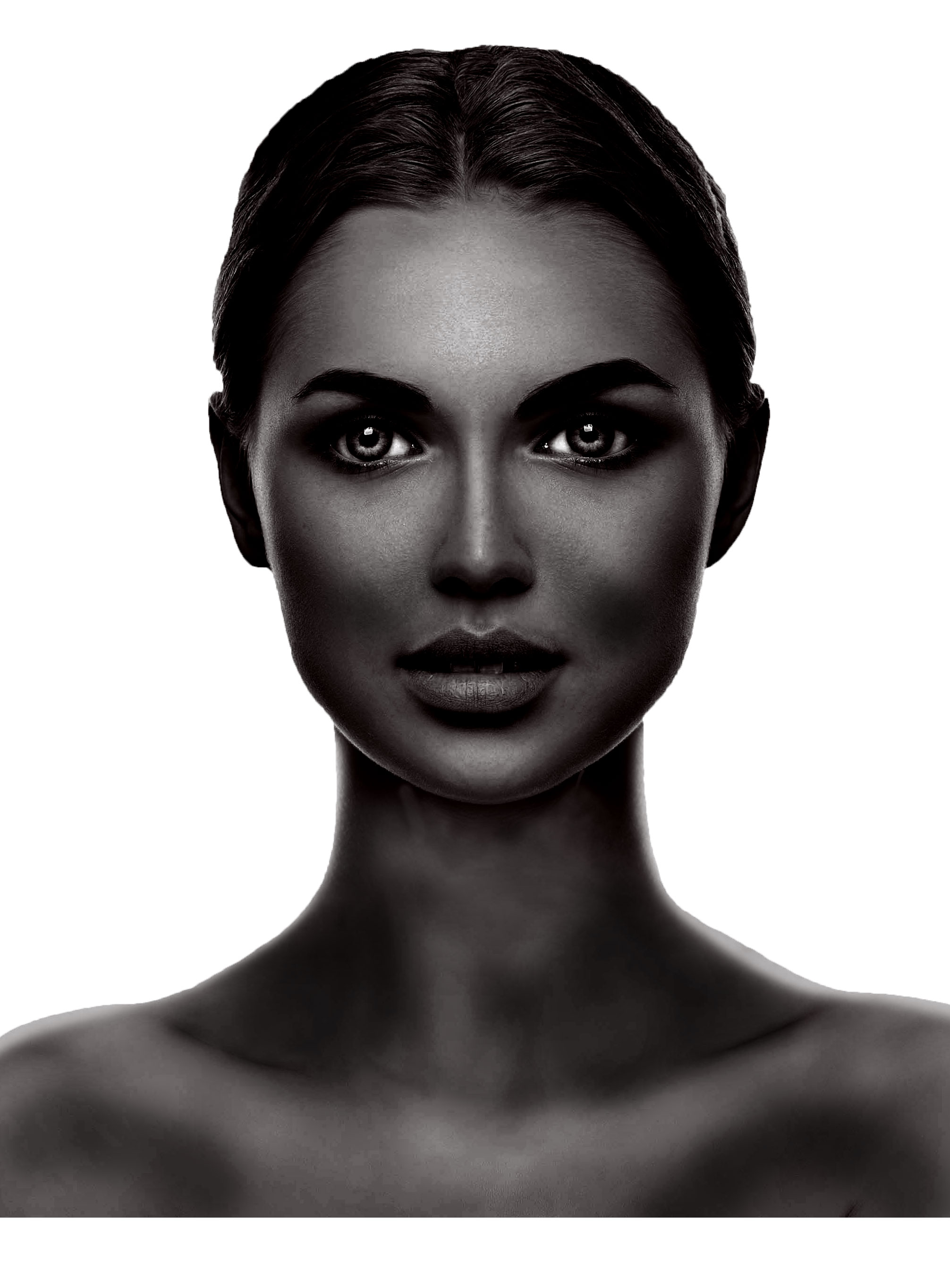
- At this step, the big difference is easy to see. I did a lot of work tweaking colors to fit the original scene as much as I could. I find this step very important as colors are among the first that is noticed on designs. Also, this little holes you can see at her shoulders are just preparation for further work (check lighting wires at original poster). - They will represent 3D feeling, nothing more.
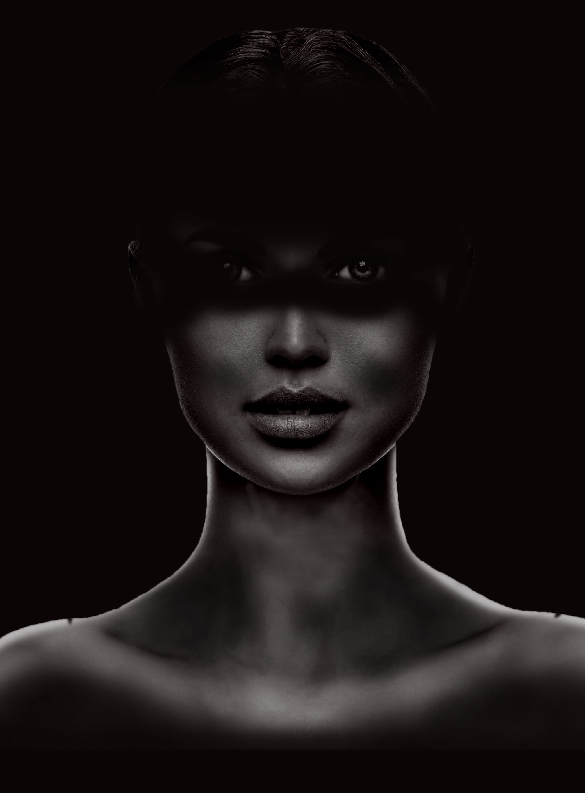
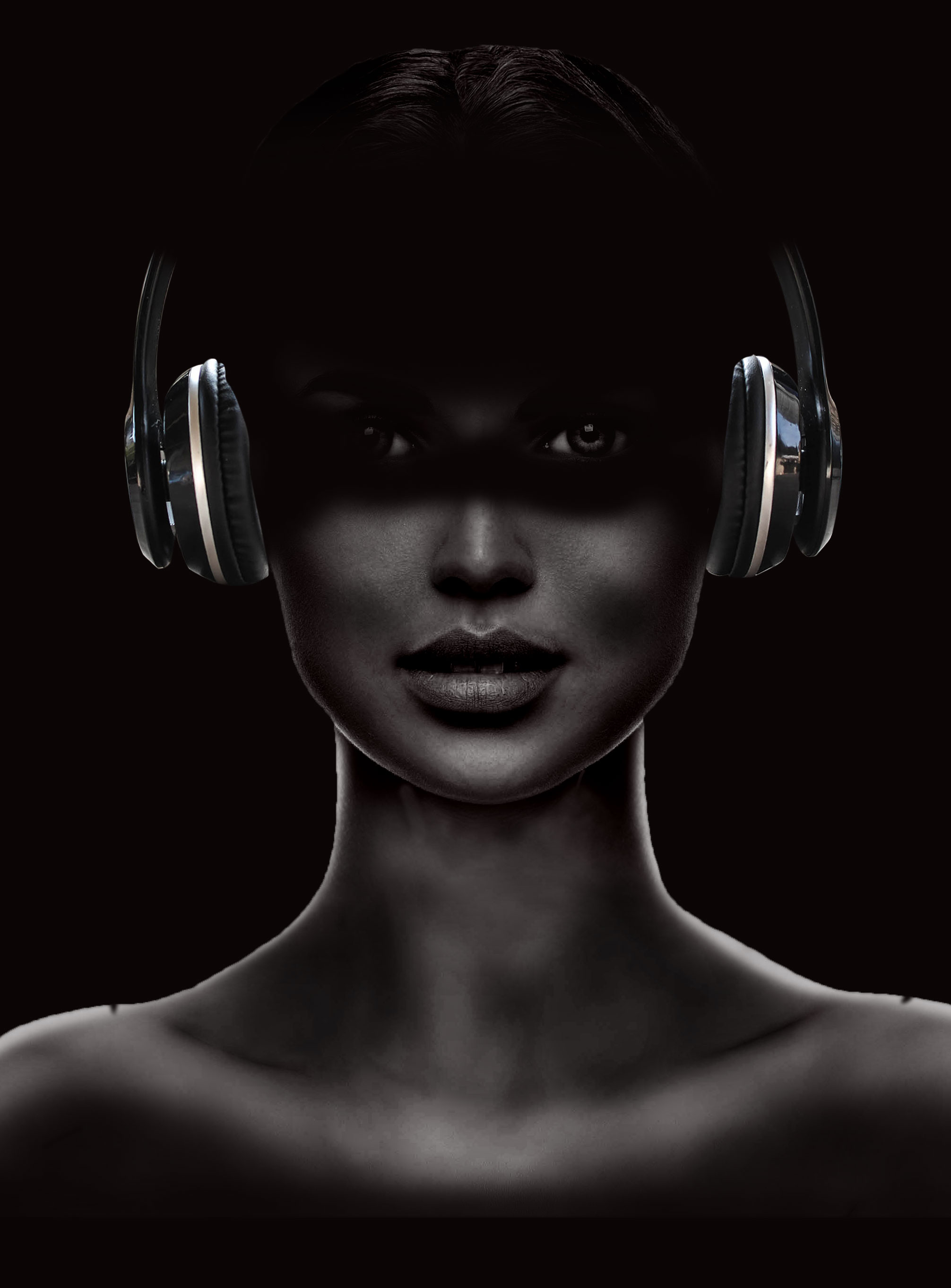
[3] Implementing Headphones Into the Scene + VFX
- Throughout the whole time I'm working, I'm repeatedly checking the original reference so I don't get lost. - Creativity can make you lost sometimes, believe me. On the original reference you can see that headphones are having strong orange hue with some light glows and feeling of some energy inside them.
- So let's make that headphones ENERGIZED!
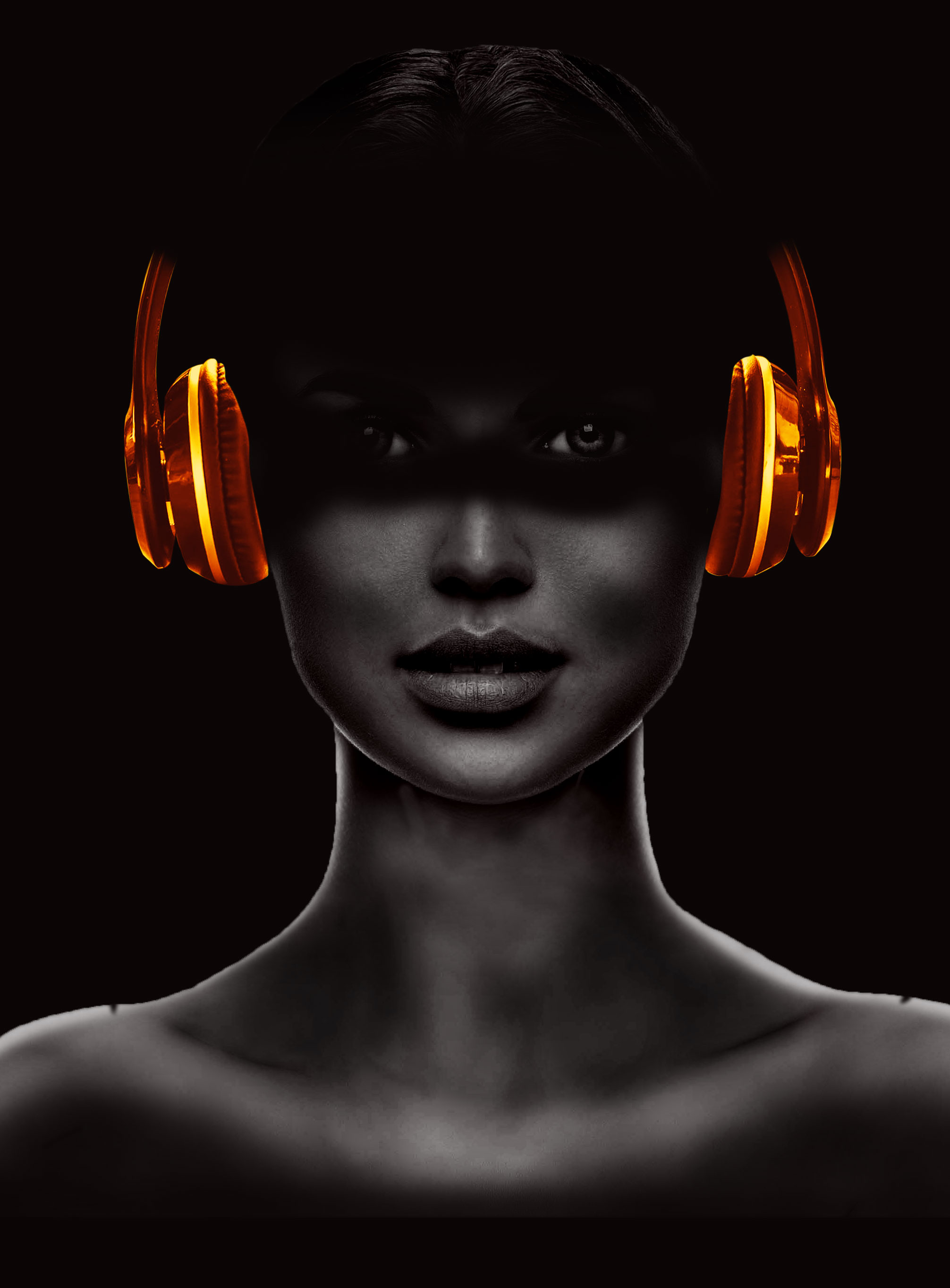
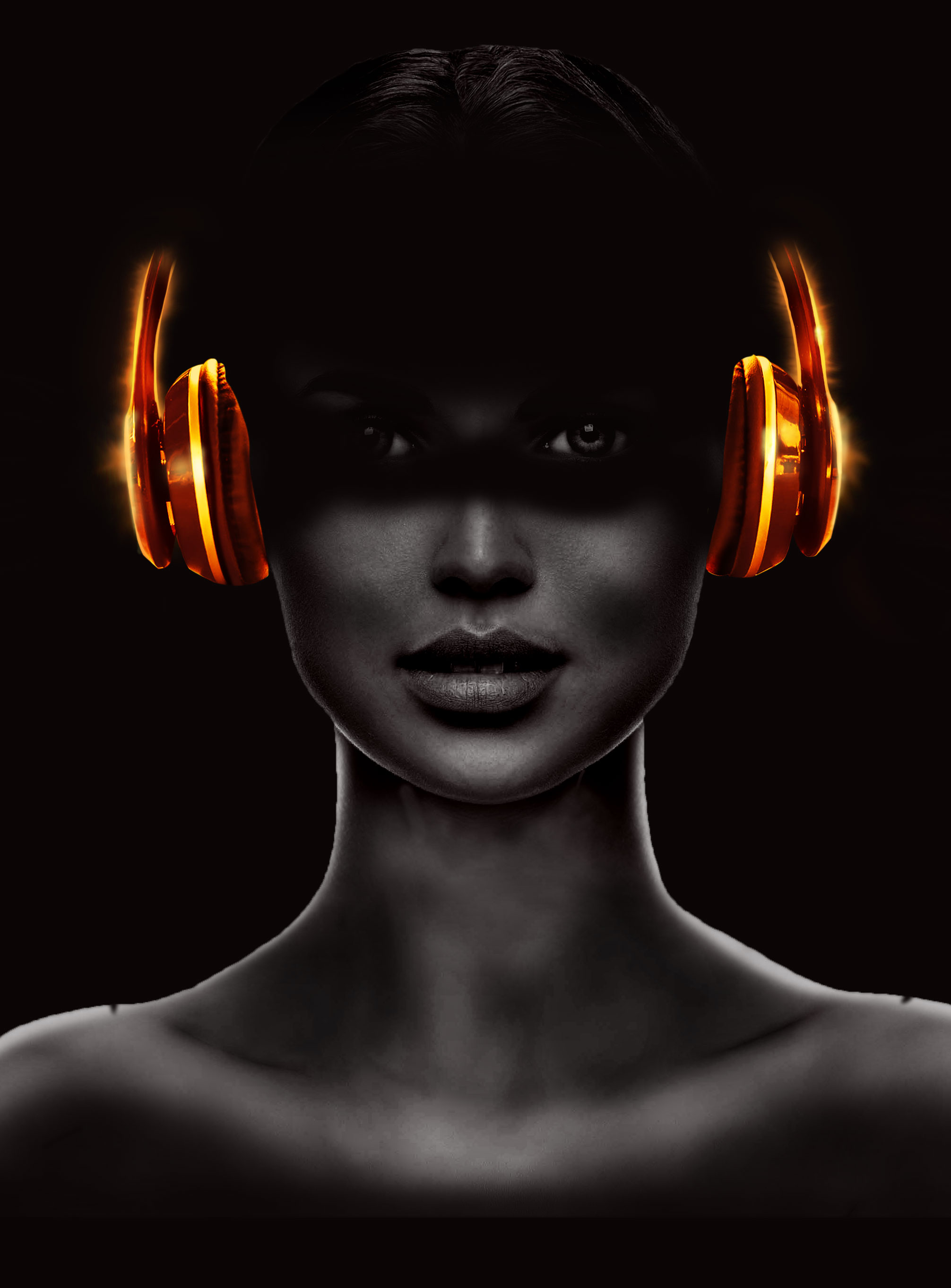
- Firstly, I was working on the color itself, played with "Hue/Saturation" of the color and made that strong orange with shades.
After that, it was time to make some layers BELOW the headphones, to represent the light which is glowing powerfully.
[4] Making the Energized Waves!
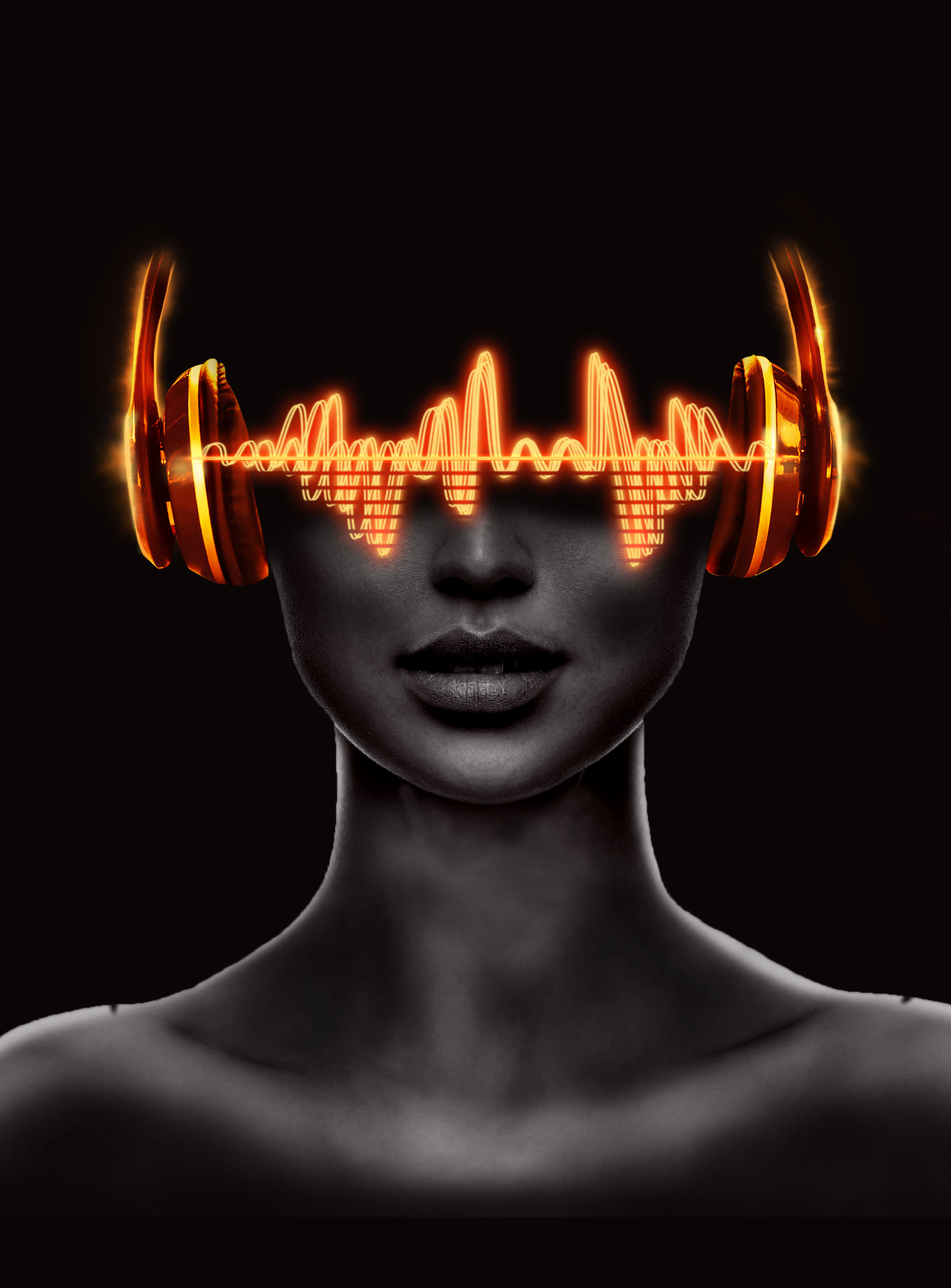
- This step was probably the most time-consuming from all the processes until now, yet wasn't hard to do. I made one wave with PEN TOOL, played with the colors and made it ready. Then copied it once to make a pair then copied that "pair" 2 times. Voilà!
[6] The Moment for Energetic Wires
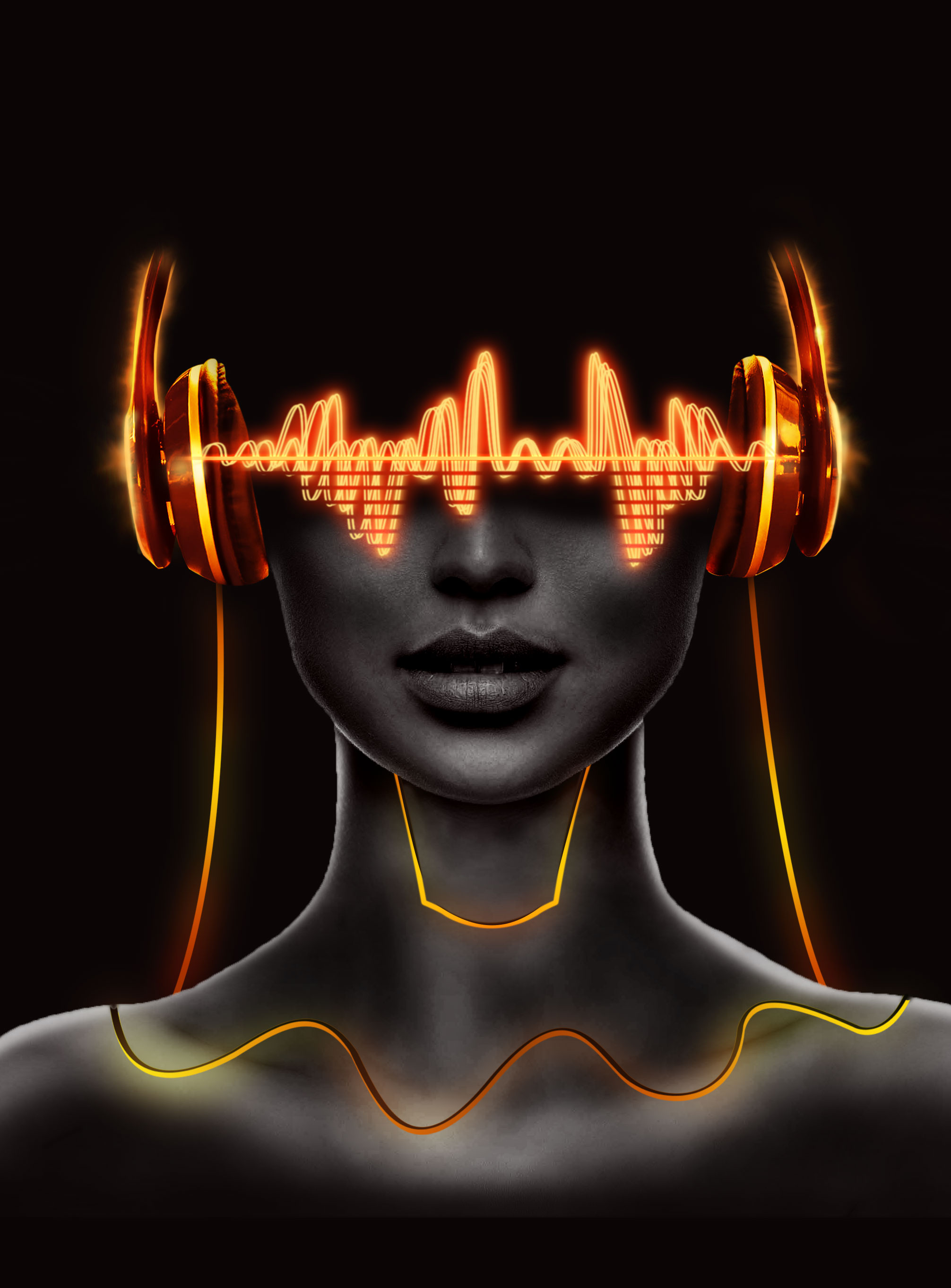
- With this wires on, the overall design is beginning to look similar to the original one. Those wires were also made with Pen Tool. The main focus was on GRADIENT COLOR: Orange-Yellow-Orange. and about making the 3D look with FAKE SHADES.
That's really easy visible on the wire on the torso. It gives nice 3D feeling.
[7] VFX & Particles
- Something EVERY KID and big part of us, adults, find the most attractive. Much particles, much explosion, much light! Let's make some!
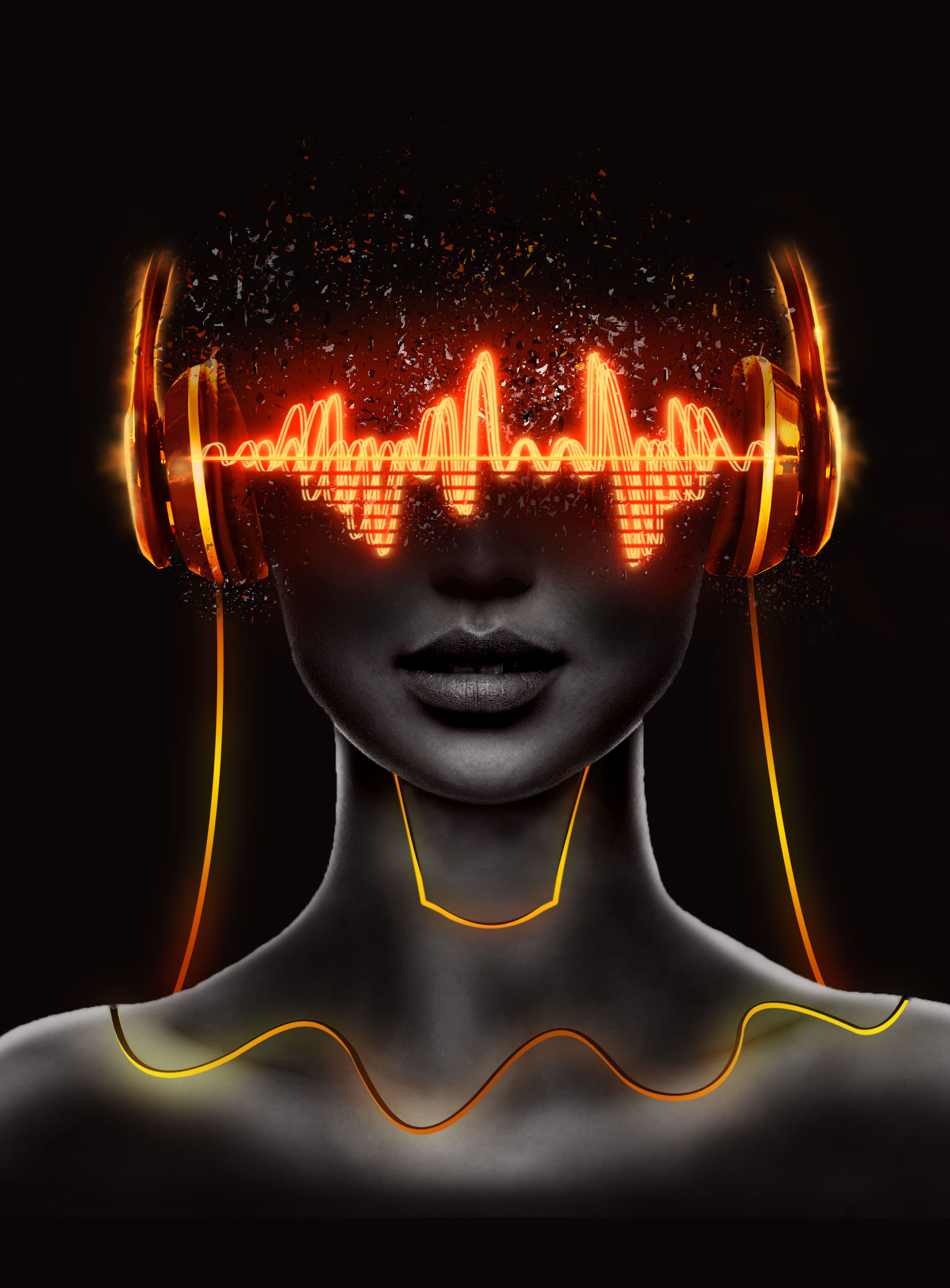
- Mainly, my job is done here. I'm perfectly happy with the result I came with. It's time for the personalized text, little bit of CC [Color Correction] and adding some noise to the scene. The particles are one thing I'm really proud of, because I made my custom brush exactly for that project and it actually worked very well. I was sceptical about that, honestly.
[8] The Ending Result
- Some noise was added to the scene - especially on the body of hers. The text is there to fit original reference. It's not very Important.
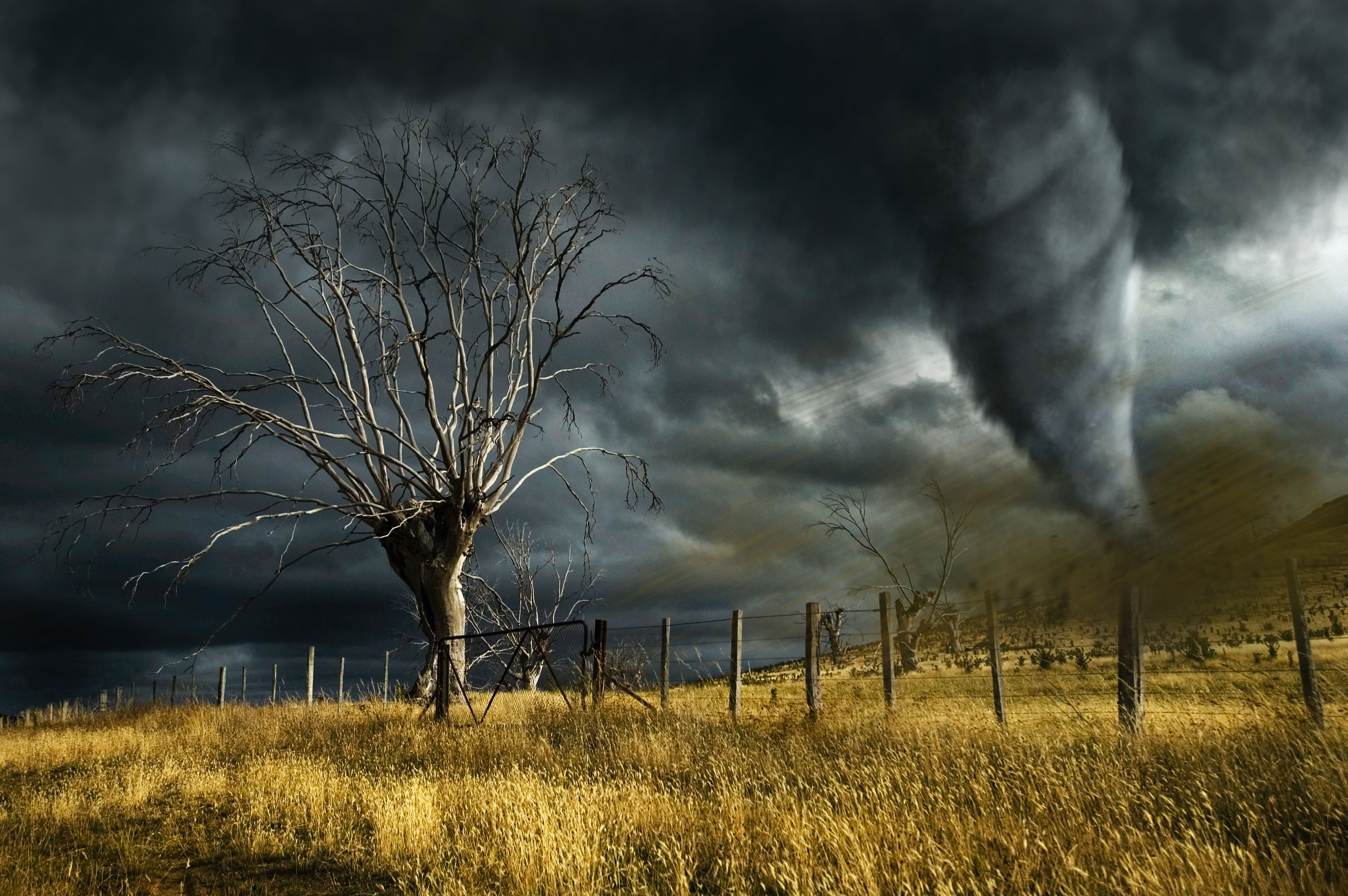
- Check out my recent Digital Photo Manipulation post with a lot of great techniques and step by step explanation --> Digital Photo Manipulation with Custom Brushes | Project "TORNADO" 🌪️
- Also Check Out My Recent "Let's make a Collage" Contest with Design Workflow --> My Visualisation + Design Workflow Let's Make a Collage Contest - Round 74
© This content is originally made by @tonac
Very cool work, well done! 😎
Thank you, I appreciate that! ☺️
This was a really cool project! Seeing the progression really got my own creative juices flowing! 🤩
Haha, thank you! I'm really glad you liked it 😊
I did! I’m just wondering how to come up with cool concepts like this! It’s the idea that unlocks the magic... 🪄
Looks so professional! I love this recreation!
You killed it with this one! Such an awesome design and yours looks just as good. I actually like the fonts you used even better than the original’s.
Hey thanks! Actually, font picking lasted for too long than expected. It's understandable font designers are earning a lot of money. Not an easy branch of what we do.
Font has always been the most difficult part of a design to me.
Typography is such a deep study.