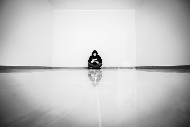
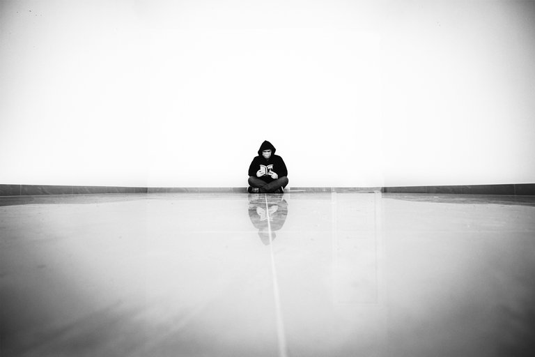
I need your help. Few of us local photographers are doing an exhibition (i hope we are, shit is a bit crazy right now) and the theme is local :D i am struggling with selection and i am not sure how i feel about this one. It is a selfie.


So the help needed is, would you print this, or you think it is blah. And feel free to be honest, it will help :D
And if you think it is not blah, would you go with first or second version?
Thanks for your help and honesty.
This is shit.
That's not true ! For real, the picture is really good and I personally would choose the first one because the second look a little too much empty in my opinion, and seeing the back wall adds something to the picture.
Or as said daveks cropping the second would be great too !
But you could use it like that the picture is really great, especially for a selfie 😅
thanks. now reading the comments and thinking about it, first has a more "limiting"/closed down feeling and the second is more opened.
I like the first one.
I think the space in the picture depicts that Local isn't so close anymore... I like that you have it spaced out. I also like the shading from vignette.
while doing it, i thought that vignette added something to it, later i was not sure :D think the vignette will stay :D
Thanks
I think by making the room look long and narrow vs wide it gives the feeling of distance, with a touch of loneliness, as well. I think whatever you chose will be great besides art in all its forms is in the eye of the beholder, and not everything is for everyone.
I think you already know that I am an amateur photographer and self-taught, that said, I would choose the first option, but I would repeat the photo to create symmetry with the line that comes from your feet, it is a little to the right and I think I feel dizzy, by the way, I do not know if the small spots on top are from your sensor, but they can be distracting and I don't know if it is good that it is there.
i was doing this on a timer so it is really hard to line it out perfectly when you don't see what the camera sees and have 10 seconds :D
i totally missed the spots. Thanks
The pic makes me uncomfortable, maybe it’s the all in the center composition, but since you’re wearing a mask, it makes sense to have that feeling.
Another thing is the dark vignette on a white pic, not sure if that works well.
All the best with the exposition Bil 🙏🏼
that kinda was an idea, so maybe it is working.
i tried to clean it out, but i feel that i am floating in space :D
in the end maybe i will go with the first one, to get that bit of closed space.
Meni se dopadaju obe. Prva u smislu dopune ogranicenosti maskom i rukavicama ogranicenoscu u "praznoj kocki" a druga u smislu kontrasta ogranicenosti i prostranstva
sad citajuci komentare kapiram da su u suprotnosti. mozda zavisi od momenta kad sam ih sredjvao. slikana je i prva verzija nastala negde u aprilu kad smo bili pod onim full zakljucavanjem. a drugu sam editovao juce. moguce je da je to uticalo na moji izbor edita. inicijalna ideja je bila ogranicenost, pa cu verovatno ici sa prvom verzijom.
Hvala
Hvala za tip, tek sam sad videla, ne posecujem cesto novcanik a i nisam se udubljivala u to kako finansijsko-tehnicki sve ovo funkcionise pa sam ostala funkcionalno blockchain nepismena :/
They both have a different appeal. But I'm leaning towards the first one. It makes me feel safe and secure. While the second one feels. Disruptive and unknown, not bad, but just depends what kinda feelings you want to awake in the viewer. 🤷🏻
Thanks.
I just realized the book is Pratchett's :D
Lol this pratchett bond is going to take us far!! 🤣 🤣
I'm replying without reading the comments. So I like both, both are great but have different meaning. I see the first as kind of cornered if you like, between 4 walls.
The other if I were to say one word it would be endless.
I don't know if it helps you, could say more if I knew more about the exhibition.
If I were to choose, I'd go with the second.
I may be late with my answer, but I'm posting anyway. And good luck!
i am kinda late with picking the photos, but everything is postponed because of the situation so i have an excuse.
i said that in the comment in Serbian, that i realized why edits are different and why i the first one has the feeling of cornered and second one endless.
I took the photo (and the first edit) somewhere in april, when we were in the full lockdown and had a 48+ no going out of your house weekends. And for the second one i got the idea yesterday, not that everything is great, but we are not locked down.
Thanks
I've opened your comment on hive.blog and I saw next to your name says Pro Clicker?
What does that mean? I've never seen that before, as I rarely use hive.
did not know they do it on hive.blog too. on peakd communities have options to add "names" to users for the community. it is mostly used for admins, curators... pro clicker is probably an active user. as i do vote and post a lot on photographers lovers community.
I like #2. It feels really expansive without the corners in it. I would print it, but I'm pretty eclectic when it comes to this type of eye. Good work!
i first did the first photo, than i got an idea to try to blow out the upper part to try and get the "more space" feeling. I would never remember the word expansive but i think that is the exact thing.
Thanks
Maybe crop it.
Would choose the second one though.
you mean to lose the vignette? or just crop it to be closer?
thanks
To be closer.
Number 2 is spectacular because you seem to sit into 'nothingness' - also lots of room for extra-spectacular green-screen like photo manipulation for the upper half of the pic :D Love the selfie, glad to see you being your creative self <3
went with number one in the end, reading through comments and thinking about it, first one gives that closed up feeling, and that was the initial idea.
did not think about "green-screen" manipulation, it could be fun.
Thanks
Depends on how big the print is. 8x10, maybe not. I think it would work better as a bigger print though. The higher contrast one is better.
it should be double of that size.
thanks