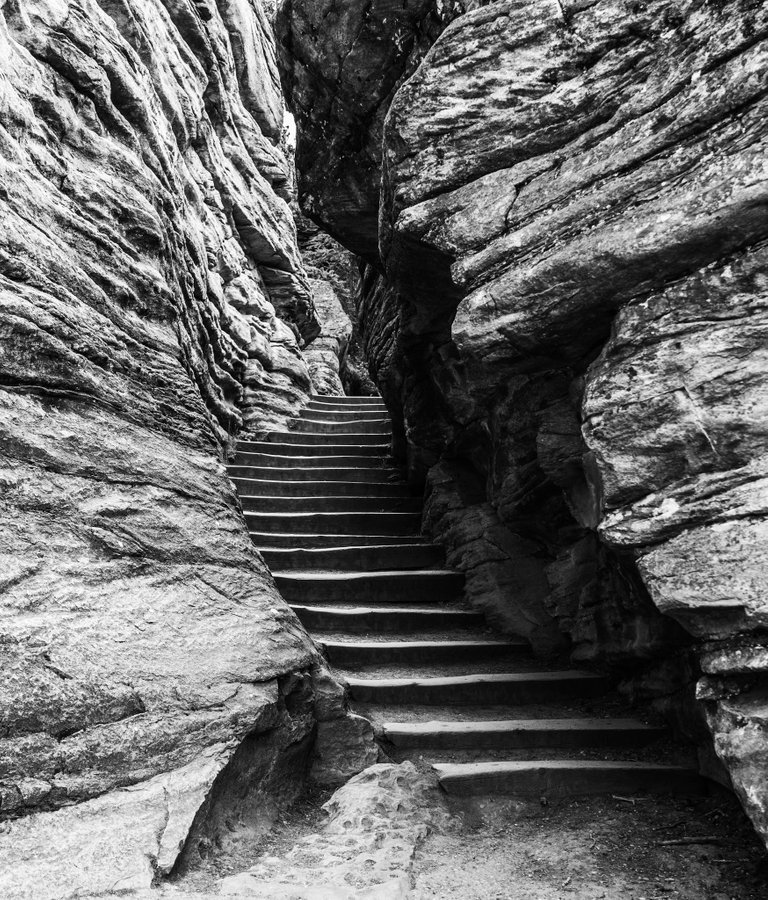
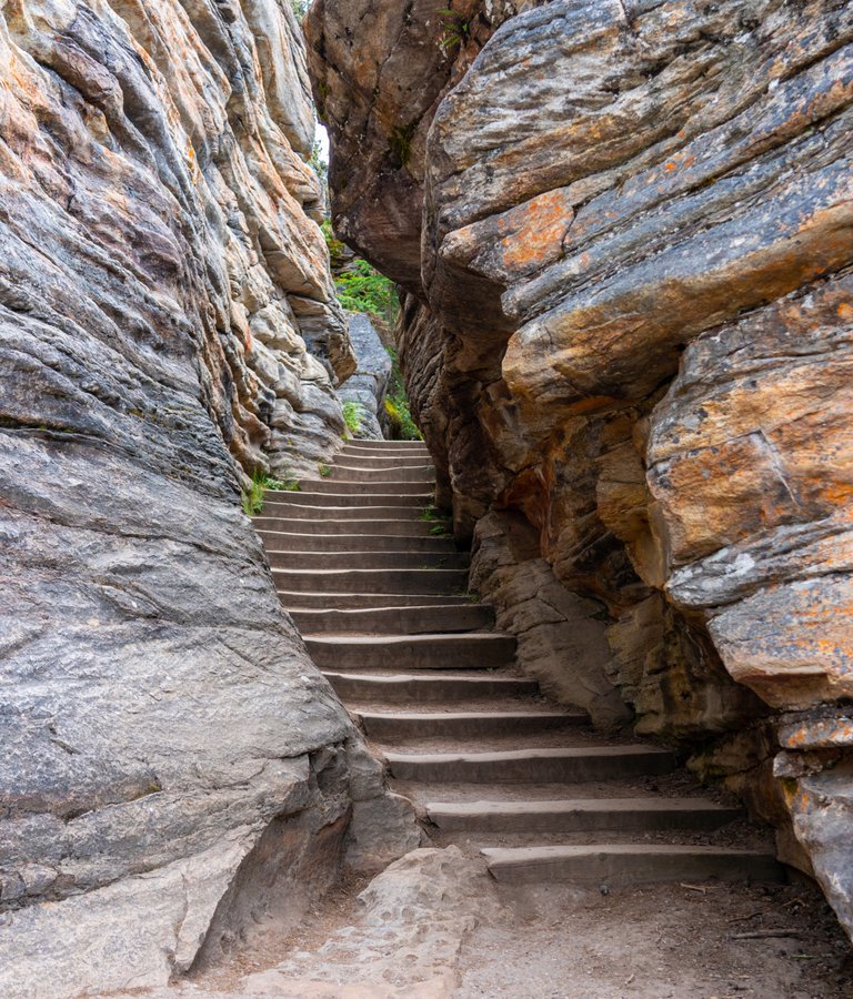
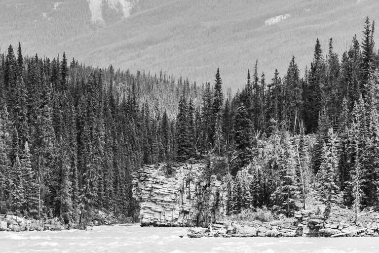
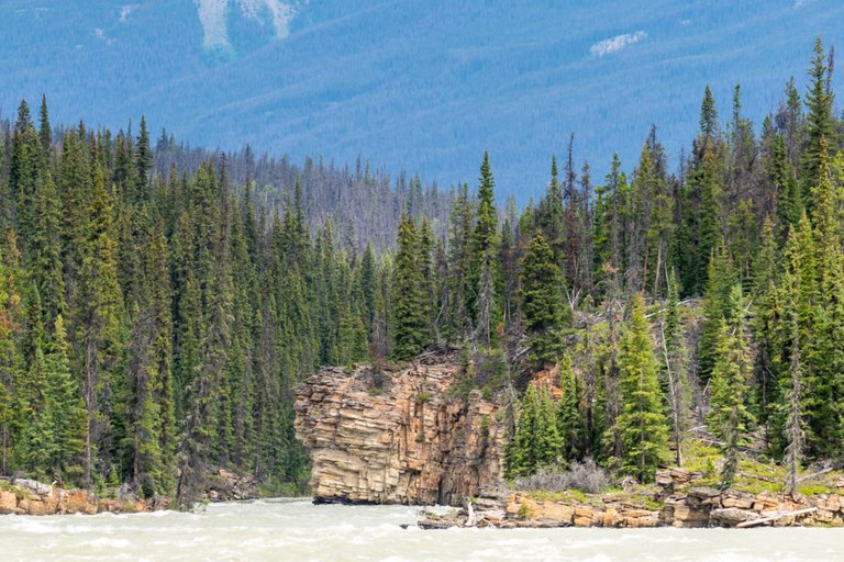
I waffled a bit about which photo to lead with today. Finally the black & white won the battle. I’m quite happy how it turned out. Tell me what you think? This is the stairway to Athabasca Falls, seemingly hewn out of the rock bed. It is such a cool stairway, and mostly busy with people using it, so I had to wait for the perfect opportunity to snap a couple of shots. Glad I got it done! Photos taken at Athabasca falls, Jasper National Park, Alberta, Canada.
Camera: Sony A7R III
Lens: 24-105mm f4 G OSS
Editing: Lightroom & Camera+
Do you like Black and White photography? Do you like Colour photography? If you answered yes to both questions, then you are a perfect candidate for the “Colour / Black & White” photography community. Created specifically for that purpose. I will be personally curating qualifying posts. What are you waiting for? Join now!
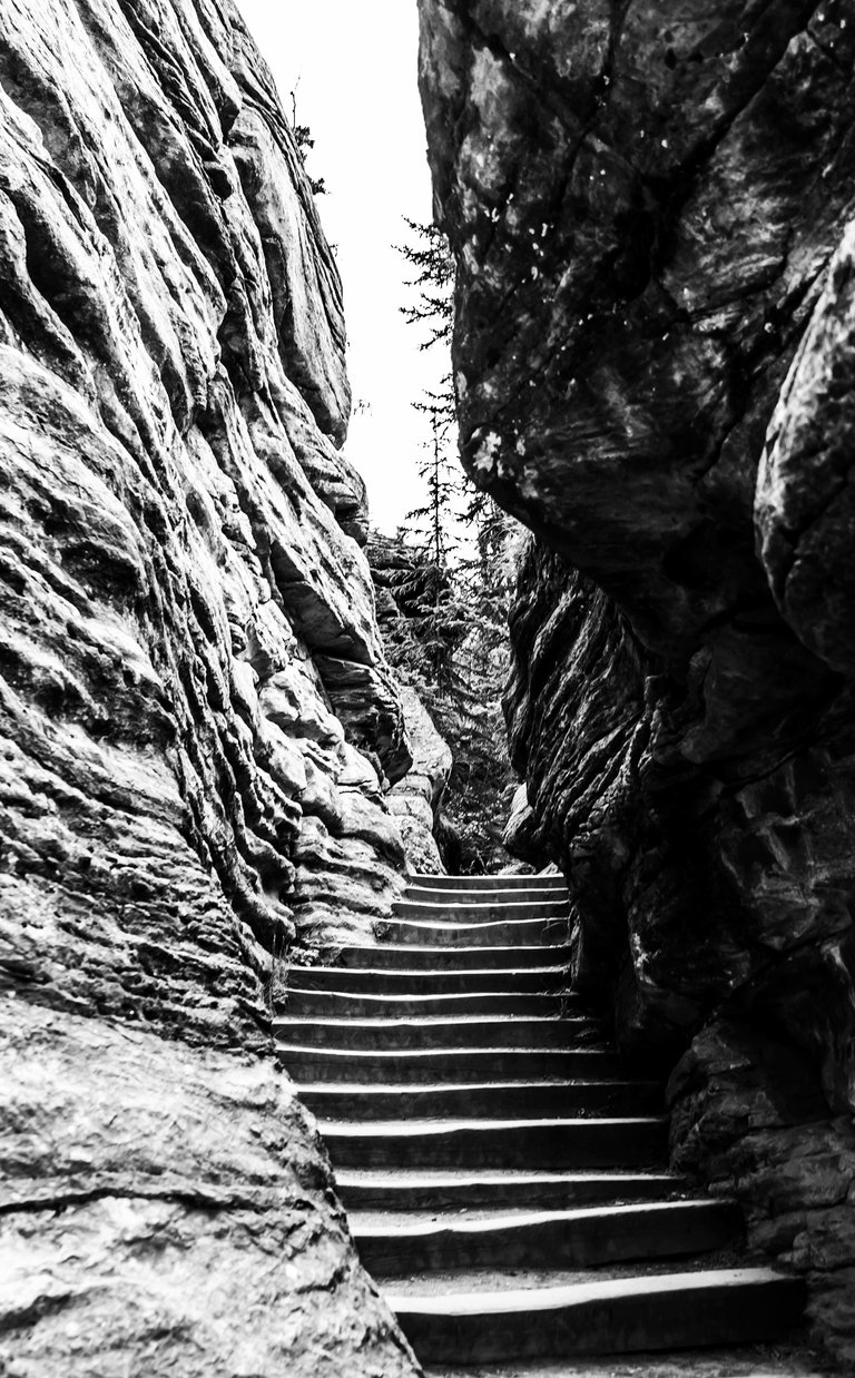
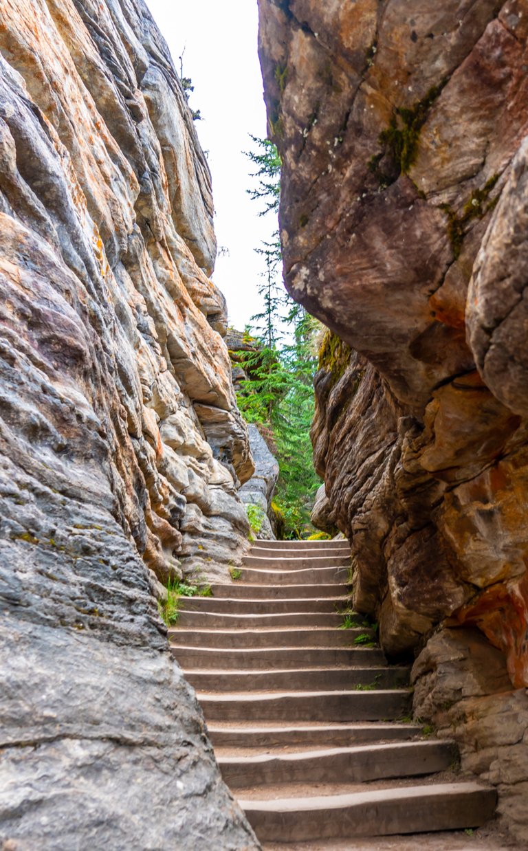

Stairway to heaven😉
Yeah, thats what I was thinking.
~~~ embed:1624899481274654720 twitter metadata:MTg5MTY5MDQwfHxodHRwczovL3R3aXR0ZXIuY29tLzE4OTE2OTA0MC9zdGF0dXMvMTYyNDg5OTQ4MTI3NDY1NDcyMHw= ~~~
The rewards earned on this comment will go directly to the people( @daveks, @jlinaresp ) sharing the post on Twitter as long as they are registered with @poshtoken. Sign up at https://hiveposh.com.
The steps hewn out of the rocks is such a mastery. I think I applaud the beauty and the shot is phenomenal. I think I'll agree with you that the white and black is beautiful..
Yes, a unique and beautiful slab of chiseled rock. Thanks for looking.
I'm a fan of monochromatic photos too. I have to agree that the black and white gave heaviness and value to such a majestic scenery. You captured it well. 👏
Appreciate that, thanks.
That's the place I was thinking about....So awesome! Thanks for sharing!
Now that your in the neighborhood, the Rockies are not that far away anymore!
I think the one you led with is awesome, but i am going with the colored version because you can see the distance a little better with the way the color contrasts. Plus, the rock tones and green spots make the eye's ascent to the focal point a bit more interesting. However, you could look at that B&W version for a very long time. I really like the framing. Cheers browski!
Good points. Off topic but, you are doing a bang up job with the community. I like the fact that double and triple platform dippers won't be curated anymore. I did post a bit on blurt sometime back, but then came to my senses and sold all my holdings. At this point, I'm truly all in with Hive, you might say I've bet the farm on it's success. I am a Hive Maxi. Mic drop.
Yes, i have been a HIVE maxi the whole time... but never had a problem with people diversifying their assets. However, with the scandals on Steem and the inability to adjust rewards via no downvote.. there is no sense in not being only on Hive. Thank for the appreciation and honestly, the other users haven't been getting money curated in a very long time. Just featured in the community posts. The only reason you don't get curated for money is because you aren't an 'underrewarded' user. But, i try to show your stuff off when i can. I favor the B&W version but think the color version would appeal more to the masses.... so that's the one in the upcoming HotShots! Spoiler alert! hahahha
Nice, the b&w's are coo, but the colors are too coo.
A lovely staircase and it looks wonderful in the black and white... You could say it leads to a monastery somewhere in Tibet! :) ... 📷🔝
!BBH
Your Content Is Awesome so I just sent 1 $BBH(5/5)@daveks! (Bitcoin Backed Hive) to your account on behalf of @jlinaresp.
Difficult choice but B&W by a nose…
It was difficult to choose actually!
Thanks for your opinion, maybe I should have led with the colour!