S
o, in the last few articles in the series, we saw how to perform linear regression, and then we moved on to polynomial regression hoping for better fits to our data.
In the last article, we also saw that using higher order polynomials doesn't always means that the prediction will be better. It rather adds more degrees of freedom and the curve fluctuates arbitrarily between and beyond the data points...as can be seen below:
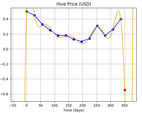 | This is the result we achieved fitting the data with a polynomial of order 14. |
NOTE: If you haven't seen the other articles in this series, you can find them here:
1. Do we really need to optimize?
A thought: I had an interesting thought when I posted the last article, and the image of the curve given above. You see, I said we need to optimize and that higher order polynomials are not the best solution. But saying that, we can't forget the fact that the 14th order fit does pass through all the data points.
It only seems to be messing between those data points (hence, it's not well suited for interpolation - where we try to find the values between two given data points).
But, since it does pass through all the data points, that means it performs periodic wiggles, the wavelength of these wiggles (or waves) being twice the distance (along the independent axis, here x) between two data-points.
This means, that the curve may perform well, if we tested it only at half a wavelength after the last data-point.
Reveal spoiler
EXPERIMENT - 1
So, let's perform a test: rather than trying to get a prediction for 1st June (day = 350), we try to get a prediction for 15th June (day = 364).
| Nope, that didn't work...haha! We can't have Hive price in negative! | 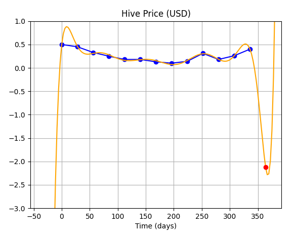 |
So, that idea failed...and if we look closely, we'll find that the we made a false assumption on the wavelength of the wave...looking closely, one will find that the wavelength actually is not constant (meaning the number of points covered in a full-wave are not the same through out.)
Now, let's not try to make unnecessary sense out of this and proceed to Optimization, our only hope!
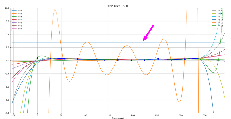
But, before we move ahead, I'll surely like to do one more experiment, ...and that is to plot all the fits of different orders together on a single chart...and see how it looks...
EXPERIMENT - 2
Well, that's quite a mess! ...and I can see one of the curves out of place as well (marked with pink arrow)!
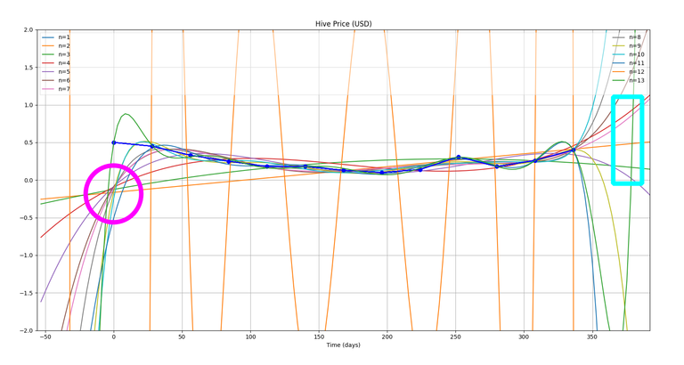
But, now let's reduce our x-range a bit...to maybe: (-3,3)
Now, we do notice two things in this plot:
- Pink Circle: You can very clearly see that all the curves tend to pass through that point...which is very close to origin (0,0). This has got something to do with the particular method I am using.
- Blue Rectangle: I was hoping that the curves should again meet at the end somewhere in that rectangle and that may give us something interesting to ponder upon, but well! Our experiment failed again!! Hahaha!
2. Yeah, we surely need "it" !!
(Optimization!)
Now, the way we'll move ahead is that, we'll try to minimise the error in the fitted curve. That is the fit that has minimum deviation from data points will be chosen.
For this, we'll need two formulae:
(So, for example, if we have a quadratic polynomial, then we'll use the following...)
Sum of squares of residuals

Standard Error

Since, m = 2 (for quadratic polynomials)
....and so for a general mth order polynomial, these equations will become:
Sum of squares of residuals:

Standard Error:

So, we'll run our code for all orders of polynomials i.e from m = 1,...,n and we'll find the standard error in each case, and then, whichever order gives the least value of error will be used to predict (or extrapolate!).
The code for it looks something like this:
Caught in another Experiment!!
You can't help deviating from your course sometimes when your program accidentally spits out something which can be useful!!...
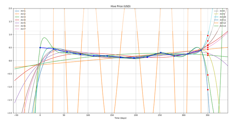
So, as I was programming the optimization in my code, while trying to evaluate the error for all the curves, I accidentally got this graph because of an extra line of code in my program.
(The red dots which you can see at x = 350, are actually predictions for day = 350 (1st June) for each of these fitted curves of different orders (m)).
What is very interesting is that these values are clustering around a particular point, though some of them are even outside the range of the graph...but, leaving them apart, let's try to find the average of all of these.Finding average of these predictions:
Avg = (0.95 + 0.75 + 0.61 + 0.58 + 0.5 + 0.43 + 0.28 + 0.21 − 0.55 − 1.11) / 10 = 0.265 $We'll check this with the actual value of Hive on 1st June, but first let's get on with our optimization...!
import os
import numpy as np
import matplotlib.pyplot as plt
import math

# DEFINING FUNCTIONS
    # Function to sum the elements of an array
def sum(a):
    sum = 0
    for i in range(len(a)):
        sum += a[i]
    return sum

# Main function to perform Gauss Elimination and fit the data.
def fitCurve(x, y, n):
    #if (order == "default"):
    #    n = len(x)
    #if (order != "default"):
    #    n = int(order) + 1

    print(n, type(n))
    data_m = np.zeros((n,n+1))

    #Explicitly Defining the Augmented Matrix
        #Generalising Augmented Matrix Definition
            # Defining the matrix A
    for j in range(0,n): #Row counter
        for i in range(0,n): #Column counter
            if(i == 0 and j == 0):
                data_m[j,i] = n
            if(i!=0 or j!=0):
                data_m[j,i] = sum(pow(x,(i+j)))

    # Defining the matrix B
    for j in range(0,n):
        data_m[j,n] = sum(y*pow(x,j))

    print("Initial augmented matrix = \n", data_m)

    # Elimination
    for j in range(1,n):
        #print("LOOP-j:", j)
        for k in range(j,n):
            #print("     LOOP-k:", k)
            factor = data_m[k,j-1] / data_m[j-1,j-1]
            for i in range(n+1):
                #print("         LOOP-i:", i, "| ", data_m[k,i])
                data_m[k,i] = format(data_m[k,i] - factor*data_m[j-1,i], '7.2f')
                #print("-->",data_m[k,i])

    print("Matrix after elimination = \n", data_m)

    # Back Substitution
    solution = np.zeros(n)

    for j in range(n-1, -1, -1):
        subtractant = 0
        for i in range(n-1,-1,-1):
            subtractant = subtractant + (solution[i] * data_m[j,i])
        solution[j] = (data_m[j,n] - subtractant)/data_m[j,j]
    print("Solution matrix:\n", solution)

    return xStart, solution

def predict(x, m):
    prediction = 0
    for j in range(0,m):
        prediction += solution[j]*pow(x,j)
    return prediction

# Function to resolve the fitted curve.
def resolveFit(n, curveRes, curveMar):
    #curveRes = float(input("Please enter the curve Resolution (relative to original data)"))
    #curveMar = int(input("Please enter the curve margins (rel.)"))
    xRes = np.zeros((2*curveMar + len(x))*int((len(x)-1)/curveRes))

    count = -curveMar
    for i in range(0,len(xRes)):
        count += curveRes
        xRes[i] = count # xRes will now become the higher res x-matrix for the polynomial curve.

    y2 = np.zeros(len(xRes))
    j = 0
    for j in range(0,n):
        y2 = y2 + solution[j]*pow(xRes,j)

    return xRes, y2

# Function to define the plot
def definePlot(x, xStart, xRes, y, y2, m):
    ax = plt.subplot()
    ax.plot(28*(x+xStart),y, "ob", linestyle="solid")
    ax.plot(28*(xRes+xStart), y2, linestyle="solid", label="m=%d"%(m,))
    ax.plot(350,predict(12.5, m), 'ro')
    return ax

# Function to set options for plot and show it.
def showPlot(x, curveMar, xStart):
    plt.xlim(28*(x[0] - curveMar + xStart),28*(x[len(x)-1] + curveMar + xStart))
    plt.ylim(-2,2)
    plt.grid(True)
    plt.title("Hive Price (USD)")
    leg = plt.legend(loc='best', ncol=2, mode="expand", shadow=False, fancybox=False)
    leg.get_frame().set_alpha(0.5)
    ax.set_xlabel("Time (days)")
    ax.set_ylabel("")

def findRes(x, y, solution, resSqrSum):
    for i in range(len(x)): #NOTE: This index plus 1 will give the order of the polynomial being fitted
        resSqrSum[i] = y[i]
        for j in range(len(solution)):
            resSqrSum[i] -= solution[j]*pow(x[i],j)

    return sum(resSqrSum)

# MAIN PROGRAM
fileData = open("<location>/data.csv", "r")

for line in fileData:
    line = fileData.readlines()

print("Data received:\n",*line)

x = np.zeros(len(line))
y = np.zeros(len(line))

for i in range(len(line)):
        x[i], y[i]= line[i].split(",")

xStart = x[0] #xStart makes sure that that the x-matrix for original data always starts from 0?
x = x - x[0]

print("x-matrix:\n",x,"\n y-matrix:\n",y)

# Defining Residual Squared Sum Matrix, this will store the residuals for different order fits.
resSqrSum = np.zeros(len(x))

#order = 2
#n = order

# Defining Syx matrix
Syx = np.zeros(len(x))

n = len(x)
curveRes = 0.1
curveMar = 2

for order in range(0, len(x)): # Actual order is 1 plus this index
    m = order + 1

    xStart, solution = fitCurve(x, y, m)

    xRes, y2 = resolveFit(m, curveRes, curveMar)

    # Finding sum of residuals squared.
    Sr = findRes(x, y, solution, resSqrSum)

    # Filling standard error(Syx)

    preSyx = np.sqrt(Sr/(n-m-1))
    if math.isnan(preSyx): # Checking if the values are imaginary, and appears as "nan".
        Syx[order] = pow(Sr/(n-m-1),2)*pow(10,37) # Assigning a dummy value
    else:
        Syx[order] = preSyx

    #ax = definePlot(x, xStart, xRes, y, y2, m)

print(Syx)
minErr = np.amin(Syx)

for i in range(len(Syx)):
    if Syx[i] == minErr:
        minErrOrd = i + 1

m = minErrOrd
print("Minimum Error Order =", minErrOrd)

xStart, solution = fitCurve(x, y, m)

xRes, y2 = resolveFit(m, curveRes, curveMar)

ax = definePlot(x, xStart, xRes, y, y2, m)

showPlot(x, curveMar, xStart)

#print(y2)


#y_=np.mean(y)
#s1,s2=0,0
#for i in range(n):
#    s1=s1+(y[i]-y2[i])**2
#    s2=s2+(y[i]-y_)**2
#R2=1-(s1/s2)
#print("R2 = ",R2)
#xinput = input("Proceed to plot? (y/n)")


plt.show()
You'll notice that I have changed the function a lot and modularised it by defining new functions.
Okay, so running the code with our data, we get the best fit order = 5....and fitting the data with a polynomial of order 5, we get the following:
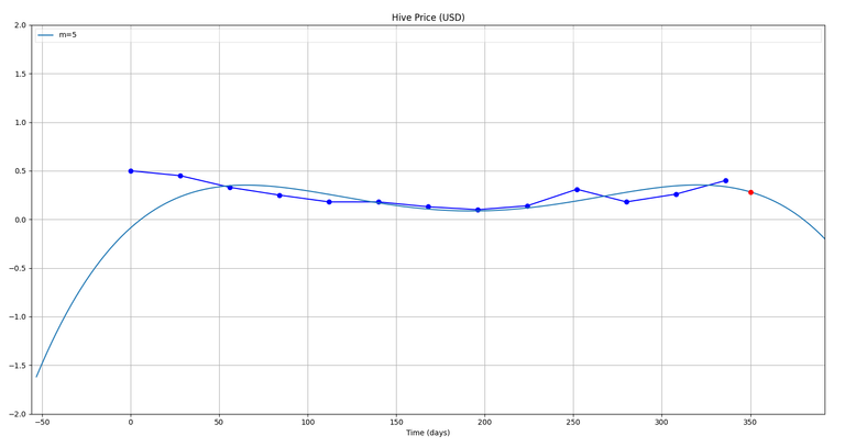
The red dot as usual is the prediction...
So, from this we get a prediction of 0.28 $
Now, let's check what the actual value on 1st June was... (we'll take it from the same site from which we took our initial readings: https://www.marketwatch.com/investing/stock/hive/charts?countrycode=ca)

We get a price of around 0.39$, and a Simple Moving Average (SMA) of around 0.3$ on June 1, 2020.
...Hmm...not bad I guess I wasn't expecting any better, given the low resolution of our data (less number of data points we took). I am happy that we were close to the SMA!
I hope you enjoyed this article.
Have a nice day!
Best,
M. Medro
Credits
All media used in this article have been created by me (unless specified). I am thankful to the following sources:
- Hive Price Chart (for Final Testing of prediction): https://www.marketwatch.com/investing/stock/hive/charts?countrycode=ca
Congratulations @medro-martin!
You raised your level and are now a Minnow!
Support the HiveBuzz project. Vote for our proposal!
Thank you!
It is a real reason to celebrate!
cheers to you,
lizanomadsoul
Worth reading
Interesting post, thank you!
Thanks a lot for the appreciation, great that you liked it!
@tipu curate
Upvoted 👌 (Mana: 14/28)