Foreword
Hey hey, (the) Mikky here.
Since it seems that you seem to enjoy this nerd's rambling, I decided to take on a project that might interest more of you.
So first of all - thanks for all the rewards! I never expected my first posts to be so successful.
You are all truly wonderful.
@apshamilton has done me a great service in pointing out some errors in the presentation. I really hope that they have been fixed and the graphs are both clear and fully factual now.
Skip to either Country comparisons or Conclusions for the summary.
Happy reading!
The goal:
I want to look at interactions between the following and see how well they fit the mainstream narrative:
Vaccinations
Measured in doses normalised for population sizeExcess mortality
Measured in excess (or reduction) % of total deaths expected during this period
See my previous post for a brief explanation of the termDeaths from covid
Measured as covid deaths per million
As each country designated it
Luckily, Our World In Data has done an amazing job at collecting all of this for me, rather than having to try to dig through each country's database and find the data myself.
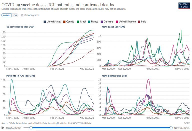
Here is their visual summary of the situation - beautiful done, but hard to interpret. I hope to add some light from a different angle.
Caveats and limitations (nerd shit):
This is gonna be a lot of babble, and if you want to get to the juicy stuff, skip this.
What is a covid death?
The eternal question. I can't go over every country's hospital data and confirm (not that I could, anyway).
For the sake of this exercise I will assume a covid death is a "death by covid" even if I know this may not be true.
I will however justify (or disprove) this by looking at the correlation with excess mortality.Lack of data and asynchrony
You guys are lucky to see the final result. Without getting too much into it, it's obnoxiously difficult to try to sync up different types of data so that you can reliably present all of it together.
I heavily filtered the majority of countries to those who had at least 20 data points (arbitrary cut-off that seemed reasonable to me) where all 3 factors were recorded on a certain date, to avoid comparing last week's deaths to this week's covid deaths, etc.Defining vaccination levels
Because we know that vaccine efficacy wanes over time (see my first post as an example), some countries are now doing boosters while others are still trying to encourage their population to get the first shot, it becomes a logistical nightmare to try and calculate doses per time given.
So I went for how many vaccine doses (normalised per population) were given overall.
So note that "time from vaccination" is not accounted for here, nor is there a difference between 3 people getting a single dose, or one person getting 3 doses. C'est la vie.How to reliably measure relations between the variables?
Whether one variable affects another is notoriously difficult to pinpoint into a simple, digestible number. Rather than using some sort of cut-off (50% population vaccinated, for example) I decided to look at simple Pearson correlations.
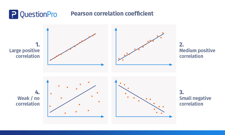
These are however problematic, as perfectly linear correlations hardly exist in the real world and outliers can skew your results heavily. I don't want to completely ignore outliers, however - if suddenly, very few people die (or a lot), that's relevant information, even if it makes the stats awkward.
So I made the decision to bootstrap the correlation - meaning, I took all the data for a country (say, 20 data points) - calculate the correlation on 15 of them, then do this 100 times and get the mean with the deviation. This will be relevant later.
One unresolved issue: unlike covid or excess deaths, vaccine doses can only go up. I don't think it'll be an issue, but could be if unforeseen circumstances show their ugly face.Not looking at the full timeline
Because we're looking at the start of vaccine campaigns, we will be ignoring say, covid-excess death correlations pre-vaccines. This will be relevant RE: Spain, for example.
Meet the data
Let's first look at higher resolutions before getting into conclusion-worthy territory.
Vaccines on X, excess/covid deaths on Y
The first plot shows how vaccination levels affected covid/excess deaths.
Here per graph you will see:
- Vaccination doses on the X axis, essentially time since the beginning of vaccination campaigns.
Large gaps indicate a lot of vaccines over a period of time, small gaps mean a decline in vaccine rates. - Total vaccine doses at the latest date available are shown under the country name
- **Excess mortalityon between excess mortality and vaccination is the number to the left
To those who don't know -
A perfectly negative correlation is -1 ("more vax = less excess death'),
No correlation whatsoever is 0 ("more vax = no effect on excess death'),
A perfectly positive correlation is 1 ("more vax = more excess death') - Covid deaths in orange
Correlation between covid deaths and vaccination is the number to the right
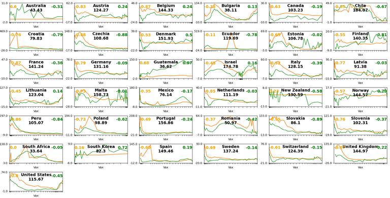
OK, so other than that I can't get the Y axis to be universal (trust me I tried, it made the graphs more confusing), let's see if we can get a general idea of the situation.
- Frustratingly, many countries (Israel, Netherlands, Germany, Switzerland, Portugal, US, Slovakia, Canada, Denmark) started vaccinating during a covid decline. This gives the impression that vaccines are directly responsible for the drop in mortality.
- A few countries just had really low covid so there's little variance in their numbers anyway (Portugal, Denmark and Switzerland after the end of their wave, Australia, New Zealand, Norway)
- Generally speaking, excess mortality lines up with covid to an extent. Meaning, when there were many covid deaths, you'd see an increase in excess mortality. * Note that this does not guarantee that the change will be high
Covid deaths on X, excess deaths on Y
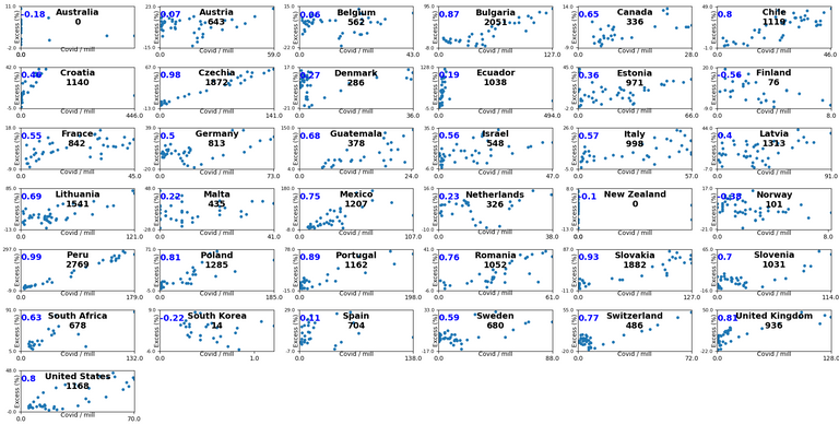
One more, because I understood that the previous graph was easy to misinterpret (and I messed up the colours).
Here we see covid deaths vs excess deaths, generally the more covid deaths, the more excess deaths.
Australia and New Zealand have had pretty much no covid deaths, but plenty of excess death. This may provide interesting insight since covid is practically non-existent there, supposedly.
- This time around, the number under the country signifies total covid deaths/million since the start of the vaccination campaigns.
- Every dot is a snapshot in time - when the US had X covid deaths, it had Y excess deaths. etc
Country comparisons
OK, so that's the data. Now let's look at this on a larger scale.
Expectations
Here is how I predict what the narrative should assume.
- Covid deaths cause excess deaths (+ correlation)
- Vaccines reduce covid deaths (- correlation)
- Vaccines do not cause non-covid deaths (- correlation if 2 is true)
Correlations per country (the graph)
So I ordered all countries according to how well they fit this narrative.
Honestly? I was kinda surprised, and not in the "wow" sense.
- You are looking at correlation scores (Y axis) per country.
- Each country has 3 correlations to it, with error bars (black lines) signifying stability of the correlation -
- Covid - excess death (blue)
- Covid - vaccination (orange)
- Vaccination - excess death (green)
- Stable correlations will have a small error bar, unstable correlations will have a wide error bar.
See Croatia's blue bar for an example of unstable (i.e. unreliable) result)
- The mean over all countries is on the far right
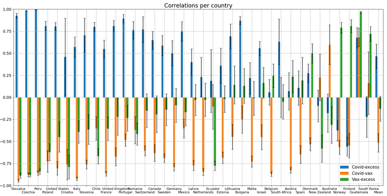
Well, then.
- It appears that overall, there's a reasonable positive correlation between covid and excess deaths.
- The negative vax-covid correlations are also strong, overall.
If this continues, I'm gonna take off my conspiracy tinfoil hat. - Vaccination and excess deaths are a little trickier...
- For the first 10 or so countries, the conclusion seems clear and I might hop to the local clinic to get my first jab.
- But then we get to say, the UK and the waters get murky. Covid correlates with excess deaths, vaccines correlate with negative covid, but... vaccines don't cause a drop in excess deaths?
This invites a worrying predicament that vaccines are "evening out" the covid deaths they're saving.
If this was just the UK, I wouldn't take it too seriously - but then the next 8 countries (Romania excluded) show the same pattern. Uh-oh. - For the quartet Belgium-Austria-Spain-Denmark, vaccines are actually more in line with excess deaths than covid deaths are. Big uh-oh.
Regarding Spain especially it is important to keep in mind that there was a tsunami wave (reaching 150%, which is huge) of excess mortality back in March-April 2020. We don't see it here because vaccines were irrelevant then. - It seems to be worse for countries that had really low covid to begin with - Norway, Finland, South Korea. (Guatemala is the exception, they've had a lot of excess death and covid)
I don't want to sound alarmist, but this is actually worrying. The numbers are pretty low so no need to sound the alarm bells yet, but this is a space we should be watching closely.
- You may have noticed that I skipped some countries. I don't really know what to say about some anomalies
Conclusions
At first, it seems that covid generally causes excess death and vaccines (generally speaking) reduce covid, yay!
But.... there are too many countries showing that excess deaths don't go well with vaccines despite the drop in covid. In some countries we even see that vaccines are followed by an increase in excess death. This is a worrying state of affairs.
It is crucial to state that the situation's not severe enough (nor data + methodology bullet-proof enough) to conclude "the vaccines are killing us all!", but there is definitely serious risk/benefit ratio to consider on the matter.
Anyone who wants to look deeper into a specific country is invited to do so on the excellent OWID dashboard. Report any interesting findings, as I am sure that I am ignorant of a lot of country-specific nuances (e.g. wtf happened to Guatemala's huge, sudden covid spike?)
Word of thanks
Many thanks to the Hive merchant guild, sponsoring and promoting these posts!
They take me WAY longer than I ever mean to, and honestly aren't worth the money. But the fact that I see that people are interested enough to "vote" for them gives me motivation to keep them coming.
You are still, truly wonderful. I appreciate your digital shekels.
Future
If I can gather more data on live births/fertility and compare them to excess mortality, I'll do that. For now I have this on Israel.
Currently, worry of an incoming collapse (economic, social, logistical) has me more worried than trying to challenge the narrative.
This is great analysis however there seems to be a discrepancy with the blue correlation numbers where negative numbers have been graphed as positive.
This was a graphing/presentation issue and I hope it's resolved/clear now! Many thanks!
Congratulations @themikky! You have completed the following achievement on the Hive blockchain and have been rewarded with new badge(s):
Your next payout target is 50 HP.
The unit is Hive Power equivalent because your rewards can be split into HP and HBD
You can view your badges on your board and compare yourself to others in the Ranking
If you no longer want to receive notifications, reply to this comment with the word
STOPCheck out the last post from @hivebuzz: