Every morning in the context of the @ourpick curation project, my job is to find one post worth reading and to curate it manually. You would think that this is an easy exercise. I thought so too but it isn't.
When I curate, I try really to find picks that are from authors that I don't know. What matters in my search is not so much the author but the content. So I go through the feed of all the posts sorted according to the most recent posts. Like that I see everything that has been posted on Hive for the past hours.
What I look at first
To find my daily post, I really scan the feed for things to stand out. There are two things that have the chance to attract my eyes: The image and the title. Only if one of them catches my attention, do I read the smaller print.
Find a title that would make you want to read your post
It's pretty frustrating to see what kind of titles most hive users chose for their posts. Here a list of titles that I randomly picked of posts today. This list comes from the feed of all hive posts sorted according to time of publication. So these posts actually follow each other in the timeline:
- Effort and passion
- The charm of mushrooms on rotten oil palm trees
- Coffee photography
- 31 May 2024: Freewrite Writing Prompt Day 2389: Players of games
- Vibes Web3 Music Competition Week 12 Original Song
- Jazz avant-garde Nigerian Juju Hilife y Origin
- A swan in the shallows
- Heraklion Port morning views
I'm sorry to say but I wouldn't want to read a single of these posts just because of the titles that were chosen. Would you?
If you want people to curate and upvote your posts, you need to find a title that sells your content as well as possible. It should incite to read your post and also rise curiosity. Or at least it should incite people to come to the post because what they can learn from your content.
The image is the billboard of your post
You should consider your post to be like a product that you want people to consume. There won't be any comments or upvotes if people don't come to your post in the first place. So you need to attract the readers and curators and to do that, the image that you chose is your best marketing tool.
Some tips regarding that:
- Always use an image to illustrate your post
- There are plenty of free images available on different sites that you can use
- Use a platform like Canva to give a style to your images.
- If you use a similar style on all your posts, people will recognize your „brand“
- It can be a good idea to use text on your post images. I always repeat the title of my post on my images. That's how I think the billboard works best.
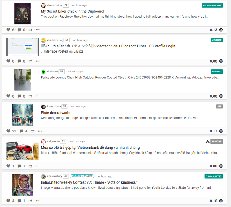
I just took a random series of posts on peakd, again sorted according to the time of publication. There aren't really many images here that attract my attention.

source: https://peakd.com/created
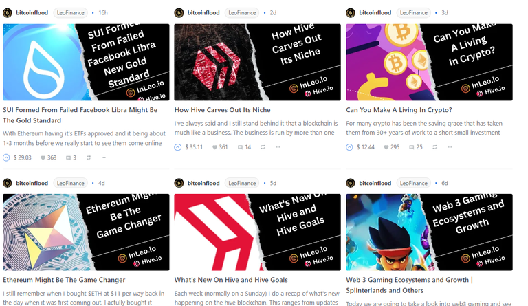
Here a screenshot of somebody who I believe sells his posts very well and creates a brand around his content (feed of @bitcoinflood)

source: https://ecency.com/@bitcoinflood/posts
Work on your titles and your images to get more readers and more upvotes
I've been researching content to curate for about 3 years now and maybe I'm a bit too demanding but I want to find the little pearls on hive that are worth reading and feature them over @ourpick. I believe that if we support really good content, then others will be inspired to create good posts as well. This is important for the people's career on hive and also for the blockchain in general. We will attract people from the outside only if they find an added value in the content that we create.
So when you create content, make sure that you don't undersell yourself. Put a lot of effort into choosing a good title and spend some time to find a nice illustration for your post. If you create great content, I want to be sure not to miss it. With a good title and a nice image you can help me find it!
Title image: made in https://www.canva.com/
With @ph1102, I'm running the @liotes project.
Please consider supporting our Witness nodes:
Those are all really great points and I would also just add that using a tool like Canva to format your title picture to 1600 x 900 pixels is really important too. From your image above, only 2 from 6 had the image correctly formated for a title image.
The format matters especially when you look at it in the feed. You simply don't want to click the ones that have a "wrong" format.
Catchy titles are dangerous, they tend to disappoint the reader. The image is important, as they say, a picture is worth a thousand words. But good free images are hard to find.
Well I would say it's better to disapoint a reader than not to have the reader at all but of course it can be exagerated.
You can take a free image and then individualise it with Canva for example.
Wow it's interesting how much impact a title and image can have on whether we click to read a post. I'll definitely be more mindful of those when I create content. Thanks a lot for this man
I think it can only be helpful to invest some time into chosing a good title and a good image to illustrate your posts. In a way we are all influenced by the packaging of a product that we buy. The title and the image are the packaging of our posts in a way.
Wow you're absolutely right on that the title and image really is the package.... Infact that's 80 percent of why I open the post of people I don't know... This is so true friend.
What gets my attention the most is the picture content of a post. I truly don't like downloaded pictures, original pictures or canva ones. Obviously I wouldn't read the post with such titles as you've listed
It's the same for me. Sometimes it's really frustrating to see how little effort is put in these posts.
Good pieces of advice here!
Thanks :-)
!LUV the suggestions. Thank you for the guidance. !LOLZ
lolztoken.com
This changes everything.
Credit: marshmellowman
@achim03, I sent you an $LOLZ on behalf of fjworld
(1/10)
No problem. Thanks for stopping by!
I knew there was something missing from my posts. i am going to get an idea from this post and will try to apply it on my post. Thanks for the learning
You are welcome!
Hmm, interesting article!
In terms of titles, I think I am doing fine. Could it be improved, sure but it's okay ish.
In terms of thumbnail pictures, that's something else. I agree that the example you gave of bitcoinflood is really great. Will think about creating my own 'brand' :D
I think it can be a good idea to create a kind of brand. People recognize it quickly.
I agree, will think how I'll create mine :D
Thanks for the inspiration! ;D
It's something that I should do, but I find it a little tiresome to make new images. So I tend to opt for more images that come from a site or game directly. I really should use Canva to make some images. As for the title, I agree that it's a good point to consider. It reminds me of how people clickbait videos in Youtube.
I think that it's worth to spend some time on better pictures but it's definitely addition work.
Hmm
You have a valid point here. It’s always important to make our post title more catchy so that people will be willing to read
Thanks for sharing this hint
You are welcome!
!discovery 30
Thanks for the curation!
Thanks for the curation!
Excellent tips, to take into account in future publications.
Thank you.
!PIZZA
You are welcome! Thanks for stopping by!
$PIZZA slices delivered:
@edgerik(1/15) tipped @achim03
This post was shared and voted inside the discord by the curators team of discovery-it
Join our Community and follow our Curation Trail
Discovery-it is also a Witness, vote for us here
Delegate to us for passive income. Check our 80% fee-back Program
You may want to rethink your curation method because not looking at the author and the overall health of the account can lead to big problems