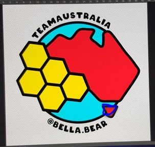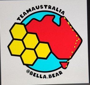
I'm not sure that made things any clearer but it was hard to get a colour to stand out enough XD
Alternately (and actually maybe the better option now that I've been looking at it longer, bring in the east coast slightly to line up with Tassie:

Hm maybe I should have used yellow the first time too XD
and also probably shouldn't have been so lazy and actually moved the annotation screen onto my tablet rather than fudging it as my point is way off
Your first blue ocean was pretty dark like the blue on the flag XD And while I think a lighter blue is definitely the go I don't think it should be quite this light :)
It is a great design, how many more votes needed?
Right!! I moved tassie instead, was easier :D
I think we have 5? Ausbit, Matt, Krystle, You, Me and I think Choo? I'm happy with 6 🤷🏻♀️ I'm keen to move on to the next task which is organising the virtual meet up.