It is with pleasure to participate in this design contest as i have been waiting to participate in any design contest i come across in this great community and i am happy that i got to participate in creating or designing a business card for the hive community.
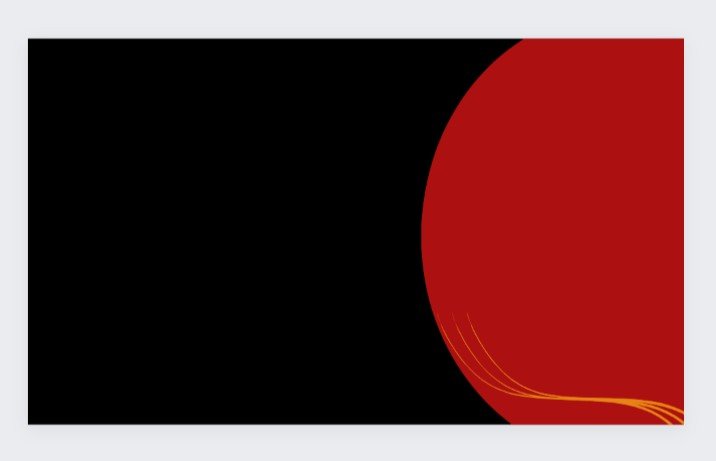
Here are my procedures and processes on how i got this amazing design done.
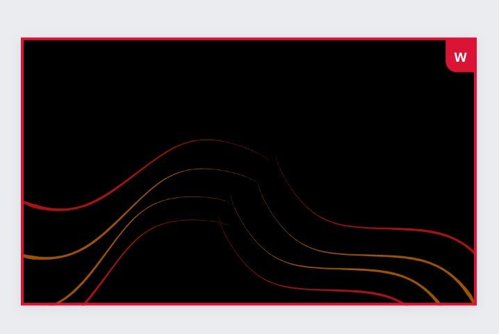
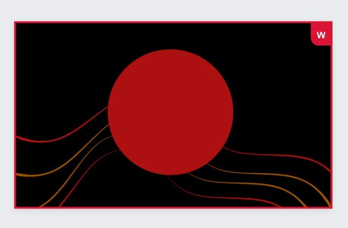
To start with, i decided to give the feel of the business card a black colour and as we all know many colours rhymes with the black colour almost perfectly or perfectly, also in the first step i added a semi circle of a red like colour to bring out the beauty little by little.
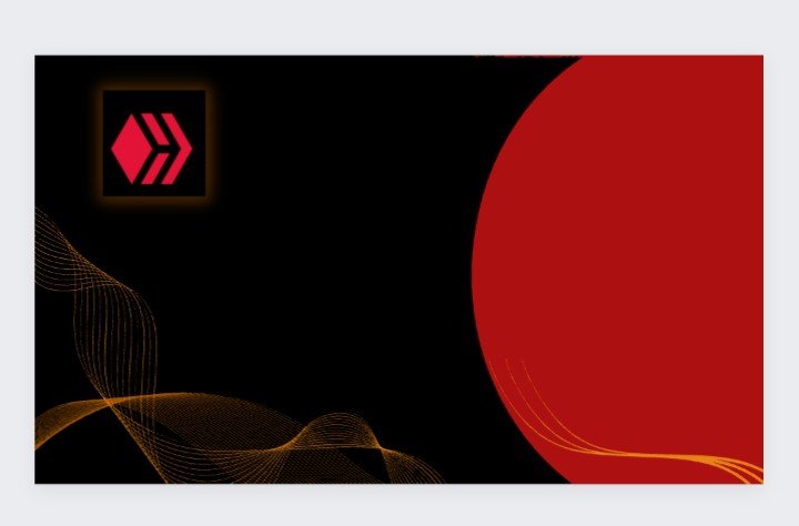
After that i decided to bring in the hive logo and a wavy feel of lines to give it more class and beauty
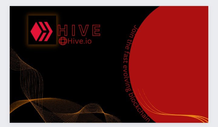
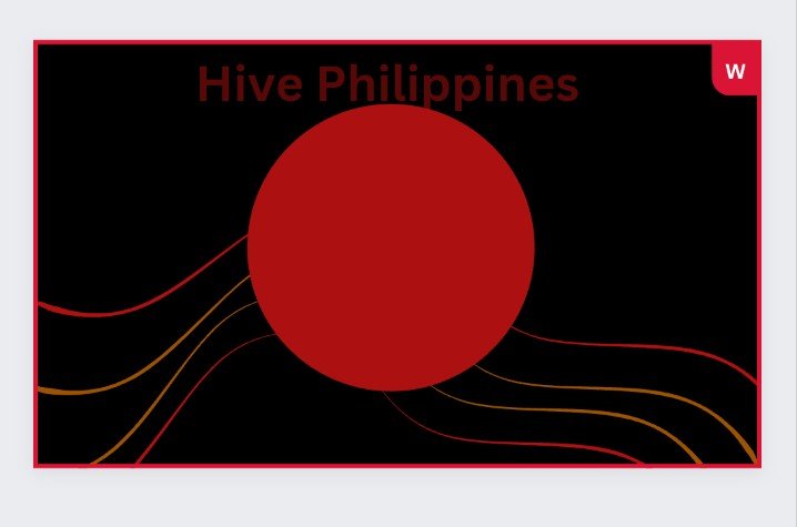
Moving on i decided to add a text which makes someone who is not a hive member to feel he or she is missing something you can see the text beside the semi circle.
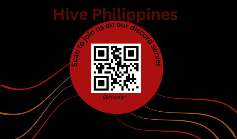
After being satisfied with the simplicity of the design i added the qr code and some more texts to give it the perfect look
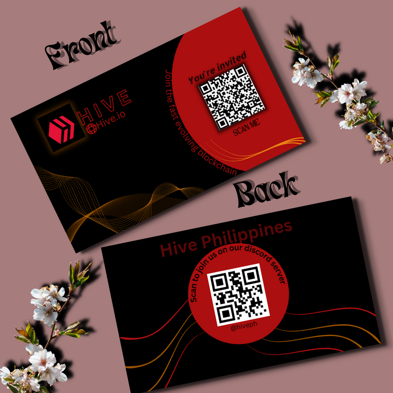
Final design of the front page

I decide not to waste time and also to make the design more simple as possible, so i gave the back page a wavy feel as like the front page and i added a round circle to connect the wavy lines together, making it seem like the lines are holding the circle , where i later added my qr code for the hive phillipines discord community or server
I also left a little space for any other text that might be added to the designs in the future.
Final design of the back page
I hope @acidyo and the hive community likes the design and watch out as i might be coming out with more designs before the contest deadline.
The design is cool and the use of graphics is nice to create this hive business card. Nice work
I found this post by browsing Threads. Learn more about threads.
Thanks so much
What a cool design Akinola, and I am intrigued if you will enter more designs like you say!
Good luck in the contest.
I found this post by browsing Threads. Learn more about threads.
Thanks so much
Will surely be creating more designs as i enjoyed creating this first design
Excellent, it can be addictive!
Haha😀
sick design, bro.
I found this post by browsing Threads. Learn more about threads.
Thanks so much 🙏
Your simplistic design is cool and pretty interesting. Good luck to you on the contest.
I found this post by browsing Threads. Learn more about threads.
Thanks so much
You're very welcome 😉
Posted Using LeoFinance Beta
I really like the dark tones of the card. One thing to consider is that black print tends to come off easily especially as it is a business card it will get tossed around quite a bit.
Just my 2 cents though. Print shops will love you for this, it requires a lot of black. But you could go printing them on black paper but that would be a costly solution as well. Overall I really like the design and these are just things you have to count with.
I found this post by browsing Threads. Learn more about threads.
Yea, you have actually said it all, i guess you have to spend more to get a black paper so as to retain its beauty.
Thanks so much for checking it out
That is quite and interesting idea. The simplicity speaks a lot and conveys the message well
I found this post by browsing Threads. Learn more about threads.
Thanks so much
you are welcome
I have seen a few entries but so far this is the best one I have come across and the design is nice.
I found this post by browsing Threads. Learn more about threads.
Wow,Thanks so much
That means a lot😊
Yes it's a nice reward. Thanks
Cool design and lovely analysis. This contest has brought out the creativity of many people 😁
I found this post by browsing Threads. Learn more about threads.
There is no doubt about that, i have personally seen some design made by people i didn't expect it from.
Thanks for the compliment