A few days ago I had a sort of vision so I decided to join Hive Business Card Design Contest with my business cards ideas so here they are. Hope you like them!
Front

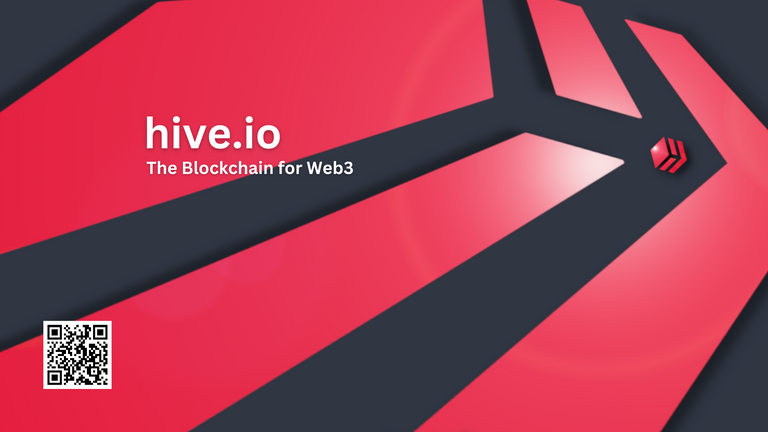
As for the front side of the card, my inspiration came from sci-fi movies such as Independence Day and V (tv-series) which both had those huge spaceships hovering above cities.
I wanted to use the Hive logo as a gigantic spaceship approaching the earth which is also a Hive logo but on a much smaller scale. I used GIMP and its perspective tools to change the point from which we are looking at the larger logo. I did this to make it more dynamic(fast, powerful) and also make it look even bigger(scalable) compared to the Hive "planet".
Have you ever noticed that the Hive logo has the letter H in it? By changing the perspective I wanted to make it more visible in this case and lead our eyes to look at the planet. Adding a lens flare filter near the golden ratio also supports this idea same as the shadows which will also make it stand out nicely.
The slogan, 'Fast. Scalable. Powerful.' was also on my mind during the process and hopefully, it can be seen in the design and create those impressions.
Back

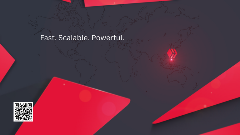
supernova filter together with a Hive logo.I had two ideas for the back side - first, I wanted to include the Philippines(@hiveph) in a cool way so I decided to pinpoint it to the map. A normal pinpoint logo didn't look that cool so tried different effects of GIMP and ended up using the
If this design were to be used for some other countries' communities, or meetups, the logo can be easily moved to another correct location.
The outlines of the map were a bit dark at first so added transparency to make it look more like the background and so it wouldn't jump out too much while still being visible.
The second idea was to wrap the "huge spaceship" Hive Logo around the card so the objects would extend to the other side. With this, I kinda extend the spaceship theme in a way that it would now be closer to earth but the perspective was now changed and we are looking at earth from inside the ship. Its destination is now visible on their radar. This will create a front layer and together with the map it will add more depth.
"The beacon" was much brighter at first(seen below) but I had to tone it down to maintain the same background color as the front side.

Here are the final versions with text and QR codes:
FRONT FINAL:
I wanted to keep the QR code as small as possible but it can of course be scaled up as well as positioned in each corner.
I chose white as the color of the text so it would jump out a bit from the picture and it also goes well with the QR code.
BACK FINAL:
Same thing with the QR code on the backside. Added the slogan here also but this space can also be used to provide some additional(email, phone number, etc) and can be moved to a different spot depending on which country the pinpoint mark is placed.
Other Notes
I thought I could also do a "universal" background in which there would be a pinpoint hive logo on each continent and they would be connected with an arch to each other.
Hardest part was to make objects wrap around the card. It's surprisingly difficult to figure out which way they would turn! 😅 At least it was for me!
All images are created by me and are my entry Hive Business Card Design Contest.
Images were made with GIMP version 2.10.18 and texts & QR codes with Canva.
Thank you for reading!
All comments and questions are highly appreciated!
Looking good mate! 😎
Posted Using LeoFinance Beta
Thanks! 😊
Looks Great!! Good job!
Thank you very much! 😊
Looks awesome! Would be nice if there's some text beside the QR code but overall, looks neat and attractive
Thank you very much!
I also thought about adding more info, perhaps I'll make a version like that!
Thanks for your comment, really appreciate it. 😊
Looks awesome!! Great work, I think it is striking with great contrast and I like the use of glow. Good luck with the contest!
Posted Using LeoFinance Beta
Thank you so much mate!
Put a lot of thought into this. 🙂
Nice job.That looks really sharp, @brando28
!CTP
!ALIVE
Thank you much, John! Appreciate it.
!CTP
!PIZZA
Excellent design brother! I love it! Simple, clean, striking, and useful! Fantastic job! 😁🙏💚✨🤙
Thank you very! Glad you liked it!
!CTP
!PIZZA
That is a nice design!
Thanks! Glad you like it. 😊
Nice nice
I love how you pinpointed the Philippines...hehe
It made lots of sense
Thank you!
Yeah, first I thought of using the flag colors but pretty glad I came up with this idea. 🙂
The rewards earned on this comment will go directly to the people( @brando28 ) sharing the post on Twitter as long as they are registered with @poshtoken. Sign up at https://hiveposh.com.
I gifted $PIZZA slices here:
brando28 tipped beststart (x1)
(2/5)
brando28 tipped adcreatordesign (x1) @brando28 tipped @tydynrain (x1)
Join us in Discord!
Hi Brando.
Great job!
I like your designs. Nicely done!
I didn't realize there is an H in the graphic.
Good luck in the contest!
Barb 😊
!BBH
!CTP
!HBIT
Thank you! Just recently noticed the H myself! 😅
!CTP
!PIZZA
You are most welcome Brando LOL 😆 !BBH !CTP !HBIT