Hello Everyone,
This post is my participation for the Hive Business Card Design Contest by @acidyo. Here is a link to the contest post - https://peakd.com/hive/@acidyo/hive-business-card-design-contest.
Firstly I would like to thank Acidyo for organising this contest, I really am excited to participate in it as I have missed out on a lot of contests that were held in the past few months, I've been quite busy for my exams but now they are finally over I can focus on creating content a bit more.
So I've made the following business card for the contest with the given rules in mind.
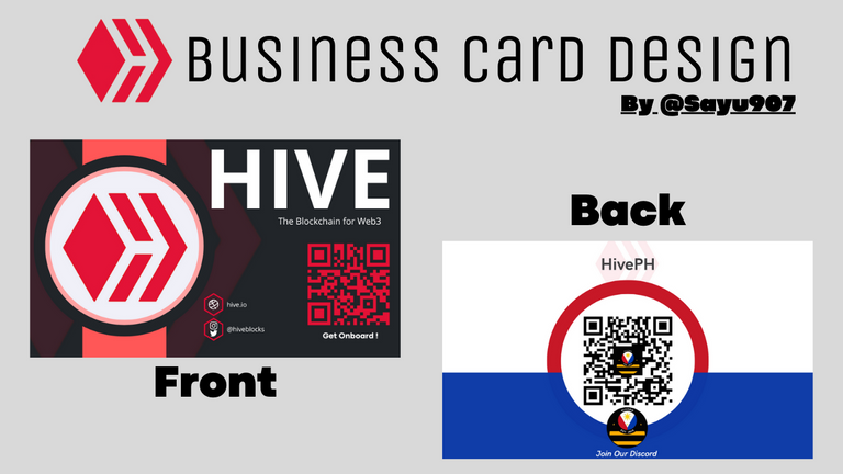
Design Breakdown
The Front Side :
To start with the front side, I've kept it subtle and clean but putting all the necessary information that one would require pretty cleary like official social handles of HIVE and the website and a Quick Response Code (QR) to simply scan and get a account made on Hive blockchain in minutes. I've kept the HIVE logo relatively bigger than all the other elements so that it draws max attention and the reason for picking a shade of black and grey as the background too was done with the same reason in mind. The QR has been placed at the right bottom corner with a red color shade similar to the logo. On the top right corner you would see HIVE in bold and big font under which the slogan of HIVE is also mentioned.
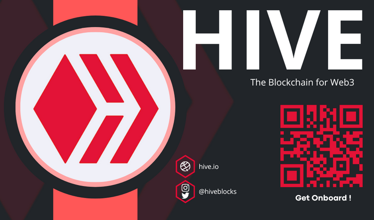
The Back Side :
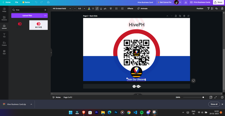
Once you flip the card you're gonna see a call to action design which has been made with flag of the Philippines in mind along with the QR Code for joining the Discord server of @hiveph in a flash. I've mentioned the name of the community at the top which has a HIVE logo overlayed on it with depleted opacity. At the bottom you can see the logo of HivePH and the call to action text.

How Did I Make it ?
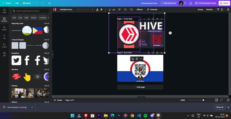
I used canva for the project, I myself put together all the elements like the logo, text, background as well as all the other elements used were put in place manually. I did not used a template for it as none were up to the mark, moreover I wanted to keep it unique. After some thoughts I tried a wrist watch type design for the HIVE logo on the left and tweaked the colors accordingly after which I kept the vector logo of HIVE behind it in a bit faded fashion. I kept the text big so it is easily readable and draws attention. Same for the back side, I tried doing it as per the Philippines' Flag, made sure to involve all the flag colors at the back side along with the logo of HivePH. The back side is far more clean and serves just once purpose for the call to action QR Code.
 |  |
|---|
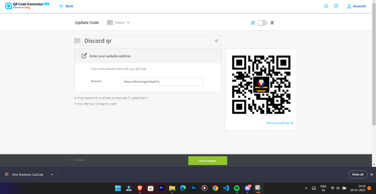
For the QR Codes I used an online QR Code Generator where I put the logo of the community in the QR code itself and also the QR for the front side was made using this website.
Editability
The whole project is fully editable, you can change any element or every single element used in the project. I will also provide the link for the template in canva, if you want to edit it. For that just drop me a DM on my Twitter, over there I will provide you the edit link for my Canva project.
Click here for the view link of the project.

Find me on :
3Speak
DTube
Instagram
Twitter
Cheers !
Sayu
The rewards earned on this comment will go directly to the people( @sayu907 ) sharing the post on Twitter as long as they are registered with @poshtoken. Sign up at https://hiveposh.com.
Congratulations @sayu907! You have completed the following achievement on the Hive blockchain And have been rewarded with New badge(s)
You can view your badges on your board and compare yourself to others in the Ranking
If you no longer want to receive notifications, reply to this comment with the word
STOPCheck out our last posts:
Thanks