The following guest analysis article is written by Taki Tsaklanos, lead analyst at InvestingHaven.
The price of Ethereum largely recovered from this week’s flash crash. Some call it a sell off in a secular bull market, others call it buying the dip. We call it: strong fundamentals, and by that we mean that the price surge is justified by demand driven dynamics. Because of that we stick to our long term Ethereum forecast of $1000.
Talking about fundamental strength in Ethereum, it is interesting to apply traditional relative strength ratios to cryptocurrencies. When analyzing traditional markets we look at the gold to silver ratio to identify which of the two is outperforming or to understand whether a bull market has started or ended. In stock markets the S&P 500 to Russell 2000 ratio is popular as a gauge of risk (the small cap Russell typically outpeformers when investors are in ‘risk on’ mode).
When it comes to cryptocurrencies the most popular way among analysts is to compare market caps. While that is a good indicator it is not the most valuable one in our view.
What really is valuable as an indicator is the price ratio, for instance the Ethereum to the Bitcoin price ratio. The reason why we prefer this ratio above a market cap comparison is that, bottom line, whatever the market cap, all that matters is price. The point is that price reflects supply and demand factors; price is the point where supply and demand find equilibrium.
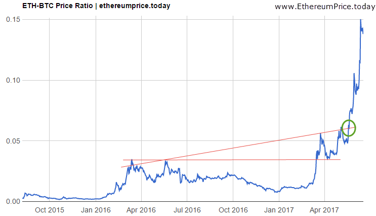
The Ethereum to Bitcoin price ratio is shown on the following chart:

This ratio reveals a very interesting insight. In March of this year, Ethereum’s relative strength moved to an “all-time high” right when it crossed the horizontal red line annotated on the chart. In chart analysis terms we call it a “breakout.” As goes with most breakouts it tends to come back down to test the breakout point before moving higher as of that point. That is called a “confirmation of the breakout” so it suggests that the uptrend will continues.
The “real deal” took place in May, when the Ethereum to Bitcoin ratio crossed the other red line, see green circle. That is when the acceleration of Ethereum’s outperformance started.
What all this means is that Ethereum is the clear winner, and that this ratio was able to forecast it in April and in May.
It also learns that readers can do their own research by looking for other ratios, for instance Ethereum to Ripple or Ethereum to Litecoin to get an idea of the real outperformer. Relative strength tells much more than absolute prices.
Going forward, as prices continue to fluctuate, we will start seeing new patterns on this chart. That is what investors are closely following, and we suggest readers with positions in Ethereum do the same.
Note that this ratio does not suggest anything about the future price of Ethereum or Bitcoin.
Featured image from Shutterstock.
Hi! I am a robot. I just upvoted you! I found similar content that readers might be interested in:
http://freedomnewsroom.com/breaking-news/analysis-a-significant-ethereum-to-bitcoin-price-chart/
betcoin is real nice it will become the will time I belive it will I love flpw me my friend so I get my own o