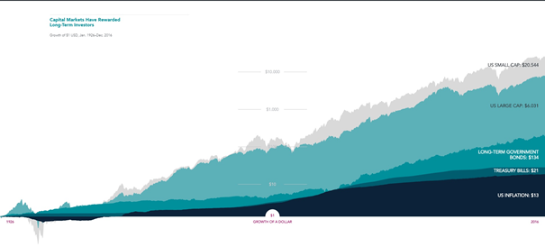
Just a very short message, or actually: a picture. I came across this great graph on the internet. It really substantiates the point I tried to make in my previous two blogs (#2 and #3) about compound interest.

It shows what would be the return of 1 USD invested under your bed (only inflation), on a sort of savings account (treasury bills and long-term government bonds) or in equity index funds (US large caps and US small caps).
Hope this is a good visual to better understand the power of compound interest as explained in my previous two blogs.
All the best,
Hum I have to go back and read your blogs.
Happy to read you.
Keep on steemin'
This picture makes it very clear. Unfortunately, it is very small, fortunately, you can enlarge it on your screen.
It is a great visual to see what would happen if you put your money in a cookie jar or if you invest it wisely. Thank you for sharing.
Thanx man, I can hardly read the words though, even if zoomed in
I upvoted you can you upvote me too?