Hello friends of the world of steemit, we are back with our second entry for the logo design for the sister of @Artzanolino.
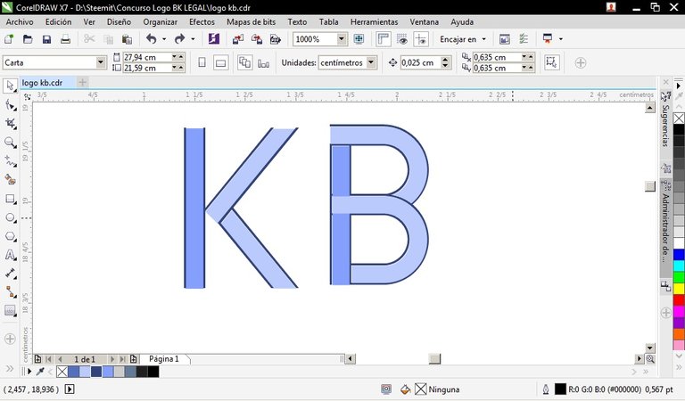
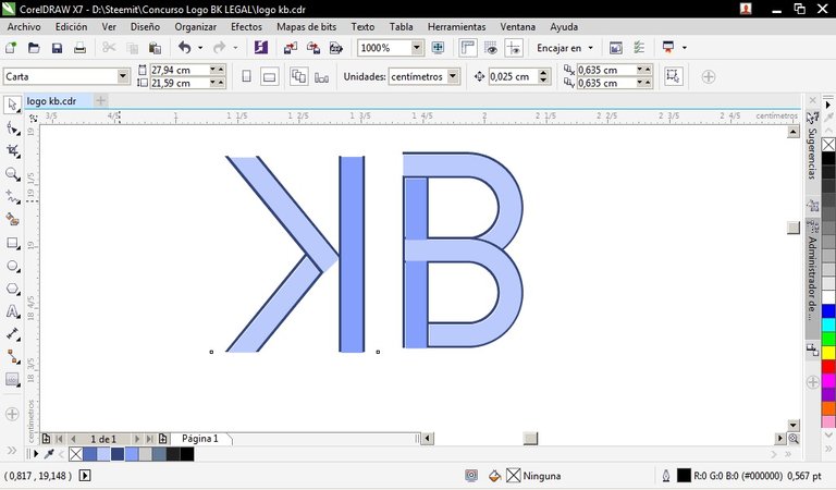
For this second installment we use elements of the entrance 1, from there we place the letters at the same level, and we orient in the opposite direction the letter "K"
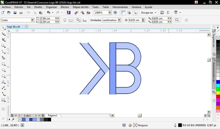
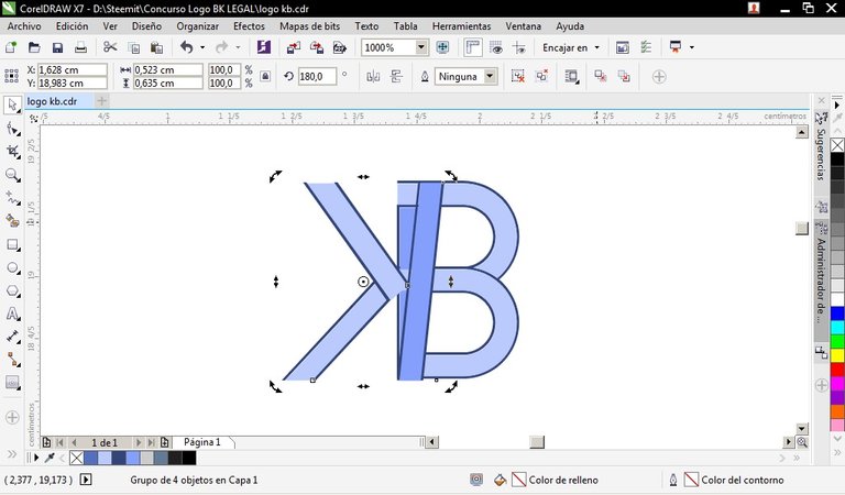
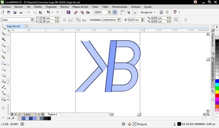
We join the "K" and the "B" and recline them on one side to give a sense of movement
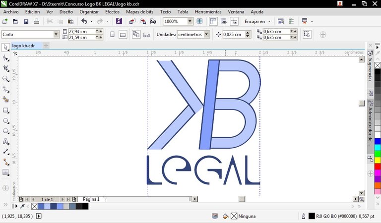
We add the text with the word "Legal" and the source QG just below, so it takes shape.
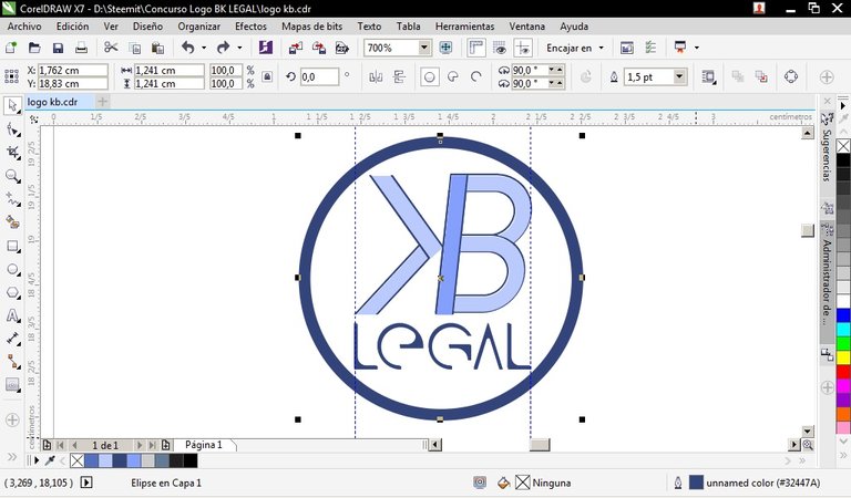
Finally we framed within a circle with a thick line that delimits the logo

Thank you for visiting my post, if you are interested in knowing more, I invite you to click on the image in movement. If we are more, it is better!

Dear friend, you do not appear to be following @artzone. Follow @artzone and get added to our voting list for valuable up-votes!
Ups what you say is true, I'm really here because @altruevid mentioned the contest and encouraged me. Thank you for taking the time to write, I'll get to work.