Hello guys! Good morning, good afternoon and good evening depending on when you view this.
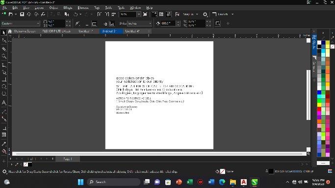
Brand: Abee Cakess and Nibbles
Software: Corel Draw
Size: 5 inches x 5 inches
These are what I consider while designing or creating a work for a client.
A. The concept
B. Arrangement
C. Fonts selection
D. The colour combination
E. Finishing
With these, you are very certain of having a neat and perfect work.
THE CONCEPT
At this stage, I need to stress the brain a bit, and have good background music to help the brain think😀.
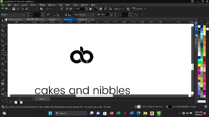
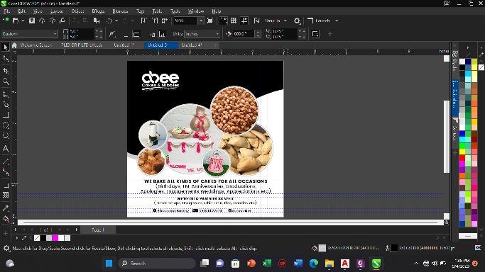
Get your content ready as you see.
Try to play with some shapes to get what you think
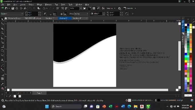
And yes at this point this shape is cool for me to go with.
ARRANGEMENT
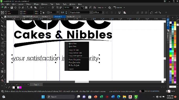
At this level, l think of creating a unique and stunning design with the name of the brand first before every other arrangement.
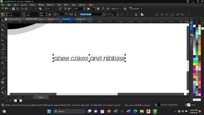
I chose a nice font for name branding (Aristotelica Display Trial)
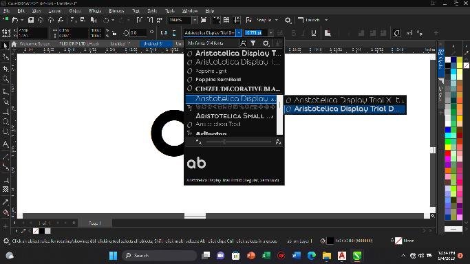
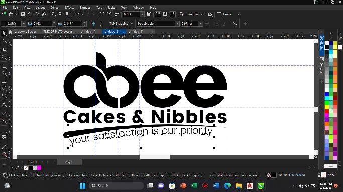
The next slide shows you the outcome
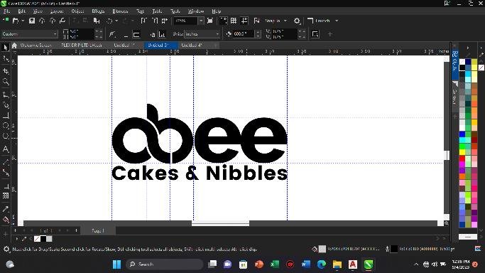
For the slogan, I thought it wise to fix it to the path.
Yes……. My client logo is ready for use🙌
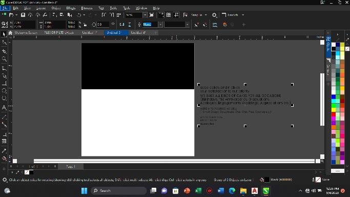
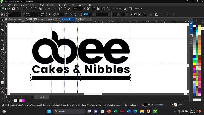
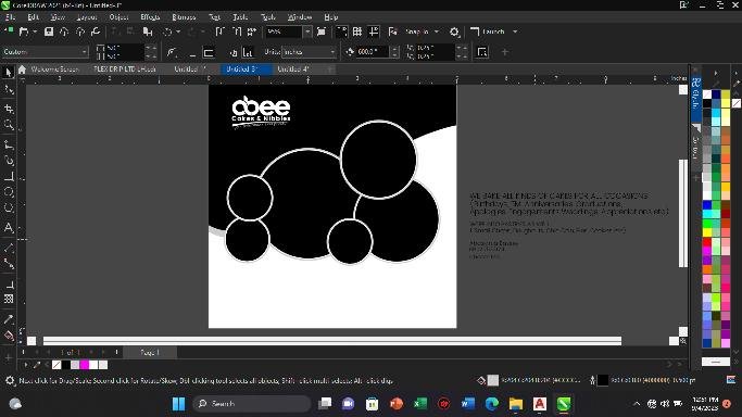
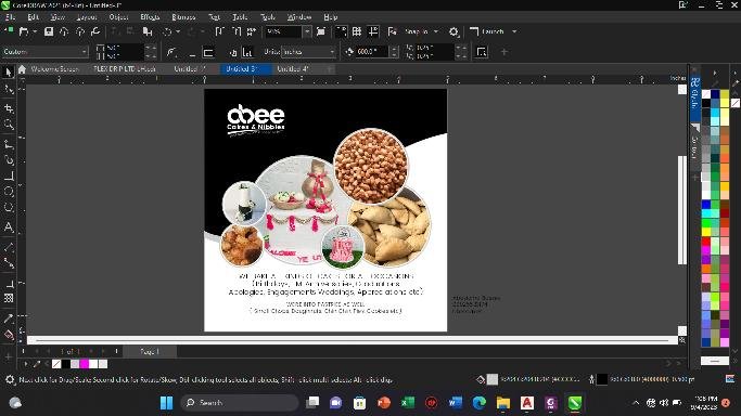
Placing the images in the boxes to add beauty to the work.
FONTS
I chose to use Poppins and Aristotelica Display Trial.
THE COLOURS COMBINATION
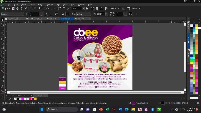
Since it's a feminine job, I decided to play with these colours: Deep Pink, Deep Yellow, White and Magenta to make it colourful as you can see.
The total time duration for this job was 1:20 minutes because I had to catch fun with my design. I was enjoying my cool music and dancing to it, it helped ease work stress.
My Laptop My Pride!!!
My Design My Passion!!!