Hey Steemit Friends !

First I want to thank you , Today we will design the navbar of Steemit by HTML5 , CSS3 & jQuery I want to give you my experience in web design just follow my courses and my works you will take some ideas will help you to build your first template .
I have done the logo of bitcoin by css3 I want to tell you that the languages of programming it's not only to design simple website or simple page you can do all what you want by it as I have done , Let's start .
This is what I will do today , the navbar of Steemit with HTML and CSS , it's from my browser :

It's not exactly but I want to share you just the way and to encourage you to do some works like it ..Open your text editor and new file save as index.html or any name you want , write the syntax of HTML and put the < style>< > ;tag into the head , open a new file give it name.js and import it in your HTML document , we will use jQuery so we need the jQuery file and this is the linke you must download it :
You must download the compressed file and import it in your html document look at the picture :

This is my HTML document called SteemitNav.html and I have the file of jquery called Plugin.js and the compressed file of jquery is ' jquery-3.1.1.min.js' .
Firstly we will add the logo and I have found this logo :

Download and save it in folder ' img ' it means you will create a new folder celled img to put the images inside it .

I have written the div container that will be the navbar all the navbar and we have two sections the logo and the informations , I have done the logo as you see in the picture div and class called logo into it I have my logo in image and the alternate text if you lose the picture .

The body has those proprieties to be by default :
- margin : 0 to return to the default style
- padding : 0 also to return to the default style I wont no padding no margin to this document .
Now we have .navbar-Steemit the container that will contain the navbar :
- overflow : hidden to hide all elements which be outside the container
- padding : 10 pixels to give padding to this container
- Border : 1 pixel bold it's solid not dashed or any other type and the color is :
#d2d2d2
To divide the elements in this container the logo to the right and the informations to the left we must do this tag
.navbar-Steemit > div it means the children div just in the child level will :
- float : left to move the element to the left
- width : 50% to divide this container into two elements each one has 50%
I have written those proprieties to the logo :
- width & height : the width is 200 pixels it's very clear and the height also
- margin : -20 pixels to return to the origin point
- padding : 0 to keep its place
this is the result :

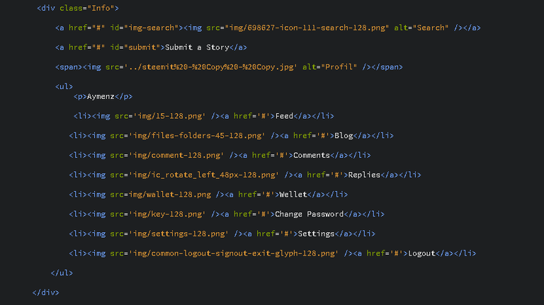
As you see we have finished the first section now we will move to do the second section is the informations , we have the icon of research and the link of submit story finally our image and when we click on the image will appear the menu let's do it :

This is the div about the informations it has class ' Info ' , So the first element is the icon of research you can find any icon you want in this site : www.iconfinder.com
the second element is Submit a story the link that when we click will open new tab to write an article
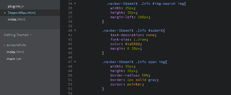
the last element we have our photo profile I have do it in span and this is the Css code :

For the first Icon I gave simple height and width and margin left 380 pixels to go to the right
The submit link : I have written
- text-decoration : none , it's a link so it has the underline to block this propriety we use ' none '
- Font-size & color : the size is 1.3 rem not pixel I have chosen this unity ,
#1a5099this color it's near that the original color on Steemit . - margin : 0 on the top and bottom 20 left and right .
Our profile image :
- width & height : the same width and height to be the same
- border-radius : 50% to be circle
- border : 1 pixel it's solid not dashed and the color is gray
- cursor : pointer to be like it

This is the result :

Now we will continue to do the menu bar , look at the code :

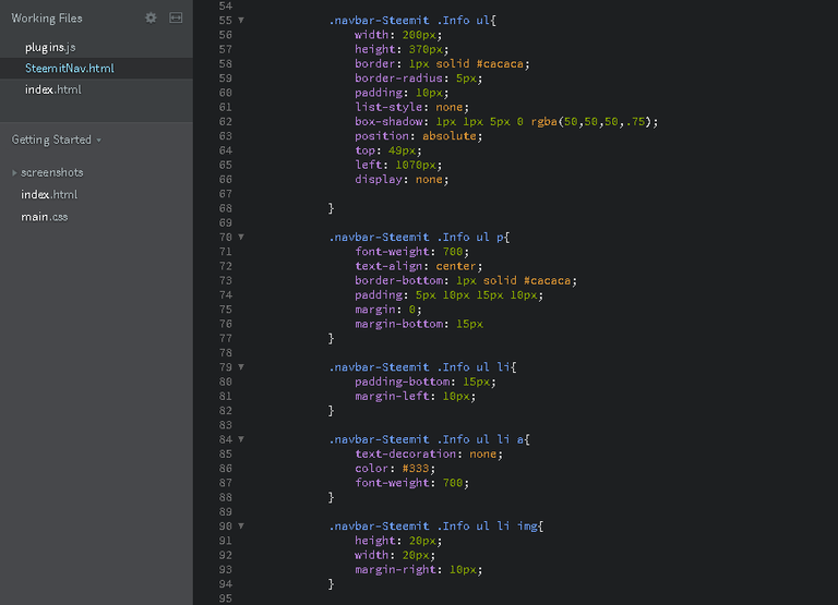
I have done a 'ul ' and in the list item I have written the images and the links that we have as you see , and this is the css proprieties :

I will just explain the new proprieties because of the others we have used in the previous elements like width and height or the border ..etc so for the first class the unordered list :
- List-style : none , we have in the list the circle that is the style of the list we will disable this propriety by 'none'
- Box-shadow : 1 pixel to the bottom and right, the color by the
rgba is ( 50,50,50,0.75)the opacity is : 0.75 - Position : absolute to be free I gave to the top : 49 pixels and to the left : 1070 pixels
- Display : none , to hide this element when we want to see it we click on the profile picture
The paragraph or the name of our profile :
- font-weight : the bold is 700 it's not normal
- text-align : center to be in the center of list
- border-bottom : border on the bottom of this element
Now the items of this list :
- margin-left : 10 pixels to give a space to the left
- padding-bottom : it will be not attach wit the other elements
The link has color and font weight bold and the text decoration is none to be without line .
The images are a little big I have minimized them by the width and height .

In jQuery I have written the document ready function to do all this when the page load
I have selected the span in the div ' Info ' by this code $('.Info span') and I have done the event ' on ' when I click it will do this function ' on('click', function() ) ' and finally I selected the list and this event fadeToggle if the list hidden it will appear and the opposite .
this is the result :

May be the dimensions that I have mentioned is not standard for all , you can increase and decrease until you get the best form that you see or you want .
This is the navbar of Steemit , If you find this post benefit and you get more informations from it don't forget to upvote and follow me just to encourage me to know that there are peoples follow my courses ..You can also follow my courses of HTML and Excel , I will do other tutorial of Css for the beginners .Thank you for reading my article , I love you all ♥ By @aymenz 
amazing post
thank you bro
your welcome thank you too
@aymenz Wow, that is certainly so wonderful. I'm quite grateful for that! Find it irresistible..
thank you ^_^
wow great post , thank you , important info
your welcome thank you too for this comment ^_^
jQuery is so outdated there are way better and faster technologies. If you want to build fast web pages start with Javascript. Later learn some ReactJs, and you will for sure have nice, fast and responsive web page.
But starting with slow jQuery? Why even people need it this days.
for me jQuery is very fast if you want for example to select element just do it ' $('element') ' but in Javascript ' document.getElementById('id') ' and you will do it in variable it's so long and jQuery has many beautiful events you can mix the two languages and build a great website , thank you to your comment !
Great Post a bit too complex for my tiny mind but defo a lot of effort been put in here. I need to up my game :)
Welcome thank you ^_^ If you want to learn the HTML language I have done some courses and I will continue thank's again
If you have any questions or something you can ask me and I will do all my best to give you the important things , thank you
Thank you ^_^