Many times politicians will say things that don't seem very true. When however, a graph appears with the claim, it's cold hard data you can't argue with... or is it?
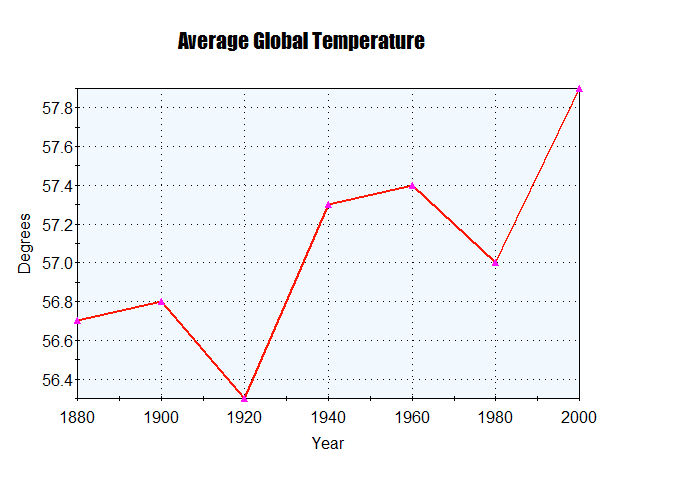
So right here is a graph that is actually made up. The only thing that is true is roughly the start and end points. As you can see, this is probably a graph I would use for arguing about climate change, and why it is a big deal.
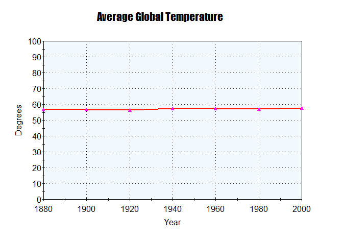
So right here is a new graph with the same data as the old one. However, now it looks like climate change is a false. 1 or 2 degrees higher than normal is actually quite important, but with this graph, it goes from 0 to 100, making the difference unnoticeable.
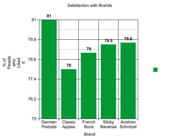
Here's another one.

This one is especially tricky, because your brain assumes that the bars are proportional. It looks like German Pretzels are twice as good as Classic Apples, when it is barely noticeable after changing the graph.
.png)
So when you see a graph next time, check the labels, and you might avoid getting fooled.

