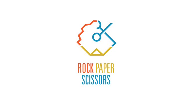
This was rather a challenging context due to the elements involved and the nature of the game. I decided to go with something different rather than the traditional hand gestures. This is after all an online version of the game and second it would need to have a unique look. I also prefer my logos to be as simple as possible since they are often scaled down to tiny icons. The identity needs to hold strong and be flexible no matter where it is placed.
Without further adue here is my submission to the Rock Paper Scissors contest.


Good work, it looked like clock to me which I thought is cool because time factor is there in game... ;)
Good job!

hello bro I feel there is something missing about it... at first I thought it is about the stroke thickness and later something about the spacing and aligntment other than that you did a great job! Followed!
Amazing job on the logo , impressive work. I love how as I went down , it just got better and better. The colors really make it stick out , it's eye catching 👌🏽
Very fantastic work. @kyriacos
Amazing job on the logo ....
Nice work!
nice work! good luck!
white background looks most OG
Good work just u need to work on combination between cold and hot color
Nice post. From me upvote.
Good job, wish you success . Upped.
@kyriacos always nice to see your post.
These look super cool , great ideas i think they will stand out
great eye for simplicity in complexity :) I like your style! following :)
Neat! I like the gray, black and white logo. :)
i like that one as well
I think you can improve the rock part a little bit, papers and scissors are nice and obvious in your logo but rock is really hard to tell, otherwise everything is looking fine.
Nah. i think is ok. it gets implied. It's a rock after all
Good logo. I like it a lot!
thank you
Second one from the bottom in my opinion. I think those 3 colors are the nicest looking combination of all, especially on that dark grey background. Great job on the logo itself too, love how you did that.
thank you
I think your art is missing contrast, color combination
The colors are cool and you can see a lot of work.
I was fighting the merge of 3 symbols too. Eventually I said fuck it. Im not gonna make an overcomplicated logo and I just use RPS letters.
Your logo is nice, but it will have a real trouble working in very small size.
Indeed. well, I might try something different in a few days
its the best logo for the contest to me nice work
I like the second to last one best.
You follow me and vote ok
Tell me the most valuable thing or object of your life ?
My neurophysiology