Hello, as you know, I'm a professional graphic designer.
I like to design logos/banners and more. However designing logos is my hobby.
I have recently finished this logo design for my client's business, he really liked it himself, but asks for suggestions for improvements which can be applied to the logo design.
PLEASE COMMENT BELOW WHAT DO YOU THINK ABOUT THIS LOGO DESIGN!
I really appreciate your help. It makes be a better graphic designer.
-Lazariko12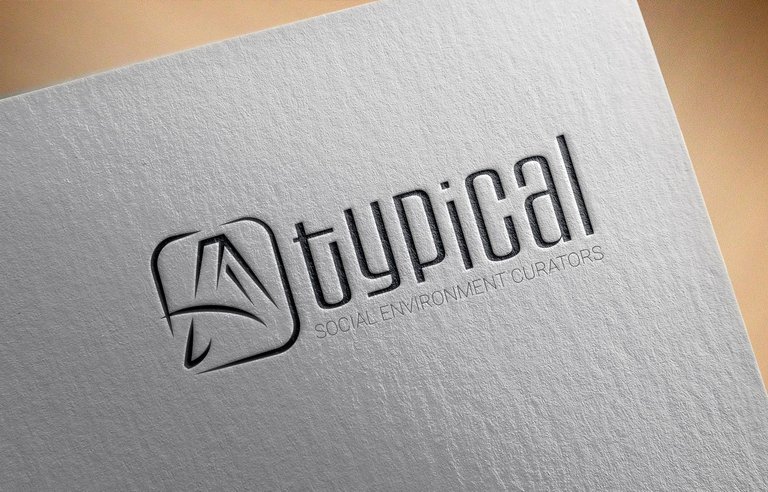
It's simple but I like it. Nice work. Followed you for more :)
Thanks you, I hope you will enjoy my next posts hehe ^_^
Shared on twitter
Disclaimer: I am just a bot trying to be helpful.
Wow thanks!
Nice work, man! I am analphabet in design, but if I would change something it would be a letter t. I would make the tail a little shorter.
That was an analphabet's tip for a professional :D
Sure, I will try to apply it soon. Thanks for the great suggestion!
Is it "A typical" or "Atypcial" :)
I like the logo, I like the font. All-in-all I like it. :)
It is "A typical". Thank you very much for your feedback!!
Since it's A typical, it works. Had it been the other one, I'd recommend removing the "barrier" between the A and t. :)
That's a great idea, thanks.
Very nice work by a talented designer!
@kus-knee (The Old Dog)
Thank you so much :)