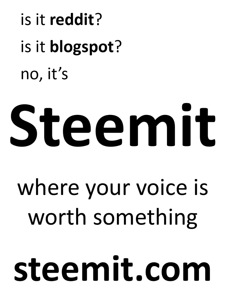
These are community ads. Keep it simple, keep it black and white if possible, and don't make it look pro. The less we say about it the better, to quote a song :) Let it generate intrigue.
Here are some old flyer designs I worked on, using these principles.

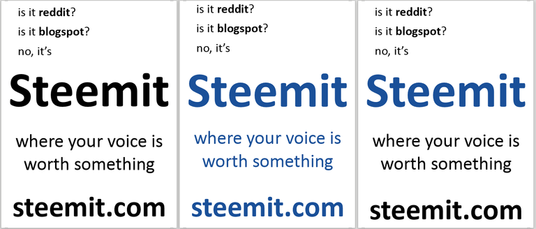
Simple variations in color:

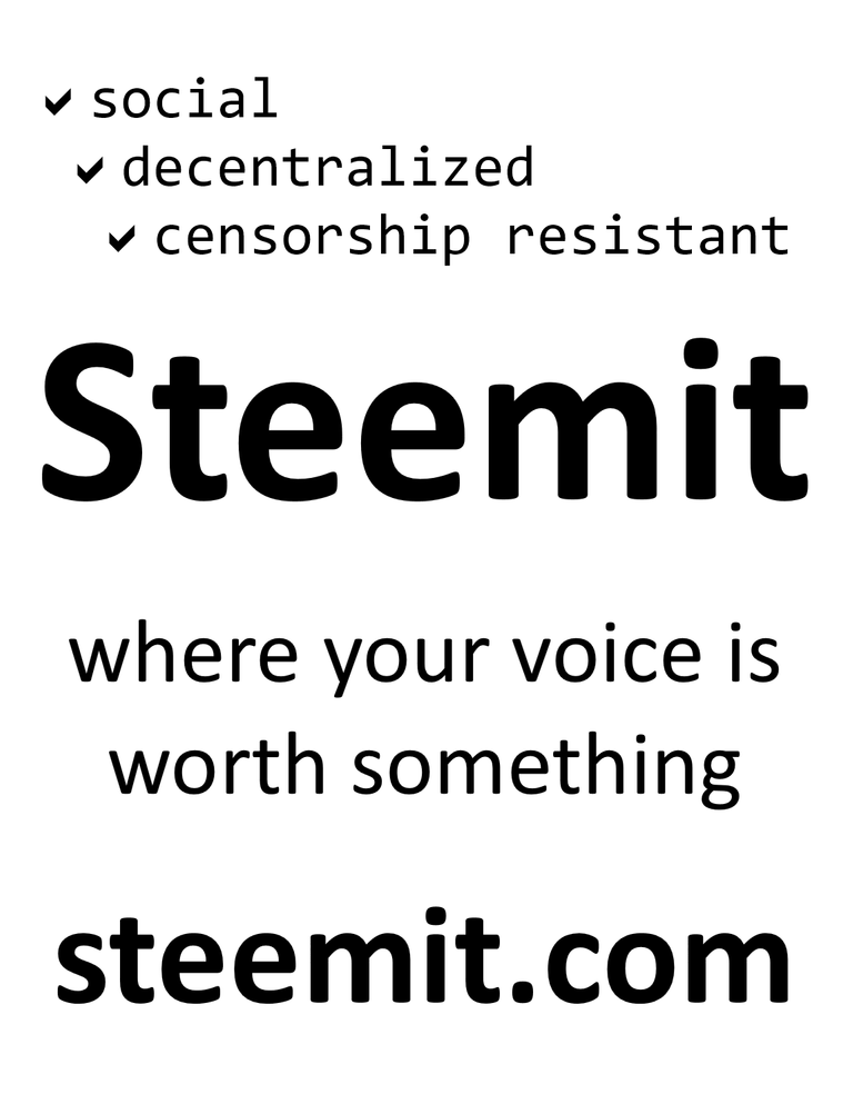
The above is a bit more friendly, and artsy. This one is more of an appeal to the more technically aware, counter-culture, free speech, or possibly nerdy crowd (location dependent):

Get in touch if you'd like these made into the full resolution. Right now I don't have the time.
Also @timcliff, consider using a half-sheet size as well, as community bulletin boards often don't have a ton of real estate. Obviously the bigger the better, but be prepared :) Use very high reflectivity paper.
Thanks @pfunk!
These flyers could be made for STEEMFEST². Then everyone would get around 10-20 of these and take them back with them to their country where they spread it? Or we just give it away in Lisbon! But I agree less is more sometimes! :)