
I was running some charts on the major indexes this weekend and I came across this large symmetry zone in the Nasdaq 100 Index.
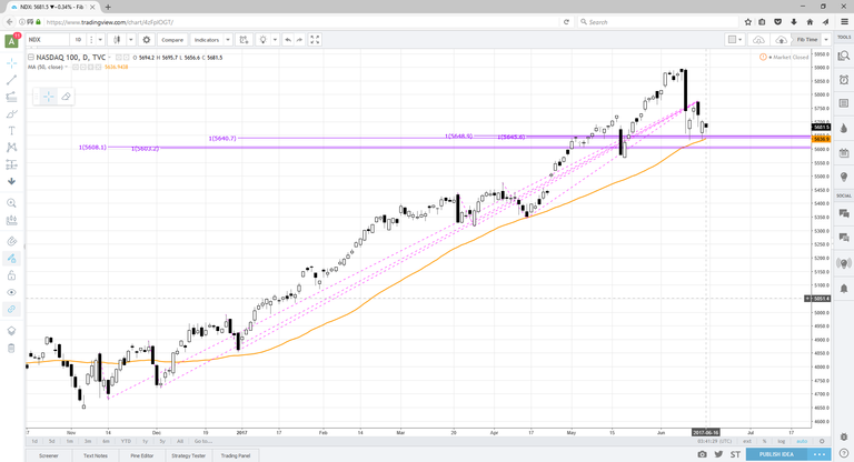
The purple lines are projections of prior down moves onto the most recent high. The alignment of prior declines (or up swings in a downtrend) is an extremely valuable chart pattern for identifying key areas.
This is undoubetdly an uptrend so my bias would be up, however, I trade based off of conditions, not absolutes. Next week, this zone will prove to be all important as it aligns with this weeks lows and the 50SMA.
Bottom line: keep and eye on the 5650 level. A break of that level would likely mean more downside, a hold could setup bullish trades.
Trade em' well.
TN Trader
Thanks for sharing, I think base analysis on tech stocks can somewhat apply also to crytpos. If you don't mind to tell us more about how you pick level please let us know!! Cheers, upvoted and followed (:
Thank you! What drew me to this level was the identical declines in the past several months. The premise of symmetry is the same as a "measured move", except it exist everywhere not just in certain patterns, such as the poles of a bull flag. For example, if stock XYZ has been in a steady one year uptrend and has had two past declines both equal to $5 (roughly, not exact to a penny) then I could use those two symmetric declines to project from future swing highs in order to "forecast" a possible low point. The more symmetric swings, the better. I hope this helps, but please feel free to checkout some of my other charts as well.
Happy to answer any additional questions!
Hi, thanks for posting. I'm new to doing analysis on charts and I'm a little confused on what you mean by "purple lines are projections of prior down moves onto the most recent high." Could you explain how you calculated these numbers please?