Its with great exitement that i am able to deliver the very first update to my #steemitfunded factory steemit project!
I was simply blown away by the response i have had to this and shows me very clearly that #steemit has a very bright future ahead of it.
Logo redesign
I wasnt happy with the original logo, i feel it wasn't quite as slick as it could be so i sat down and brought it more in line with the factory face team sporty feel.

Now for the bit i am very excited about!
BIKE DESIGNS!!
Design 1

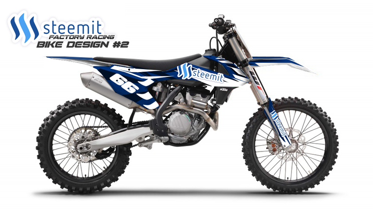
design 2

These are both rough-up works in progress and i would love some feedback from the #steem community before working them up further. Who knows we might even run with both haha depending on the support and how far we can take this project.
So please let me know if you think my designs are taking this in the right direction and if you have any suggestions or feedback i want to know! These will be representing all of us so lets make sure they do it right :)
If this is the first time you have stumbled accross #factorysteemit then please check my first post for full project info.
https://steemit.com/steemit/@b0y2k/the-first-ever-steemit-and-crypto-currency-race-team
Awesome! I like the second design.
Cool that you're doing this.
Liked designing the bike No. 2 I also.
Looks virelig strangers and see pictures of the bikes in action :)
Hang on, have a nice evening :)
I can't wait to get to that stage @nippel66. Your number is my race number :)
Woow :D nice, it is my lucky number. I like more and more :D
Keep up the great project, and name your bike after mee ;) hehe
I actualy dont notice that before you tell me :) hehe
me too!
Seems popular !
thanks @maximkichev
and I would take the two currently
Thanks @grahnite :) seems to be the winner so far :)
The second decal imo is awesome. I would slap those plastics on my yz250 if they were available!
things will be coming!watch this space @tim-johnston :)
Great stuff...i like the second one the most for sure...added a pic of some of my ideas...hope you like it :)
Steemit rim decals and steemit swing arm decals.
The ass

been there got the t-shirt @paddman08 :)
Yeah i think the rear or the bike needs a little more, will work on that and the swingarm next. Im not personally a fan of rin decals but dont let me stop you :)
yea i agree...the rims are maybe bit too much pimp my ridy for mx racing :) and with enduro they tend to get damaged quickly
yeah they wouldn't last long :)
lovely enhancement. great stuff
thank you :)
wooohoo i love this @b0y2k #upvoted like a superman
:) nice one @giostar!! :) we can update that bike with the new gfx soon :D
I need this bike!...and something like that on me :D
If it goes to the next level @sumonerrk i will design and hand out some of these T-shirts :)
@b0y2k. It will. Believe me.
write me up for one! :D
@summnerrk I like where you are going with this! Stay Tuned.
really attractive design. I think the second design is better, white and blue color combination that matches the logo steemit which has white and blue, so perfect. maybe if I get money from steemit, I'll buy that one : D *just dream
If project goes to the next level i would be happy to offer out graphics kits :)
I think rider's knees will cover the SSS Steem logo. I'd try moving to a larger part of gas tank. Angle the word Steem to match angle of gfx. I like the forks stickers. Helmet gfx from previous post way cool.
Maybe you could hit up Dash for a sponsorship too. They fundworthy stuff directly from their blockchain if Supernodes vote it up.
Unfortuantly @the-ivor the plastics are kinda locked as to where you can place the decals. On the upside though you will still see the logo, motocross riders move around alot on the bike and also spend 90% of the time standing.
Good idea with DASH though! I will see if i can make some connections.
haha nice @qonq99 :) love these dudes
Nice update @b0y2k. My vote is for the 2nd design. The blues and whites really work well together and incorporate the #steemit logo nicely. I almost like the idea in making the blues even lighter so that they match the steemit logo even better.
I tried it with lighter blues but it wasnt sitting on the eye quite right for me...
The logo was lost and the darker blues make it pop alot more. I do think the rear section needs a little more work though...Thanks @stoner19, lol i am seeing a clear winner with design #2 !
The first design better, i think!
I'm always a member of team Orange @vi1son :) ridden KTMs for years!
excellent. beginning Hunger Games!
Thanks @maykor :)
upvoted me?
Wow this is great. Its awesome to see another person thats into motocross also into crypto
We are everywhere haha, what/ where you ride mate?There is more than one out there @dice1904 :)
I happen own a motorcycle shop in Louisiana. I think that look s pretty damn cool!
Will be doing a final version based on the comments herenice one @ratm69 :)
I liked the second one better. Steemit can do powerful and wonderful things.
You and many others @randomblock1 :D
great design. looking forward to other great design you will be coming out with.
thanks @gabbans :)
bike #2 for sure!
many plagiat
It seems to be in front at this point @steemedbroccoli
Like most people here I would have to say the second one looks better as a rough.
I think the first would look better if you added a second thinner darker(black or a darker blue) stroke after the white to help to make it stand out of the bike a bit more as I think it is blended into the white of the bike.
Nice comments @tecno thank you, I wanted to stay true to the branding but 'sporty' it up.. sounds easier than it was to be honest. I will take all this on board and i think V2 will be bang on the money :D
Great designs, I think the second is better
You are not alone @ben99 , i think the rear needs a little more work though...
Don't put a #steemit sticker on your visor.
WOW!! How was that legit @felixxx! :o Danger!!!
It seems, Ricky Bobby just loves Fig Newtons.
I likem both equaly, not sure which on i'd decide pickin if i'd had to, great job! tnx for update
Thanks @ozmaster :) never going to please everybody with one design but some great feedback so far!
i wouldnt be able to decide srsly, took nother look at them again today hehe:D
Definitely the second one:)
haha there is a patern here... :) Thanks @cryptoiskey
lol exactly mate, the majority votes are in do your damage!!
awesome, first one design! @b0y2k 8]
Thanks @gekko haha its becoming clear which is in front!
Great....
Thanks @meteor78
like it,, nice Motorcycles
:) thanks @robi-rusmana
your welcome @b0y2k
wonderful creative work i like both and this will increase the STEEM community as any one will see it .best regards and wishes.
I agree and it was one of the things that got my mind thinking about this project to start with :)
Nice one @shaheer001 :) #sport and #steem! perfect :)
This is really cool! Please keep posting :)
like the second design!
I will do just that @jennamerbles :) thank you :)
COOL!
:) Thanks @blockchainbilly
Kick ass post dude! Congrats on the improved logo!
Thanks @sacsha :) hopefully you will see it more places soon :D
Nice boy2k , I told you I will follow you
Will definitely , get a similar bike like yoursWhen I get my Bonus @bullionstackers new post
Nice one @bullionstackers!! We all deserve a nice bike in our lives :D
Do ask steem owners if they will allow you to use their trademark
I have done and they are aware of the project. If they have any reservations i would be happy to rebrand. I just felt as it was #steemit funded that they deserved the advertising :)
Second is better, but instead of number 66, I would prefer 666
haha @busser i get ya, but 66 is my race number :D
Don't be using your race number for passwords! 😃 I don't use my old race number like that.... any more. LOL
haha dont worry mate, boy2k66 is not my password :)
or is it... :D
┌(▀Ĺ̯ ▀-͠ )┐
haha nice
Cool! The first one is better in my opinion!
noted @richman :D
That is just great. Steemit is really starting to spread it wings!!
:) thanks @streetstyle
you need to make an announcement of the winning bike design :)
you know it @bitcointop :)