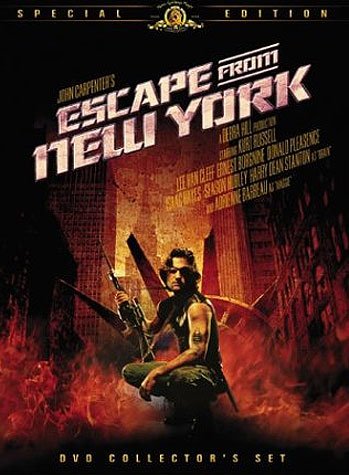
John Carpenter’s “Escape from New York” was never a top 100 movie for me until I decided to review it for “A Grey Idea”. I always felt that the films camp and costume designs really distracted from what should have been a fantastic science fiction action thriller. I had a theory that watching this film in black and white would change my perception of it and that is why I chose it as my first movie review. I thought it would be a great first example of how black and white can take okay film and make it a great film.
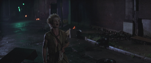
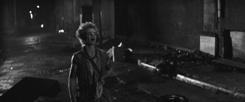
Right from the start it’s clear that the dark tone of this movie goes hand in hand with the black and white aesthetic. The incredible shot of the New York City skyline and the twin towers in the distance really strikes home and places the film in a strange early 80’s vision of a scary dystopian future of 1997 America. At exactly 16 minutes into the film we get a great example how the black and white improves the lighting, make up, and costume design from a purely visual standpoint. Here we see one of the Dukes creepy followers in a dark dimly lit street. Notice how the distinction of the street lights and shadows just seem be more crisp in the black and white version. The stark contrast adds to the depth of shadows and enhances the film in a fantastic way that color could never do.
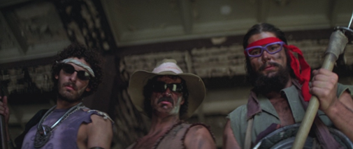
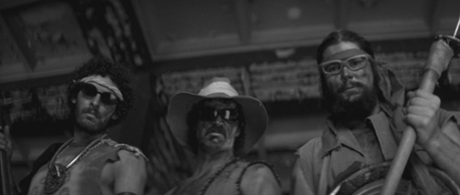
Another reason why black and white helps this film is the silly and obviously unrealistic costume design that I believe really distracts from the film when you view in color. In black and white you can tell that the hipster on the left with the bright red bandana has no lenses in his glasses or that the on the right is wearing a ridiculously bright and clean looking cut off T-Shirt. When you remove the color suddenly the costumes are no longer as off-putting and you can focus on what is actually taking place in the film. In other instances I think it greatly enhances the costume design like in the first picture comparison at the start of this review. The actor playing one of the Dukes followers to me looks way more freaky and realistic than in his color form.
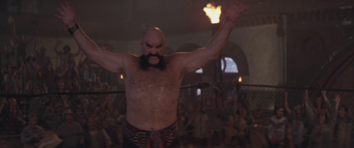
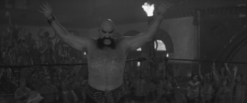
I have to say without a doubt in my mind this this film was infinitely better in black and white than in color. It gives the film a serious tone and makes it feel a great deal less campy which improves the film exponentially. I also felt that since the film was shot mostly at night, that the black and white aesthetic helped create more of an eerie atmosphere for the film giving a nice horror genre feel at times which I believe John Carpenter was trying to achieve. It also allows for us to appreciate the fantastic lighting work that was done in this film which can be easily overlooked.
For these reasons I believe it be “a grey idea” to give Escape from New York a second watch in Black and White!
Let me know what you think in the comments below!
THIs post is just an amazement @pencilandink
I honestly would take both. What I enjoy about the colors in the movie are that, the story takes place within a freshly emerged dystopian NYC. With fashion being what it was in the 80's, it gives you the feeling that even though time has passed since the walls were put up, those people are still living within that fashion era. Not to mention, the fashion itself adds to the "campiness". The movie is a bit of a grindhouse flick, the goofy aspects sometimes are caricatures or cartoony which make it fun.
Ghostbusters in black and white is phenomenally creepy. Seriously, if you get the chance, give this one a go.
I also really dig two-disc special edition of The Mist, which included Darabont's original idea of showing the film in black and white. The producers shot that idea down, saying audiences in the 21st century wouldn't go see a film that wasn't in color. While they were probably right, it's still a gorgeous way to experience the movie, and it gives it the feeling of an extra long episode of The Twilight Zone or The Outer Limits. Highly recommended. :)
The original Godzilla movie is best in black and white.
Posted using Partiko Android
Congratulations @pencilandink! You have completed the following achievement on the Steem blockchain and have been rewarded with new badge(s) :
Click here to view your Board of Honor
If you no longer want to receive notifications, reply to this comment with the word
STOPDo not miss the last post from @steemitboard:
The original Godzilla movie is best in black and white.
Posted using Partiko Android
Congratulations @pencilandink! You have completed the following achievement on the Steem blockchain and have been rewarded with new badge(s) :
Click here to view your Board of Honor
If you no longer want to receive notifications, reply to this comment with the word
STOPThe use of color (or lack) can help emphasize certain points or moods. I think it's best to use a combination of both. Grey scale is good for flashbacks or darker moods, while colour can be used selectively ( Shindler's List) or to indicate some shift in the mood.
Pure grey scale works for some films, but I would bet that most filmmakers who filmed in black and white would have preferred to have colour to depict the vision more clearly. Without careful consideration it's basically just a technical limitation.
That being said, as you mention, the grey method can reduce campiness. Some films that rely on color can lack in other areas.
So, color/grey can be seen as a tool, rather than just a medium.
Congratulations @pencilandink! You received a personal award!
You can view your badges on your Steem Board and compare to others on the Steem Ranking
Vote for @Steemitboard as a witness to get one more award and increased upvotes!