What is this series about?
Microsoft Excel is the single most used application in Offices across the world and it is this way for a reason! This application comes with a variety of tools that make analysis and presentation very powerful and effective. One of the most widely used applications of Microsoft Excel is in presentation of analysis using dashboards. Dashboards are tools that help you slice and dice your data to derive meaningful insights.
This series is about things that you must know about Microsoft Excel if you want to convert your ideas into effective dashboards. We have listed them below and are a must for anyone starting to explore the world of dashboards. We'll be presenting this tutorial as a multi-part weekly series that you can follow and learn everything about creating dashboards in MS Excel. We'll be starting off from topic number 10 and will move down to topic number 1. At the end of this countdown, you'll be a master of dashboarding in Microsoft Excel.


This post will cover the first topic in the series on Dashboard design in Excel.
10. MS Excel Dashboard Design
This is one of the most important aspects of the Microsoft Excel-based dashboards and is in fact the first thing that comes to our mind when we think about dashboards. We have seen so many MS Excel dashboards that were awesome, in terms of the technical details, yet never became popular amongst the clients just because they were not designed properly. At Crab Sheet, we usually follow the following 5 steps while designing our dashboards:
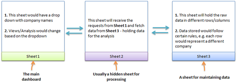
Step 1: Create a schema of the data flow in your dashboard-across sheets
This is a lot simpler than it sounds and mostly you won’t need to put things on paper for doing this. For this, we divide our dashboard into three distinct units 1) a sheet to show results/analysis, 2) a sheet to process the analysis requests and 3) a sheet to store the raw data. It would ideally be something like this:

We refer this dashboard three sheet structure as the D3S structure. Also, this is the step where you should formulate rules about maintaining data in your data sheet. Why? Because it becomes very hard to perform analysis with unstructured data.
Step 2: Design Sheet-1 or the main dashboard
This is the part where you can unleash your creativity. The idea is to create a dummy layout of how your end product (dashboard) should look like. Some of the steps that were followed while creating the CompTrax™ are shown in the image below:

Think through the design as much as you can and as much the time allows. Some questions that you may want to ask yourself while building a dashboard may include:
- What is the purpose of this dashboard?
- What all do I need to show here? Graphs? Tables?
- Is the end-user tech savvy? Do I allow space for more numbers?
- What all text do I need to show?
- What color font should I use?
- Will the data fit the space that I am allocating on the dashboard? If no, how do I handle it? Should, I allocate more space?
- What color schema should I use? Company specific? Brand specific?
Step 3: Revisit the color scheme
It is a good idea to revisit the scheme once you have finalized the basic look of the dashboard. And though this is very person specific, the color combination for dashboards should be soothing—and when we say soothing, it does not necessarily mean that it has to be dull. But try not to use too many colors in the same dashboard. MS Excel has a wide variety colors and gradients built inside it that you may want to use from the ‘drawing tools’ menu. Alternatively, If your company, or brand has a fixed color palette you might want to use them for a more professional feel.

Step 4: Don’t forget the data sheet
Remember that the data sheet is also a part of your dashboard and the user may have to go there frequently to update data. Hence it is equally important that it looks good as well. Excel provides various table color schemes that you may want to use on these data sheets. Ideally this should be in sync with the color scheme you use on the main dashboard page.
Step 5: Hide the control sheet
The control sheet usually contains a lot of formulas and user input data. It is not uncommon for the user to make random click on sheets and in case of the control sheet, these clicks, at times, can change formula references and mess up the whole dashboard. So, unless required, we would suggest that you hide this sheet before sending it to other users.
One of the primary aims of a dashboard is to effectively represent the analysis in a single page to avoid navigation problems. Dashboard design, thus, is of paramount importance and simple steps (as shown above) can drastically enhance the visual appeal of a dashboard.
If you have any queries on dashboard design, please leave a comment and we'll get back to you as soon as possible. Tune in next week for our next post on Dashboards in MS Excel.
Note: This post is a part of the series I wrote on Crab Sheet -- A website for learning MS Excel
Hi! I am a content-detection robot. This post is to help manual curators; I have NOT flagged you.
Here is similar content:
http://crabsheet.com/cs/dashboard-101/dashboard-101-1-design
Thanks! Yup, this post is a part of series that I have written on my blog crabsheet.com/cs. I hope it's okay to do this since the original content is mine as well.
Good Luck buddy! Seems like your first post. Should be helpful for Excel enthusiasts on Steemit!
Thanks man! Looking to bring the power of Excel to every one! Hope you like the following posts as well!