Dear MSP-Waves Audience,
We are proud to reveal MSP-Waves's new logo today on @pennif's
SPECIAL SHOW: The What Makes A Good Radio Show Radio Show - Thursday 4 October airing right now on mspwaves.com and Vimm.tv
Labor of Love
This logo is a labor of love. The initiative was led by @r0nd0n and @globocop over many months. We involved the MSP-Moderator's team and a number of designers.
@ankapolo is our logo-star
After asking a number of graphic designers, our friend @ankapolo came out on top with her creative ideas and innovative designs.
Why a new Logo
MSP-Waves approaches its second year since inception. It has had a nice animated logo, but its implementation took much of graphic estate on any presentation. We set out to design a logo that would take up less real estate and be instantly recognizable with or without lettering.
Now, without further ado:
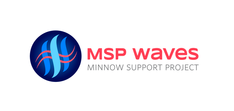
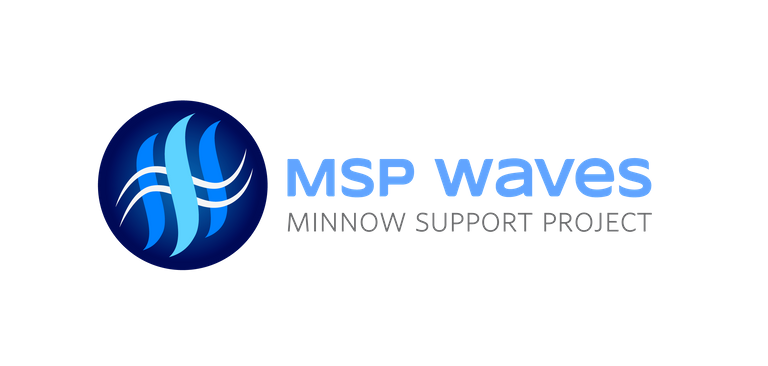
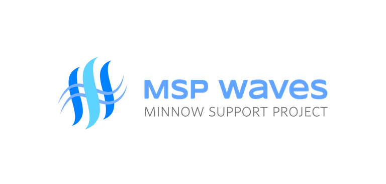
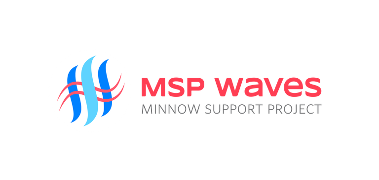
The MSP-Waves Logo
On bright backgrounds:


On dark backgrounds:


The main font is Syncopate Bold and the second one is Whitney Light. We provide this information so that MSP-Waves hosts may be able to customize their show with MSP-Waves branding
What do you think?
We would love to know what you think?
Thumbs up? Constructive criticism?
Stay Connected
Please make sure to follow @msp-waves here on Steemit and follow us on Vimm.TV for instant channel access.
Check out mspwaves.com for show listings, video feed and 2 audio feeds for when you're on the go and don't want to miss a beat on MSP-Waves.
Big improvement!
Looking good guys!
I like it!
Posted using Partiko Android
I think it's pretty cool, I am really bad at coming up with ideas like this but I am learning
@ankapolo ~ Great job on this logo! It is fabulous!
It is such a crisp, clean design! Bravo! 💚
Schweet! Will use one of these going forward.
Looking nice! I really like the red color in those logos, looks slick :)
good one! Really minimalist and powerful!
I like it a lot! Thank you so much.
Awesome ! Juicy colours! Warm radiation.. the LoveWaves :D
I love the top version! It is the best one - with the red radio waves impermeating the steemspace!
Great work.
when scaled down it will need a stronger stroke in "minnow support project" // beautiful font by the way. light and clear